AI for Financial Pricing Website Template
Calibrate is a dashboard-style landing page template built for AI-driven financial services pricing platforms. It combines a live-feel tab switcher, an animated comparison grid, client outcome cards, and an interactive ROI calculator into a single high-impact page. The design uses a command-center dark aesthetic with iridescent accents that make data feel alive the moment it moves.
by Rocket studio
Quick summary
Calibrate is a conversion-focused landing page template for financial services AI pricing platforms. It opens with a three-tab live dashboard mock-up, accelerates through an animated manual-versus-AI comparison grid, and closes with an ROI calculator paired with a two-step lead form. Every section is built to make the cost of inaction visible before asking for anything.
Who this template is for
This template is designed for B2B software-as-a-service (SaaS) teams selling AI pricing intelligence to financial services buyers. It speaks directly to decision-makers who control pricing strategy at scale.
- Heads of pricing at mid-market insurers tired of stale quarterly rate reviews
- Fintech chief financial officers (CFOs) managing dynamic lending books where small margin losses compound fast
- Revenue operations leads at wealth platforms whose fee schedules were set by intuition years ago
What problem this template solves
Manual pricing processes in financial services are slow, opaque, and expensive. A quarterly reprice cycle cannot keep pace with real-time competitor moves or margin signals. This template gives your platform a page that makes that gap impossible to ignore.
- Visitors arrive skeptical; the animated comparison grid shows them exactly where their current process loses on every metric
- Abstract ROI claims fail to convert; the interactive calculator lets buyers input their own book size and see projected recovered revenue instantly
- Generic SaaS landing pages do not resonate with pricing professionals; this template uses financial services language, hard numbers, and a command-center visual register that earns credibility
What you get with this template
You get a complete, single-page layout built around one conversion goal: getting a pricing-gap analysis request from a qualified financial services buyer. Every section is sequenced to build urgency before the call to action appears.
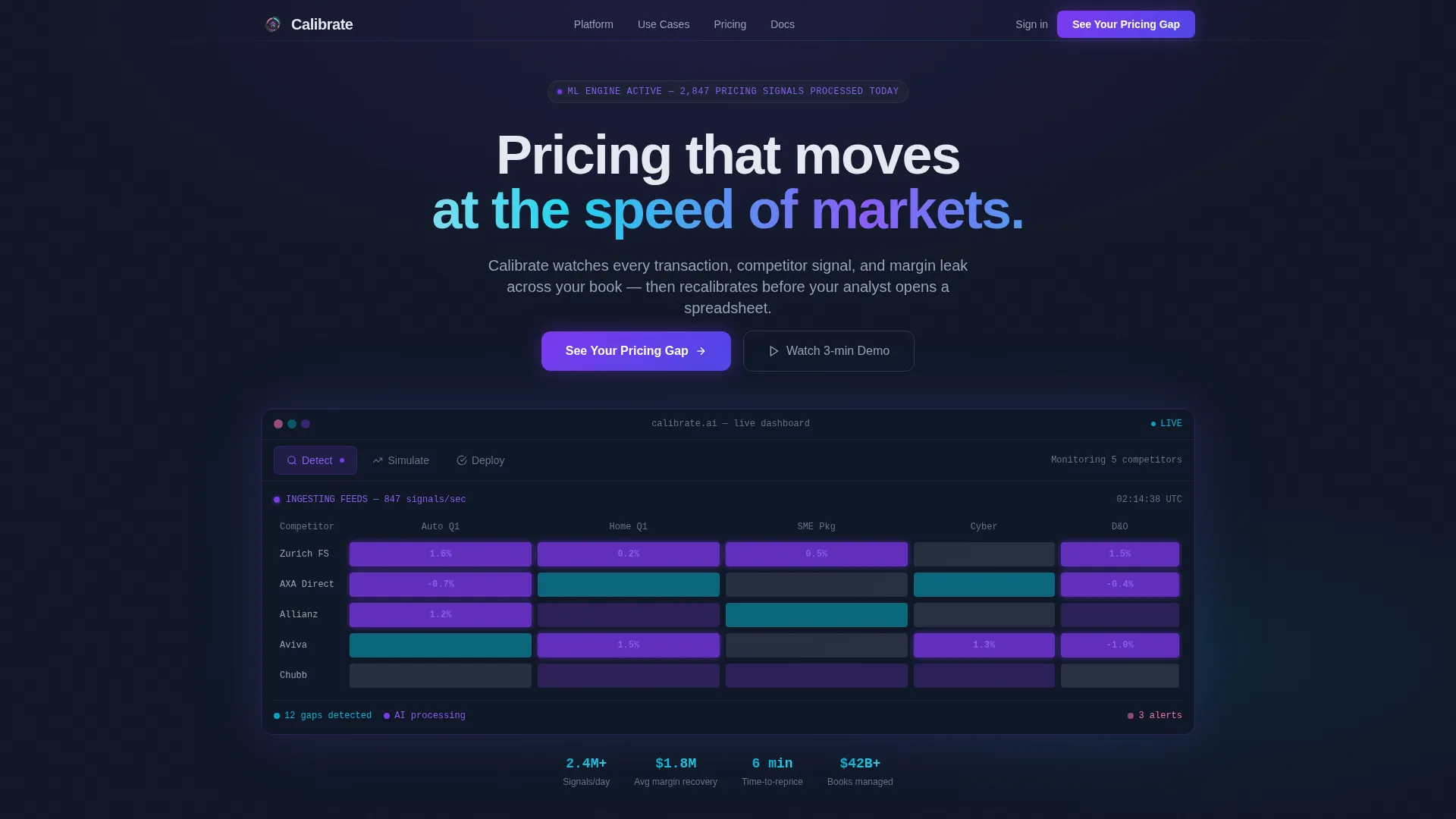
- A Feature Tab Switcher hero with three interactive states: Detect, Simulate, and Deploy
- An animated comparison grid, three client outcome cards, a live ROI calculator, and a two-step modal form
- A deep charcoal command-center design system with iridescent violet, teal, and rose accents tied to specific data meanings
Feature list
This template is built around high-interactivity components that make an AI pricing platform feel real and credible before a single sales call happens.
Three-State Feature Tab Switcher
The hero section uses three clickable tabs labeled Detect, Simulate, and Deploy. Each tab reveals a different dashboard view with an iridescent wipe transition. Detect shows a competitor pricing heatmap with pulsing violet cells. Simulate displays a margin-impact scatter plot with a draggable price lever. Deploy presents a deployment queue with approval toggles and a live countdown timer.
Animated Comparison Grid
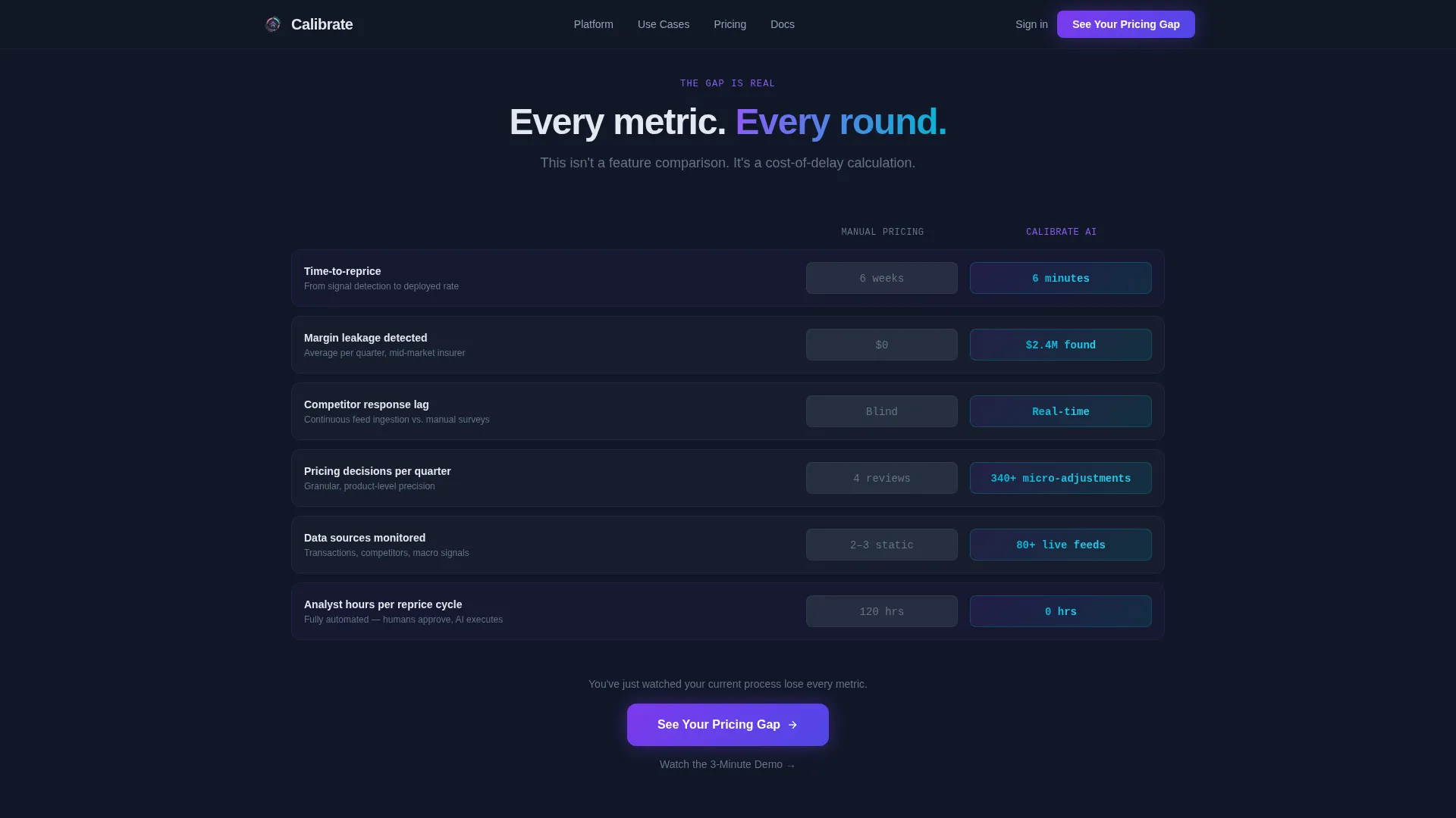
A side-by-side scoreboard places Manual Pricing on the left in muted gray and Calibrate AI on the right in violet-teal gradients. Specific metrics animate on scroll like a scoreboard flipping: time-to-reprice drops from six weeks to six minutes, margin leakage detected jumps from zero to $2.4 million found, and competitor response lag shifts from blind to real-time.
Client Outcome Cards
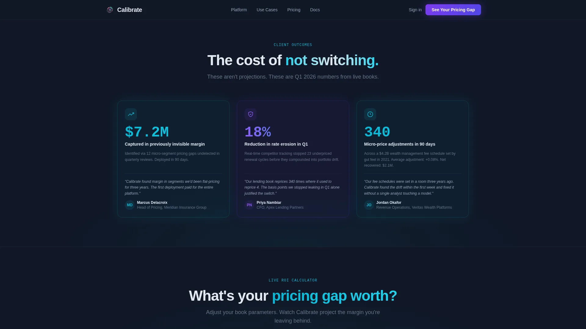
Three result cards display hard client numbers with staggered scroll reveal animations. The cards show concrete outcomes: 18 percent reduction in rate erosion in one quarter, 340 micro-price adjustments deployed in 90 days, and $7.2 million in previously invisible margin captured.
Interactive ROI Calculator
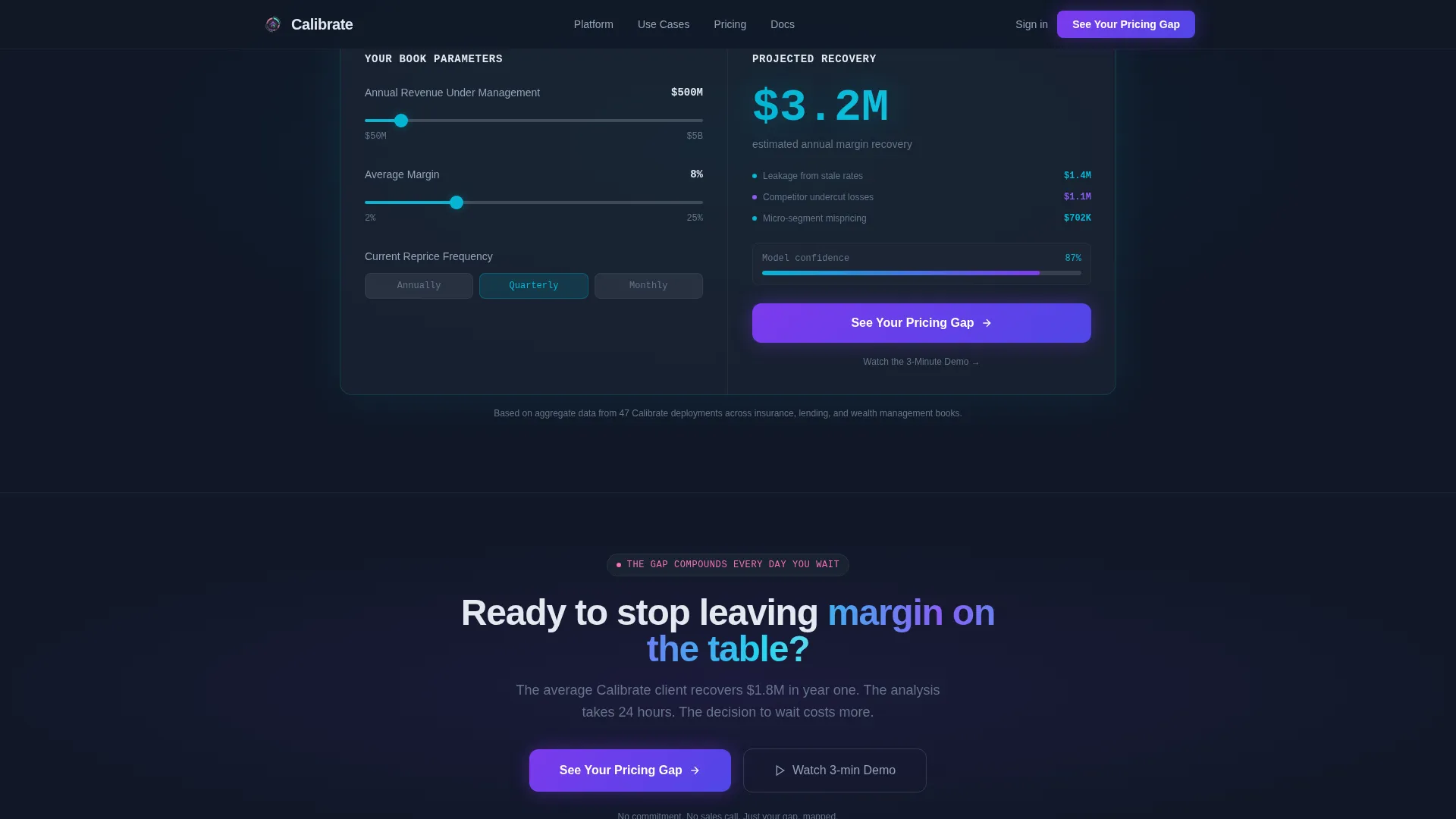
Visitors enter their book size, average margin, and reprice frequency. The calculator projects recovered revenue in an animated teal counter. This component makes abstract platform value concrete and personal before the call to action appears.
Two-Step Lead Capture Form
The primary call to action, "See Your Pricing Gap," opens a two-step modal. Step one collects company name, book type (insurance, lending, or wealth management), and approximate annual revenue under management. Step two asks current reprice frequency and whether an existing data feed is in place. A secondary text link, "Watch the 3-Minute Demo," captures only an email for visitors not yet ready to commit.
Scoreboard-to-call to action Conversion Flow
The primary call to action appears first inside the comparison grid, immediately after the visitor has watched their current process lose on every metric. It reappears below the ROI calculator pre-filled with the visitor's own inputs. This placement sequence ensures the ask follows maximum demonstrated value.
Page sections overview
| Section | Purpose |
|---|---|
| Tab Switcher Hero | Showcase Detect, Simulate, Deploy dashboard states interactively |
| Comparison Grid | Contrast manual pricing versus AI on specific timed metrics |
| Client Outcome Cards | Present three hard-number results with scroll reveal |
| ROI Calculator | Let visitors project their own recovered revenue in real time |
| call to action Form Modal | Capture qualified leads via two-step pricing gap request |
| Footer Row | Provide a clean single-row linear footer close |
Design & branding system
The visual identity follows a command-center dark aesthetic where charcoal dominates eighty percent of the canvas. Every iridescent accent carries a fixed semantic meaning so the interface feels like a system, not decoration.
- Deep charcoal (#111827) as the primary background, soft silver-mist (#E2E8F0) for typography and grid lines, liquid-violet (#7C3AED) for AI-driven highlights and active states
- Iridescent teal (#06B6D4) reserved exclusively for positive-delta indicators and upward trends, shimmer-rose (#F472B6) appearing only on hover states and notification pulses
- DM Sans for headings and interface labels, JetBrains Mono for all data values and numeric displays to reinforce a data-native reading experience
Mobile & speed optimization
The template is designed desktop-first to serve financial services power users on large monitors. Animation performance is handled through GPU-accelerated transforms and Intersection Observer scroll triggers.
- Tab wipe transitions, scoreboard flip rows, and the ROI counter use GPU-accelerated rendering to keep animations smooth on data-heavy viewports
- Intersection Observer drives scroll animations so effects only fire when sections enter the viewport, avoiding unnecessary processing
- The desktop-first layout prioritizes the data grid and tab switcher experience where screen real estate supports full dashboard immersion
How this template helps you convert
Every section is sequenced to raise the perceived cost of inaction before a single form field appears. The page earns the click rather than demanding it.
- The comparison grid shows the visitor exactly how much time, margin, and competitive intelligence they lose under manual pricing, making the gap visceral and specific before the call to action is placed.
- The ROI calculator personalizes the value proposition with the visitor's own numbers, so the projected recovery figure in the animated teal counter feels like their money, not a vendor's estimate.
- The two-step form and the secondary demo path serve two readiness levels at once, capturing both high-intent buyers ready for a gap analysis and earlier-stage visitors willing to share only an email for a three-minute demo.
Other information about this template
This template is part of the Dashboard Pro theme family and uses the AI Iridescent color system. The creative direction is Launch Energy, which means each scroll section is sequenced like a countdown rather than a brochure. The landing page direction is Comparison/Versus, a layout strategy optimized for B2B SaaS products that win by making the alternative look costly. The header concept is a Feature Tab Switcher, which replaces a static hero image with an interactive product demonstration.
- Built on the Dashboard Pro theme with the AI Iridescent color system and Launch Energy creative direction
- Uses the Comparison/Versus landing page direction to structure the entire page around a clear before-and-after contrast
- Intersection Match Score of 13 reflects a precise alignment between the financial services AI pricing niche and this template's design and conversion architecture
Theme
Dashboard Pro
Creative direction
Launch Energy
Color system
AI Iridescent
Style
Dashboard/Data Grid
Direction
Comparison/Versus
Page Sections
Three-state Feature Tab Switcher Hero
Animated Manual Versus. AI Comparison Grid
Hard-number Client Outcome Cards
Interactive ROI Calculator with Animated Counter
Two-step Lead Capture Modal
Related questions
Who is this landing page template designed for?
Can I edit the metrics in the comparison grid and outcome cards?
What makes the ROI calculator effective for financial services buyers?
Does the template include the two-step form and demo capture path?
Is this template optimized for desktop viewing?



