Calibrate - Powerful Dentallab Landing Page Template
Calibrate is a dental lab analytics dashboard landing page built on a modular card grid layout. It opens with an interactive calculator that instantly shows lab owners their estimated annual revenue lost to remakes and idle time. The dark, cockpit-style design and staggered card animations make every metric feel urgent, personal, and actionable from the first scroll.
by Rocket studio
Quick summary
Calibrate is a single-page dental lab analytics dashboard template built for lead generation. It leads with an embedded interactive calculator, then unfolds a grid of animated metric cards covering case lifecycle, material waste, technician utilization, and rejection analysis. The design runs on a deep navy and teal color system that keeps focus sharp and every data point deliberate.
Who this template is for
This template is built for software teams and founders selling data tools into the dental lab market. It speaks directly to the operational pain points of dental lab decision-makers, so it works best when the product behind it addresses those same problems.
- Lab managers running mid-to-large operations who need to trace remake costs
- Multi-location dental lab owners who compare site performance across facilities
- Dental group Chief Financial Officers negotiating reimbursement rates with hard utilization data
What problem this template solves
Most dental lab software pages rely on feature lists and stock photography. They describe the tool instead of demonstrating it. Calibrate flips that approach by putting the product experience front and center before the visitor even scrolls.
- Lab owners cannot see their own waste until a number is placed in front of them
- Generic landing pages fail to create urgency around the specific costs of remakes and idle technician hours
- Visitors leave without converting because the page never made the problem feel personal
What you get with this template
The template delivers a fully structured, single-page layout with a working interactive calculator at the top, a modular animated card grid in the body, and two distinct conversion paths at the close. Every section is designed to build diagnostic confidence in the visitor before asking them to act.
- An interactive header tool with real-time Lab Efficiency Score output rendered as an animated radial gauge
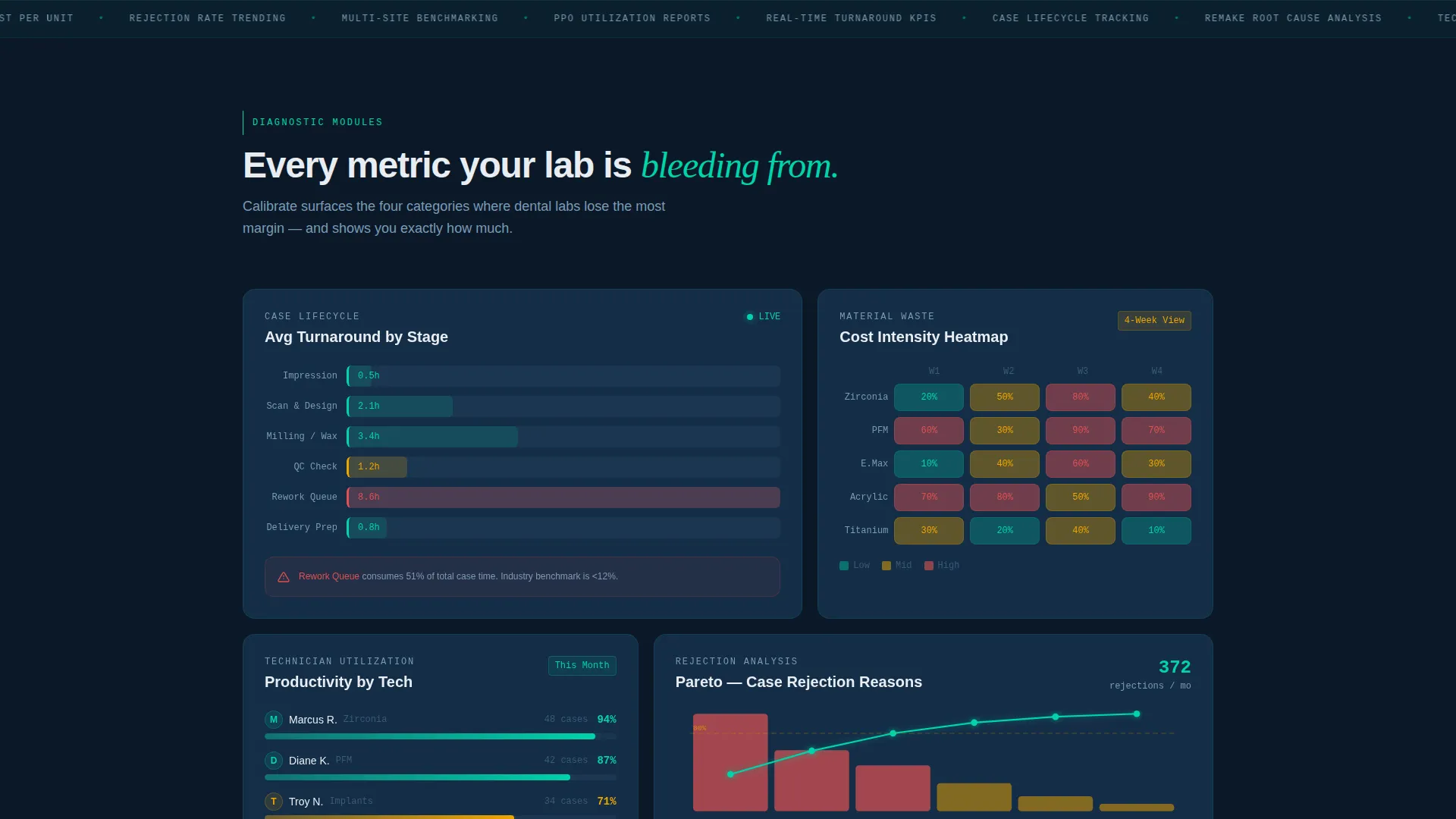
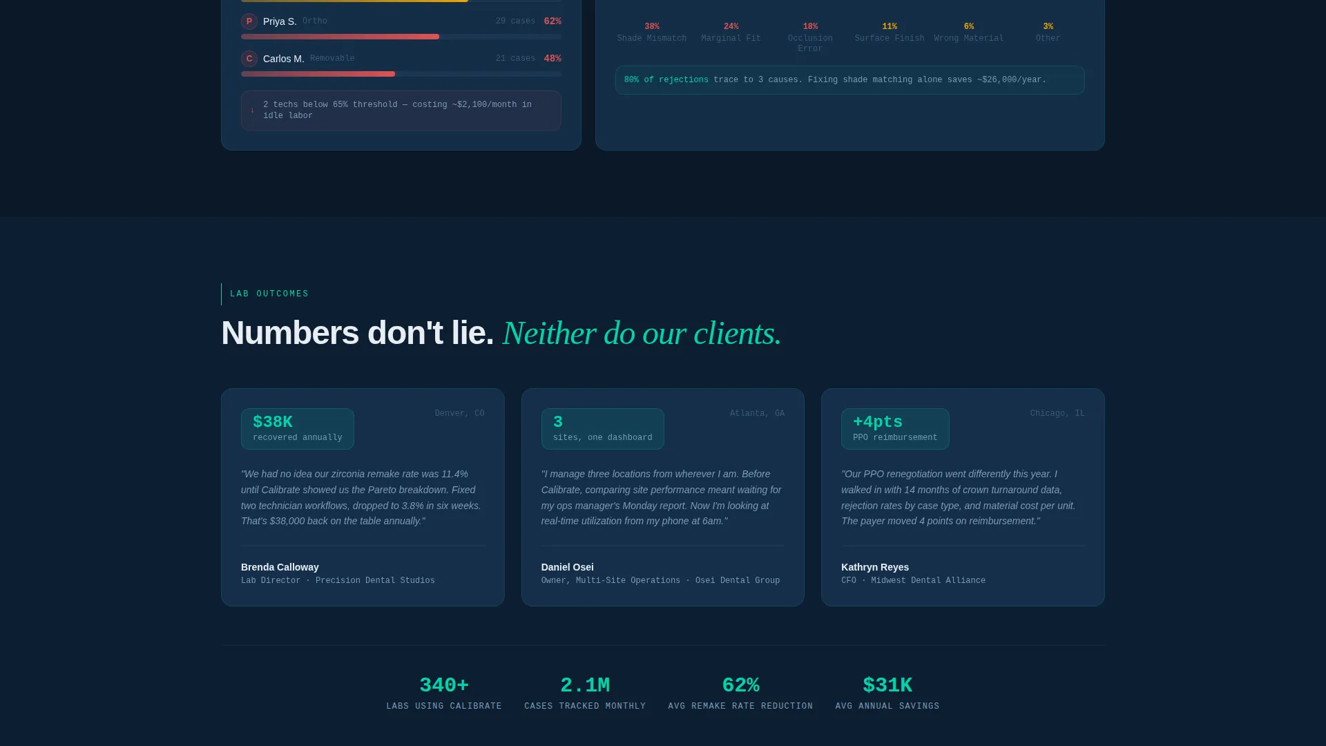
- A staggered card grid featuring a case lifecycle timeline, material waste heatmap, technician utilization comparison, and rejection reason Pareto chart
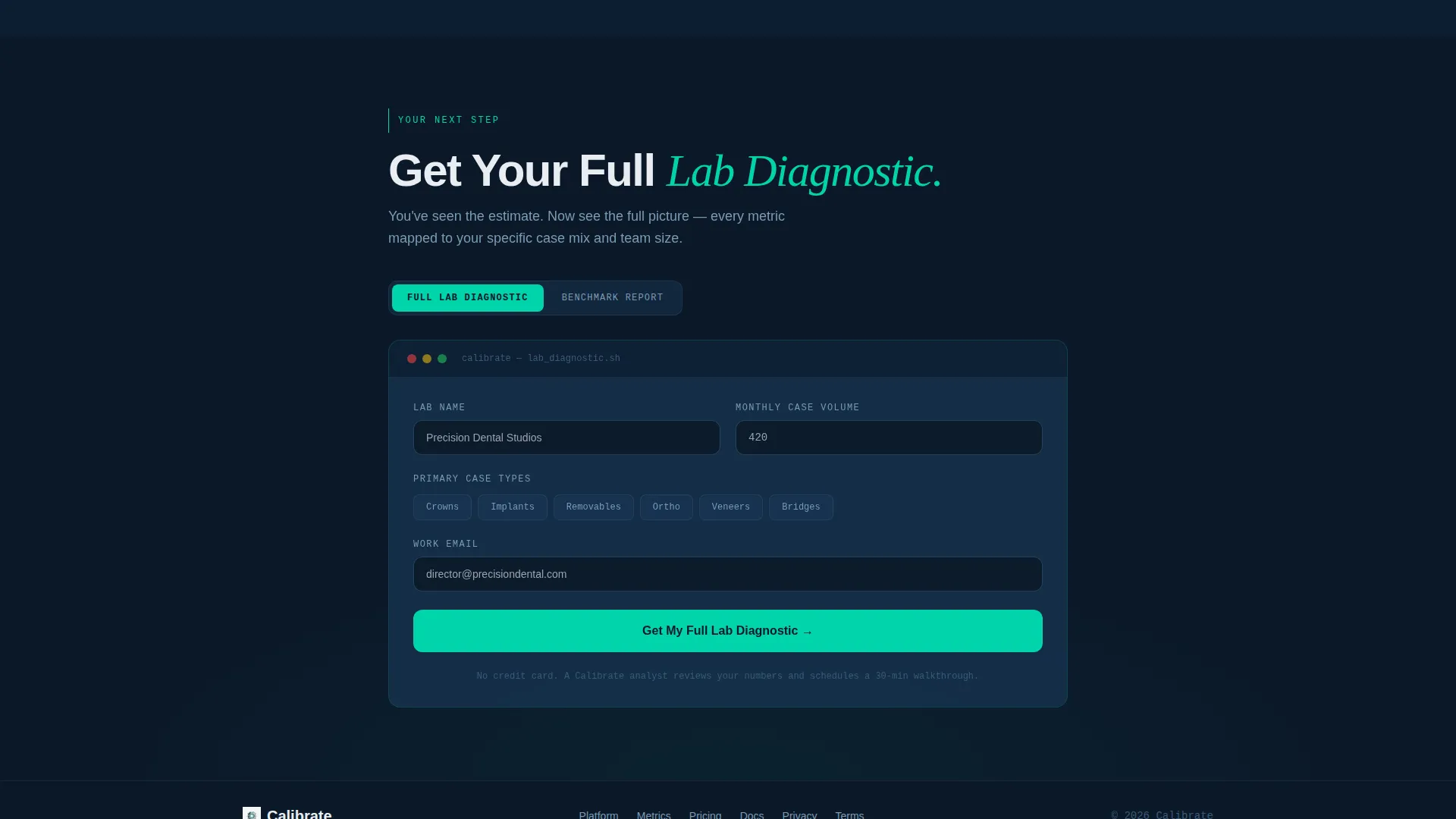
- Two lead capture paths: a primary diagnostic request form and a secondary benchmark report download gated by email
Feature list
This section covers the core functional and design capabilities built into the Calibrate template as described in the source brief.
Interactive Header Calculator
Visitors enter their lab's monthly case volume, average remake percentage, and number of technicians. The tool immediately calculates estimated annual revenue lost to remakes, idle technician hours, and a Lab Efficiency Score. The score renders as an animated radial gauge that fills in real time before the visitor scrolls a single pixel.
Animated Modular Card Grid
Below the calculator, metric cards appear in staggered animation with subtle parallax drift. Each card isolates a specific operational metric: case lifecycle timeline, material waste heatmap, technician utilization comparison, and rejection reason Pareto chart. Data visualizations draw themselves as each card enters the viewport, mimicking a system booting up module by module.
Dual Conversion Path Design
The primary call to action, "Get Your Full Lab Diagnostic," appears twice: once as a sticky bottom bar that activates after the calculator interaction, and once as a terminal card at the grid's end. A secondary path offers a downloadable benchmark report gated behind email-only capture, giving visitors a lower-commitment option.
Pre-filled Lead Capture Form
The primary lead form captures lab name, monthly case volume, primary case types via checkbox (crowns, implants, removables, and orthodontics), and work email. Monthly case volume is pre-filled from the header calculator, reducing friction and reinforcing the personalized experience the visitor has already had.
Dynamic Motion Visual System
Every animation in the template serves a functional purpose. The staggered card entrance, gauge fill animation, and parallax drift are choreographed to feel like a diagnostic system initializing, not decorative motion. This gives visitors a visceral sense that the product is actively reading and responding to their inputs.
Page sections overview
| Section | Purpose |
|---|---|
| Interactive Calculator Header | Captures lab inputs and outputs personalized waste and efficiency metrics instantly |
| Lab Efficiency Score | Renders animated radial gauge with real-time score based on visitor inputs |
| Case Lifecycle Card | Visualizes the full timeline of a case from intake to delivery |
| Material Waste Heatmap | Shows cost-per-unit waste patterns across material categories |
| Technician Utilization Card | Compares productivity across technicians or shifts |
| Rejection Pareto Chart | Ranks rejection reasons by frequency to surface the biggest cost drivers |
| Sticky call to action Bar | Appears after calculator interaction with primary diagnostic request prompt |
| Lead Capture Form | Collects lab details with case volume pre-filled from header tool |
| Benchmark Report Gate | Secondary email-only capture for visitors not ready to request a demo |
| Terminal call to action Card | Closes the card grid with a final diagnostic request call to action |
Design & branding system
The Calibrate template uses a Midnight Blue color system designed to feel like a cockpit instrument panel. Every color choice serves a functional role, and nothing in the palette is decorative.
- Deep terminal navy (#0B1929) as the primary background, desaturated steel blue (#1B3A5C) for card surfaces, and clinical white (#E8EDF2) for all typography
- Pulsing teal (#00D4AA) is reserved exclusively for live data points, hover states, and call-to-action elements, making interactive elements immediately recognizable
- The Dynamic Motion theme governs all animation: staggered card entrances, viewport-triggered data drawing, and a parallax drift system that communicates system activity rather than visual style
Mobile & speed optimization
The modular card grid structure is inherently well-suited to responsive stacking on smaller screens. Each card operates as a self-contained unit, so the layout adapts without losing the analytical narrative.
- Cards reflow into a single-column stack on mobile, preserving the top-to-bottom diagnostic storytelling sequence
- The interactive calculator and animated gauge are designed to function within the header viewport on any screen size
- Staggered animations are triggered on scroll entry, keeping the page load lean by deferring visual rendering until each section is needed
How this template helps you convert
Calibrate is built around a single insight: the best way to sell a data tool is to show the buyer their own data first. Every structural decision on the page reinforces that logic.
- The interactive calculator creates a personal financial stake before the visitor reads a single feature claim, making the downstream form feel like the logical resolution to a problem they just quantified themselves.
- The sticky call-to-action bar appears only after the calculator has been used, so it arrives at exactly the moment the visitor's interest peaks, not before.
- The secondary benchmark report download gives hesitant visitors a low-friction entry point, capturing an email from buyers who are not yet ready to request a full diagnostic but are clearly in the research phase.
Other information about this template
Calibrate sits at the intersection of dental lab vertical software-as-a-service and data analytics design. It is built specifically for a niche where generic technology templates consistently underperform because they do not speak the operational language of the buyer.
- The template style is Card Grid (Modular), making individual sections easy to reorder, remove, or extend without breaking the overall layout
- The header concept is classified as Interactive Preview, meaning the product demonstration begins at page load rather than after a click or scroll
- The creative direction is Calculator or Tool First, a pattern that prioritizes personal relevance over feature enumeration
- The lead generation focus means every section is sequenced to reduce hesitation, not just to inform
- This template is categorized under Technology, specifically the Dental Lab Analytics Dashboard niche within Dental Lab Vertical SaaS

Theme
Dynamic Motion
Creative direction
Calculator/Tool First
Color system
Midnight Blue
Style
Card Grid (Modular)
Direction
Lead Generation
Page Sections
Interactive Header Calculator
Staggered Animated Card Grid
Dual Conversion Path Layout
Pre-filled Lead Capture Form
Dynamic Motion Theme
Related questions
Can I customize the calculator inputs and output metrics?
Does the template include the chart and gauge components?
Is the sticky call-to-action bar included as a built-in component?
Who is this landing page template designed for?
Can the secondary benchmark report gate work as a standalone lead capture?



