Optometry Software Privacy Policy & Terms Website Template
Calibrate is a split-screen landing page template built for optometry compliance platforms. It pairs a dark, engineered visual identity with a structured Feature Matrix layout to communicate complex quality management capabilities clearly. Practice managers, clinical directors, and multi-site operations leaders can instantly see what the platform does and why it matters, then act on a single, frictionless call to action.
by Rocket studio
Quick summary
Calibrate is a precision-crafted landing page template for optometry quality management platforms. It uses a 50/50 split-screen structure, a Carbon Fiber color system, and a Feature Matrix creative direction to present compliance dashboards with immediate visual authority. The design converts first-time visitors into booked demos before they reach the bottom of the page.
Who this template is for
This template is built for compliance-focused optometry businesses that need to communicate the value of a quality management platform to a professional, time-poor audience. It speaks directly to people who live inside audit cycles, accreditation reviews, and multi-site oversight responsibilities.
- Practice managers preparing Care Quality Commission (CQC) evidence folders and audit trails
- Clinical directors managing General Optical Council (GOC) peer reviews and staff competency records
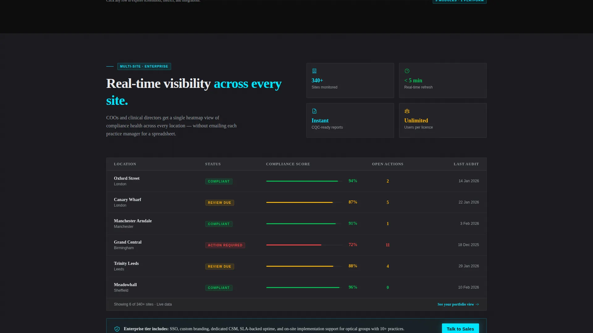
- Multi-site optical group chief operating officers who need real-time compliance visibility across locations
What problem this template solves
Quality management in optometry is typically fragmented. Audit trails sit in paper folders, incident logs live in spreadsheets, and accreditation checklists circulate by email. When inspections arrive, pulling everything together is slow, stressful, and error-prone. This template communicates, at a glance, that the platform replaces that chaos with a single, organized dashboard.
- Scattered evidence formats make it hard to prove compliance readiness quickly
- Multi-site operations lack a unified view of open corrective actions and upcoming audit dates
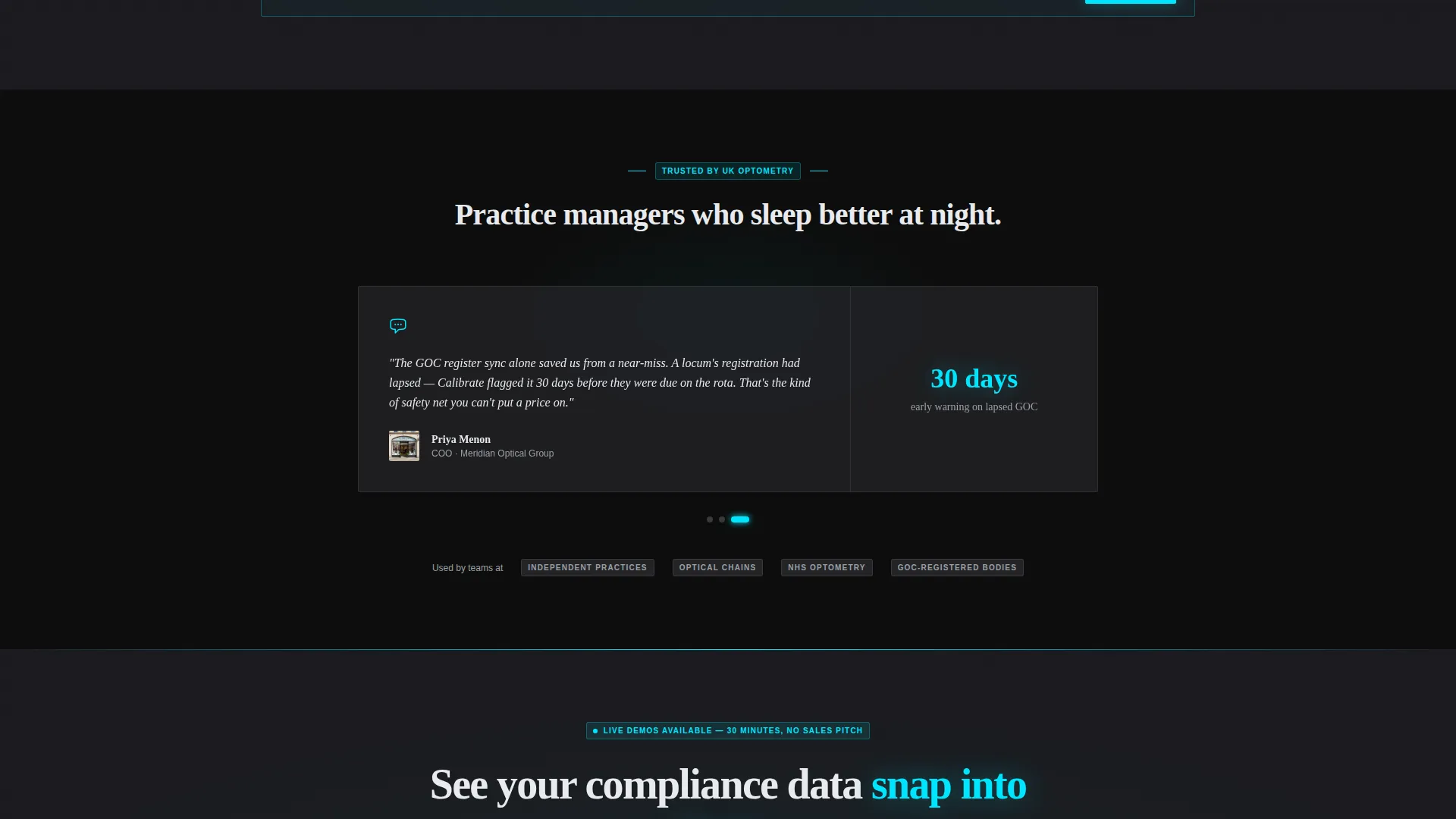
- Visitors need to trust a platform before booking a demo, and generic landing pages rarely build that trust fast enough
What you get with this template
You get a complete, conversion-focused landing page built around the specific language and priorities of optometry compliance buyers. Every section is designed to show real platform value before asking for a commitment.
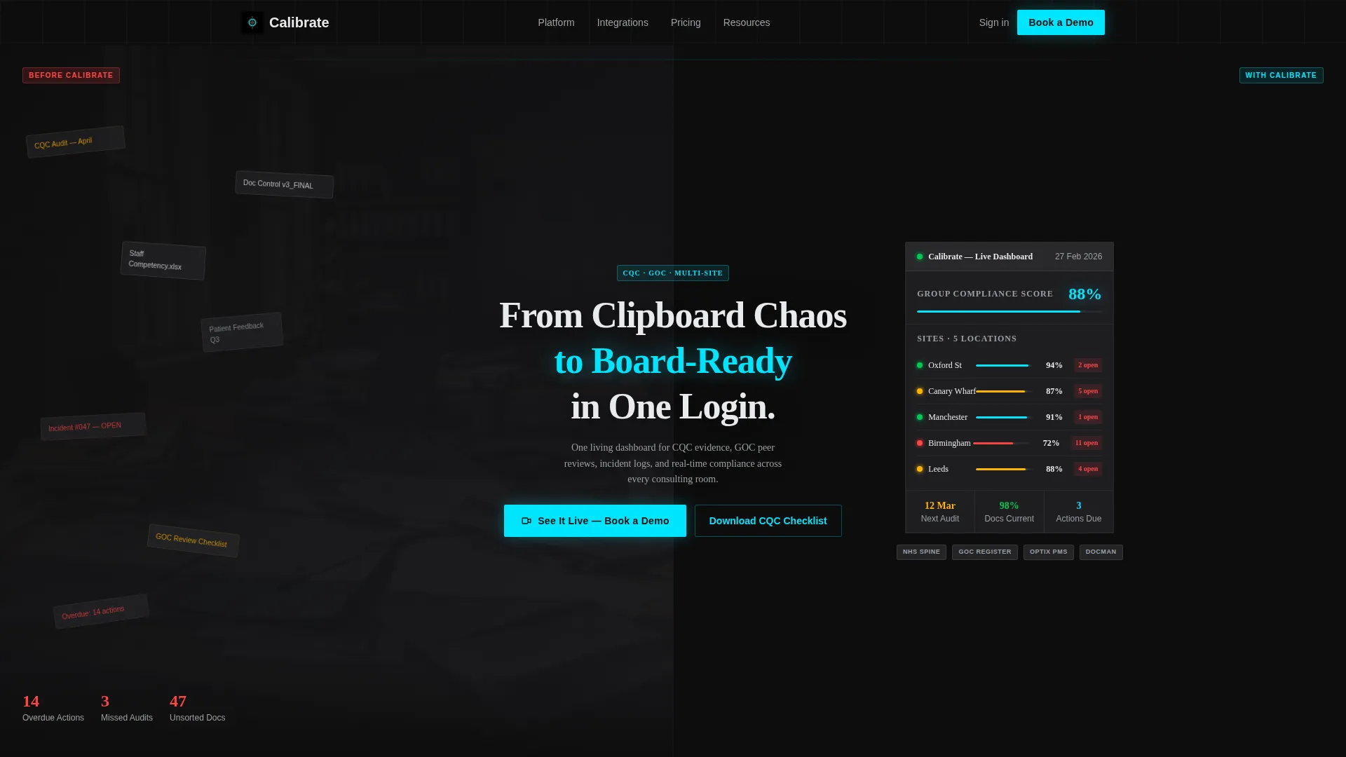
- A 50/50 split-screen header that visually contrasts the problem (clipboard chaos) with the solution (a live compliance dashboard)
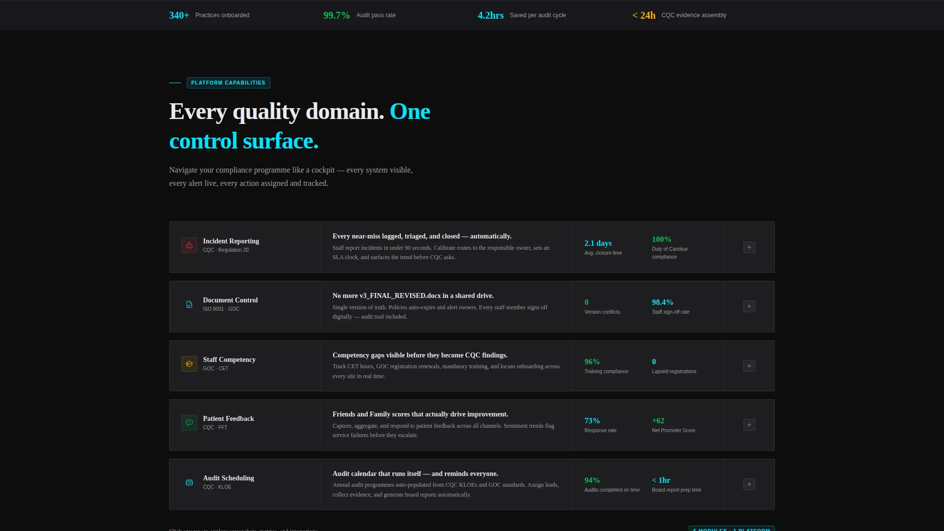
- A scrollable Feature Matrix that escalates from individual-practice capabilities to multi-site enterprise features
- Two precisely placed calls to action and one secondary lead-capture link, with no on-page form to create friction
Feature list
This template is structured around deliberate design and layout decisions that work together to move visitors toward action.
Split-Screen Header Panel
The header divides the viewport into two smoke-tinted glass rectangles set over a pure black background. The left panel shows a chaotic collage of paper audit forms, sticky notes, and email threads. The right panel displays a crystalline compliance dashboard with site scores, audit dates, open corrective actions, and a green-amber-red heatmap. A headline fades in between them: "From Clipboard Chaos to Board-Ready in One Login."
Scrollable Feature Matrix Grid
The Feature Matrix organizes platform capabilities into a structured grid that visitors navigate like a control surface. Each row pairs a quality domain on the left with interactive dark glass feature cards on the right. Cards expand on click to reveal screenshots, metric previews, and integration badges. The scroll path escalates from single-practice features to multi-site enterprise capabilities, building the business case as the visitor moves down the page.
Live Micro-Animation System
Cyan progress rings fill on scroll. Compliance percentages tick upward as each feature card comes into view. These micro-animations keep the grid feeling alive and reinforce the dashboard's real-time data character without requiring the visitor to imagine the product working.
Anchored and Floating Call-to-Action
The primary call to action, "See It Live, Book a Demo," appears anchored in electric cyan at the base of the header split. It reappears as a persistent floating button after the second feature row. Clicking it carries the visitor to a scheduling screen pre-filtered for optometry. No form appears on the page.
Secondary Lead-Capture Link
A text link, "Download the CQC Readiness Checklist," sits beneath the primary call to action. It targets visitors who are not yet ready to book a demo and captures their contact details for follow-up. It addresses the Care Quality Commission preparation stage directly, matching the language practice managers use.
Page sections overview
| Section | Purpose |
|---|---|
| Split-Screen Header | Contrast problem versus. solution visually |
| Headline Fade-In | Anchor the core value proposition |
| Primary call to action Block | Drive demo bookings from header |
| Feature Matrix Grid | Present quality management capabilities |
| Expanding Feature Cards | Show screenshots and metric previews |
| Floating call to action Button | Persistent demo prompt while scrolling |
| Secondary Lead Link | Capture pre-demo email contacts |
Design & branding system
The visual identity follows a Startup Velocity theme built on a Carbon Fiber color system. The palette feels like the interior of a performance vehicle at night: dark, taut, and engineered, with glowing telemetry cutting through the black.
- Core colors: deep cockpit black (#0D0D0D), woven carbon gray (#2A2A2E), instrument-panel white (#E8EAED), and electric cyan (#00E5FF) for interactive states and data highlights
- Cyan activates on hover states, toggle switches, progress bars, and active data points, replicating heads-up display readings
- Backgrounds sit in the deepest blacks and grays; body text renders in instrument white for maximum contrast and readability
Mobile & speed optimization
The template is designed with a lean layout structure that supports fast load times and clean rendering across screen sizes. The split-screen format and card-based grid adapt naturally to narrower viewports.
- Dark glass panels and card components are built for smooth scroll performance without heavy asset dependency
- Micro-animations are scoped to interaction triggers, keeping them efficient on mobile connections
- The floating call-to-action button remains accessible at all scroll positions on both desktop and mobile layouts
How this template helps you convert
The entire page is structured to build trust progressively, showing the product working before asking for a commitment. Conversion is earned through visible evidence, not persuasive text alone.
- The split-screen header shows real dashboard data immediately, so visitors understand the product in the first three seconds without reading a word of copy
- The escalating Feature Matrix builds the business case from solo practice to enterprise scale, meeting visitors wherever they are in their buying journey
- The persistent floating call-to-action and secondary checklist link ensure every visitor has a next step, whether they are ready to book or still evaluating
Other information about this template
This template is built specifically for the optometry quality management niche and is well-suited to platform demos targeting regulated practice environments. It can also support broader health sector software platforms that operate under similar inspection and accreditation frameworks.
- The template style is Single-Page Split Screen (50/50), making it suitable as a focused campaign landing page or a product launch page
- The header concept uses Dark Glass Panels, a design choice that communicates precision and technical authority without feeling clinical or sterile
- The Feature Matrix creative direction is purpose-built for software platforms that need to communicate multiple capability tiers to different buyer personas in a single scroll
Theme
Startup Velocity
Creative direction
Feature Matrix
Color system
Carbon Fiber
Style
Split Screen (50/50)
Direction
Click-Through
Page Sections
Split-screen Header with Dark Glass Panels
Scrollable Feature Matrix Layout
Cyan Micro-animation System
Anchored Primary Call to Action
Secondary Lead-capture Text Link
Related questions
Who is this landing page template designed for?
Does the template include a contact form?
Can I adapt the Feature Matrix for a different number of capabilities?
What does the split-screen header actually show?
Is this template suitable for multi-site optical group platforms?



