Precision Medicalequipment | Free Website Template | Rocket
Calibrate is a dashboard-style landing page template built for medical equipment insurance and risk management firms. It leads with a live-style portfolio overview, data-driven metric tiles, and a cost-of-downtime calculator. Designed for B2B outreach, it targets biomedical engineering directors, hospital CFOs, and imaging center owners making high-stakes coverage decisions.
by Rocket studio
Quick summary
Calibrate is a single-page, data-grid landing page template for firms that insure critical medical equipment. It opens with a simulated portfolio dashboard, stacks proof through metric tiles and comparison grids, and closes with a persistent audit request form. The visual system is built on surgical steel tones with a status-green accent for key data points.
Who this template is for
This template is built for firms that protect high-value clinical assets. It speaks directly to decision-makers who evaluate coverage in financial and operational terms.
- Biomedical engineering directors managing six-figure service contracts across multiple facilities
- Hospital CFOs tracking capital depreciation and coverage gaps on imaging and surgical equipment
- Imaging center owners where a single downed scanner means measurable daily revenue loss
What problem this template solves
Medical equipment insurers struggle to communicate value to buyers who speak in asset registers and downtime costs, not insurance language. A generic brochure page cannot carry that conversation.
- Prospects need numbers first, not paragraphs of policy language
- Decision-makers need a side-by-side view of their current contracts versus a bundled policy
- Leads who are not ready to call still need a reason to stay engaged and build an internal business case
What you get with this template
You get a fully structured, section-led landing page that moves a B2B buyer from curiosity to a qualified audit request in a single scroll session.
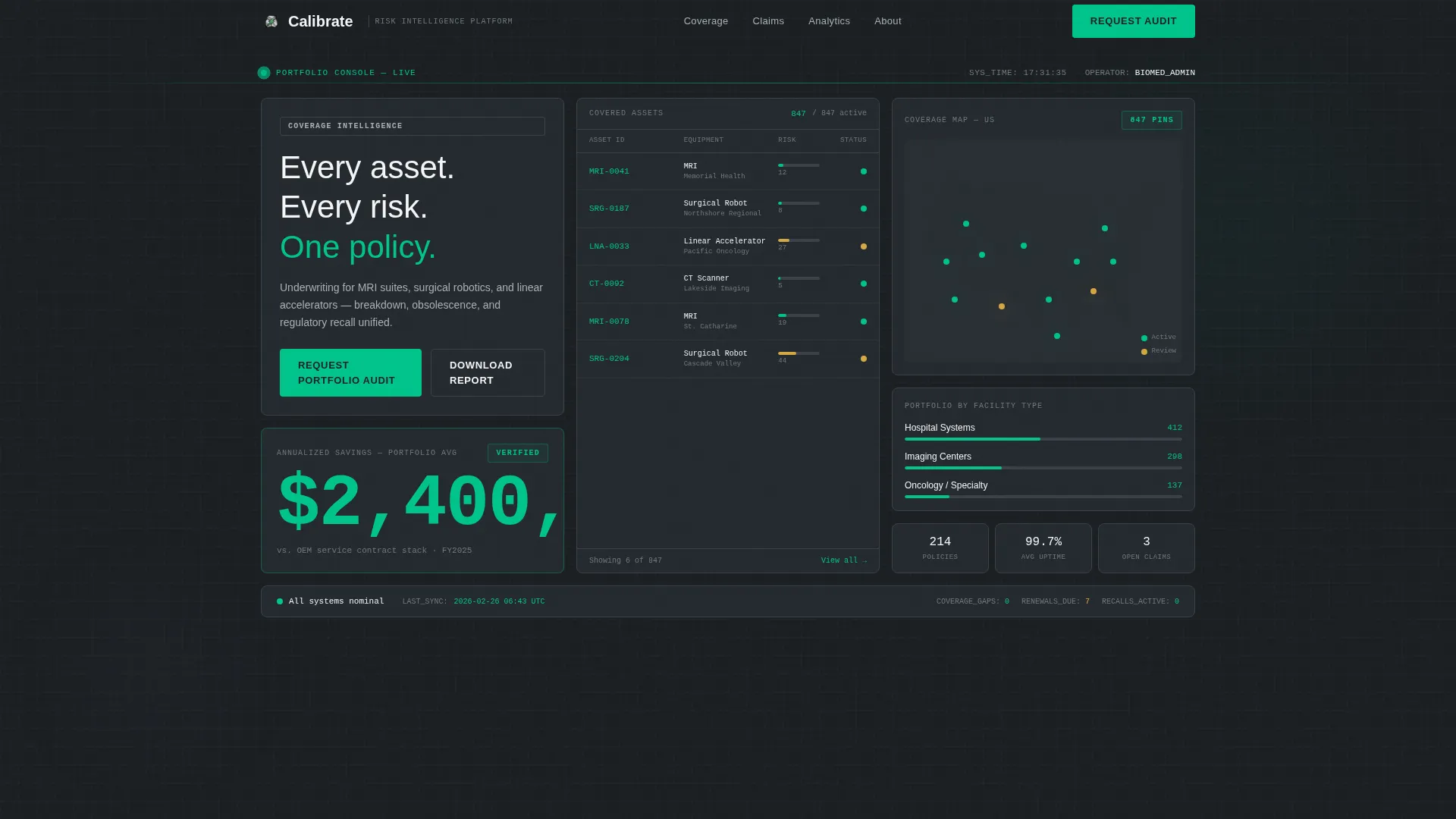
- A viewport-filling dashboard header showing 847 covered assets, risk score gauges, a coverage map, and a $2.4M annualized savings figure
- Three data-first sections: a claim turnaround comparison tile, an interactive downtime cost calculator, and a coverage comparison grid
- Two conversion paths: a portfolio audit request form and a gated downtime cost report download
Feature list
This template includes purpose-built components that carry the weight of a complex B2B sale without relying on dense copy.
Live-Style Dashboard Header
The header fills the full viewport with a simulated portfolio overview. It displays 847 covered assets across three facility types, horizontal bar gauges for real-time risk scores, a muted U.S. geography coverage map with pin clusters, and a $2.4M annualized savings figure rendered in status-green. Monospaced typography reinforces the platform feel from the first second.
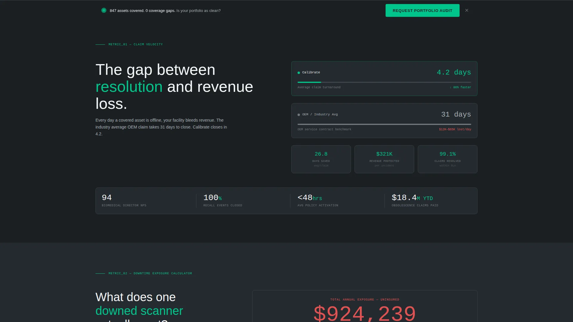
Claim Turnaround Metric Tile
The first scroll section places average claim turnaround at 4.2 days directly beside the industry benchmark of 31 days. The side-by-side layout lets the number speak before any supporting copy appears, establishing credibility through contrast rather than claims.
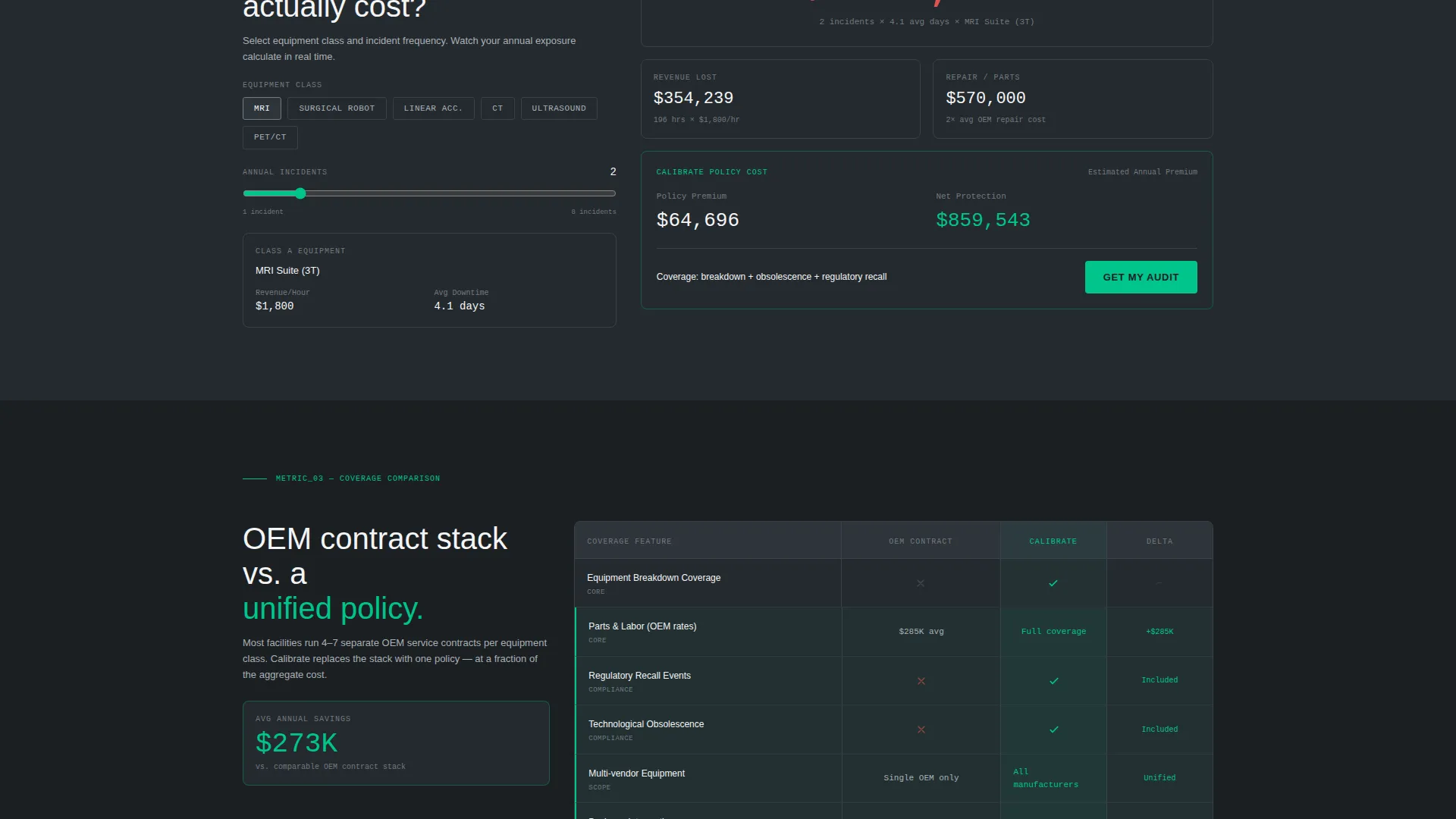
Downtime Cost Calculator
Visitors toggle an equipment class selector and watch a revenue loss figure animate upward per hour. The calculator makes the cost of inaction tangible and personal. It converts an abstract risk into a specific dollar figure the prospect can carry into an internal budget meeting.
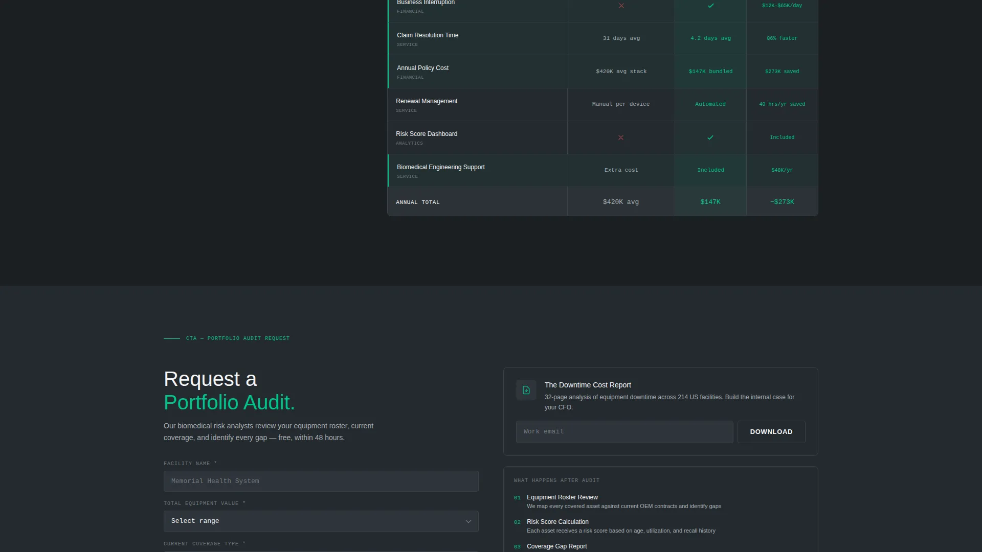
Coverage Comparison Grid
A line-item grid compares the prospect's current original equipment manufacturer service contract against the bundled policy. Savings lines are highlighted in status-green so the financial case is visible at a glance without reading every row.
Portfolio Audit Request Form
The primary call to action captures facility name, total equipment value range via dropdown, current coverage type, and a work email address. It appears inside the header dashboard and repeats as a persistent bottom bar throughout the scroll session, keeping the conversion path accessible at every point.
Gated Downtime Cost Report
A secondary lead path offers a downloadable report gated behind email only. It warms leads who are not ready for a direct conversation but need supporting data to build an internal case for switching coverage.
Page sections overview
| Section | Purpose |
|---|---|
| Dashboard Header | Establish platform credibility with a live-style asset portfolio overview |
| Claim Speed Tile | Contrast 4.2-day turnaround against the 31-day industry benchmark |
| Downtime Calculator | Let visitors quantify revenue loss per hour by equipment class |
| Coverage Comparison Grid | Show line-item savings versus current OEM service contract |
| Audit Request Form | Capture qualified leads with facility and coverage details |
| Report Download Gate | Warm early-stage leads with a gated downtime cost report |
| Persistent call to action Bar | Keep the audit request visible throughout the full scroll session |
Design & branding system
The visual identity follows a Service Utility theme. Every design decision reads as engineered precision rather than marketing polish.
- Color system: surgical steel (#71797E), deep instrument charcoal (#1B1F23), sterile field white (#F4F5F7), and a single status-green accent (#00C48C) reserved for active indicators, call to action buttons, and data highlights
- Typography: monospaced fonts for all data values and clean sans-serif for labels, evoking a trusted clinical platform rather than a promotional page
- No decorative elements, gradients, or warm tones; every pixel reflects the brushed-metal aesthetic of a medical device control panel
Mobile & speed optimization
The template is structured so the data-grid layout translates clearly to smaller screens without losing the dashboard feel.
- Metric tiles and data cards reflow into single-column stacks on mobile viewports
- The persistent bottom call to action bar remains anchored on scroll across all screen sizes
- The coverage comparison grid collapses into a scannable vertical format for touch-based review
How this template helps you convert
The narrative structure is designed to accumulate proof. Each scroll increment delivers a new data point before asking for any commitment.
- The dashboard header establishes authority immediately with asset counts, risk scores, and savings figures before the visitor reads a single line of body copy.
- The calculator and comparison grid make the financial case specific and personal, giving the prospect numbers to justify an internal decision before reaching the form.
- Two conversion paths, the audit request form and the gated report download, ensure that both ready buyers and early-stage researchers have a natural next step without friction.
Other information about this template
Calibrate is designed specifically for the medical equipment insurance and risk management space. It suits firms covering high-value assets such as MRI suites, surgical robotics, and linear accelerators under a single bundled policy that addresses breakdown, obsolescence, and regulatory recall.
- The template style is a Dashboard and Data Grid layout, matching the Service Utility theme from the matched intersection context
- The creative direction is Stats-First Impact: data cards and metric tiles always appear before supporting paragraphs on every scroll increment
- The Partnership and B2B outreach direction means all form fields and calls to action are scoped for institutional buyers, not individual consumers
- This template works well for firms positioning against fragmented OEM service contracts and self-insured models where coverage gaps carry measurable financial risk
Theme
Service Utility
Creative direction
Stats-First Impact
Color system
Monochrome Steel
Style
Dashboard/Data Grid
Direction
Partnership/B2B
Page Sections
Live-style Dashboard Header
Claim Turnaround Metric Tile
Downtime Cost Calculator
Coverage Comparison Grid
Portfolio Audit Request Form
Gated Downtime Cost Report
Related questions
Who is the ideal user of this template?
Can I update the asset numbers and savings figures in the dashboard header?
What does the downtime cost calculator include?
Does the template support two separate lead capture paths?
Is the persistent bottom call to action bar part of the template?


