Nonprofit Measurement Consultancy Landing Page
Calibrate is a precision-built landing page template for nonprofit measurement consultancies. It leads with an interactive calculator that shows visitors their own reporting inefficiencies in real time. A modular card grid then presents core capabilities, each expandable with case-study evidence. The result is a focused, evidence-first page that earns commitment before asking for a single click.
by Rocket studio
Quick summary
Calibrate is a single-page template designed for nonprofit quality management consultancies. The hero section is a live measurement-gap calculator, not a photo. Below it, a modular card grid presents distinct service capabilities, each expandable in place with case-study panels. Every design choice reinforces one message: rigorous thinking, no clutter, clear signal.
Who this template is for
This template speaks directly to consultancies that help nonprofits replace vague program narratives with structured, funder-ready evidence. It works for teams that need a page as precise as the work they sell.
- Nonprofit measurement and evaluation consultancies presenting their services to executive directors and program managers
- Outcome framework designers and funder-reporting specialists who need to demonstrate credibility before the first meeting
- Foundation-facing consultants whose clients demand proof, not promises
What problem this template solves
Most consultancy landing pages describe services in abstract terms. Visitors read a list of offerings and still cannot picture the value. Calibrate flips that pattern by making the visitor's own numbers the opening argument.
- Executive directors and program managers arrive skeptical; the interactive calculator surfaces their actual reporting burden before a single sentence of sales copy appears
- Consultancies struggle to show rigor on a page that itself lacks rigor; the structured card grid and expandable case-study panels close that credibility gap
- Funder-facing messaging often gets buried in long prose; sector-filter chips and consistent card structure keep every capability scannable and comparable
What you get with this template
Calibrate delivers a complete, single-page layout built around three connected ideas: show the problem, prove the solution, and make the next step obvious. Every component is purposeful and prompt-backed.
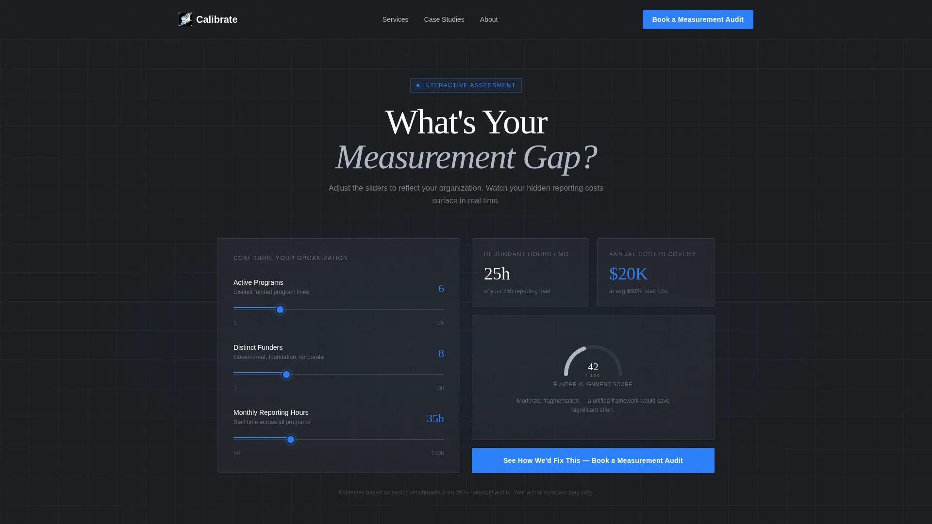
- An interactive "What's Your Measurement Gap?" calculator with three sliders, animated output fields, a radial gauge for funder-alignment score, and real-time cost-recovery estimates
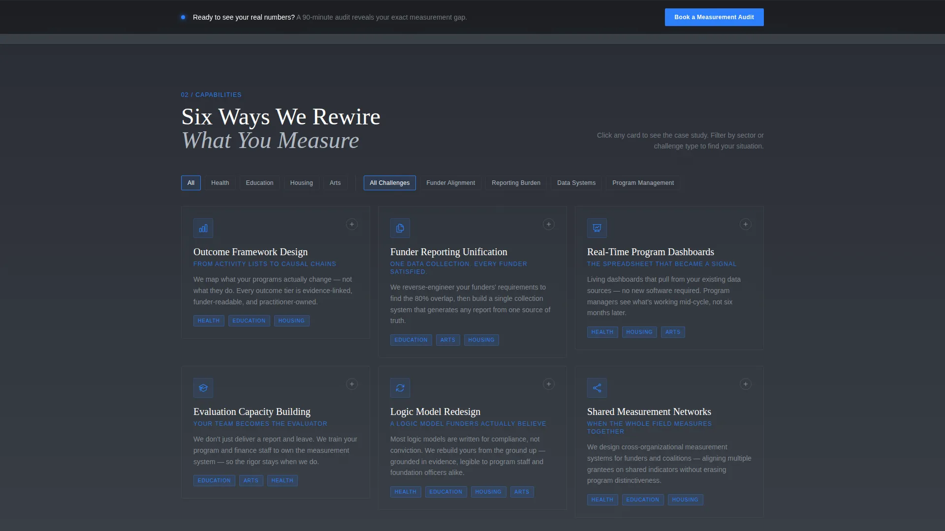
- A filterable modular card grid covering distinct service capabilities, each card expandable in place with a mini case study, before-and-after metric snapshot, and sector tag
- A persistent bottom conversion bar carrying a single primary call to action, keeping the commitment ask visible without interrupting the evidence-building scroll
Feature list
This template includes the following built-in components, each grounded in the source brief.
Interactive Measurement Gap Calculator
The hero section is a compact, typeset calculator titled "What's Your Measurement Gap?" Three sliders let visitors input active programs, distinct funders, and monthly reporting hours. As they adjust each slider, the output card animates to show estimated redundant reporting hours, potential cost recovery, and a funder-alignment score displayed on a radial gauge.
Expandable Capability Card Grid
The core content area is a modular card grid. Each card represents one service capability such as Outcome Framework Design, Funder Reporting Unification, Real-Time Program Dashboards, or Evaluation Capacity Building. Clicking a card expands it in place with a smooth motion panel rather than navigating away.
In-Place Case Study Panels
Every expanded card reveals a mini case study, a before-and-after metric snapshot, and a sector tag covering health, education, housing, and arts. This keeps the visitor inside the page while delivering the depth of a portfolio without a separate click.
Sector and Challenge Filter Chips
Toggle chips sit pinned above the card grid. Visitors can filter cards by sector or challenge type, causing the grid to reorder and reflow fluidly. This interaction mirrors the consultancy's core promise: turning complexity into a clear, navigable signal.
Persistent Conversion Bottom Bar
A fixed bottom bar carries the primary call to action: "Book a Measurement Audit." It remains visible throughout the scroll without interrupting the reading experience. Every expanded card also ends with a consistent secondary call to action: "See the Full Case Study."
Signal-Blue Interactive States
All interactive elements use a single electric accent color reserved exclusively for slider tracks, hover states, call-to-action buttons, and the radial gauge needle. This disciplined use of color makes interactive affordances immediately obvious without decorating the layout.
Page sections overview
| Section | Purpose |
|---|---|
| Measurement Gap Calculator | Hero interaction that surfaces the visitor's own reporting inefficiency in real time |
| Capability Card Grid | Modular service overview with expandable in-place case study panels |
| Sector Filter Chips | Toggle controls that reorder the grid by sector or challenge type |
| Case Study Panels | In-card evidence layer showing before-and-after metrics and sector tags |
| Persistent Bottom Bar | Fixed conversion bar carrying the primary "Book a Measurement Audit" call to action |
Design & branding system
Calibrate uses a Monochrome Steel palette that feels like the milled face of a precision instrument. There is no warmth, no decoration, and no photography. Every visual choice signals engineered confidence.
- Four-color system: forge-dark charcoal (#1C1E22) and brushed gunmetal (#3A3F47) alternate as section backgrounds; polished chromium (#B0B8C1) carries all body text; signal blue (#2D7FF9) appears only on interactive states and call-to-action elements
- Card borders catch a 1-pixel steel highlight on hover, giving the grid a subtle kinetic shimmer as the cursor moves across it
- Typography is precisely set with no decorative elements; the Dynamic Motion theme means transitions and animations are smooth and intentional, not ornamental
Mobile & speed optimization
The template is built with a responsive layout that adapts the card grid and calculator for smaller screens. Interaction states remain clear and usable across device sizes.
- The calculator sliders and radial gauge reflow cleanly on mobile viewports, keeping the hero tool functional without horizontal scrolling
- Card grid columns reduce gracefully to a single-column stack on narrow screens, preserving the expand-in-place behavior
- The persistent bottom bar remains anchored on mobile, keeping the primary call to action reachable at any point in the scroll
How this template helps you convert
Calibrate is structured as an evidence case that builds in stages. The page earns the visitor's trust before making any ask, which makes the final conversion click feel like a natural conclusion rather than a cold pitch.
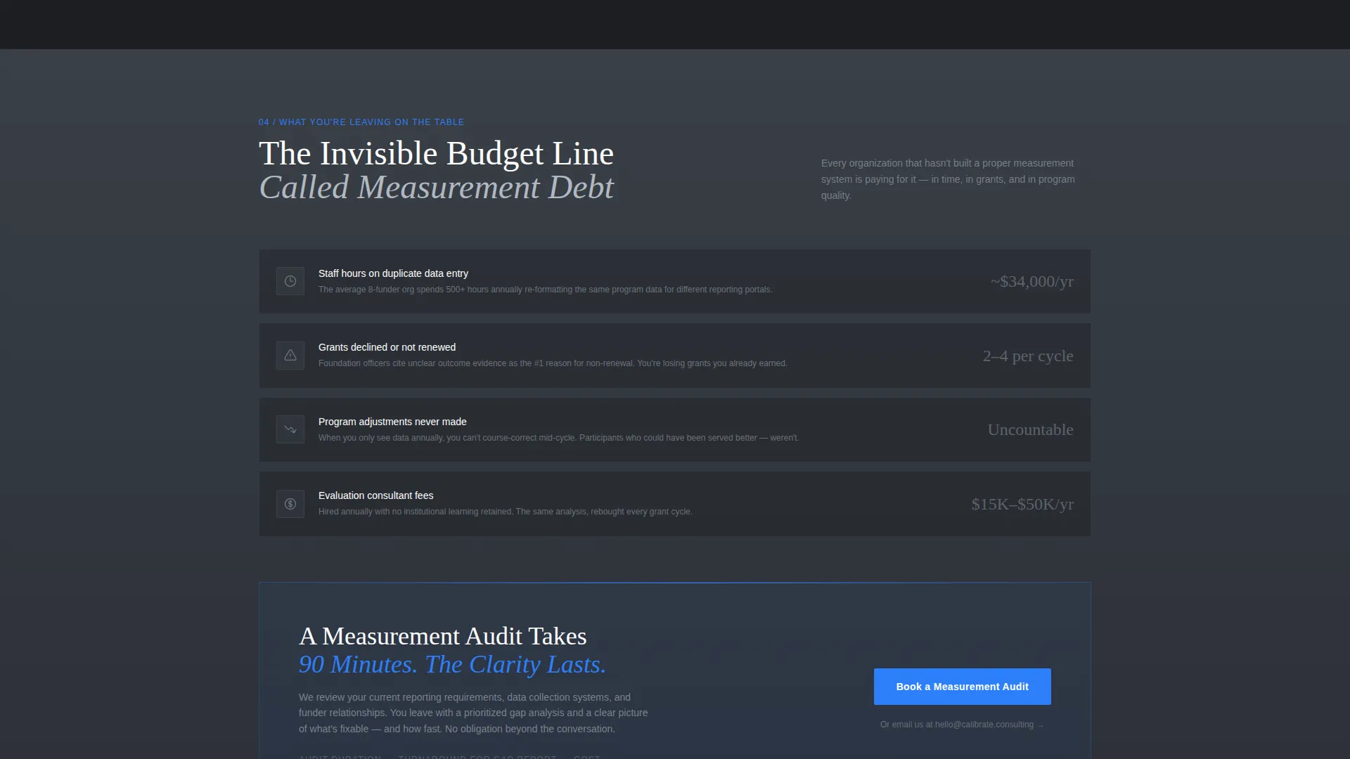
- The calculator opens by reflecting the visitor's own numbers back at them, making the cost of inaction concrete and personal before any service description appears
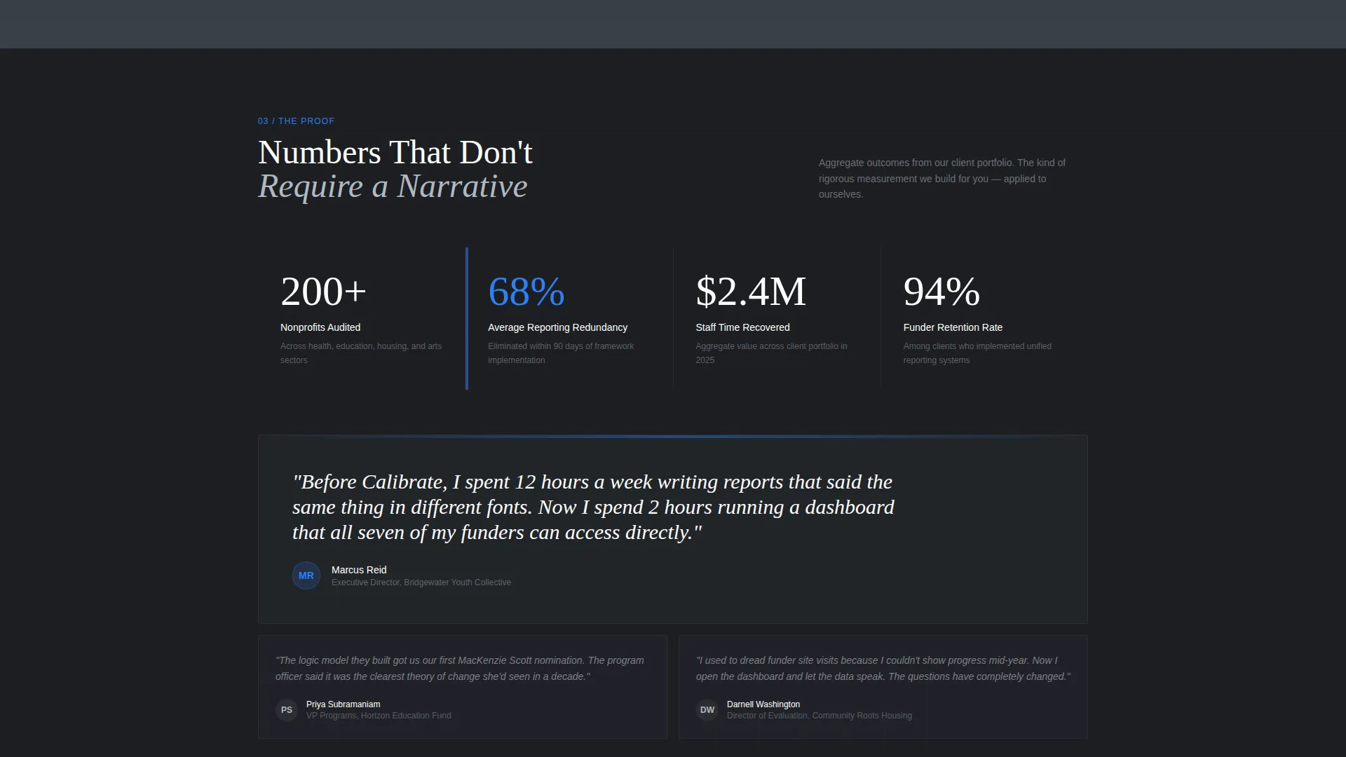
- The expandable card grid then delivers proof in the form of sector-specific case studies and metric snapshots, moving the visitor from awareness to conviction without leaving the page
- The persistent bottom bar and consistent in-card calls to action keep the commitment step visible at every scroll depth, so the decision to click "Book a Measurement Audit" requires no searching
Other information about this template
Calibrate sits at the intersection of nonprofit software tools and quality management consulting. It is purpose-built for a niche where credibility is the product and the page itself must demonstrate the same rigor the consultancy sells.
- The template falls under the Technology category with a Nonprofit Software subcategory, making it a strong fit for teams serving foundation officers, program evaluators, and impact measurement leads
- The Interactive Explorer creative direction means the page rewards curiosity; visitors who engage with the calculator and filter chips spend more time with the content organically
- The Click-Through landing page direction means there is no form on the page; the conversion path is a single confident button click after the calculator and case studies have done the convincing
- The Card Grid (Modular) template style makes future capability additions straightforward; new service cards can slot into the grid without restructuring the page layout
- The Dynamic Motion theme keeps transitions purposeful and tied to user interaction, reinforcing the consultancy's message that data should move and respond, not sit static in a report
Theme
Dynamic Motion
Creative direction
Interactive Explorer
Color system
Monochrome Steel
Style
Card Grid (Modular)
Direction
Click-Through
Page Sections
Interactive Measurement Gap Calculator
Expandable Modular Card Grid
In-place Case Study Panels
Sector and Challenge Filter Chips
Persistent Conversion Bottom Bar
Related questions
Does this template include a working calculator?
Can I update the service capabilities shown in the card grid?
Is there a contact form included on this page?
Can the sector filter chips be relabeled?
Who is this template designed for?



