Ministry Job Board Landing Page Template
The Calling landing page template is built for religious organization job boards connecting churches with ministry professionals. It features a Stats/Metrics header, a Feature Matrix comparison layout, dual conversion tracks for hiring churches and job-seeking candidates, and a persistent anchor navigation in sanctuary teal. Every section is designed around purposeful discovery and decisive action.
by Rocket studio
Quick summary
Calling is a hub-and-spoke landing page template designed for a faith-based job board. It connects churches seeking ministry staff with candidates such as associate pastors, worship directors, and church administrators. The page opens with animated metrics, guides visitors through a structured feature comparison, and closes each section with a contextual call to action.
Who this template is for
This template is built for organizations running a religious organization job board. It serves two distinct audiences at once and handles both with care.
- Church hiring teams posting roles such as senior pastor, worship director, or children's ministry coordinator
- Ministry candidates including seminary graduates, bivocational ministers, and experienced church administrators searching for their next placement
- Platform builders or digital agencies building a dedicated faith-and-vocation discovery experience
What problem this template solves
General job boards treat ministry roles like any other position. Denominational classifieds lack structure, comparison clarity, and conversion design. This template addresses that gap directly.
- Ministers searching for placement have no easy way to compare a purpose-built ministry board against a generic jobs platform
- Churches cannot clearly communicate features like credential verification, congregation culture matching, or confidential search on a plain listing page
- Visitors arrive without context and leave before converting because there is no guided scroll or moment-of-conviction call to action
What you get with this template
You get a complete single-page layout structured around a hub-and-spoke anchor navigation. Every element serves either discovery, comparison, or conversion.
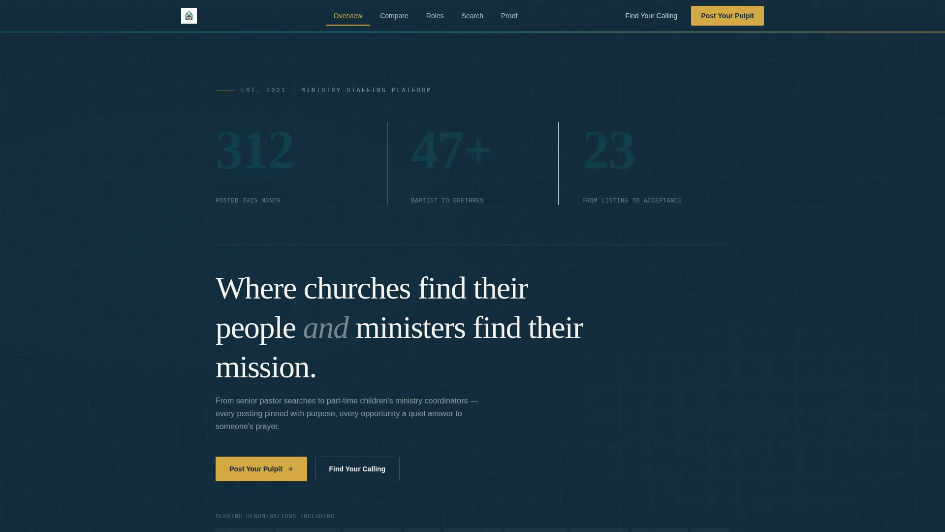
- A Stats/Metrics header with three animated numerals showing active positions, denominations represented, and average days-to-placement
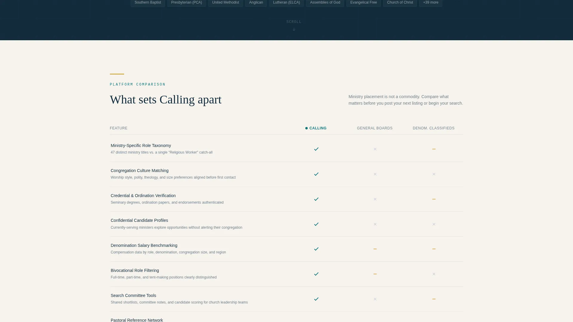
- A Feature Matrix comparison section with column-by-column rows comparing your platform against general job boards and denominational classifieds
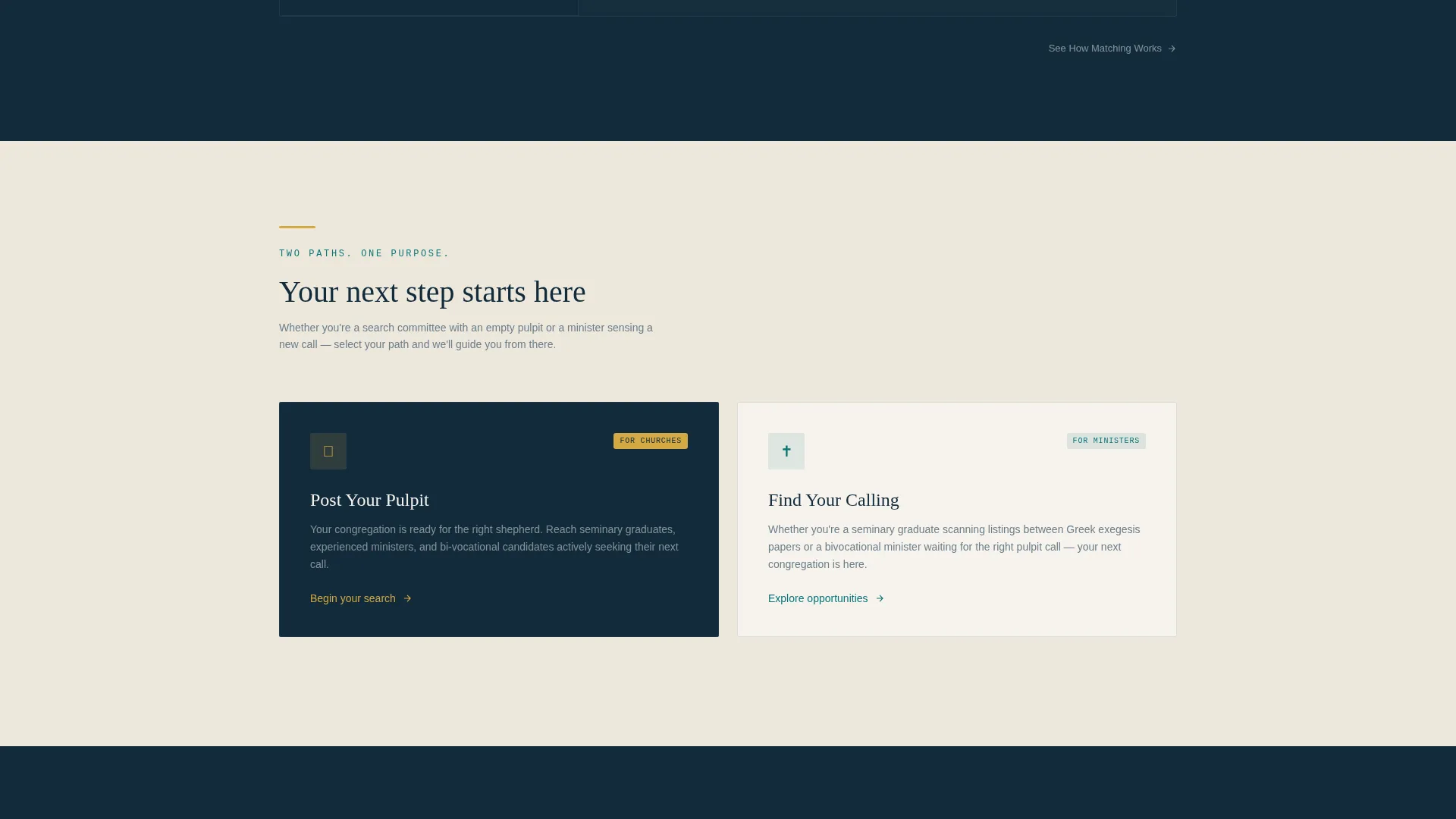
- Two separate conversion tracks: "Post Your Pulpit" for hiring churches and "Find Your Calling" for ministry candidates, each with a tailored intake flow
Feature list
This section describes the core functional and structural components included in the template.
Animated Stats Header
Three large numerals animate upward on page load against a vestment navy background. The figures represent active ministry positions posted this month, denominations represented, and average days-to-placement. A single supporting line reads: "Where churches find their people and ministers find their mission."
Hub-and-Spoke Anchor Navigation
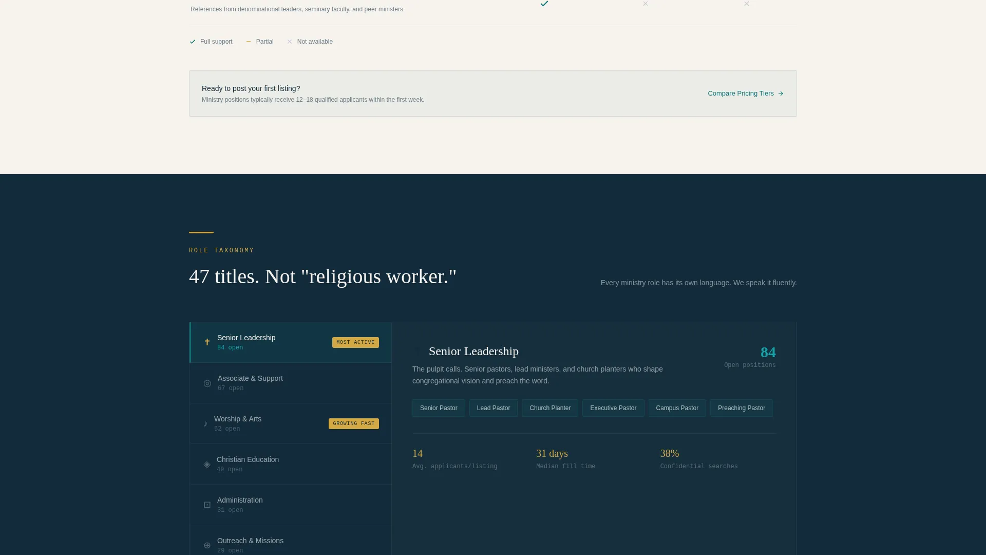
A persistent navigation bar in sanctuary teal follows the visitor as they scroll. Each nav item anchors to a specific spoke section, covering dimensions such as role taxonomy, culture matching, credential verification, confidential search, and salary benchmarking. Visitors can jump to any section without losing their place.
Feature Matrix Comparison Layout
The scroll moves through a structured comparison table architecture. Rows compare the platform against general job boards and denominational classifieds across five spoke dimensions. Rows highlight in calling-gold on hover, turning each comparison point into a decisive, high-conviction moment.
Dual Conversion Tracks
Two primary calls to action serve two different visitor intents. The church path collects denomination, congregation size, and role type before email. The candidate path asks for ministry area, years of service, and whether the search is confidential.
Contextual Micro-calls to action Per Section
Each spoke section ends with its own contextual call to action, such as "See How Matching Works" or "Compare Pricing Tiers." This design lets visitors convert at the moment of highest engagement rather than scrolling back to the top.
Role Taxonomy and Credential Spoke Sections
Dedicated sections cover role taxonomy depth, ordination and endorsement credential verification, congregation culture matching, and denomination-specific salary benchmarking. Each spoke is a self-contained content block anchored to the navigation.
Page sections overview
| Section | Purpose |
|---|---|
| Stats Metrics Header | Opens with animated numerals to establish platform credibility at first glance |
| Anchor Navigation Bar | Persistent teal nav anchors each spoke section for smooth guided scrolling |
| Role Taxonomy Spoke | Compares ministry-specific role depth against generic job board categories |
| Culture Matching Spoke | Shows how congregation culture fit is surfaced for both churches and candidates |
| Credential Verification Spoke | Highlights ordination and endorsement verification as a platform differentiator |
| Confidential Search Spoke | Explains how currently-serving ministers can search without alerting their congregation |
| Salary Benchmarking Spoke | Presents denomination-specific compensation data as a decision-making resource |
| Dual call to action Section | Splits church and candidate conversion paths into two distinct intake flows |
Design & branding system
The visual identity follows a Directory and Discovery theme using the Teal Catalyst color system. The palette is intentionally reverent but energizing, drawing on sacred architectural references without feeling dated.
- Deep sanctuary teal (#0D7377) anchors the persistent navigation bar and primary interactive elements; vestment navy (#122B3B) is used for text and navigation rails; communion linen (#F7F3EE) warms section backgrounds
- Calling-gold (#D4A843) is reserved for active states, hover highlights on comparison rows, badges, and conversion buttons to guide the eye toward action
- Typography uses a clean serif at billboard scale for the header numerals, giving the statistics a monumental presence consistent with the stained-glass window visual metaphor
Mobile & speed optimization
The template is structured to remain clear and navigable on smaller screens. The hub-and-spoke layout collapses gracefully without losing its comparison logic or conversion paths.
- The persistent anchor navigation adapts to mobile viewports so visitors can still jump between spoke sections without losing context
- The Feature Matrix comparison layout is designed to reflow into a readable vertical format on narrow screens, keeping row highlights and calling-gold states functional
- Dual conversion track forms are kept concise by design, requesting only three fields per path, which reduces friction on mobile keyboards
How this template helps you convert
Every structural decision in this template moves visitors toward a specific action. The layout removes hesitation by answering objections before they form.
- The animated stats header leads with proof. Visitors see real platform activity in the first seconds, which builds trust before any feature claim is made.
- The Feature Matrix turns abstract platform advantages into visible, row-by-row comparisons. Calling-gold hover states make each winning row feel personal and immediate.
- Contextual micro-calls to action at the end of each spoke section meet visitors at their peak moment of conviction, removing the need to scroll back to find a button.
Other information about this template
This template was designed specifically for the religious organization digital presence space. It is a strong fit for ministry-focused platforms that need a structured, credible, and conversion-ready landing page without relying on stock photography or generic job board aesthetics.
- The template style is Hub and Spoke with Anchor Navigation, meaning each comparison dimension lives in its own scroll section linked from a single persistent bar
- The header concept is Stats/Metrics, which means the design intentionally avoids decorative imagery in favor of live-data credibility signals
- The creative direction is Feature Matrix, making this template particularly well suited for platforms that need to justify their value against established alternatives
- The landing page direction is Comparison/Versus, a layout strategy ideal for audiences who arrive already considering multiple options
- This template supports use cases across a wide range of Protestant, Catholic, and non-denominational hiring contexts as suggested by the denomination-breadth metric in the header
Theme
Directory & Discovery
Creative direction
Feature Matrix
Color system
Teal Catalyst
Style
Hub & Spoke (Anchor Nav)
Direction
Comparison/Versus
Page Sections
Animated Stats/metrics Header
Feature Matrix Comparison Layout
Persistent Anchor Navigation
Dual Conversion Tracks
Contextual Micro-ctas Per Spoke
Spoke Sections for Ministry-specific Features
Related questions
Can this template support both a church hiring path and a candidate application path at the same time?
What spoke sections are included in the anchor navigation?
How does the Feature Matrix comparison work visually?
Does the template include support for confidential ministry searches?
Is this template suitable for a non-denominational or multi-denominational job board?



