School (K-12) Professional Website Template
Campusgate is a modular card-grid landing page built for prestigious boarding schools. It guides prospective families through an admissions narrative that moves from first impression to Open Day registration. The layout uses a Forest Trust colour palette, serif display typography, and staggered card reveals to create an experience as considered and compelling as the institution it represents.
by Rocket studio
Quick summary
Campusgate is a single-page boarding school admissions template built around a narrative scroll. Three modular card rows take families from first encounter through academic depth to alumni outcomes, then deliver them to an Open Day registration form. The design carries institutional gravitas without feeling cold, and every element earns its place before asking for a commitment.
Who this template is for
This template is designed for boarding schools that attract a discerning international audience. It suits admissions teams who want a page that does serious persuasive work before the phone ever rings.
- Independent boarding schools marketing Open Days to legacy families and expatriate parents
- Admissions offices serving first-generation scholarship applicants who need proof before they commit
- School marketing teams replacing a generic prospectus page with a structured, story-driven experience
What problem this template solves
Boarding school admissions pages often show beautiful photography but fail to earn trust at the level families expect. A family choosing a residential school needs evidence, narrative, and a clear next step, not a gallery.
- Families arrive with high expectations and leave without a clear reason to act
- Admissions statistics, pastoral detail, and alumni outcomes are buried or missing entirely
- Registration forms appear too early, before the school has proved its depth or character
What you get with this template
You get a complete, ready-to-customise landing page structured as a Hero's Journey scroll. Every section has a defined role in moving a reader from curiosity to commitment.
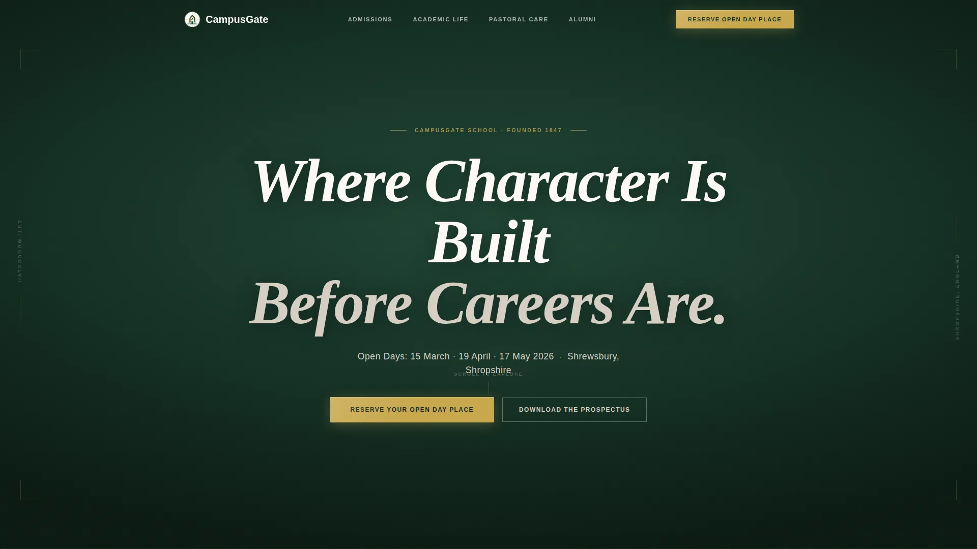
- A bold hero section with a giant serif headline on headmaster green and a brass call-to-action button
- Three modular card rows covering admissions context, academic and co-curricular life, and alumni outcomes
- A dual-path registration section with an Open Day booking form and a prospectus download option
Feature list
This template bundles together a set of carefully considered components, each tied directly to the admissions conversion goal.
Giant Headline Hero Section
The hero opens with large Fraunces serif type set on a deep headmaster green background. A single line of chapel stone subtext names the open day date and location. The brass call-to-action button sits directly below, drawing the eye without competing imagery.
Modular Three-Row Card Grid
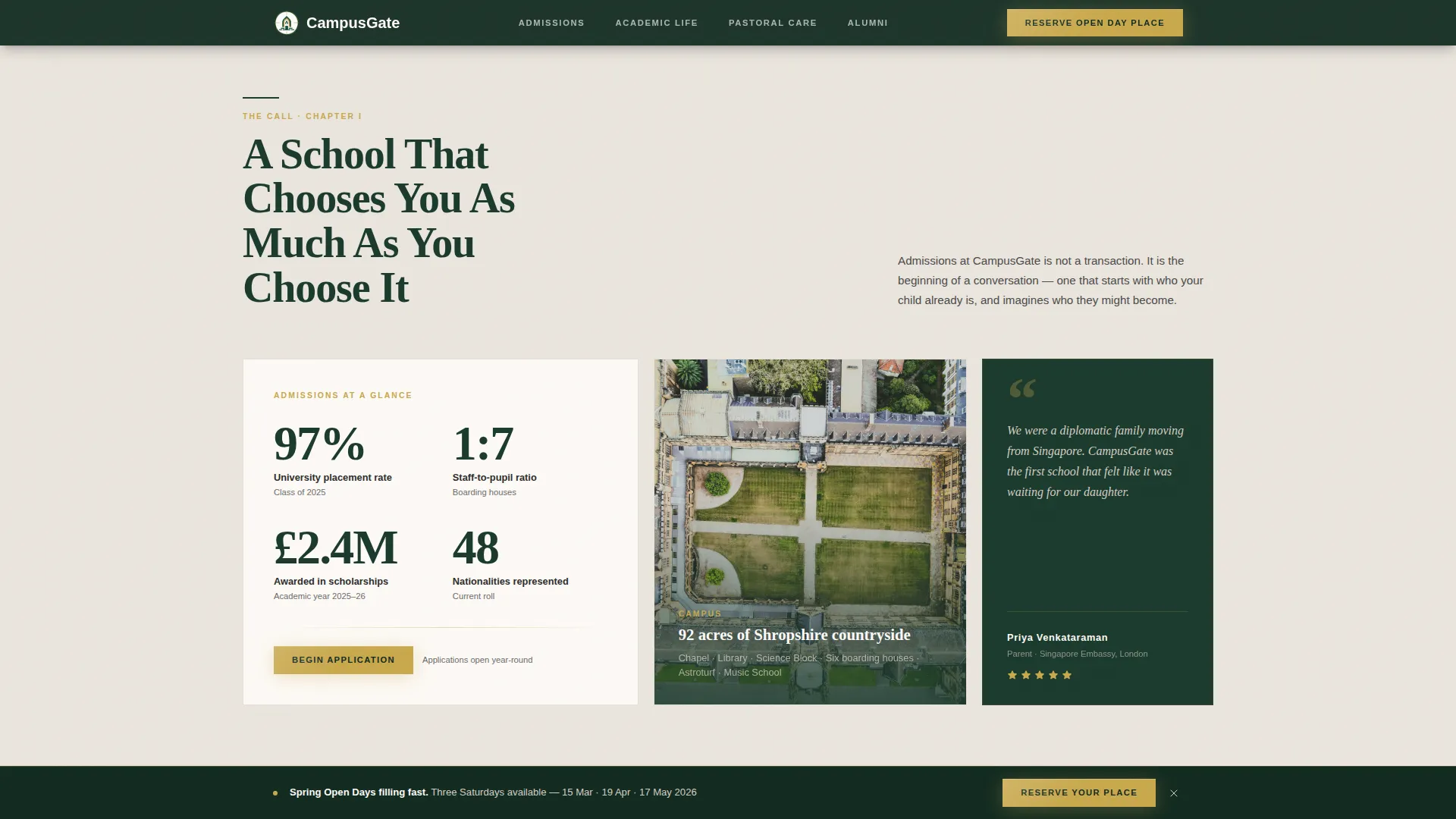
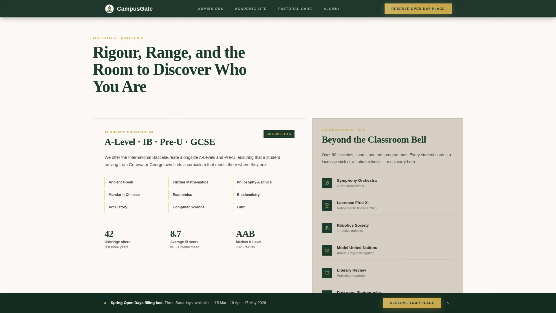
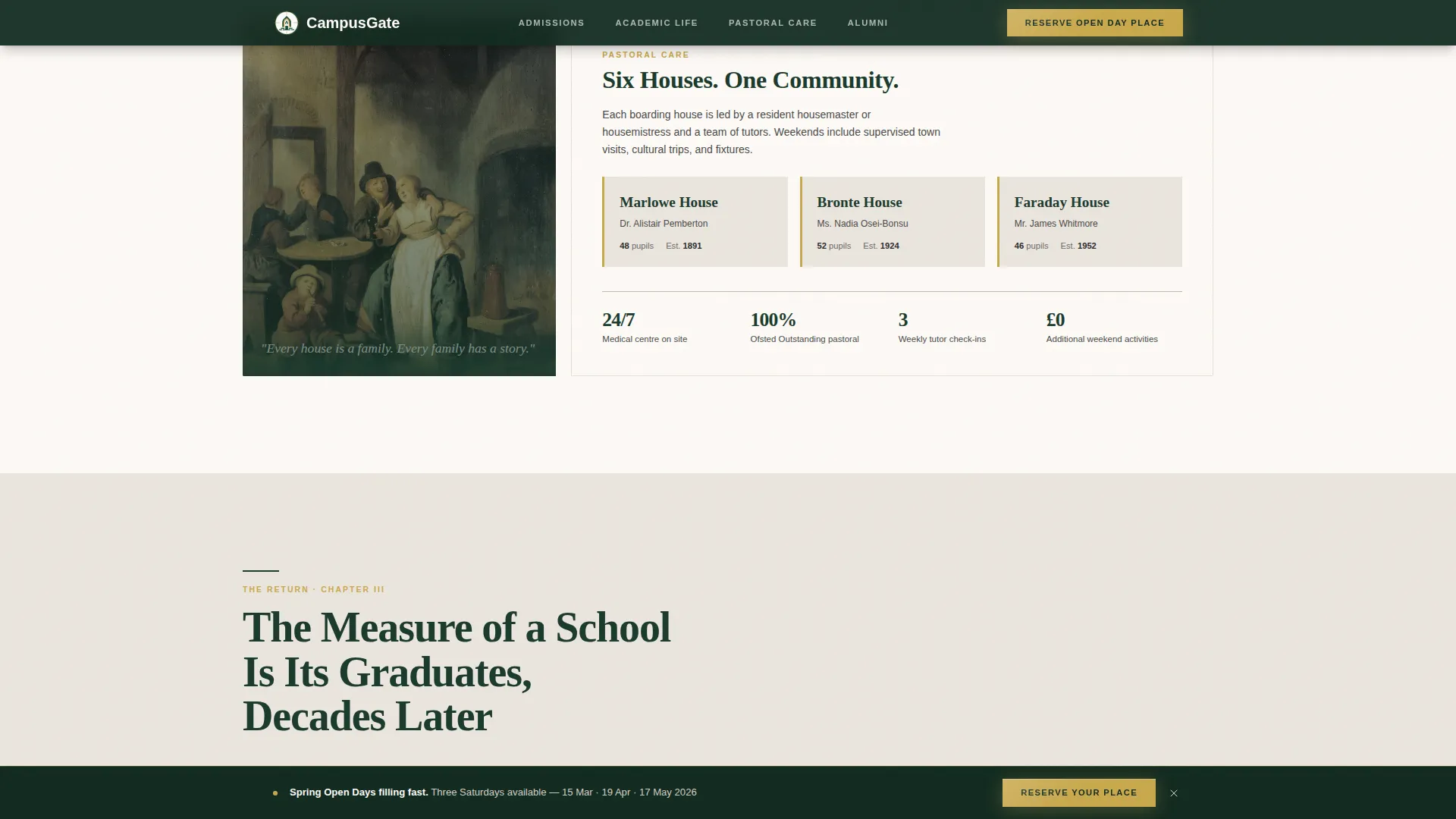
Cards are organised into three thematic rows. The first row introduces admissions statistics, a campus map thumbnail, and a current parent quote. The second covers curriculum depth, co-curricular programmes, and the house pastoral system. The third presents alumni university destinations, career outcomes, and a graduate video testimonial.
Sticky Open Day Call-to-Action Bar
After the second scroll, a sticky bar appears at the top of the viewport carrying the "Reserve Your Open Day Place" prompt. It persists throughout the lower sections so the registration path is always visible without interrupting the reading flow.
Open Day Registration Form
The registration form collects parent name, the child's current age and school, a preferred open day date chosen from a dropdown of three Saturday options, and an optional field for questions or access requirements. It is built as a client-side component for smooth interactivity.
Prospectus Download Secondary Path
Families not yet ready to visit can request the digital prospectus by submitting their email address and postal address. This secondary conversion path captures warm leads without requiring an in-person commitment at this stage.
GSAP ScrollTrigger Card Reveals
Each card row uses staggered reveal animations driven by scroll position. Cards enter the viewport in sequence, giving the page a considered, unhurried pace that reflects the school's character rather than rushing the reader.
Page sections overview
| Section | Purpose |
|---|---|
| Hero headline | Opens with authority; presents the brass call to action button |
| Admissions stats row | Introduces key numbers, campus map, parent quote |
| Academic life row | Shows curriculum depth, programmes, house system |
| Alumni outcomes row | Proves long-term value via destinations and video |
| Registration form | Captures Open Day bookings and prospectus requests |
| Footer | Provides contact links in a clean single-row layout |
Design & branding system
The visual identity follows a Corporate Precision theme built on the Forest Trust colour system. The palette is warm and institutional, evoking a mahogany-panelled study rather than a sterile admissions brochure.
- Deep headmaster green (#1B3A2D) anchors headers and section dividers; chapel stone (#D6CFC4) dominates background areas; blackboard slate (#2C2C2C) carries body text
- Polished brass (#C9A84C) is reserved exclusively for buttons, crests, and interactive highlights, so the eye is drawn only where action is required
- Fraunces serif handles all display headlines; DM Sans covers body copy, labels, and form fields for a pairing that is readable at every scale
Mobile & speed optimization
The template is built desktop-first, reflecting the research habits of its primary audience. Full mobile responsiveness ensures the experience holds up across all screen sizes.
- Static sections are built as server components, keeping initial load light for text-heavy informational areas
- Interactive elements such as the registration form, prospectus download form, and sticky navigation bar are isolated as client components to avoid unnecessary rendering overhead
- The card grid reflows cleanly on smaller screens, preserving the narrative sequence without horizontal scrolling or content loss
How this template helps you convert
Every design and structural decision in Campusgate is aimed at reducing hesitation and building the confidence a family needs before registering.
- The narrative scroll earns trust progressively, presenting admissions context and academic evidence before the registration form ever appears, so families arrive at the form already informed and engaged.
- The dual conversion path serves both ready and researching families at the same time, capturing Open Day registrations from decisive parents while collecting prospectus requests from those still weighing their options.
- The sticky call-to-action bar keeps the registration prompt visible throughout the page without being intrusive, reducing the friction of having to scroll back to find a booking button.
Other information about this template
Campusgate is localised for a United Kingdom and international audience. Dates follow DD/MM/YYYY format, open day options are Saturday dates, and currency references use GBP where applicable.
- The footer uses a linear single-row pattern, keeping the close of the page as clean and restrained as the opening
- Animation intensity is set at medium-high, using GSAP ScrollTrigger for staggered card reveals and a brass button glow pulse that draws attention without distraction
- The template is categorised under Education and Training, School (K-12), and is purpose-built for the boarding school niche, making it a focused starting point for any independent school admissions page
Theme
Corporate Precision
Creative direction
Hero's Journey
Color system
Forest Trust
Style
Card Grid (Modular)
Direction
Event Registration
Page Sections
Giant Headline Hero with Brass Call to Action
Three-row Modular Card Grid
Sticky Registration Call-to-action Bar
Open Day Registration Form
Prospectus Download Secondary Path
GSAP Scrolltrigger Staggered Reveals
Related questions
What kind of school is this template designed for?
Can I adjust the open day dates in the registration form?
Does the template include a way to capture families who are not ready to visit?
How is the card grid organised?
What typography does this template use?



