AI for Cannabis Professional Website Template
Cannalytics is a split-screen cannabis AI analytics landing page template built for B2B SaaS operators in the cannabis industry. It pairs a high-contrast Monochrome Steel visual system with a structured Feature Matrix layout that pits legacy spreadsheet workflows against a live, AI-powered command center. The result is a conversion-focused page designed for multi-state operators, dispensary finance teams, and fund analysts.
by Rocket studio
Quick summary
Cannalytics is a single-page template built for cannabis analytics platforms targeting B2B buyers. It uses a blacked-out cockpit aesthetic, a 50/50 split-screen layout, and a row-by-row Feature Matrix to convert multi-state operators (MSOs), dispensary CFOs, and fund analysts into trial signups through a frictionless data-ingestion form.
Who this template is for
This template is built for cannabis technology companies and analytics platform founders who sell to sophisticated, data-driven operators. It speaks directly to buyers who already manage complex data workflows and are actively looking for something better.
- Multi-state cannabis operators tracking cultivation metrics across ten or more facilities
- Dispensary CFOs reconciling seed-to-sale reports at month-end and compliance officers managing multi-state regulatory filings
- Fund analysts and investors modeling license valuations who need faster answers than their current business intelligence stack can deliver
What problem this template solves
Cannabis operators are drowning in siloed data. Metrc exports, point-of-sale reports, and consultant-built spreadsheet models sit in separate tools with no unified view. Compliance gaps stay hidden until a filing deadline, and yield variances only become visible in hindsight.
- Operators lack a single view that connects cultivation metrics, compliance status, and market benchmarks in real time
- Legacy business intelligence tools are too slow to surface the yield forecasts and regulatory gaps that affect decisions at month-end
- The buying journey for cannabis SaaS is skeptical by default, so conversion copy needs to show proof through contrast, not just feature lists
What you get with this template
You get a fully structured, high-interactivity landing page template designed around one conversion goal: getting qualified operators to submit a data ingestion form. Every section is built with that goal in mind.
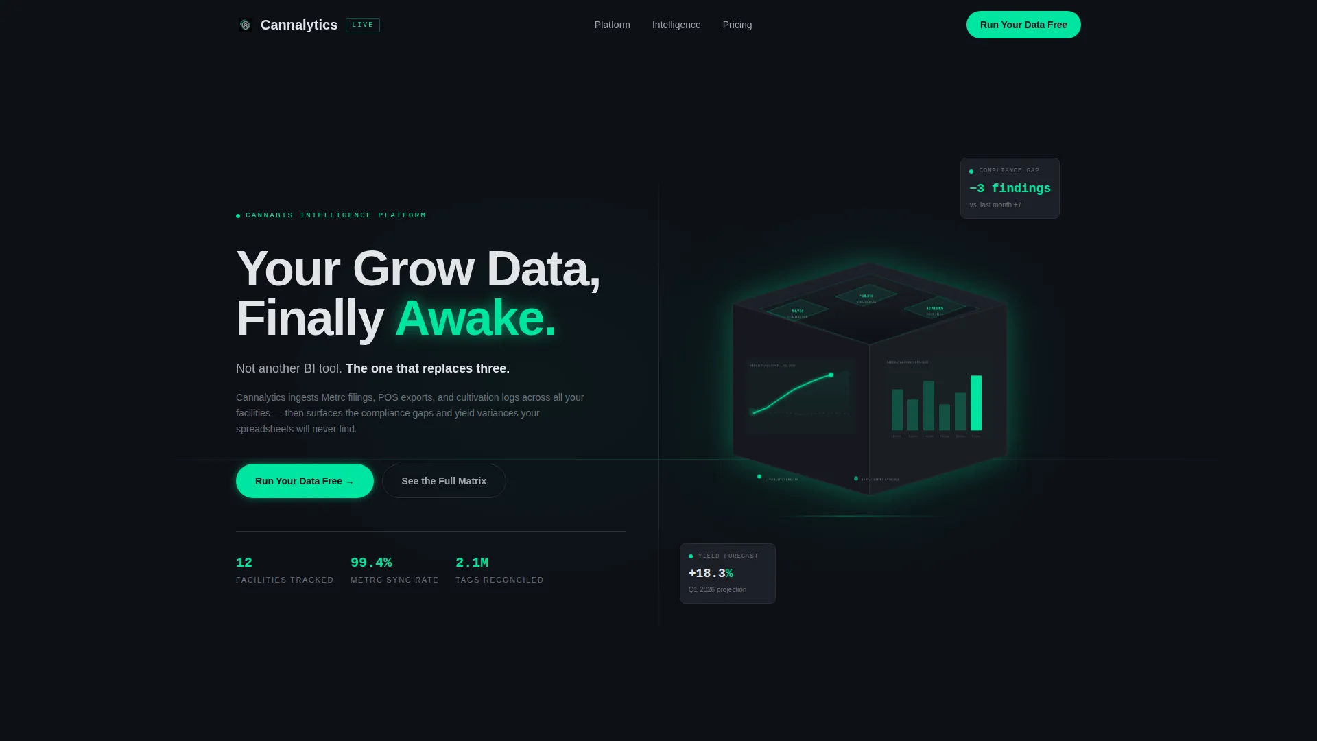
- A forge-black hero section with an animated isometric dashboard render, a scrolling yield-curve SVG pulse, and a headline that fades in on load
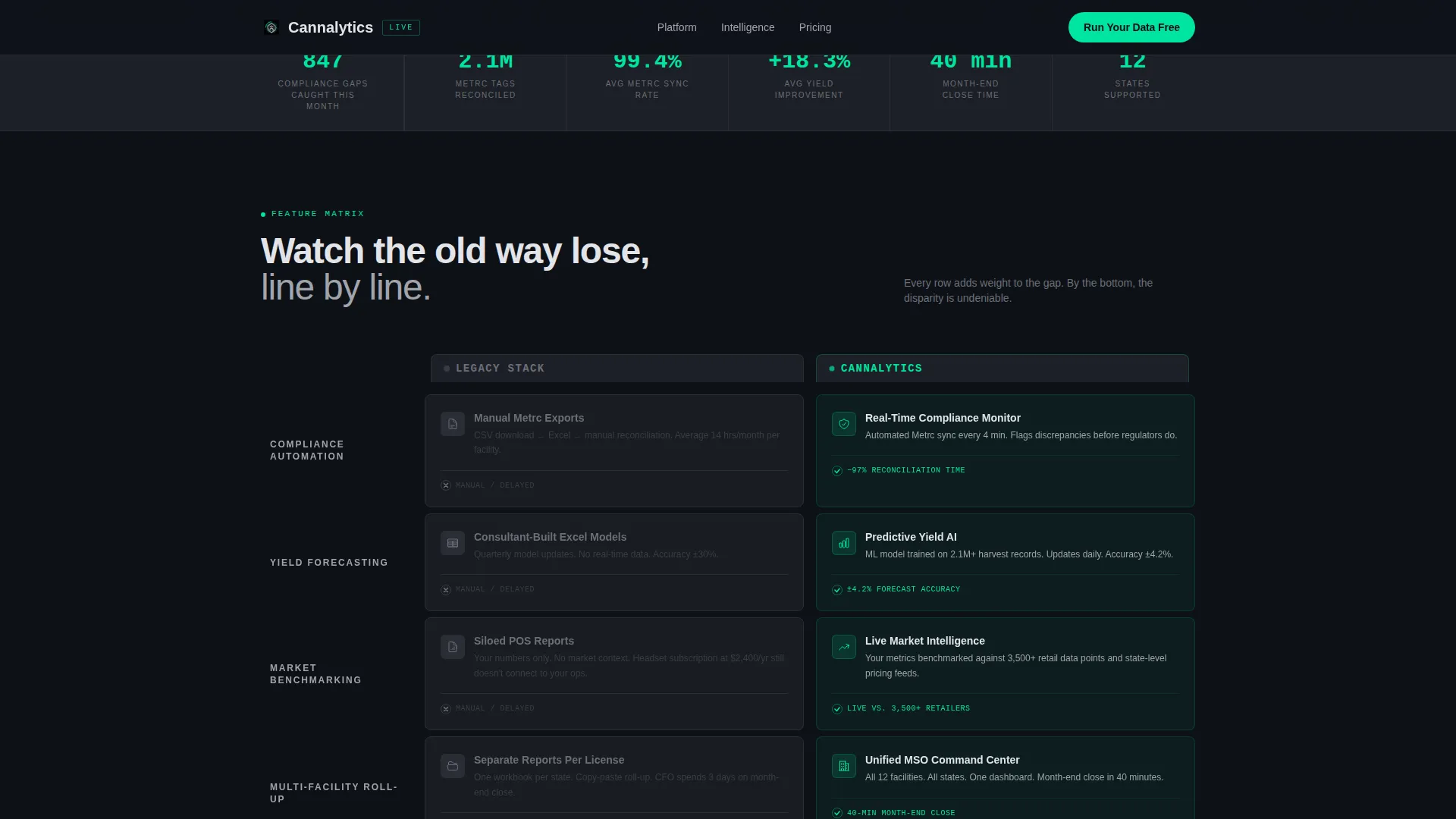
- A four-row Feature Matrix split screen that visually dismantles the legacy stack argument row by row, with scroll-triggered reveals powered by GSAP ScrollTrigger
- A live metrics ticker with animated counters, an expandable full feature comparison table with checkmarks and cross-marks, and a persistent sticky call-to-action button anchored to the bottom of the viewport
Feature list
This template is built around high-interactivity components and a structured conversion architecture. Every feature below comes directly from the template brief.
Split-Screen Feature Matrix
The core layout is a structured 50/50 comparison. The left column shows a muted, static legacy stack. The right column shows the Cannalytics side, glowing and animated. Four capability rows build the contrast row by row: compliance automation, predictive yield modeling, real-time market benchmarking, and multi-facility roll-up.
Animated Hero with Yield-Curve Pulse
The hero is a full-bleed forge-black frame with an isometric dashboard render at its center. A thin animated pulse travels along a yield-curve line, and the primary headline fades in above it. The electric accent color is reserved for live data points and the call-to-action pulse only.
Persistent Sticky Call-to-Action
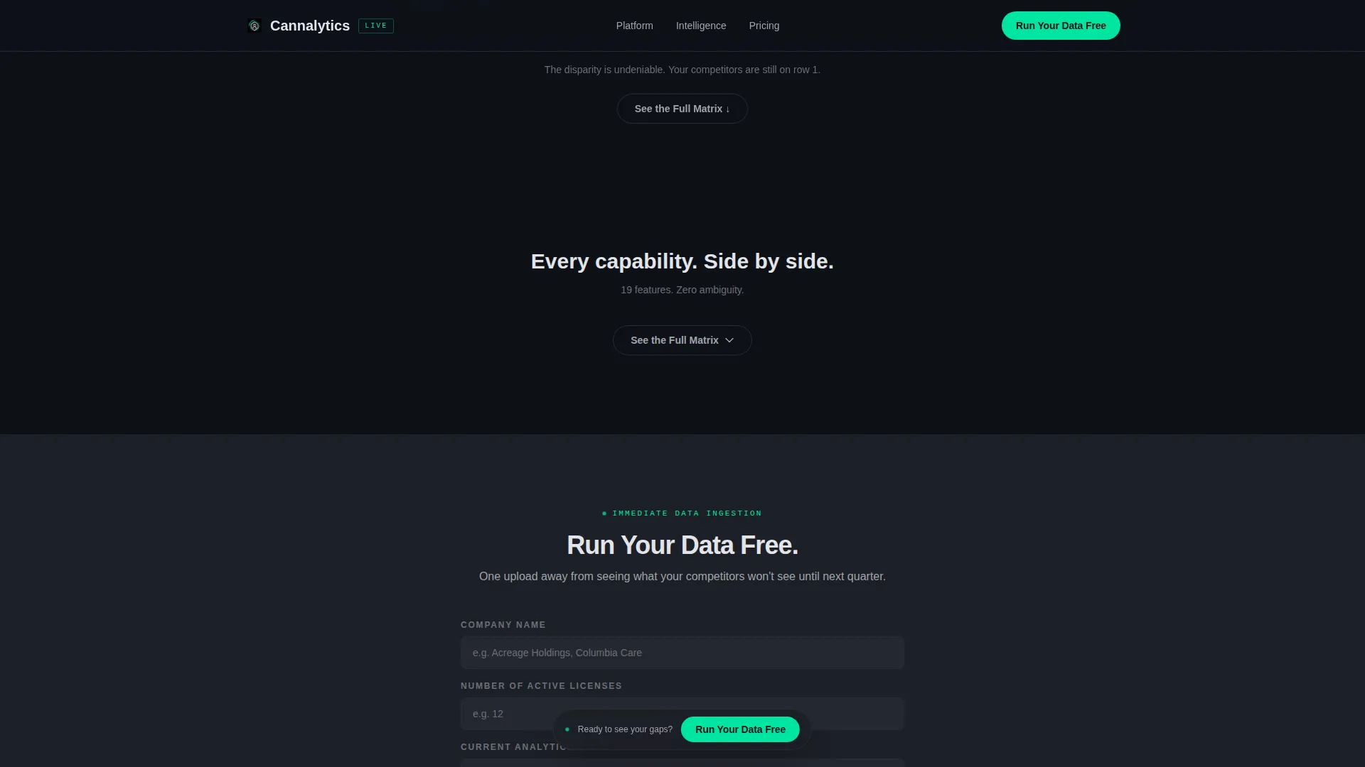
The primary call-to-action button labeled "Run Your Data Free" appears first in the hero. After the second scroll, it anchors persistently to the bottom of the viewport. This keeps the conversion path visible at every point in the page journey without interrupting the reading flow.
Expandable Full Comparison Table
A secondary conversion path labeled "See the Full Matrix" expands a detailed feature-by-feature table with checkmark and cross-mark indicators. The table funnels directly into the same lead capture form, giving skeptical buyers a deeper proof layer before they commit.
Psychologically Sequenced Lead Form
The conversion form asks for company name, number of active licenses, current analytics tool via dropdown, and work email in that exact order. Asking buyers to name their current stack before entering their email increases psychological commitment before contact information is shared.
Live Metrics Ticker
An animated counter section simulates a live data feed. It surfaces metrics such as facilities tracked, Metrc tags reconciled, and compliance gaps surfaced. This creates social proof through live-feeling specificity rather than static testimonial blocks.
Page sections overview
| Section | Purpose |
|---|---|
| Hero Split Frame | Establishes brand tone and surfaces the primary call-to-action with animated dashboard render |
| Feature Matrix Rows | Builds the versus argument row by row across four capability comparisons |
| Live Metrics Ticker | Delivers social proof through animated counters tied to real operator metrics |
| Full Matrix Table | Expands the feature comparison with checkmarks and funnels into the lead form |
| Conversion Lead Form | Captures company name, license count, current tool, and work email |
| Minimal Footer | Displays copyright, privacy, and terms in a single developer-minimal row |
Design & branding system
The visual identity is built on a Monochrome Steel palette that communicates precision and authority without warmth or decoration. The design language is described in the brief as feeling like a milled-aluminum chassis: cold, machined, and confident.
- Color system: forge-black (#0E1117) backgrounds, gunmetal mid-tone (#1C1F26) for surface cards, brushed-steel (#A0A4AB) for secondary text, and electric green (#00E5A0) as the sole accent, capped at under ten percent of any viewport
- Typography: Manrope handles all body and heading text; JetBrains Mono is reserved for data values, counters, and numeric display elements
- The electric accent appears only on live data points, hover states, call-to-action pulses, and animated chart lines so it reads as a signal flare every time it appears
Mobile & speed optimization
The template is built desktop-first, matching the primary use case of CFOs and analysts working on workstations. A responsive mobile fallback is included for secondary access patterns.
- Animations use GPU-accelerated CSS transforms only, avoiding layout-thrashing paint operations
- Scroll-triggered section reveals use Intersection Observer to fire only when elements enter the viewport, keeping the page lean on initial load
- GSAP ScrollTrigger drives the matrix row reveals and counter animations without blocking the main thread
How this template helps you convert
The entire page is structured as a single, escalating argument. Each section adds one more reason why the legacy stack fails and why the alternative is worth trying right now.
- The hero anchors the call-to-action immediately and repeats it as a sticky button after the second scroll, so the conversion path is never more than one click away at any point on the page.
- The Feature Matrix and expandable table give skeptical B2B buyers two levels of proof depth: a quick visual contrast and a detailed checkmark breakdown, both funneling into the same low-friction form.
- The form sequence asks buyers to identify their current tool before requesting their email, which increases commitment and improves lead quality by filtering for operators who are actively evaluating alternatives.
Other information about this template
This template is part of the Startup Velocity theme family, designed for high-growth B2B technology products that need to move fast and communicate authority from the first scroll. It is a single landing page, not a multi-page site.
- The template style is Split Screen (50/50), meaning every major section is architecturally divided into a contrast pair rather than a single-column narrative
- The creative direction is Feature Matrix, a structured versus argument format that works well for cannabis SaaS products competing against entrenched legacy workflows
- The header concept is Dark Full-Bleed with Glow, which positions the product as a precision instrument rather than a marketing asset
- The landing page conversion direction is Comparison/Versus, optimized for buyers who are already aware of their problem and are evaluating whether to switch tools
- No demo scheduling is included by design; the promise is immediate data ingestion, reducing friction to a single upload away from value

Theme
Startup Velocity
Creative direction
Feature Matrix
Color system
Monochrome Steel
Style
Split Screen (50/50)
Direction
Comparison/Versus
Page Sections
Split-screen Feature Matrix Layout
Animated Hero with Dashboard Render
Persistent Sticky Call-to-action Button
Expandable Full Comparison Table
Psychologically Sequenced Lead Form
Live Metrics Ticker with Animated Counters
Related questions
Who is this landing page template designed for?
What sections are included in this template?
Can I edit the Feature Matrix rows for my own product?
What animation library does this template use?
Is the lead form connected to a backend or CRM by default?



