Canopy - Instant Botanist Landing Page Template
Canopy is a bento grid landing page template built for white-label plant identification software. It guides garden center chains, landscaping platforms, and nursery franchises through a Problem to Solution arc, showing the cost of generic plant apps, then presenting a branded SDK fix. The page includes a hero phone mockup, live demo simulator, and a streamlined SDK access form.
by Rocket studio
Quick summary
Canopy is a single-page bento grid template designed to sell a white-label plant identification engine to B2B buyers. The layout moves visitors from pain to proof, competitor bleed, live SDK demo, revenue dashboard, and closes with a two-field form. Every tile is sharp enough to read without scrolling, and the primary call to action stays visible throughout the entire page.
Who this template is for
This template is built for software vendors and platform teams selling embedded visual identification technology to the horticulture industry. The design speaks directly to decision-makers who already run a customer-facing app and want to add branded plant intelligence without rebuilding from scratch.
- Garden center chains that want their own brand on the identification screen
- Landscaping software-as-a-service platforms looking to embed a visual plant search feature
- Nursery franchises that need a white-label experience without directing customers to a competitor's app
What problem this template solves
Generic plant identification apps pull customers away from the brand that earned their trust. When a homeowner photographs a wilting fiddle-leaf fig and the result sends them to a competitor's storefront, the garden center loses both the upsell and the relationship. This template gives vendors a clear, persuasive page to show exactly why that problem exists and how their SDK solves it.
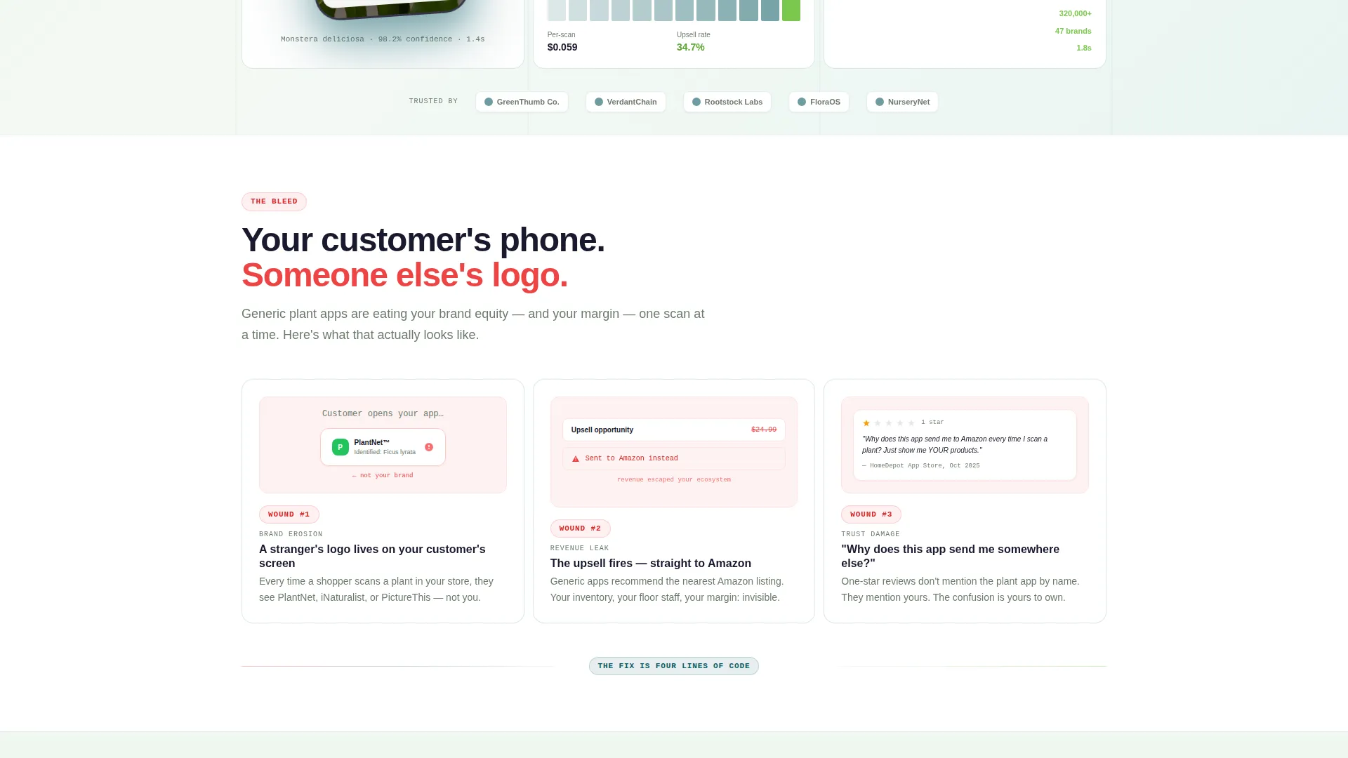
- Customers are redirected to third-party platforms instead of the client's own storefront
- Missed upsell moments that could have been triggered at the point of identification
- Negative reviews caused by off-brand app experiences the client cannot control
What you get with this template
The template delivers a fully structured bento grid landing page with distinct tile zones for storytelling, product demonstration, and conversion. Each section is designed to serve a specific moment in the buyer's decision journey, from recognizing the problem to submitting a work email.
- A hero bento cluster with a large angled phone mockup, SDK dashboard tile, brand-customization panel tile, and a real-time analytics feed tile
- A problem row of three cards showing competitor logo exposure, a missed upsell notification, and a one-star review quote
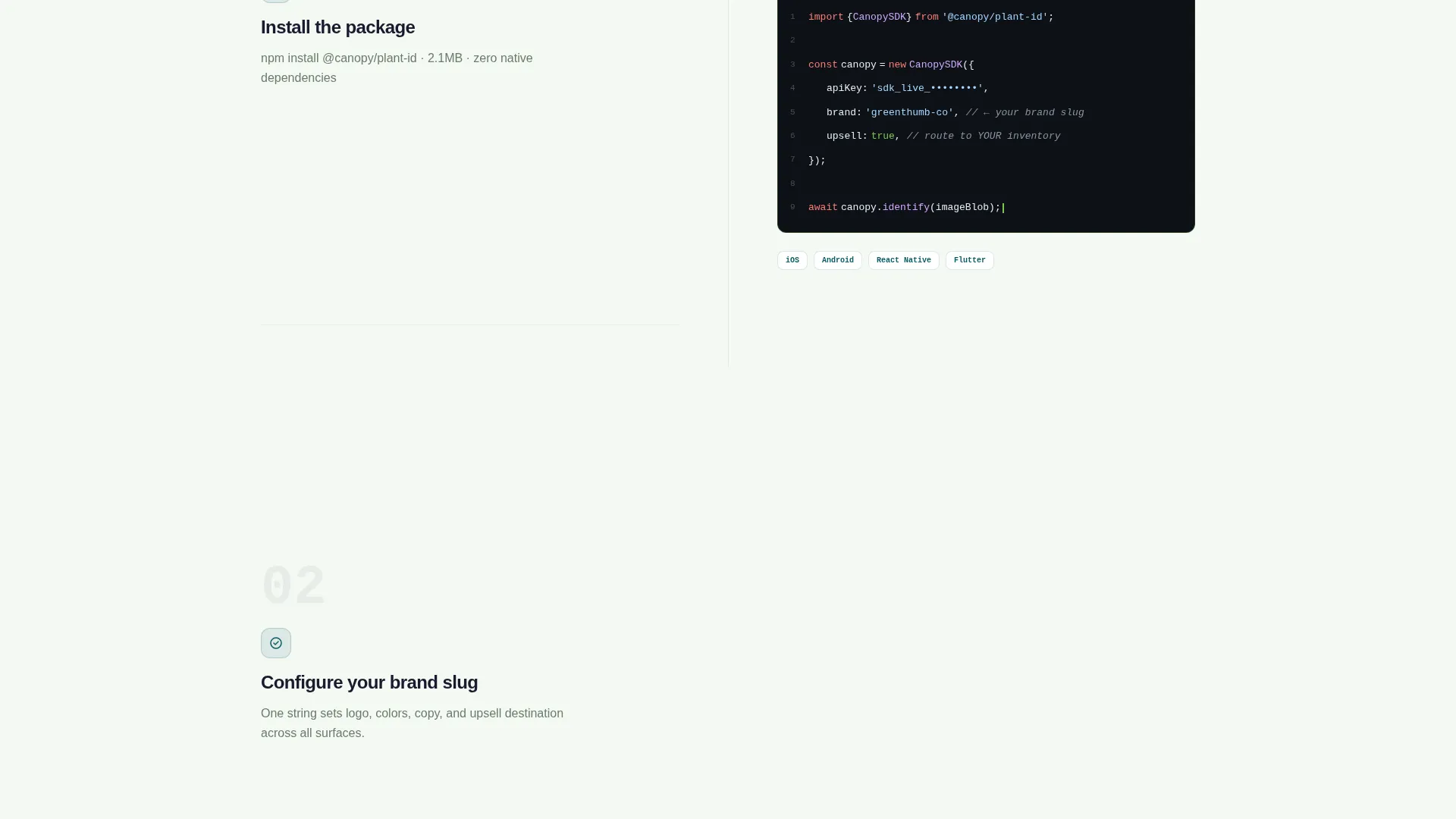
- A solution grid with SDK integration code snippet, a drag-and-drop brand-skin editor, and a revenue-share dashboard
- An inline phone simulator where prospects photograph a plant from their camera roll and watch a branded identification resolve live
- A sticky mobile bottom bar and a minimal two-field conversion form asking only for work email and platform choice
Feature list
This section describes the core functional components built into the Canopy template.
Hero Bento Product Screenshot
The header tile holds a phone mockup angled to show a monstera leaf inside a camera viewfinder. The identification overlay is already rendered: species name, confidence score, care summary, and a "Shop This Plant" button with a sample partner logo. This tile is twice the height of its neighbors, creating an immediate focal point.
Problem Arc Card Row
Three side-by-side bento cards open the pain narrative. The first shows a competitor's logo on a client's customer's screen. The second shows a missed upsell push notification. The third displays a one-star review reading "why does this app send people to Amazon?" Each card is designed to land as a specific, recognizable cost.
SDK Integration Tile
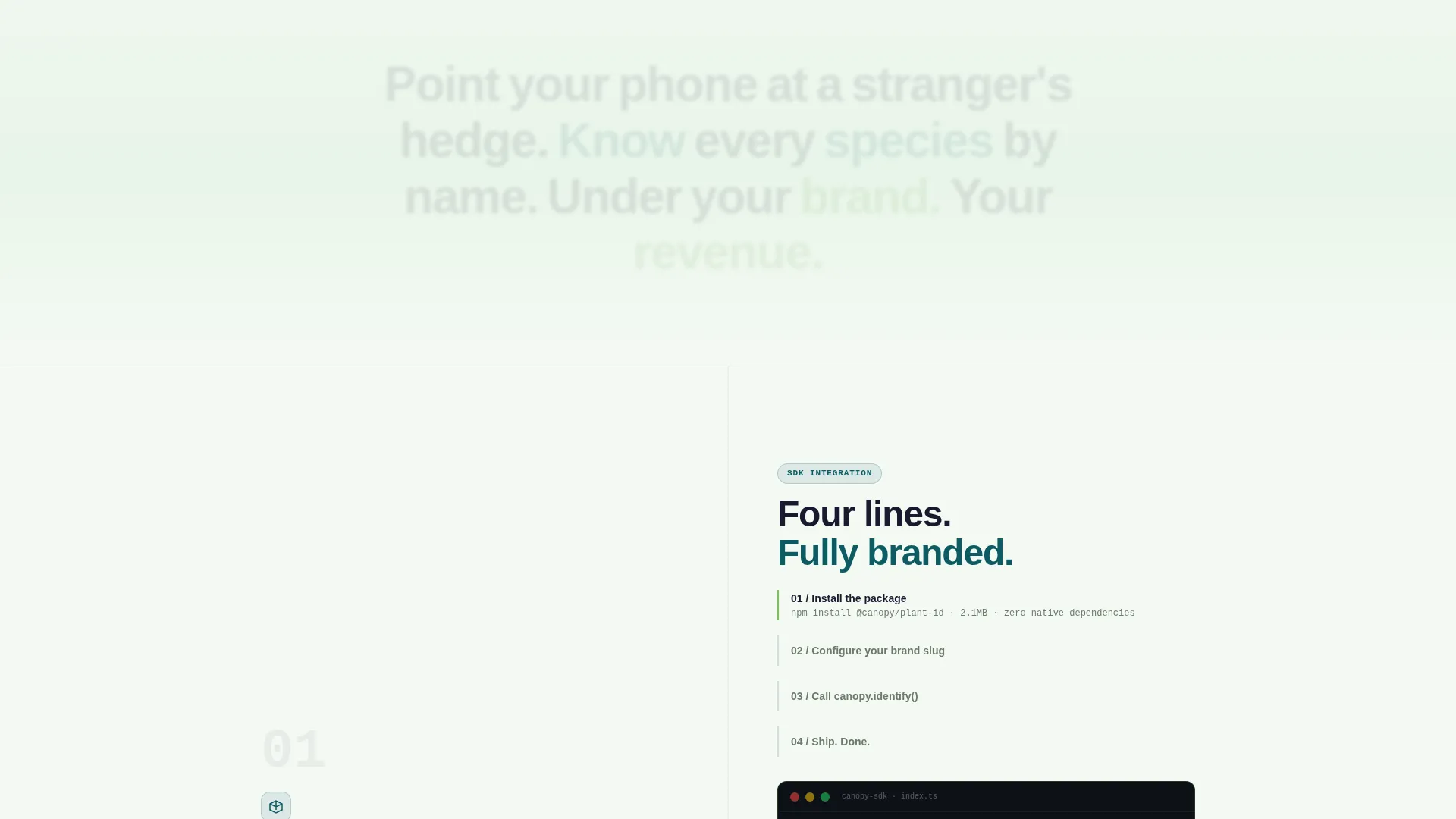
A solution tile displays the SDK setup reduced to four lines of code. It communicates low friction to technical evaluators without requiring a lengthy explainer. The tile sits inside the solution grid where the layout begins to tighten and fill with capability.
Brand-Skin Editor Panel
A drag-and-drop brand customization panel tile lets prospects see exactly how their logo, colors, and interface skin would appear inside the identification flow. It answers the white-label question visually before the prospect has to ask it.
Live Demo Phone Simulator
A secondary call-to-action labeled "See a Live Demo" opens an inline phone simulator. Visitors can upload a plant photo from their camera roll and watch the identification resolve in real time, branded with a sample partner skin. The demo earns the conversion by making the product tangible.
Revenue-Share Dashboard Tile
A bento tile showing per-scan affiliate earnings makes the commercial case without requiring a sales call. It visualizes the revenue-share model as a live-looking data feed, turning a financial argument into a product feature.
Page sections overview
| Section | Purpose |
|---|---|
| Hero Bento Cluster | Anchors the product with a large phone mockup and surrounding SDK, analytics, and brand tiles |
| Problem Card Row | Surfaces the competitor bleed pain across three sharp, specific cards |
| Solution Grid | Presents the SDK, brand-skin editor, and revenue dashboard as a tightening tile system |
| Live Demo Simulator | Lets prospects test branded plant identification with their own camera roll photo |
| Conversion Form | Collects work email and platform choice to initiate SDK access |
| Sticky Mobile Bar | Keeps the primary "Get the SDK" call to action visible as users scroll on mobile |
Design & branding system
The Canopy template uses a Teal Catalyst color system that draws its palette from greenhouse and botanical reference points. The result feels clinical enough to trust and alive enough to engage, like a well-organized potting bench under clean light.
- Deep greenhouse teal (#0D5C63) as the primary surface, propagation white (#F4F9F4) for card backgrounds, chlorophyll accent (#7BC74D) on interactive hits and success states, and root-dark charcoal (#1A1A2E) for body text
- The Directory and Discovery theme organizes content as a living catalog: tiles get smaller and more numerous as the page scrolls, mimicking a directory filling with data
- Visual identity is consistent across the hero mockup overlay, the brand-skin editor panel, and the inline simulator, so the white-label concept is visible at every stage
Mobile & speed optimization
The bento grid layout is structured to prioritize the most conversion-critical elements on smaller screens. The sticky bottom bar keeps the primary call to action reachable without requiring a return scroll to the header.
- The "Get the SDK" button persists as a sticky bottom bar throughout the mobile scroll experience
- The inline phone simulator is designed to work with a visitor's own camera roll, making the demo accessible on any device
- The two-field conversion form keeps the ask minimal so mobile visitors can complete it without friction
How this template helps you convert
Canopy is built around a conversion arc that earns its form submission by the time the visitor reaches it. The page does not ask for trust before demonstrating value.
- The problem row makes the cost of inaction concrete and specific, creating a felt urgency before any product feature is introduced
- The live demo simulator turns a skeptical visitor into an active participant, letting them see the branded identification output with their own photo before committing
- The minimal form asks only for work email and platform preference, removing every unnecessary field that would slow a qualified prospect from taking the next step
Other information about this template
This template is categorized under Technology, Consumer App and Platform, and is specifically designed for the white-label plant identification app niche. The bento grid template style suits teams who want a modern, tile-based layout that can hold a high density of product information without feeling cluttered.
- The template follows a Problem to Solution Arc creative direction, meaning the emotional and logical journey is baked into the section order
- The header concept is a Product Screenshot at hero scale, which communicates product maturity faster than illustrated mockups or icon-based headers
- The landing page direction is framed around SDK access rather than a traditional app download, making it suitable for a B2B software audience
- The inline simulator functions as a secondary conversion path, capturing prospects who need to experience the product before filling out a form
- The grid density increases as the page scrolls, creating a sense of expanding capability that mirrors the "directory filling with data" visual metaphor from the design brief

Theme
Directory & Discovery
Creative direction
Problem→Solution Arc
Color system
Teal Catalyst
Style
Bento Grid
Direction
App Download
Page Sections
Hero Bento Product Screenshot
Problem Arc Card Row
SDK Integration Code Tile
Brand-skin Editor Panel
Live Demo Phone Simulator
Revenue-share Dashboard Tile
Related questions
Who is this landing page template designed for?
What does the bento grid layout include?
Can I customize the brand colors and logo placement?
What does the conversion form ask for?
Is the inline demo simulator part of the template?



