Advanced Cannabis Digital Presence Professional Website Template
Canopy is a premium cannabis landing page template built for dispensaries, delivery services, and cannabis brands that need to launch fast. Its split-screen layout pairs dark glass panels with electric accent colors to create an immersive, high-end feel. Every section is designed to move visitors toward a live template demo with zero friction.
by Rocket studio
Quick summary
Canopy is a single-page cannabis website template built on a split-screen layout and a dark, premium visual identity. It is designed for cannabis brands that need to go live quickly without sacrificing polish. The page guides every visitor toward a live demo click, showing the product in action rather than describing it.
Who this template is for
Canopy is built for cannabis businesses at every stage of launch. Whether you are opening your first location or scaling across multiple markets, this template meets you where you are.
- First-time dispensary owners working against licensing deadlines who need a credible web presence fast
- Edible and consumer packaged goods brands moving from farmers market tables to direct-to-consumer online storefronts
- Multi-state cannabis operators who need several locations live on a tight timeline
What problem this template solves
Most cannabis brands lose customers before the first scroll because their site looks unfinished, generic, or outdated. Canopy replaces that problem with a page that feels premium from the first frame.
- Slow, patchwork builds that miss launch windows and erode buyer confidence before a single product is seen
- Visual identities that feel clinical or cheap rather than premium and trustworthy
- Conversion paths that rely on long forms instead of letting the product experience do the selling
What you get with this template
Canopy delivers a fully structured, visually complete landing page you can adapt and deploy quickly. Every section is purposefully sequenced to build momentum and push visitors toward action.
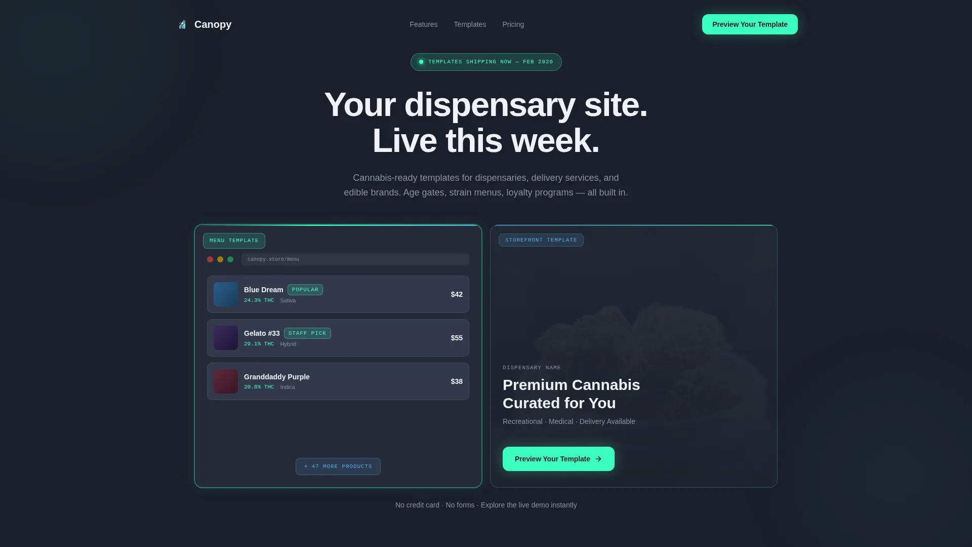
- A split-screen header with two dark glass panel previews, a self-typing headline, and a primary call-to-action button embedded directly in the layout
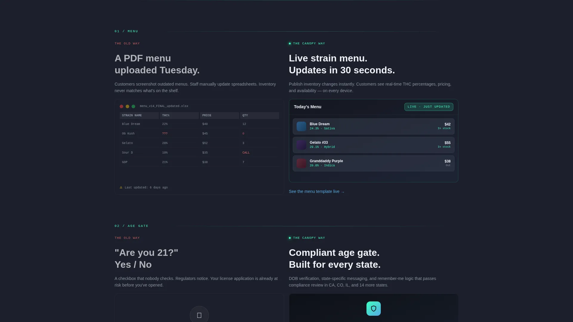
- A scroll-driven reveal sequence where each section contrasts the before state with the polished template solution, building launch urgency with every pair
- A sticky mint-colored call-to-action button that follows the visitor through the page, and secondary "See this feature live" text links anchoring into specific demo sections
Feature list
Canopy includes a focused set of purpose-built design and layout features. Each one is grounded in the goal of getting a cannabis brand live and looking credible as fast as possible.
Split-Screen Dark Glass Header
The header spans the full viewport and places two frosted, semi-transparent panel cards side by side. The left panel previews a strain menu with THC percentage cards. The right panel shows a branded product hero shot. A thin electric mint border traces each panel, and the headline types itself in the space between them.
Scroll-Driven Before and After Reveals
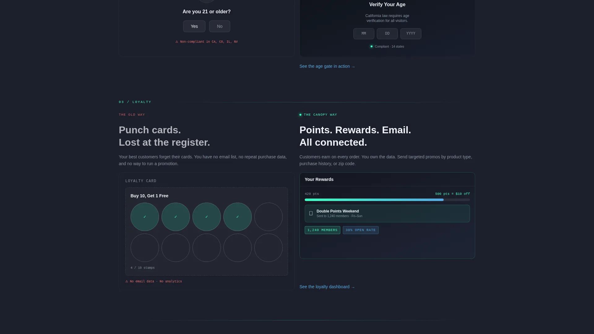
After the header, every section splits the screen between a problem state on the left and the template solution on the right. Each pair loads with a subtle upward burst animation that makes the new version feel like it is physically replacing the old one. The sequence covers the menu, age gate, loyalty program, and checkout in order.
Sticky Click-Through Call to Action
The primary call-to-action reads "Preview Your Template" and first appears inside the right glass panel of the header. It then converts into a floating sticky button in electric mint that persists through every scroll section. There is no form on this page; the click leads directly to a fully interactive demo site.
Clickable Screenshot Sections
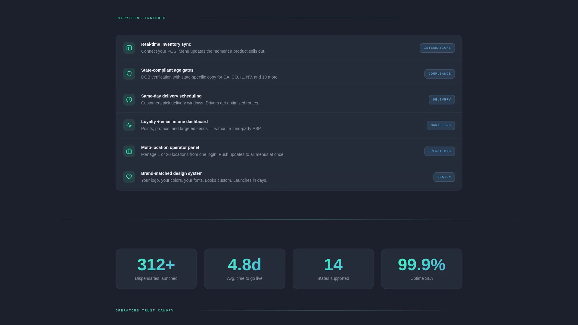
Every section uses working screenshots rather than illustrated mockups. Each screenshot is clickable and routes to the relevant section of the live demo. This approach lets visitors experience the product before they commit, reducing hesitation and building confidence through direct interaction.
Secondary In-Section Demo Links
Below each scroll reveal section, a secondary text link reads "See this feature live" with a directional arrow. Each link anchors into a specific page of the live demo site. These links give visitors a granular way to explore individual features without leaving the page flow.
Page sections overview
| Section | Purpose |
|---|---|
| Dark Glass Header | Introduces the template with two side-by-side frosted panel previews and a self-typing headline |
| Menu Reveal Pair | Contrasts a hand-drawn menu mockup with the polished animated strain card layout |
| Age Gate Reveal | Shows the before state placeholder versus the branded age verification screen |
| Loyalty Program Pair | Highlights the loyalty module by pairing a spreadsheet view with the live program layout |
| Checkout Reveal Pair | Closes the reveal sequence by comparing a basic checkout state with the conversion-ready version |
| Sticky call to action Layer | Floats the mint call-to-action button persistently as visitors scroll through all sections |
Design & branding system
Canopy uses a Slate and Sky color system built around four specific values. The palette is designed to feel dark and grounded at the base with bright, cool signals cutting through the surface.
- Core colors: deep charcoal slate (#1B1F2A) as the background, smoked glass gray (#2D3343) for panel surfaces, and open-sky blue (#56A8E2) for accent text and interface elements
- Electric mint (#3DFFC0) is reserved exclusively for buttons, badges, hover states, and panel border accents to keep focal points sharp and intentional
- The overall visual theme follows a Startup Velocity direction, evoking a rooftop at dusk where city lights are just switching on, dark underneath with cool bright signals rising through
Mobile & speed optimization
The split-screen layout and scroll reveal animations are structured to translate cleanly across screen sizes. The template is built with launch-speed priorities in mind.
- The 50/50 split-screen structure adapts to narrower viewports so that both panel states remain legible and the before-and-after contrast is preserved
- Sticky call-to-action behavior and clickable screenshot routing are retained on mobile so the conversion path stays intact regardless of device
How this template helps you convert
Canopy is a click-through landing page with one clear job: move visitors into the live demo. Every design decision supports that path.
- The header embeds the primary call-to-action directly inside the right glass panel so the first thing a visitor sees is both the product and the invitation to explore it
- The scroll reveal sequence builds progressive launch confidence by showing the template solving real problems section by section, making the act of launching feel not just possible but already in motion
- The sticky mint button and per-section demo links create two distinct conversion touchpoints at every scroll depth, so visitors who are ready to act can do so without scrolling back to the top
Other information about this template
Canopy sits at the intersection of cannabis digital presence and technology-first template design. It is built specifically for the cannabis website template category, where credibility, speed, and visual premium carry more weight than standard business site conventions.
- The template style is classified as Split Screen (50/50), making it well suited for side-by-side comparison storytelling common in product launch contexts
- The creative direction is Launch Energy, which informs the pacing of the reveal sequence and the escalating speed of each section pair
- The header concept is Dark Glass Panels, a design approach that references backlit dispensary display cases to create immediate category recognition
- The landing page direction is Click-Through, meaning there is no form, no data entry, and no friction between the visitor and the live demo experience
- The theme is Startup Velocity, reflecting the needs of cannabis operators who are building fast and need a template that matches that pace
Theme
Startup Velocity
Creative direction
Launch Energy
Color system
Slate & Sky
Style
Split Screen (50/50)
Direction
Click-Through
Page Sections
Split-screen Dark Glass Header
Scroll-driven Before and After Reveals
Sticky Click-through Call to Action
Clickable Screenshot Sections
Secondary In-section Demo Links
Related questions
Is this template designed for a single page or multiple pages?
Do I need to fill out a form to access the demo?
Can this template work for a cannabis delivery service, not just a dispensary?
What makes the visual design feel premium rather than generic?
How quickly can a cannabis brand launch with this template?



