Micro-SaaS & Developer Tools Professional Website Template
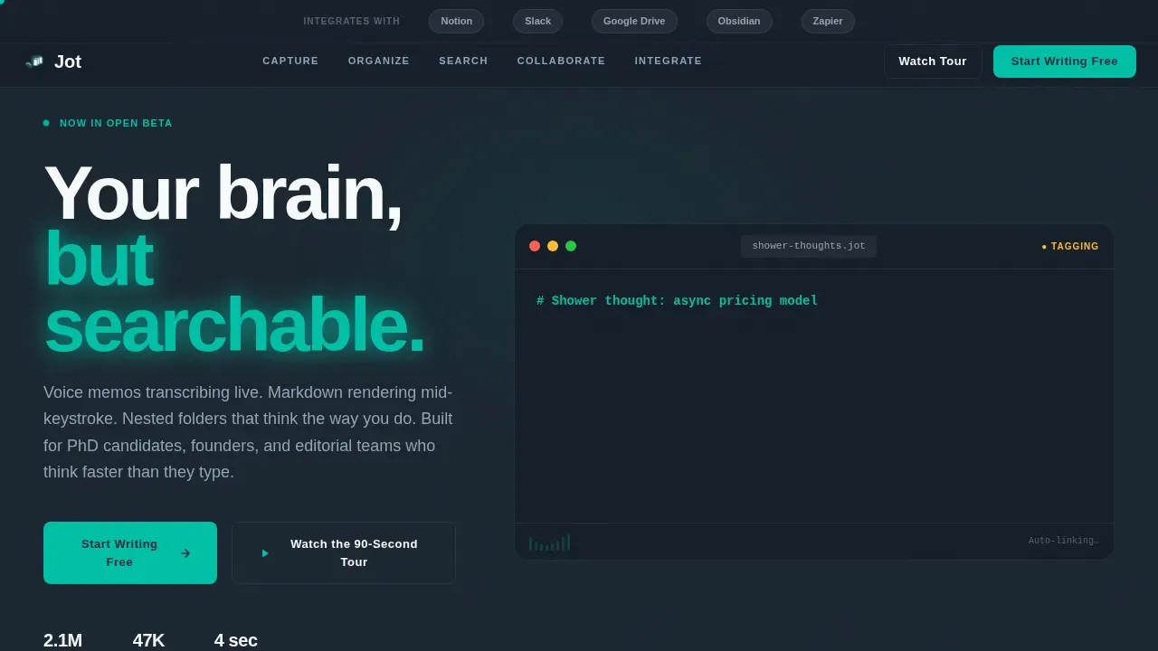
Jot is a smart workspace note taking app landing page template built for productivity SaaS products that need instant credibility and strong signups. It features a hub and spoke anchor navigation, a voice-capture hero with a looping micro-animation demo, five escalating content spokes, and a sticky call-to-action bar, all wrapped in a focused dark-mode design with electric teal accents.
by Rocket studio
Quick summary
Jot is a single-page landing page template designed for a voice-first, markdown-native note taking app. It uses a hub and spoke anchor navigation with five spokes, Capture, Organize, Search, Collaborate, and Integrate, to walk visitors through the full product story. The layout is dark, focused, and conversion-ready from the first scroll.
Who this template is for
This template is built for founders, product teams, and developers who are launching a note taking app and need a landing page that sells the product before the visitor ever opens a signup form. It fits both solo builders and growing businesses equally well.
- Startup founders and indie developers launching a productivity app who need to convert visitors into free signups fast.
- Editorial teams and knowledge-work businesses that want to show off real-time collaboration features to a professional audience.
- PhD candidates, researchers, and power note-takers whose specific needs include voice capture, markdown support, and deep organization tools.
What problem this template solves
Most note taking apps launch with a generic landing page that lists features in a classic form without ever showing the product in motion. That approach loses users before they even reach a call to action. This template solves that by putting the product experience front and center, letting visitors feel what the app does before they sign up.
- Visitors who arrive at a standard landing page with no demo interaction leave before they convert. This template uses a looping animation and spoke-by-spoke story to hold attention.
- Teams building note taking apps often struggle to communicate complex functionality like semantic search or nested folders in a way that makes immediate sense. The page structure handles that clearly.
- Without a sticky call-to-action bar, many landing page designs lose the conversion moment as users scroll deeper into the page. This template solves that with a persistent signup prompt.
What you get with this template
You get a complete, ready-to-customize landing page built around a hub and spoke anchor navigation structure. Every section is purpose-built for a note taking app launch, and the design system is fully defined so you can create a consistent experience without starting from scratch.
- A hero section with a logo bar, oversized headline, and a four-second looping micro-animation that shows notes being typed, tagged, linked, and retrieved.
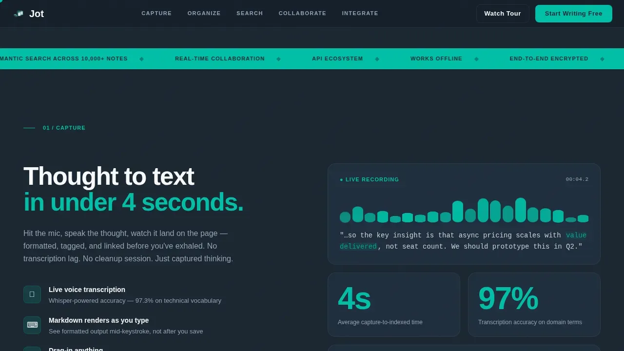
- Five spoke sections, Capture, Organize, Search, Collaborate, and Integrate, each with its own visual layout and conversion narrative, plus a footer in a linear single-row pattern.
- A sticky call-to-action bar that activates after the second spoke, a primary "Start Writing Free" button, and a secondary "Watch the 90-Second Tour" video prompt in the header.
Feature list
This template ships with a tightly scoped set of features that directly support a note taking app launch. Each one is built to help you create a page that earns attention, builds trust, and drives free signups.
Hub and Spoke Anchor Navigation
The anchor navigation pins to the top of the page and highlights the active spoke as users scroll. Five labeled sections, Capture, Organize, Search, Collaborate, and Integrate, give users a clear map of the page. This structure keeps focus high and makes it easy to explore the full product story without getting lost.
Hero with Looping Micro-Animation
The hero section opens with a logo bar of integration partner logos floating above a single oversized headline. Below it, a looping animation shows a note being typed, tagged, linked, and retrieved in under four seconds. This gives every visitor an immediate, concrete sense of what the app does, even before they read a word of copy.
GSAP ScrollTrigger Reveal Animations
Each spoke section enters the page with a teal pulse transition powered by GSAP ScrollTrigger. Notes, folders, and search results animate into view as the user scrolls, creating a keynote-style momentum. This keeps the page feeling alive and interactive without requiring the user to click anything.
Sticky Call-to-Action Bar
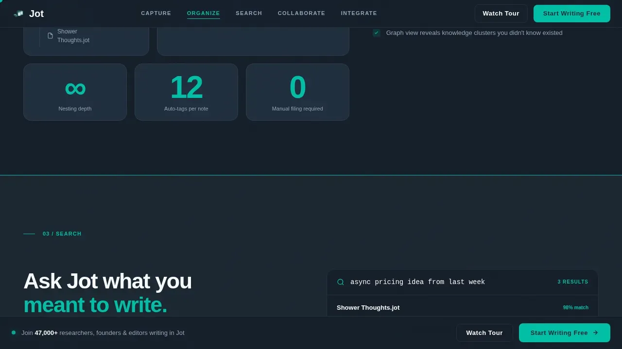
After the second spoke, a sticky bar appears at the bottom of the screen with the primary signup button. It stays visible as users continue to scroll through the remaining sections. This means the call to action is always one tap away, no matter how deep into the page a visitor goes.
Dual Call-to-Action Header
The header holds both a primary button ("Start Writing Free") and a secondary video prompt ("Watch the 90-Second Tour"). This gives visitors two clear paths forward depending on their readiness. Users who need more context can watch the video; users who are ready can sign up immediately without filling out any form fields.
Dark Mission-Control Design System
The page uses a fully defined Teal Catalyst color system, deep charcoal for the background, electric teal for active elements, soft slate for secondary text, and clean white for card surfaces. Typography is set in DM Sans for headlines and Fraunces for pull-quote accents. Every visual detail supports a premium, focused workspace feeling.
Page sections overview
| Section | Purpose |
|---|---|
| Hero with Logo Bar | Introduce the app, show the four-second demo animation, and present dual calls to action |
| Capture Spoke | Communicate raw input speed, voice-to-text demo visual, and speed metrics |
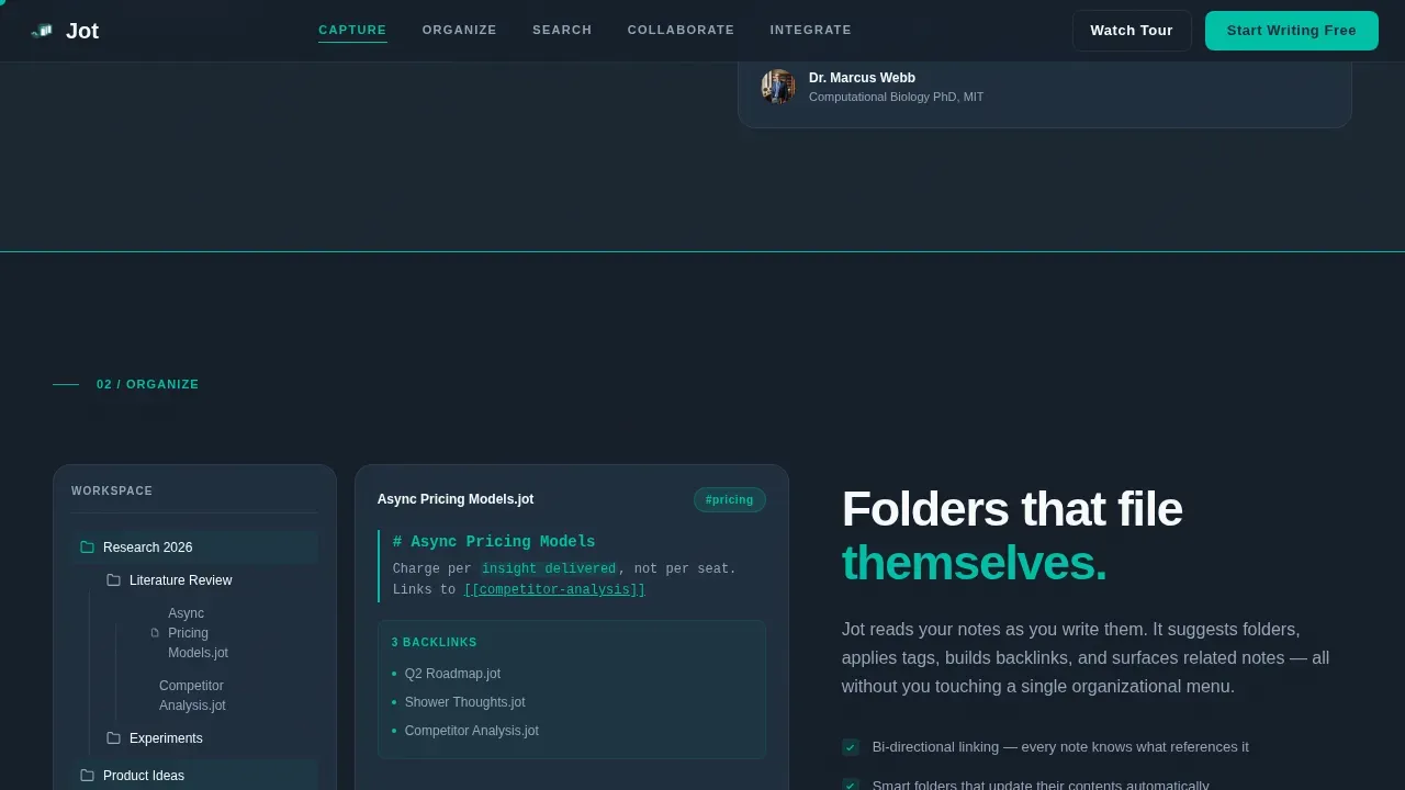
| Organize Spoke | Show nested folder structure and markdown preview panels in a bento grid layout |
| Search Spoke | Demonstrate semantic search and the "Ask Jot" interactive demo |
| Collaborate Spoke | Highlight real-time cursors, comment threads, and timezone badges for teams |
| Integrate Spoke | Display the API ecosystem grid with integration partner logos |
| Footer | Linear single-row pattern with supporting links and final call to action |
Design & branding system
The Teal Catalyst color system gives this landing page a mission-control feeling that makes every note and every call to action feel purposeful. The dark background lets content breathe. Teal accents pulse wherever something is interactive, so users always know where to look and what to do next.
- Color palette: deep charcoal (#1B2631) for the primary background, electric teal (#00BFA6) for buttons and active navigation indicators, soft slate (#94A3B8) for secondary text and dividers, and clean white (#F8FAFB) for card surfaces and note-preview panels.
- Typography: DM Sans is used for all geometric sans-serif headlines; Fraunces handles serif pull-quote accents to add warmth and editorial weight to key moments on the page.
- Animation: GSAP ScrollTrigger drives section reveals, a cursor follower adds tactile feedback, a marquee element runs in the background, and teal pulse transitions connect each spoke to the next.
Mobile & speed optimization
The template is designed desktop-first, reflecting the primary use case of PhD candidates and founders working at a computer for long sessions. It is fully responsive and scales cleanly to mobile screens. Static sections are handled with Server Components, and animations are scoped to Client Components to keep render performance manageable.
- Desktop-first layout priorities ensure that the bento grid, logo bar, and spoke sections display at full fidelity on larger screens before adapting to smaller devices.
- Responsive breakpoints carry the anchor navigation, sticky call-to-action bar, and hero animation cleanly across all screen sizes and devices.
- Server Components handle static page content; Client Components are reserved for GSAP animations and interactive elements to keep the initial page load light.
How this template helps you convert
Every design and structure decision on this landing page is aimed at moving a curious visitor toward clicking "Start Writing Free." The page earns that click by letting visitors experience the product through animation, progressive storytelling, and well-timed calls to action.
- The hero animation and logo bar create instant trust and product comprehension before the visitor reads a single feature description, reducing the cognitive load that typically causes early drop-off.
- The five-spoke anchor navigation structures the product story so each section answers the question the previous one raised, building confidence steadily and keeping users engaged through the full page.
- The sticky call-to-action bar activates after the second spoke and stays visible from that point forward, ensuring the conversion moment is never more than one click away regardless of where the visitor is on the page.
Other information about this template
This template is part of a broader ecosystem of productivity SaaS landing page designs. It is built to support founders and businesses that have seen note taking apps evolve significantly over the past few years and want a page that reflects that maturity. The design and layout make it straightforward to adapt the template to your own brand with minimal effort.
- Integration compatibility: the template visually references Notion, Google Drive, Slack, Obsidian, and Zapier in the logo bar and Integrate spoke. These are mentioned apps shown as partner logos; actual sync connections depend on your own app's backend.
- The page does not include a classic form for lead capture. Instead, all calls to action route directly to a signup flow, keeping the path from interest to account creation as short as possible.
- Notes, folders, and workspace data shown in the template are for visual demonstration. Your actual app's notes and data will populate the interface once users sign up and create new notes in your system.
- The template can support payment options pages, team onboarding flows, and follow ups as downstream pages once users complete the initial signup landing. Those pages are outside this template's scope but the design system is consistent enough to extend.
- Users can automatically create a coherent product narrative by simply filling in their own copy into each spoke section. The spoke structure is flexible enough to fit specific needs across different note taking app positioning strategies.
- Social proof areas on the page include metric placeholders for words captured, notes created, and teams using the app. These placeholders make it easy to drop in real numbers once you have them, giving customers concrete reasons to trust the product.
- The page is localized for English-language audiences with USD pricing references and US date format conventions. It is not pre-configured for other locales.
- The Jot smart workspace note taking app landing page template is listed in the Technology category under Micro-SaaS and Developer Tools, making it easy to find alongside other productivity app landing page designs in the marketplace.
Theme
Dashboard Pro
Creative direction
Launch Energy
Color system
Teal Catalyst
Direction
Click-Through
Page Sections
Hub and Spoke Anchor Navigation
Hero Micro-animation and Logo Bar
GSAP Scrolltrigger Spoke Reveals
Sticky Call-to-action Conversion Bar
Dual-path Header Call to Action
Teal Catalyst Dark Design System
Related questions
Can I use this template for a different type of productivity app?
Does this landing page include form fields for lead capture?
Are the integration partner logos in the header functional links?
Can I customize the color system and typography?
Is the hero micro-animation editable?



