Healthcare Software & SaaS Advanced Cost Calculator Website Template
Pulse is a high-intensity healthcare training landing page built for simulation-based learning platforms. It features a live-style dashboard header, an interactive Competency Gap Estimator, and side-by-side comparison data grids. The Acid Digital color system keeps every visual signal purposeful. It is designed to convert healthcare professionals and institutional buyers into engaged platform users.
by Rocket studio
Quick summary
Pulse is a single-page landing page template built for healthcare training platforms. It opens with an animated dashboard preview that mirrors a live simulation session. An embedded Competency Gap Estimator gives visitors personalized skill-gap data before any marketing copy appears. Comparison data grids then carry the page to a confident, evidence-led conversion close.
Who this template is for
This template is designed for teams building or marketing simulation-based clinical training platforms. It speaks directly to the audiences those platforms serve and to the buyers who approve them.
- Night-shift nurses and medical students seeking real-time competency scoring against national benchmarks
- Nurse practitioners, physician assistants, and medical residents preparing for recertification or licensing exams
- Hospital learning and development directors who need compliance dashboards that satisfy regulatory auditors
What problem this template solves
Generic healthcare training pages fail because they lead with marketing copy instead of proof. Visitors leave before they feel the platform's value. Pulse flips that sequence entirely.
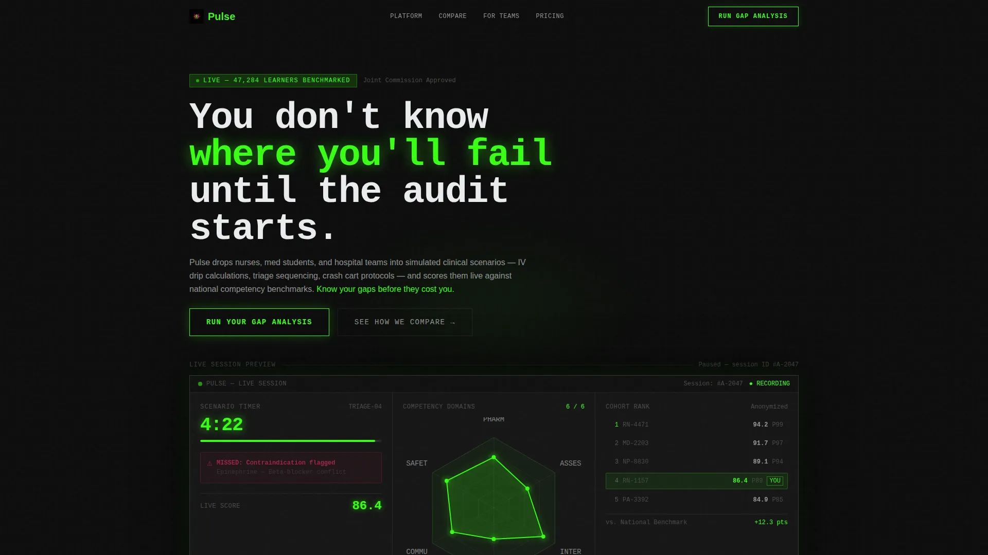
- Learners arrive and immediately see a realistic simulation already in progress, building instant credibility
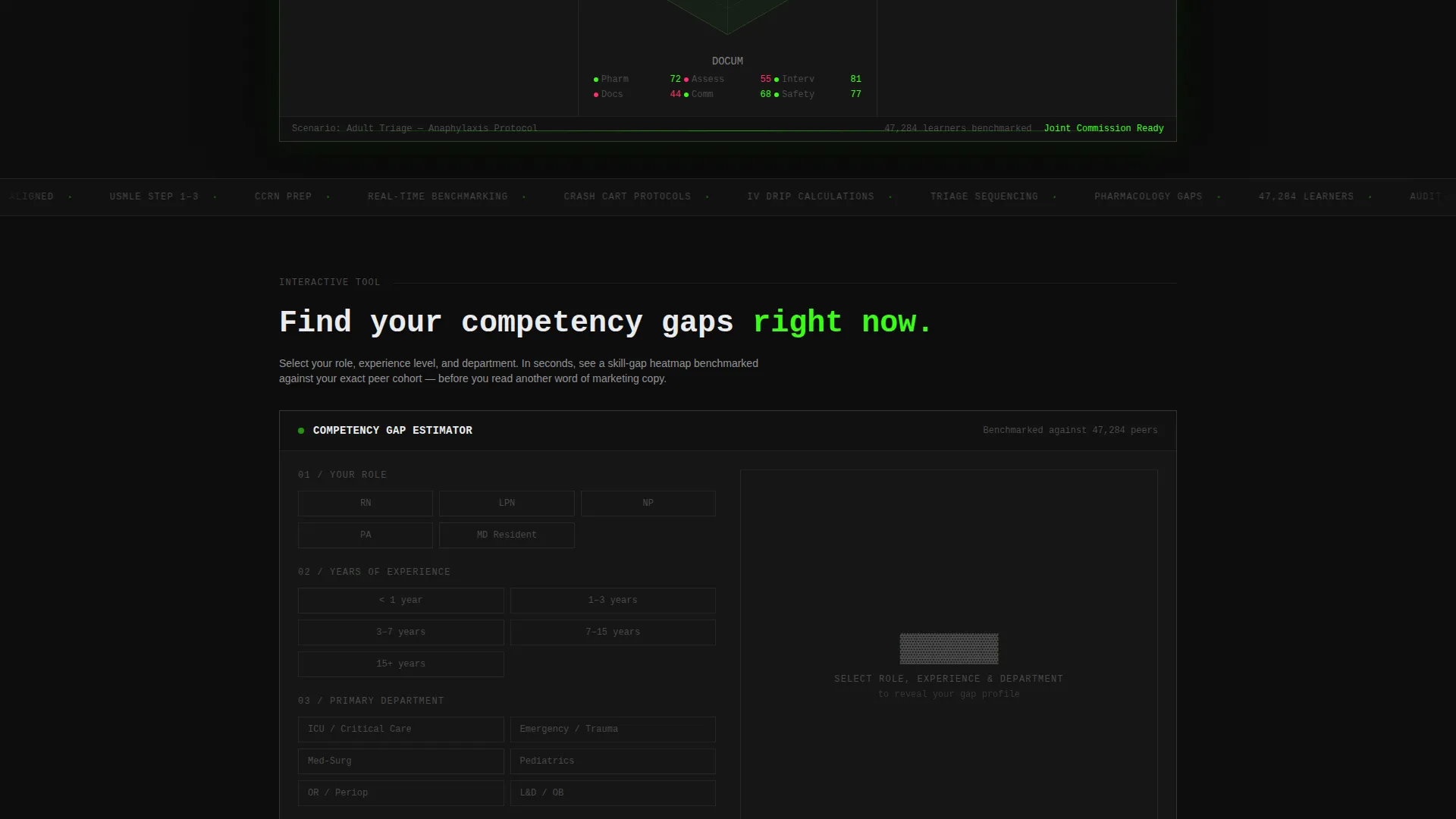
- The interactive estimator tool shows each visitor their own skill gap before asking them to sign up
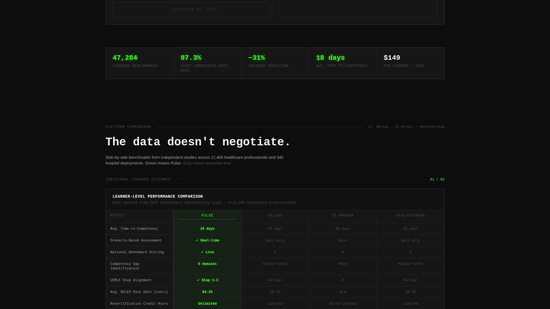
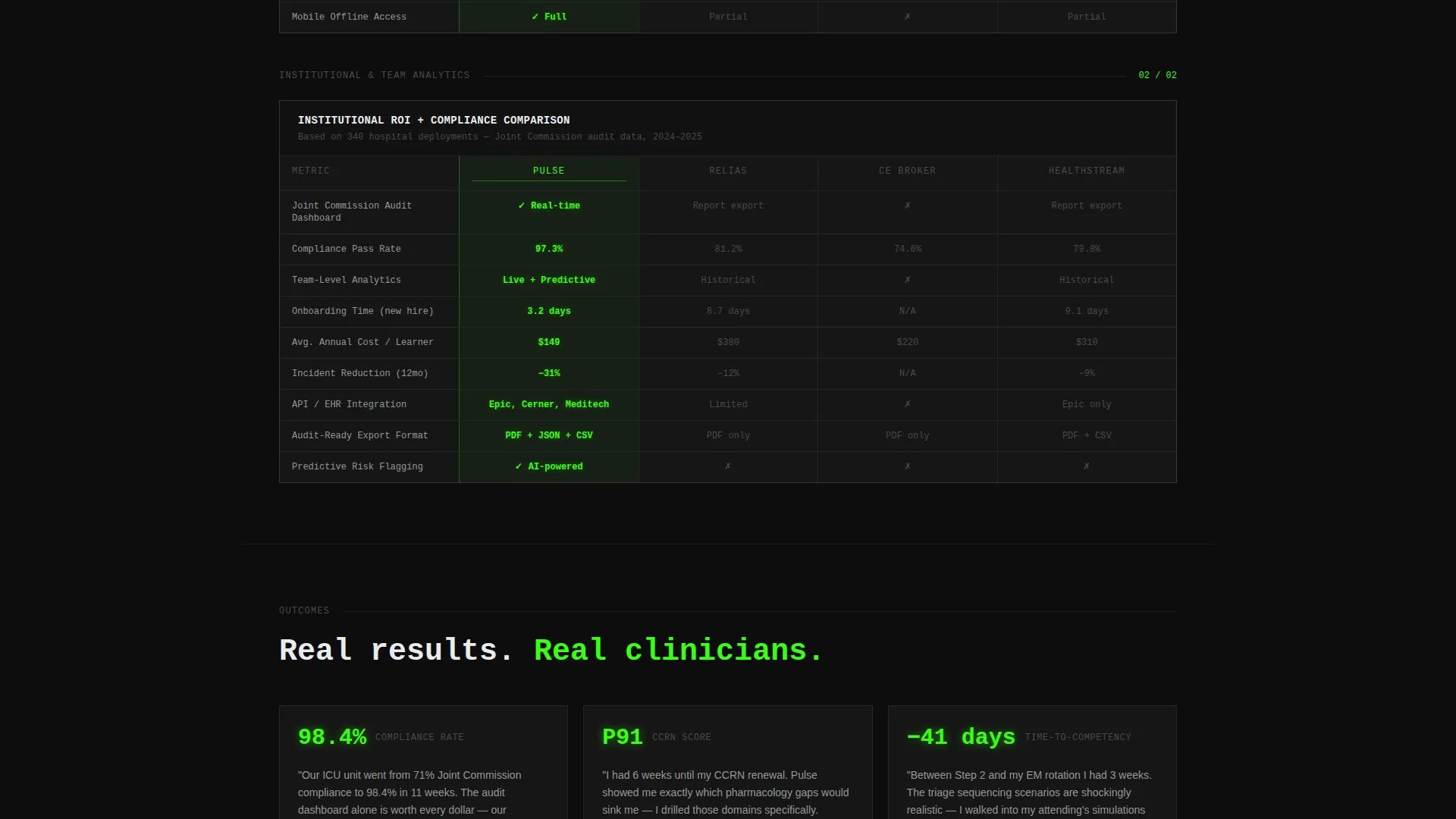
- Institutional buyers get escalating data grids that move from individual outcomes to team analytics to organizational return on investment
What you get with this template
Pulse delivers a complete, section-led landing page structure built around data visualization and comparison architecture. Every element is grounded in the training platform's core value proposition.
- An animated dashboard header showing a live triage timer, competency radar chart, leaderboard, and alert notification
- An embedded Competency Gap Estimator with role, experience, and department inputs that renders a personalized skill-gap heatmap
- A sticky "Run Your Gap Analysis" call-to-action bar, a two-field conversion modal, and a secondary comparison path for feature-by-feature evaluation
Feature list
This template includes purpose-built components that work together to engage, educate, and convert healthcare platform visitors.
Animated Dashboard Header
The header simulates a live training session mid-progress. A countdown timer pulses from 4:32, a competency radar chart ticks forward across six clinical domains, an anonymized leaderboard shows percentile rankings, and a blinking alert reads "Missed: Contraindication flagged." Subtle CSS animations keep the whole panel feeling alive without being distracting.
Interactive Competency Gap Estimator
Visitors select their clinical role, years of experience, and primary department. The tool instantly renders a projected skill-gap heatmap compared against their peer cohort. This interaction happens before any persuasion copy, so the visitor already has a personal reason to continue reading.
Comparison Data Grid Architecture
Side-by-side grids compare platform learner outcomes against traditional continuing education completion rates, time-to-competency benchmarks, and audit pass rates. Pulse metrics glow in terminal green. Legacy or competitor metrics sit in muted gray. The grids escalate in density from individual outcomes to team-level analytics to institutional return on investment.
Dual-Path Conversion System
The primary call-to-action, "Run Your Gap Analysis," appears twice: anchored below the estimator tool and in a sticky bar that activates after 40 percent scroll depth. Clicking opens a lightweight modal asking for a work email and either a National Provider Identifier number or institution name. A secondary path links to a detailed feature comparison grid.
Acid Digital Color System
The four-color palette is not decorative. Void black dominates backgrounds. Terminal green marks active states, progress bars, and live score tickers. Defibrillator magenta fires only on alerts, gaps, and competitive differentiators. Clinical white handles data labels and body text with surgical precision.
Compliance and Audit-Focused Dashboard Section
A dedicated section presents compliance dashboard visuals designed for learning and development directors. The layout communicates audit-readiness and benchmark alignment, addressing the institutional buyer's need to satisfy regulatory review without lengthy explanations.
Page sections overview
| Section | Purpose |
|---|---|
| Animated Header Dashboard | Opens with a simulated live session to establish platform credibility immediately |
| Competency Gap Estimator | Delivers personalized skill-gap data before marketing copy appears |
| Individual Outcomes Grid | Compares learner results against traditional continuing education benchmarks |
| Team Analytics Grid | Scales the comparison to department and team-level performance data |
| Institutional ROI Grid | Presents organizational return on investment and audit pass rate comparisons |
| Sticky call to action Bar | Keeps the primary conversion action visible after 40 percent scroll depth |
| Two-Field Modal | Captures work email and institution or provider identifier to generate a benchmarking report |
| Secondary Comparison Path | Links to a feature-by-feature evaluation grid for deeper due diligence |
Design & branding system
The visual identity is built on a Startup Velocity energy channeled through the Acid Digital color system. Every color in the palette carries a specific functional meaning, not a decorative role.
- Void black (#0D0D0D) covers all backgrounds, creating a darkened-screen feel that makes glowing data pop
- Terminal green (#39FF14) pulses through progress bars, active states, and real-time score tickers to signal momentum
- Defibrillator magenta (#FF2D6B) appears only on alerts, skill gaps, and competitive differentiators, keeping its impact sharp
Mobile & speed optimization
The layout is structured to remain readable and functional across device sizes. Data grids and the estimator tool are built to reflow cleanly on smaller screens.
- The animated header components scale without breaking the simulation preview illusion
- The sticky call-to-action bar repositions naturally on mobile viewports so the conversion path stays accessible
- Data grid columns condense on narrow screens to preserve readability without removing key comparison data
How this template helps you convert
Pulse is built around a specific conversion logic: earn the click before asking for it. Every structural decision supports that sequence.
- The Competency Gap Estimator gives visitors a personalized data output, creating a felt need before any sign-up request appears
- The escalating comparison grids build cumulative proof across three audience levels, moving institutional skeptics from curiosity to confidence
- The dual-placement call-to-action system, combined with a low-friction two-field modal, removes the last barrier between interest and action
Other information about this template
Pulse is designed specifically for healthcare software and SaaS products operating in the clinical training and continuing education space. The template style is a Dashboard and Data Grid layout, which suits platforms that need to demonstrate analytical depth and real-time scoring as core differentiators.
- The template supports comparison positioning against established continuing education platforms in the healthcare training market
- The versus architecture is well-suited for platforms that want to highlight superiority in time-to-competency and audit compliance outcomes
- The Calculator and Tool First creative direction is intentional: it prioritizes visitor value delivery over promotional messaging, which aligns with how skeptical clinical professionals evaluate new tools
Theme
Startup Velocity
Creative direction
Calculator/Tool First
Color system
Acid Digital
Style
Dashboard/Data Grid
Direction
Comparison/Versus
Page Sections
Animated Live Dashboard Header
Interactive Competency Gap Estimator
Escalating Comparison Data Grids
Dual-placement Call-to-action System
Acid Digital Four-color Palette
Compliance Dashboard Section
Related questions
Who is this landing page template designed for?
What makes the header different from a standard screenshot?
How does the Competency Gap Estimator work in this template?
Can this template support an institutional sales pitch?
What does the conversion modal collect?



