Careatlas - Powerful Seniorcare Landing Page Template
Careatlas is a hub-and-spoke senior care directory landing page built on a Dashboard Pro theme with a Carbon Fiber color system. It opens with a Feature Tab Switcher that lets visitors compare facilities, estimate monthly costs, and check bed availability before scrolling anywhere. Every section is a focused decision tool, not a sales pitch.
by Rocket studio
Quick summary
Careatlas is a single-page senior care directory landing page designed for people making high-stakes placement decisions fast. It leads with a three-tab interactive header, routes visitors through dedicated spoke sections for cost, proximity, and ratings, and closes with a sticky comparison bar. The data does the persuasion; the design stays out of the way.
Who this template is for
This template is built for people who need reliable, structured information about senior care options quickly. It suits anyone running or building a senior care directory and listing site where trust and clarity matter more than visual flair.
- Adult children researching assisted living, memory care units, or in-home aide services for a parent after a hospital discharge
- Geriatric care managers and eldercare attorneys who need to compare multiple facilities under deadline
- Directory operators and digital publishers building a senior care listing site that earns user trust through data, not decoration
What problem this template solves
Finding senior care information online is fragmented and emotionally exhausting. Most sites bury key numbers behind contact forms or require a phone call before showing a single cost figure. This template changes that.
- Visitors land on a page that already shows them two real-looking facilities side by side, so they immediately understand what the tool does
- Key decision filters like cost, Medicaid acceptance, bed availability, and resident-to-staff ratio are surfaced upfront, not hidden in fine print
- The anchor navigation keeps every decision axis one click away, so no one loses their place during a stressful research session
What you get with this template
You get a fully structured, anchor-navigated landing page organized around five distinct spoke sections, each focused on a single decision variable. The layout is built to feel like a well-organized research binder, not a marketing brochure.
- A Feature Tab Switcher header with three interactive tabs: Compare Facilities, Estimate Monthly Cost, and Check Availability
- Four dedicated spoke sections covering cost breakdown, proximity mapping, ratings, and facility comparison, each styled as its own instrument panel
- A sticky bottom comparison bar and a multi-step cost report form that earns the email address only after the visitor has already used the tools
Feature list
This template includes purpose-built components aligned to how real users search for senior care options.
Three-Tab Interactive Header
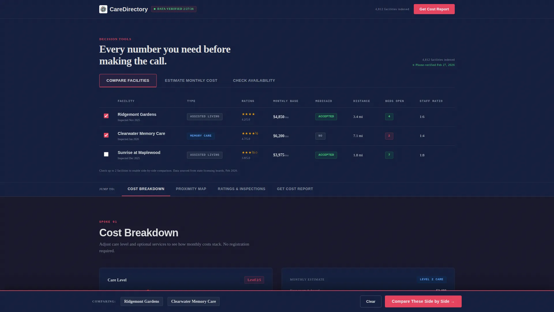
The header opens with three clickable tabs that swap panel content without a page reload. The default Compare Facilities tab pre-loads a side-by-side table with two realistic facilities showing names, star ratings, monthly base cost, Medicaid status, and distance in miles. Visitors see the tool working before they type anything.
Interactive Cost Breakdown Calculator
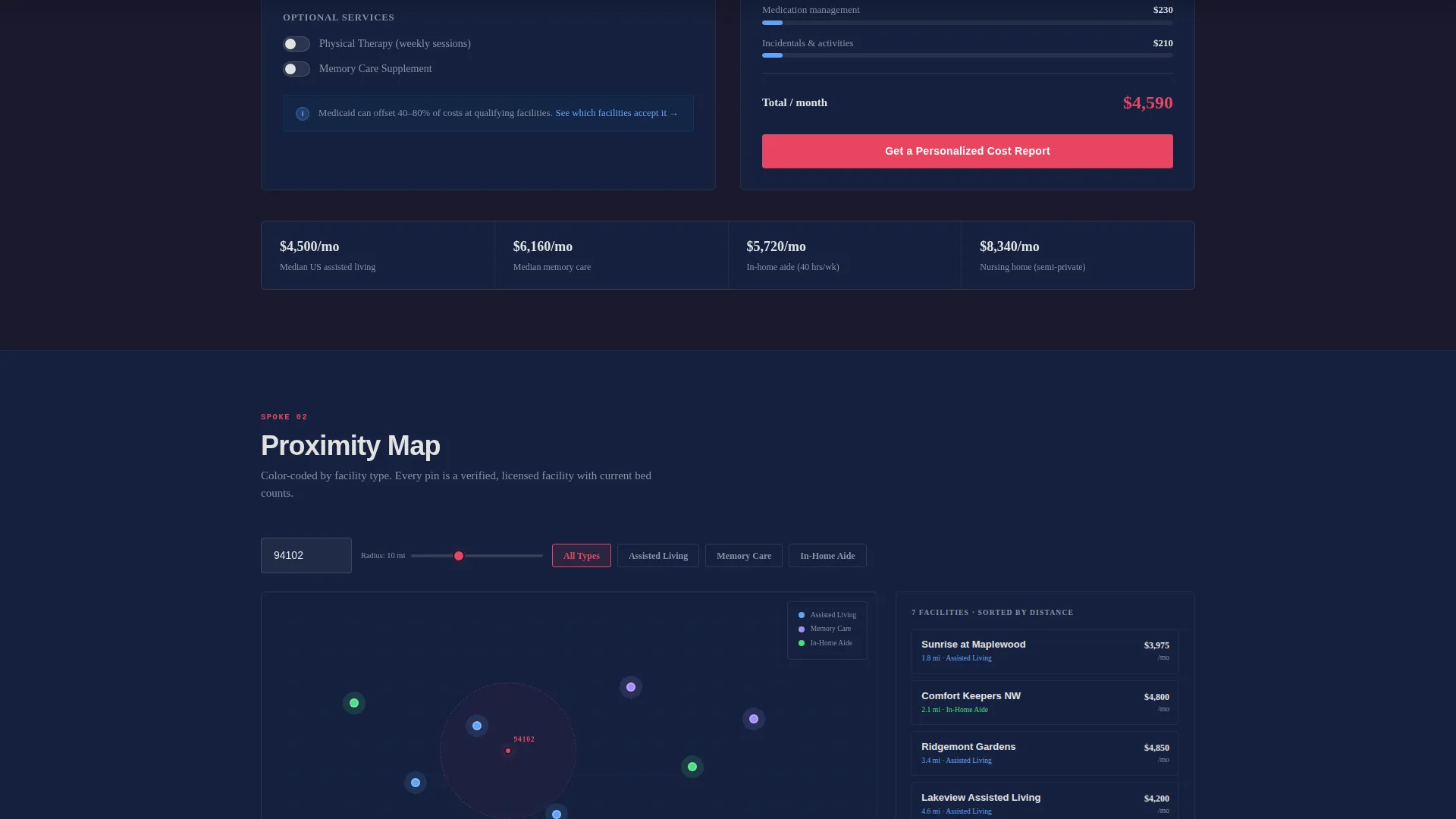
The Cost Breakdown spoke runs a monthly-expense calculator that factors in base rent, care level surcharges, medication management fees, and incidentals. Users can adjust inputs and see a running total, making the cost conversation concrete before any sales contact happens.
Zip-Code Proximity Map
The Proximity spoke loads a map view driven by zip code input. Facility pins are color-coded by type, distinguishing assisted living, memory care, and in-home aide services at a glance. This gives users an immediate geographic sense of what is actually nearby.
Verified Ratings and Inspection Scores
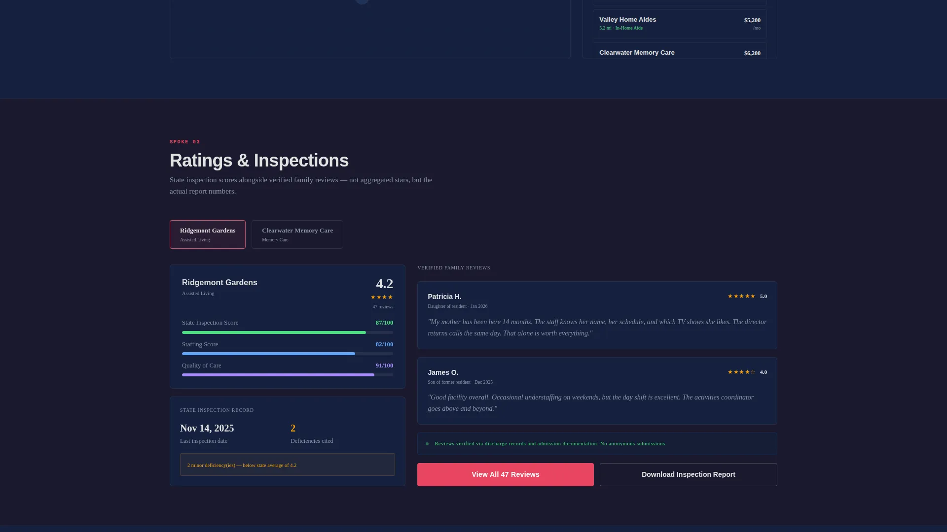
The Ratings spoke presents verified family reviews alongside state inspection scores in a stacked layout. Placing both data sources side by side lets users make a more informed judgment than star ratings alone would allow.
Sticky Comparison Bar
Once a visitor selects any two facilities, a sticky bottom bar appears with the primary call to action: Compare These Side by Side. The bar stays visible as the user scrolls, removing friction from the most important conversion action on the page.
Multi-Step Cost Report Form
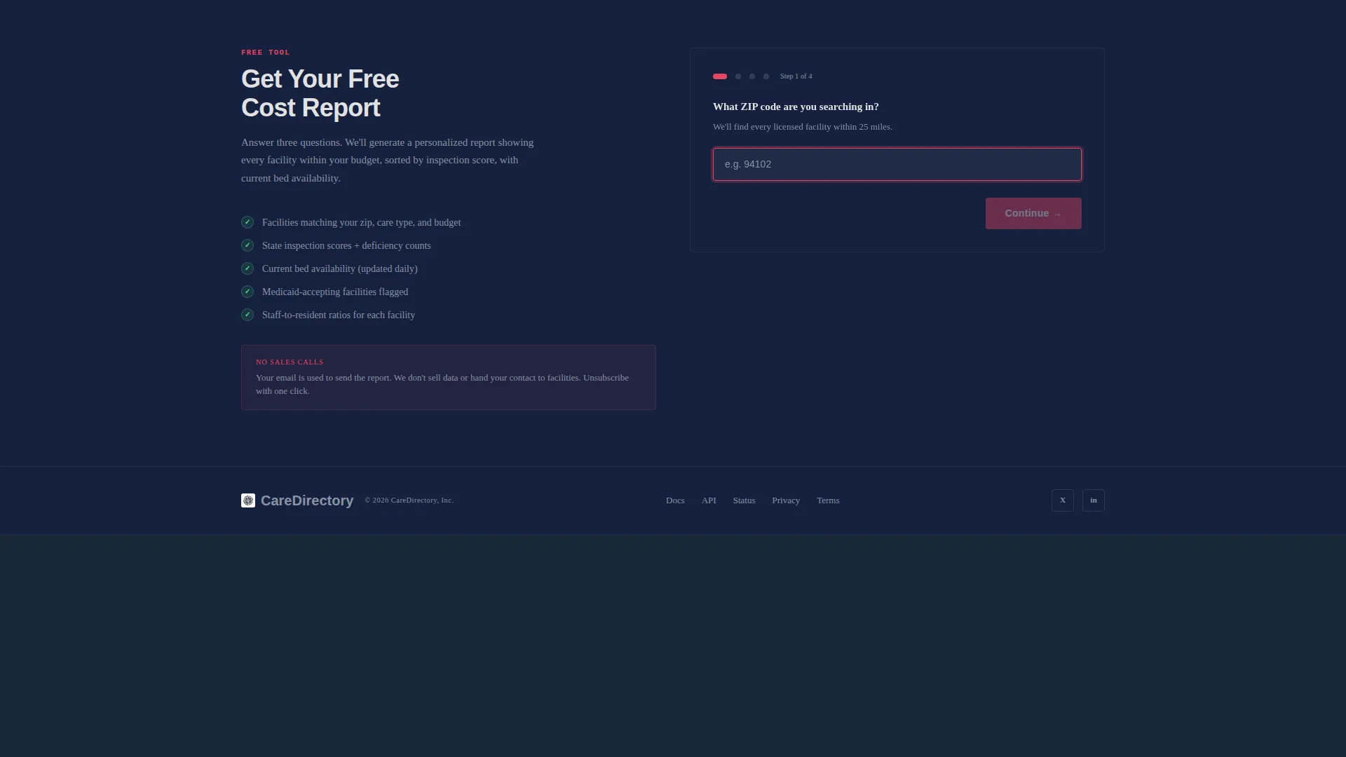
The secondary conversion path asks for zip code first, care type second, budget range third, and email address last. This sequencing builds commitment gradually and delivers value through the form flow itself, so the request for contact details feels earned rather than premature.
Page sections overview
| Section | Purpose |
|---|---|
| Feature Tab Switcher Header | Opens the page with three interactive tabs and a live comparison panel |
| Anchor Navigation Bar | Keeps all five spoke sections one click away at any scroll depth |
| Cost Breakdown Spoke | Runs an interactive monthly cost calculator with adjustable line items |
| Proximity Map Spoke | Shows color-coded facility pins filtered by zip code and facility type |
| Ratings Spoke | Stacks family reviews beside state inspection scores for each facility |
| Sticky Comparison Bar | Triggers when two facilities are selected and surfaces the primary call to action |
| Cost Report Form | Multi-step secondary call to action that collects zip, care type, budget, then email |
Design & branding system
The visual identity follows a Dashboard Pro theme built on a Carbon Fiber color system. The palette is modeled after a mission-control console interior: high contrast, zero decoration, every color assigned a specific functional role.
- Deep cockpit black (#1A1A2E) and instrument-panel charcoal (#16213E) form the background layer, while status-light teal (#0F3460) structures panel borders and data groupings
- Alert white (#E2E2E2) handles all typography and numerical data points so figures read cleanly against dark backgrounds
- Action-orange (#E94560) is reserved exclusively for call-to-action buttons and comparison badges, keeping visual priority unambiguous
Mobile & speed optimization
The anchor navigation and tab-switching header are structured to work cleanly at smaller viewport widths. Every spoke section is self-contained, which makes the layout adaptable without restructuring the information hierarchy.
- The sticky comparison bar is designed to remain functional and visible on mobile screens without overlapping key content
- Each spoke section loads as a focused panel, keeping the page organized even when vertical scrolling replaces side-by-side layouts on narrow screens
How this template helps you convert
This template earns conversions by doing real work for the visitor first. The persuasion model is utility, not urgency.
- The pre-loaded comparison table gives visitors an immediate, tangible result the moment they arrive, building confidence that the tool is actually useful before any interaction is required
- The multi-step cost report form delays the email request until after the visitor has used at least three tools, so the form feels like a natural next step rather than an interruption
- The sticky comparison bar surfaces the primary call to action at exactly the right moment: after the visitor has already selected two facilities and is clearly ready to go deeper
Other information about this template
This template is part of the Careatlas product line and is built specifically for the senior care directory and listing site niche under the broader Technology and Senior Care Digital Presence category.
- The template style is Hub and Spoke with Anchor Navigation, meaning each section operates as an independent panel while the nav ties the full experience together
- The creative direction is Calculator and Tool First, prioritizing functional components over persuasive copy throughout the entire page
- The conversion direction is Comparison and Versus, with the entire page architecture supporting side-by-side facility evaluation as the primary user goal
- The theme is Dashboard Pro using the Carbon Fiber color system, which distinguishes this template visually from warmer or image-heavy senior care designs
Theme
Dashboard Pro
Creative direction
Calculator/Tool First
Color system
Carbon Fiber
Style
Hub & Spoke (Anchor Nav)
Direction
Comparison/Versus
Page Sections
Three-tab Interactive Header Panel
Interactive Monthly Cost Calculator
Zip-code Proximity Map
Ratings and Inspection Score Stack
Sticky Facility Comparison Bar
Multi-step Cost Report Form
Related questions
Who is this landing page template designed for?
Does the template include the comparison table and calculator as pre-built components?
Can I customize the facility filters shown in the template?
What makes this template different from a standard healthcare directory layout?
How does the multi-step cost report form work?



