Carehub - Powerful Seniorcare Landing Page Template
Carehub is a senior care customer portal landing page built for adult children, care coordinators, and facility administrators. It presents a single real-time dashboard covering medication tracking, vitals monitoring, aide scheduling, and billing management. The hub-and-spoke layout with anchor navigation guides visitors from first impression to form submission in one confident, scroll-driven flow.
by Rocket studio
Quick summary
Carehub is a bold, dark-themed senior care portal landing page. It uses a hub-and-spoke anchor navigation structure to walk visitors through every core capability of a real-time caregiving dashboard. The page is designed to generate leads through a focused three-field intake form and a modal video demo path.
Who this template is for
This template is built for teams and individuals who need to communicate a complex caregiving platform in a single, high-conviction page. It fits people who already have a product and need a landing page that earns trust fast.
- Adult children in their forties managing a parent's care remotely while balancing full-time careers
- Care facility administrators coordinating residents, shifts, and billing across multiple teams
- Geriatric case managers and professional care coordinators presenting a digital-first workflow to clients and families
What problem this template solves
Caregiving information is scattered. Medication logs live on paper. Billing statements arrive by mail. Aide schedules sit in someone's text thread. This template solves the communication problem between a capable portal product and the exhausted people who need it most.
- Visitors arrive overwhelmed and skeptical; the page replaces that skepticism with recognition by showing real interface screenshots at every scroll depth
- Traditional SaaS landing pages bury the product behind abstract benefit statements; this template leads with actual product frames so visitors feel like they have already used it
- Care coordinators and family members need different entry points; the template serves both through a single scroll path with a conversion form that adapts by role
What you get with this template
You get a complete single-page layout built around a hub-and-spoke anchor navigation system. Every section is a spoke that reveals a specific capability, building momentum toward the lead capture form at the bottom.
- A sticky anchor navigation rail on the left that keeps orientation clear at every scroll depth
- Four spoke sections covering profile setup, medication and vitals tracking, anomaly alerts, and family sharing with messaging
- A primary lead capture form and a secondary ghost-button demo path that opens a sixty-second looping video modal
Feature list
This template is built around a precise set of functional components drawn directly from the caregiving portal use case.
Hub and Spoke Anchor Navigation
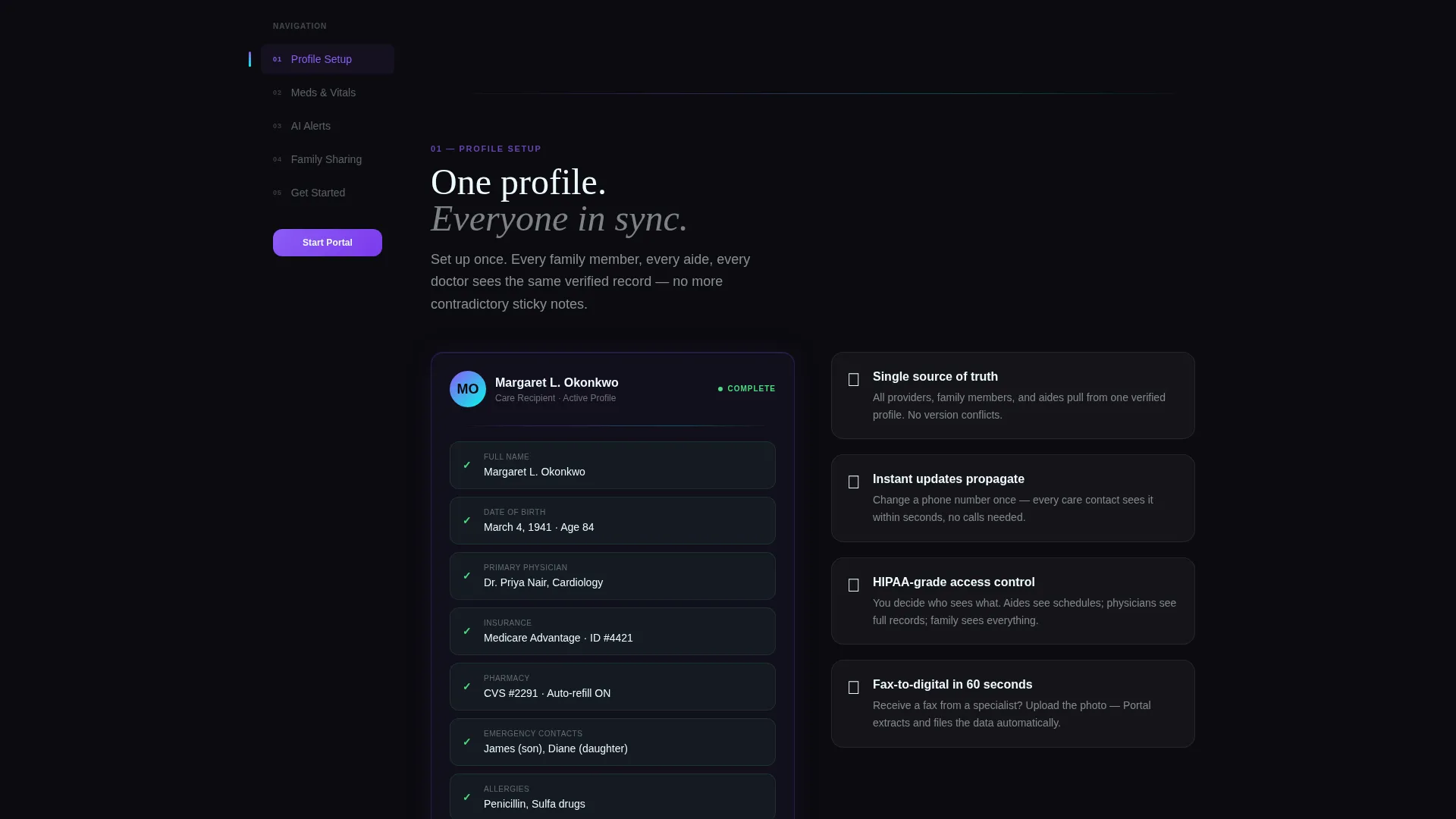
A sticky left-rail navigation connects the header to each spoke section below. Visitors can jump directly to any capability or scroll through the full reveal in sequence. The nav highlights the active section as the page scrolls.
Dark Glass Panel Header
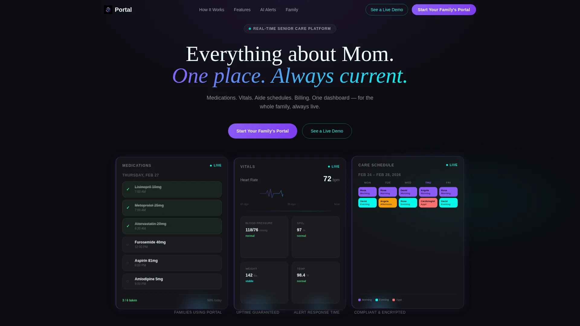
Three translucent frosted cards sit over a deep-black viewport in the header. Each panel shows a different live portal view: a medication schedule, a vitals heart-rate display, and a color-coded aide shift calendar. A self-typing headline appears between them.
Spoke Section Micro-Animations
Each spoke section opens with a micro-animation that physically transforms an analog caregiving object into its digital equivalent. A pill bottle dissolves into a digital checklist. A paper invoice folds into a payment confirmation badge. The animations reinforce the core promise without words.
Real Interface Screenshot Frames
Every spoke section includes pixel-accurate product frames rather than illustrations or stock photography. By the time visitors reach the form, they have already seen the actual interface and are primed to trust it.
Lead Generation Intake Form
The primary conversion element is a three-field intake form: relationship to the care recipient via dropdown, number of people receiving care, and email address. The secondary path is a ghost-button that opens a sixty-second looping video demo ending with the form pre-focused on the email field.
Escalating Visual Rhythm
The page is paced intentionally. The first spoke is calm and introductory. Each subsequent spoke increases data density, accent color saturation, and interface complexity. By the final spoke, the visitor has watched a disorganized caregiving life reassemble itself into something clear and manageable.
Page sections overview
| Section | Purpose |
|---|---|
| Header with Panels | Introduce the portal with three live-view dark glass cards and a self-typing headline |
| Sticky Anchor Nav | Keep visitors oriented and drive jump navigation to each spoke section |
| Profile Setup Spoke | Open the capability reveal with a calm, approachable account configuration view |
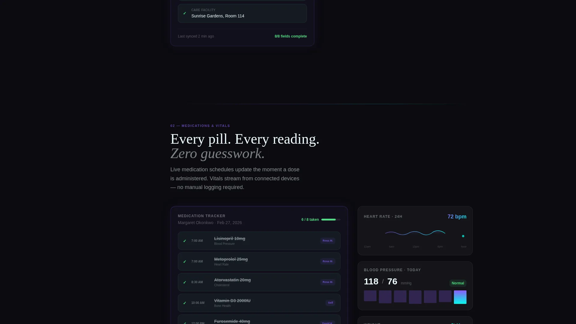
| Medication and Vitals Spoke | Show real-time medication scheduling and vitals monitoring interface frames |
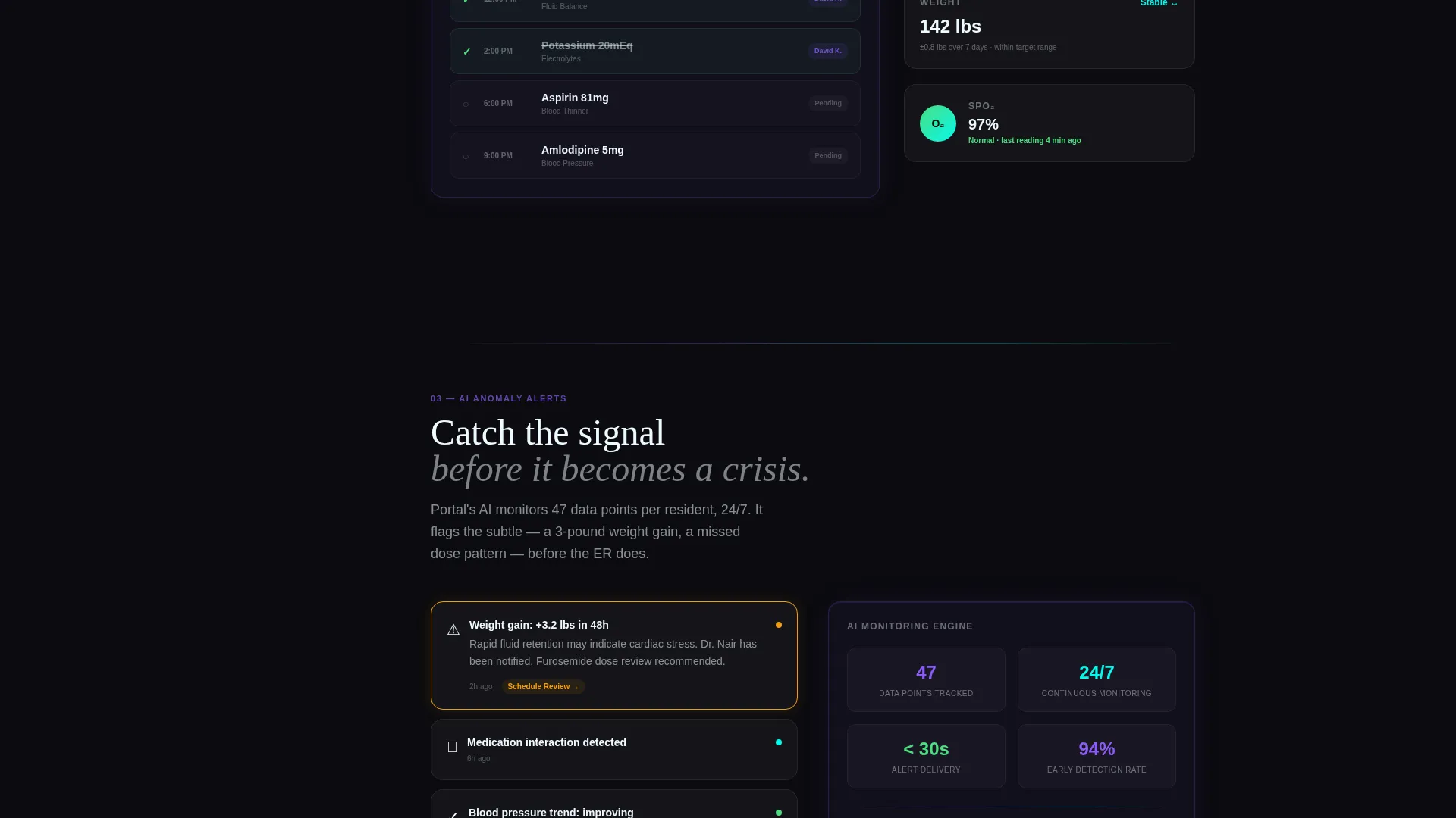
| AI Anomaly Alerts Spoke | Demonstrate intelligent alert detection as the page's most powerful capability moment |
| Family Sharing Spoke | Present shared messaging and multi-user access as the communal caregiving layer |
| Lead Capture Form | Convert intent with a three-field form and a secondary demo modal entry point |
Design & branding system
The visual identity runs on an Acid Digital color system layered over a Startup Velocity creative theme. The result feels like clinical precision made visually urgent.
- Void black (#0B0B0F) forms the full-page background; electric violet (#8B5CF6) dominates calls to action and navigation highlights; reactive cyan (#06F9EC) marks live-data indicators and hover states; phosphor white (#EDFAFF) carries body text and data labels
- Dark glass panels use translucent frosted surfaces with violet edge-lighting to suggest depth without distracting from the data they display
- The color intensity increases as the visitor scrolls deeper into the spoke sections, using accent density as a visual cue that the product is becoming more capable
Mobile & speed optimization
The template is structured to remain navigable and readable on smaller viewports. The left-rail anchor navigation and dark glass panel header are the two most layout-sensitive components.
- The sticky left-rail navigation adapts to a compact format on mobile so the anchor links remain accessible without obscuring the spoke content
- Dark glass panel cards in the header stack vertically on narrower screens, preserving the three-panel concept without horizontal overflow
- Interface screenshot frames are sized proportionally so product detail remains legible at mobile breakpoints
How this template helps you convert
Every design and structural decision in this template is aimed at reducing hesitation and moving the visitor toward the intake form.
- Real product screenshots replace promises at every spoke section, so visitors arrive at the form already familiar with the interface and less likely to hesitate
- The lead capture form asks only three questions, removing friction while still collecting the relationship context and care volume data that matter most for follow-up
- The secondary demo path lets skeptical visitors watch a sixty-second modal walkthrough before committing, and it ends with the form pre-focused on the email field so the transition to conversion is seamless
Other information about this template
This template is specifically designed for senior care software and portal products looking to generate qualified leads from caregiving decision-makers.
- The template style is Hub and Spoke with Anchor Navigation, meaning each section functions as an independent capability reveal while the sticky nav ties them into a single coherent journey
- The Launch Energy creative direction produces an escalating scroll rhythm rather than a static feature list, which suits products that benefit from a demonstrated narrative
- The header concept uses Dark Glass Panels, which is a distinct visual device suited to data-forward products that want to lead with interface rather than lifestyle imagery
- The Acid Digital color system is intentionally high-contrast; teams customizing this template should maintain sufficient contrast between phosphor white text and the void black background to keep data labels readable
- This template is a strong fit for senior care software, elder care management platforms, and family caregiving coordination tools looking to move leads from awareness to demo request in a single scroll
Theme
Startup Velocity
Creative direction
Launch Energy
Color system
Acid Digital
Style
Hub & Spoke (Anchor Nav)
Direction
Lead Generation
Page Sections
Hub and Spoke Anchor Navigation
Dark Glass Panel Header
Spoke Section Micro-animations
Real Interface Screenshot Frames
Three-field Lead Capture Form
Escalating Visual Rhythm
Related questions
Who is the primary audience this landing page is built to convert?
Does this template include the actual portal software or just the landing page?
Can I customize the spoke sections to match my own product's features?
How does the demo modal work in this template?
Is this template suitable for a care facility administrator rather than a family caregiver?



