Avantgarde Bagbrand Landing Page Template
Carré is an overlap and layered landing page template built for avant-garde bag brands. It uses a Neo-Retro Ruby and Chrome visual identity, a cinematic scroll experience with stacking editorial plates, and a click-through structure designed to seduce before it sells. Every section is composed like a fashion zine spread, not a product page.
by Rocket studio
Quick summary
Carré is a single-page, overlap-layered landing page template for avant-garde bag brands. It pairs a Neo-Retro Ruby and Chrome color system with an immersive editorial scroll structure. Sections stack like collage plates. The page builds desire through imagery first, then delivers a single chrome-on-ruby call to action at precisely the right moment.
Who this template is for
This template is built for brands and creators who treat fashion accessories as a visual language. It speaks to people who already understand that a bag is not a commodity but a statement object.
- Independent avant-garde bag designers and small-batch ateliers seeking an editorial-grade online presence
- Creative directors and stylists who need a visually arresting page for wholesale or editorial inquiry
- Design-literate founders who have outgrown conventional e-commerce templates and want something that feels curated
What problem this template solves
Standard product page templates flatten editorial fashion into a grid of thumbnails. They prioritize catalog browsing over atmosphere, and they treat every visitor like a casual shopper rather than a discerning buyer. Carré is built around the opposite logic.
- Eliminates the cold, catalog feel that undercuts luxury and avant-garde positioning
- Removes friction from the buyer journey by replacing forms and menus with a single, well-timed call to action
- Gives the visual identity room to breathe so the product does the persuading before any copy appears
What you get with this template
You get a fully structured, single-page layout where every section is a deliberate editorial decision. The template includes four stacking content plates, a scroll-triggered headline reveal, a primary click-through button, and a secondary ghost button for private inquiries.
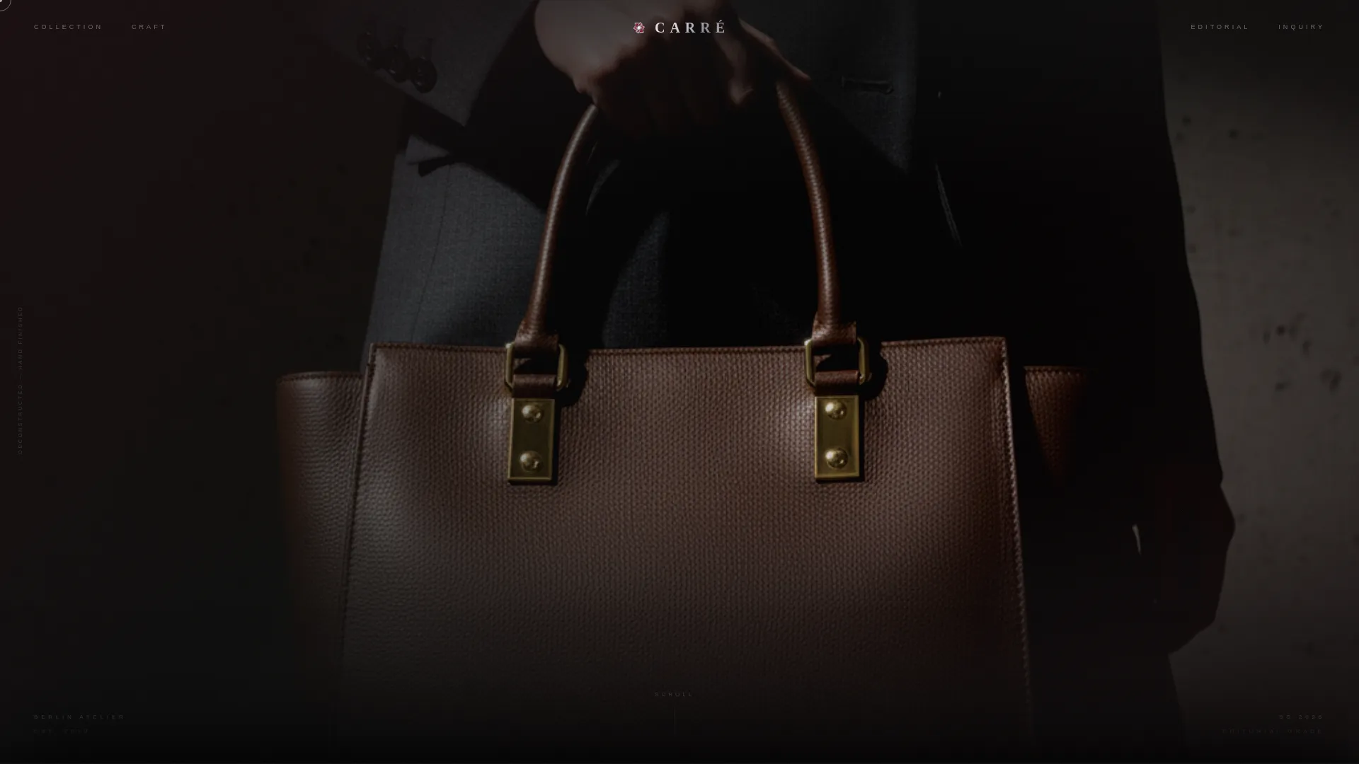
- A vertical portrait header with grain overlay, scroll-triggered brand name reveal, and hard side-lit hardware focus
- Four layered editorial plates: portrait, macro hardware close-up, auto-advancing lookbook strip, and split stylist testimonial
- Two call-to-action placements: a ruby pill button reading "Enter the Collection" and a ghost button reading "Request Private Viewing"
Feature list
This template is engineered around a specific editorial rhythm. Each feature below maps directly to a structural or visual decision described in the brief.
Scroll-Triggered Brand Name Reveal
The brand name stays hidden on page load. It slides up in chrome-weight condensed type the moment the visitor scrolls one pixel, landing over the model's shoulder. This creates a cinematic first impression that feels earned rather than announced.
Overlap and Layered Plate Structure
Each content section is a new "plate" that slides over the previous one with a slight offset. The stacking creates a collage depth effect, giving the page a physical, tactile quality that flat scroll layouts cannot replicate.
Auto-Advancing Lookbook Strip
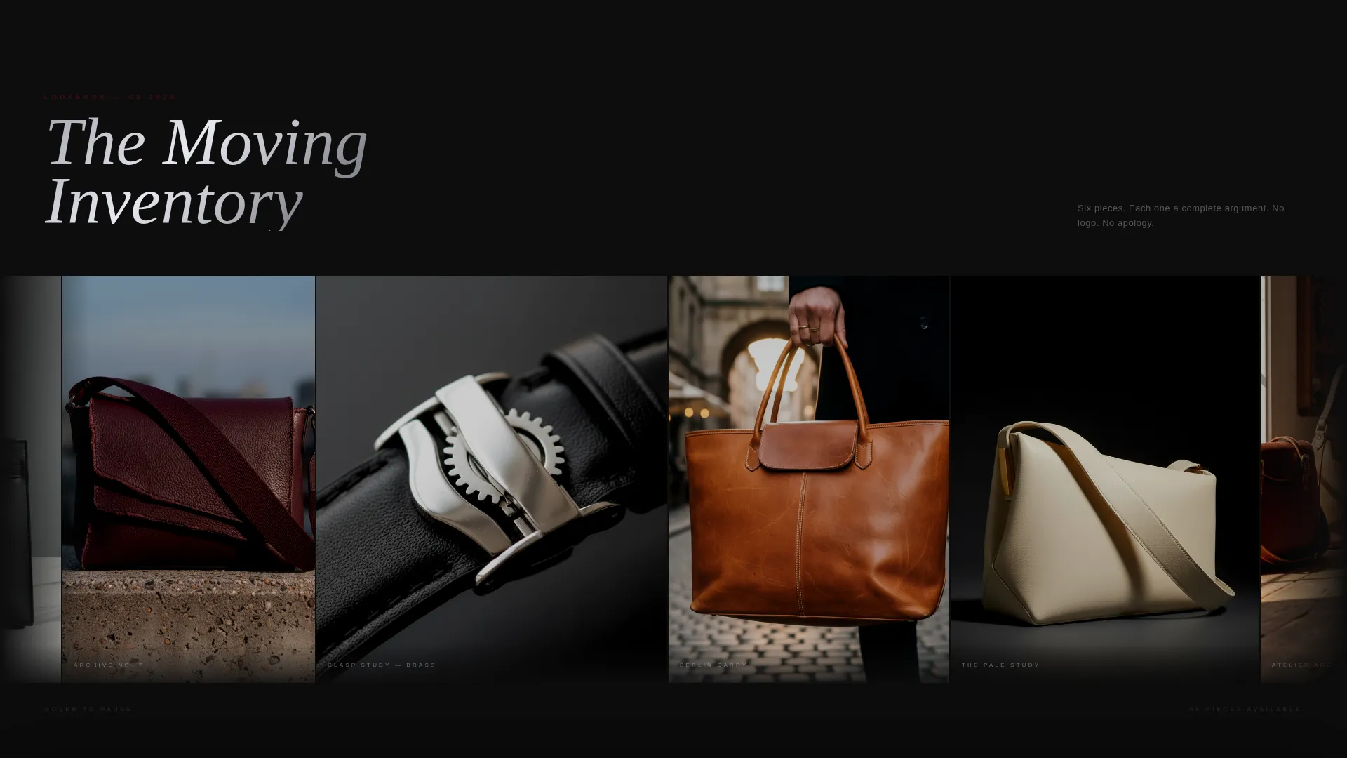
The third plate features a moving image strip that auto-advances and allows images to bleed past their containers. This keeps the visual momentum alive without requiring the visitor to interact.
Ruby and Chrome Color System
Deep gemstone red (#9B111E) floods full-bleed image washes. Liquid chrome silver (#C0C0C8) dominates type and user interface lines. Darkroom black (#0D0D0D) stacks behind every layer. Faded blush (#D4A5A5) activates on hover states and micro-interactions.
Silence-and-Whisper Editorial Rhythm
The page alternates between full-image silence and single-sentence whisper copy set with massive letter-spacing. This rhythm makes the visitor feel invited into something private rather than marketed at.
Dual Call-to-Action Architecture
A ruby pill button labeled "Enter the Collection" appears after the third plate, once desire has been built. A secondary ghost button labeled "Request Private Viewing" appears in the final plate for wholesale and editorial inquiries. No forms appear on the page.
Page sections overview
| Section | Purpose |
|---|---|
| Vertical Portrait Header | Opens the page with a navel-to-crown model shot; bag hardware is the brightest object in the frame |
| Scroll-Triggered Headline | Reveals the brand name in chrome condensed type as soon as the visitor scrolls |
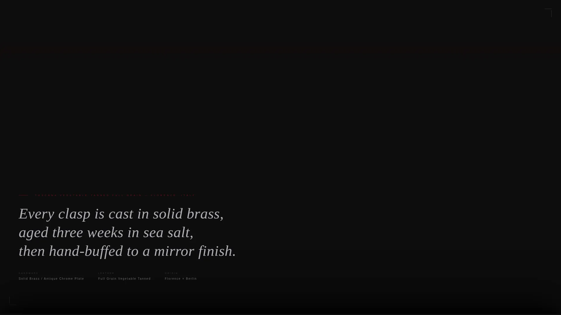
| Macro Hardware Plate | Delivers an extreme ruby-tinted close-up of the clasp with a single leather-origin copy line |
| Moving Lookbook Strip | Auto-advances editorial images that bleed past their containers to sustain visual momentum |
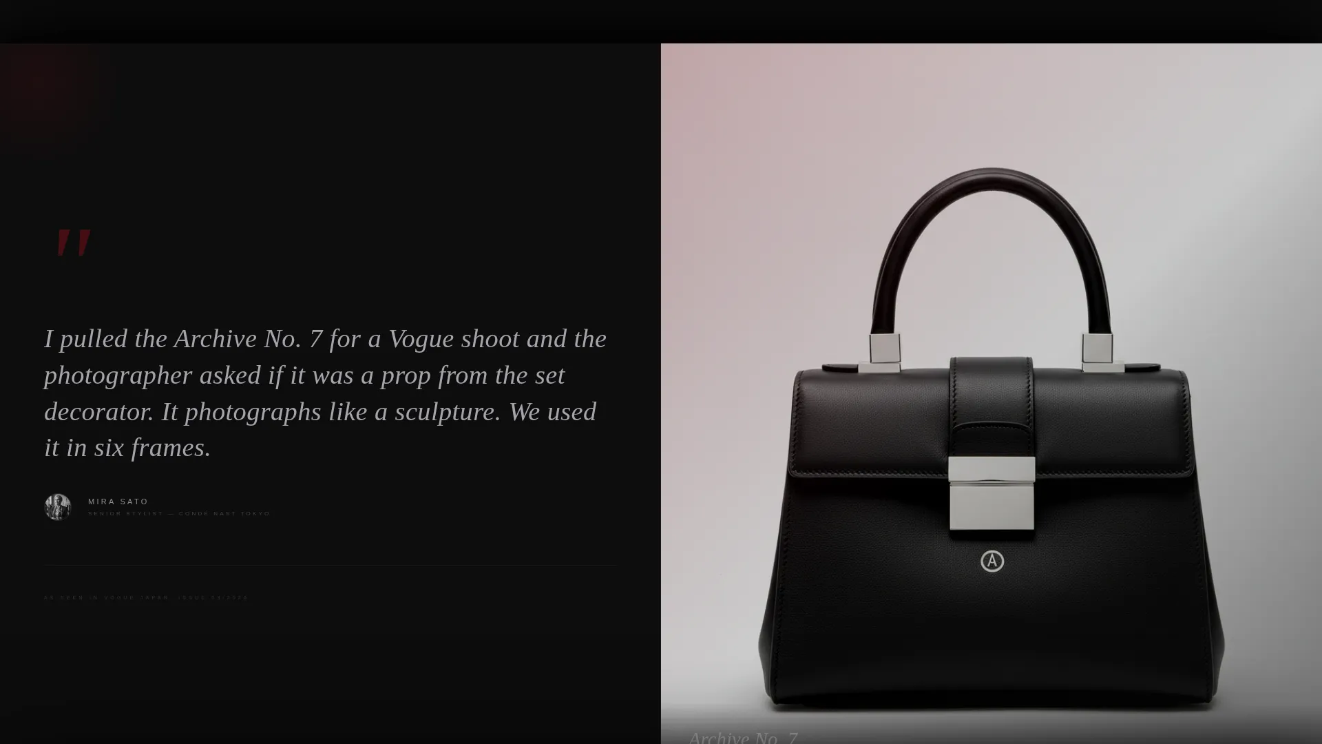
| Split Testimonial Plate | Pairs a stylist quote with an on-set bag close-up for social proof in an editorial context |
| Primary call to action Placement | Presents the "Enter the Collection" ruby pill button after three plates of image-led desire |
| Ghost Button Plate | Closes the page with the "Request Private Viewing" ghost button for trade and editorial inquiries |
Design & branding system
The visual identity is built on a Neo-Retro theme that references the reflective seductiveness of a vintage chrome bumper catching neon light. Every color choice and typographic decision reinforces a sense of danger, craft, and exclusivity.
- Ruby (#9B111E) for full-bleed image washes; chrome silver (#C0C0C8) for type and user interface lines; darkroom black (#0D0D0D) as the deep background layer; blush (#D4A5A5) reserved for hover states only
- Chrome-weight condensed type for headlines, set with generous letter-spacing to signal editorial confidence
- 400-speed film grain sits over the header image to give every photograph the texture of analog print
Mobile & speed optimization
The template is structured so its layered depth and editorial weight translate clearly at smaller screen sizes. The overlap and plate-stack logic is maintained on mobile without sacrificing the atmospheric quality of the design.
- Portrait-oriented header composition is naturally suited to mobile viewports and requires no significant layout recomposition
- Single-call to action click-through structure keeps the mobile interaction path short: one scroll, one button, one destination
- Auto-advancing lookbook strip reduces the need for tap interaction, keeping the experience passive and immersive on touch screens
How this template helps you convert
Carré converts by removing noise. The entire page is structured around a single moment of desire, followed by a single tap. There are no category menus, no price grids, and no multi-step forms competing for attention.
- The four-plate editorial sequence builds product desire through imagery alone before any purchase intent language appears, so the visitor arrives at the call to action already convinced
- The "Enter the Collection" button appears only after the third plate, placed at the psychological peak of engagement rather than at page load
- The "Request Private Viewing" ghost button serves wholesale buyers and editorial teams without cluttering the primary conversion path
Other information about this template
Carré is designed for a specific creative context. The following details are useful for buyers evaluating whether this template fits their brand and workflow.
- The template follows a click-through landing page direction: all traffic exits through one of two buttons, routing visitors to a product archive or a private inquiry channel
- The Neo-Retro theme is expressed through material references including hand-finished hardware, deconstructed silhouettes, and a color palette drawn from vintage automotive and darkroom photography aesthetics
- The target audience profile includes creative directors, fashion stylists sourcing editorial-grade pieces, and design-literate buyers who prioritize craft and identity over brand recognition
- The page is intentionally copy-light; the visual seduction strategy means most sections carry one sentence or no text at all, relying on image composition and color to communicate value
Theme
Neo-Retro
Creative direction
Immersive Visual
Color system
Ruby & Chrome
Style
Overlap/Layered
Direction
Click-Through
Page Sections
Scroll-triggered Brand Name Reveal
Overlap and Layered Plate Structure
Auto-advancing Lookbook Strip
Ruby and Chrome Color System
Silence-and-whisper Editorial Rhythm
Dual Call-to-action Architecture
Related questions
Is this template suitable for a brand with a small product range?
Can the call-to-action buttons be linked to an existing product archive or inquiry page?
Does this landing page include any forms or checkout functionality?
Who is the 'Request Private Viewing' button intended for?
How much copy does this landing page use?



