Carrier — Connectivity Landing Page Template
Signal is a modular card-grid landing page template built for telecommunications AI customer service platforms. It combines a Dashboard Pro visual theme with a Slate and Sky color system to present complex operational data with authority. The layout guides VP-level buyers from industry cost benchmarks to platform performance metrics, ending at a live savings calculator and gated benchmark report.
by Rocket studio
Quick summary
Signal is a single-page template designed for an AI platform that resolves telecom subscriber complaints before a human agent ever enters the picture. The layout follows an Industry Report cadence, moving from cost-problem cards to head-to-head performance comparisons. It closes with a real-time savings calculator and a gated PDF download that turns intent into a captured lead.
Who this template is for
This template speaks directly to operational decision-makers inside the telecommunications industry. It is built for buyers who live by handle-time dashboards and churn reports, not marketing fluff.
- VP-level operations leaders at regional carriers evaluating AI-assisted resolution tools
- Retention managers at mobile virtual network operators (MVNOs) losing postpaid subscribers to poor service experiences
- Customer experience directors at tier-one telcos who measure success through average handle time and first-call resolution rates
What problem this template solves
Telecom platforms selling AI customer service face a credibility gap. Buyers have seen vendor decks before. They need proof in the form of numbers, not promises. This template addresses that gap directly.
- It lacks a persuasive structure that moves a skeptical operations leader from awareness to a cost calculation
- Generic landing pages cannot present the scale of the cost problem clearly enough to justify a demo request
- Without a self-serve calculator, buyers leave without seeing their own projected savings, and the conversion opportunity is lost
What you get with this template
You get a fully structured modular card-grid landing page that builds the business case section by section. Every component has a defined role in the buyer journey.
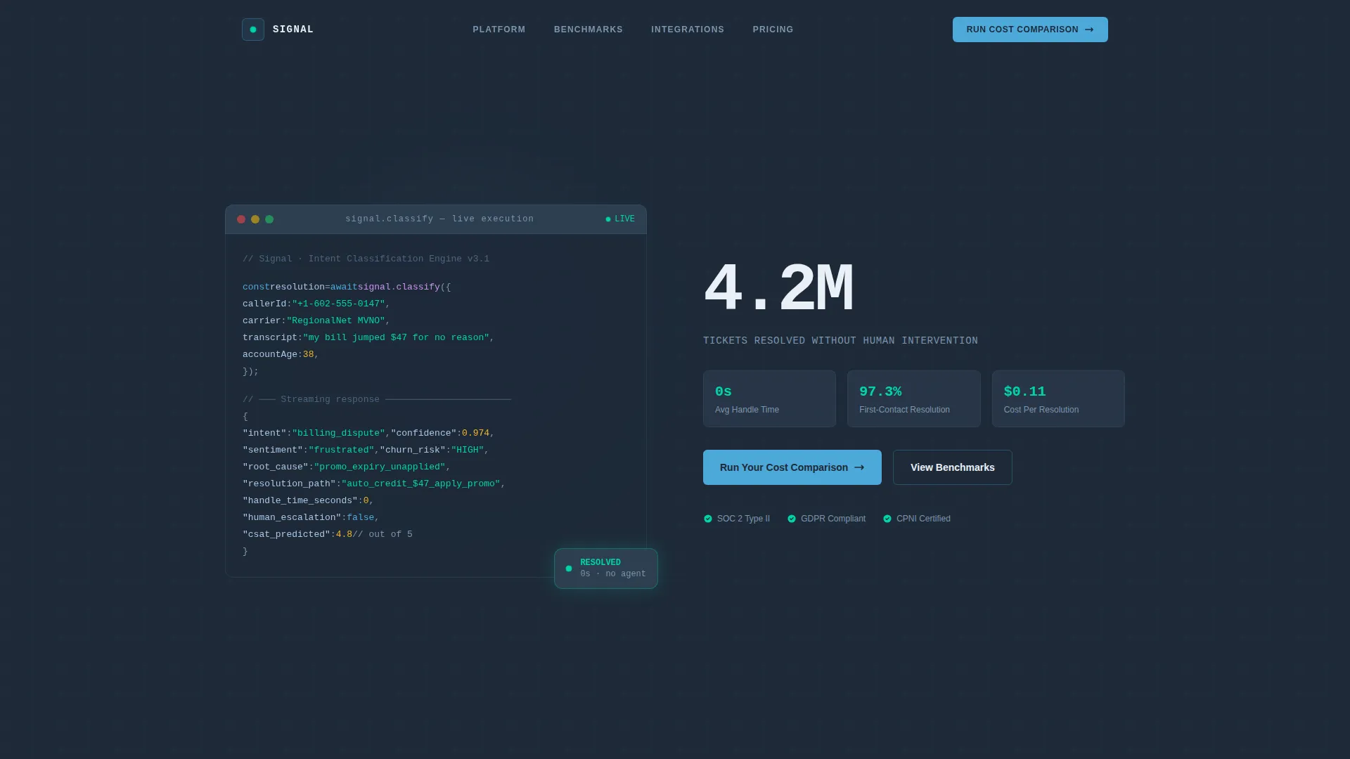
- A syntax-highlighted code snippet header showing a live billing dispute classification in progress, with intent confidence scores and a zero-second estimated handle time
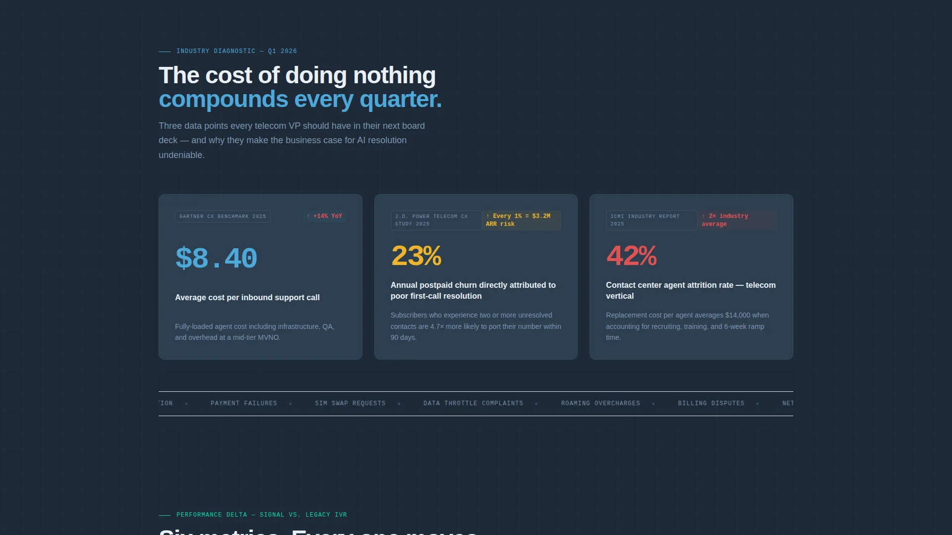
- A first row of industry-cost cards presenting average cost-per-call, annual churn attributed to poor service, and agent attrition rates as sourced data points
- A real-time savings calculator module where visitors enter monthly ticket volume, average handle time, and current cost-per-resolution to see projected savings before any form submission
- A secondary gated call to action (call to action) that collects email, company name, and subscriber base size in exchange for a downloadable benchmark report PDF
Feature list
This section highlights the core structural and functional capabilities built into the Signal template.
Syntax-Highlighted Code Snippet Header
The header opens with a realistic, mid-execution code block showing a customer intent classification call. It streams a JSON response with intent confidence scores, sentiment polarity, a recommended resolution path, and an estimated handle time of zero seconds. To the right, a single animated metric reads "4.2M tickets resolved without human intervention" in signal white.
Modular Card Grid Layout
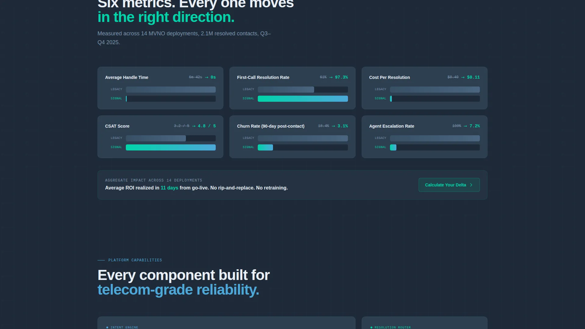
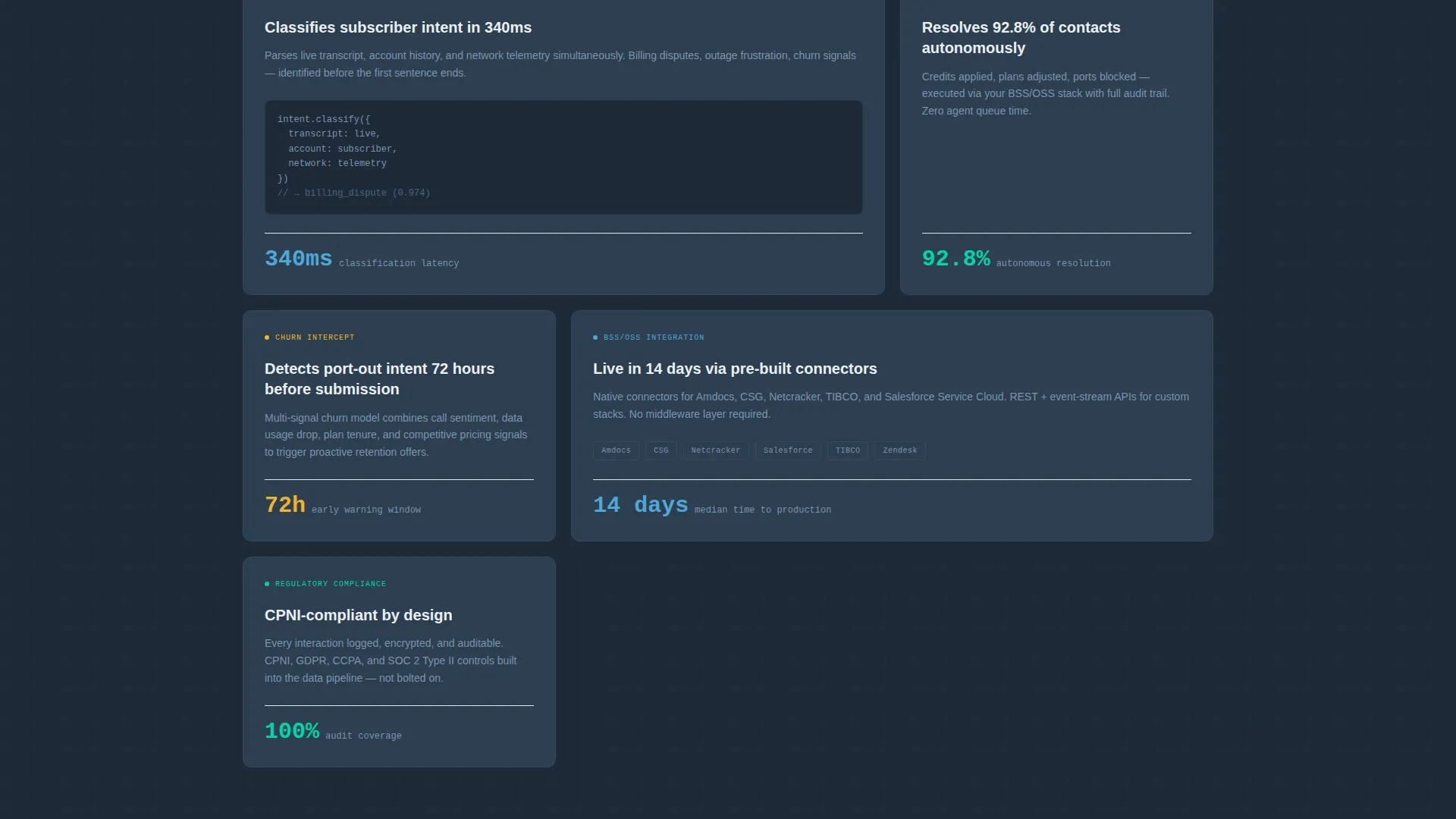
The template uses a card-grid structure where each card module functions as a self-contained data finding. Cards are arranged in rows that shift from industry pain points to platform performance comparisons, with bar charts rendering inside individual cards to collapse resolution times visually.
Comparison-Framed Content Flow
Every section implicitly positions legacy interactive voice response (IVR) systems and offshore call centers against the AI platform. Each card pairs a legacy metric with an AI-handled metric so buyers can see the gap at a glance without reading dense body copy.
Real-Time Savings Calculator
The calculator module accepts three inputs from the visitor: monthly ticket volume, average handle time, and current cost-per-resolution. It returns projected savings in real time before any form is submitted, giving buyers a personalized number that anchors the primary call to action.
Dual-call to action Conversion Architecture
The primary call to action reads "Run Your Cost Comparison" and links directly to the calculator module. Below it, a secondary call to action "Download the Full Benchmark Report" gates a PDF behind a lightweight form collecting email, company name, and subscriber base size.
Dashboard Pro Visual Theme
The entire layout uses deep operations-center charcoal, mid-slate panel gray, telco-sky blue for active states, signal white for card surfaces, and accent pulse cyan for live metrics. The palette references a network operations center (NOC) environment where every element earns its place through information density.
Page sections overview
| Section | Purpose |
|---|---|
| Code Snippet Header | Opens with a live classification call and a single animated ticket-resolution metric |
| Industry Cost Cards | Establishes the cost problem with sourced figures on call cost, churn, and attrition |
| Performance Comparison Cards | Shifts from pain to proof with legacy versus AI metric pairings and in-card bar charts |
| Savings Calculator Module | Lets visitors input their own data and see projected savings before submitting any form |
| Primary call to action Block | Anchors the "Run Your Cost Comparison" action directly above the calculator |
| Gated Report call to action | Collects email, company name, and subscriber base size for the benchmark PDF download |
Design & branding system
The Signal template uses a color system built to feel like a trusted mission-critical dashboard. Every palette choice reinforces the operational credibility that telecom buyers expect.
- Deep operations-center charcoal (#1E2A38) as the base field, mid-slate panel gray (#2D3E50) for card panel backgrounds, and signal white (#EAF0F7) for card surfaces and primary typography
- Telco-sky blue (#4DA8DA) highlights active states and data points, while accent pulse cyan (#00D4AA) marks live metrics and success indicators throughout the layout
Mobile & speed optimization
The modular card-grid architecture adapts cleanly to smaller viewports because each card is a discrete, self-contained unit. No section depends on wide-screen horizontal layouts to communicate its core data point.
- Card modules restack vertically on mobile without losing the row-by-row narrative progression from cost problem to performance proof
- The lightweight form on the gated call to action and the calculator inputs are designed to remain fully usable at touch-screen scale
How this template helps you convert
Signal is engineered around a Comparison and Versus conversion model. Every scroll interaction deepens the buyer's awareness of the cost gap before presenting the resolution.
- The Industry Report card cadence builds a data-backed case row by row, so by the time the visitor reaches the calculator, the cost problem feels undeniable and the platform's value is already established.
- The real-time savings calculator personalizes the pitch by returning the visitor's own projected savings number before asking for any contact information, which lowers friction and increases form completion on the gated report call to action.
Other information about this template
Signal is a purpose-built telecommunications AI customer service landing page template. It is designed to work for teams presenting AI-driven resolution platforms to enterprise telecom buyers who evaluate vendors on operational metrics, not brand storytelling.
- The template style is Card Grid (Modular), making it straightforward to reorder, remove, or duplicate card rows to match your platform's specific proof points
- The header's animated metric and code snippet visual are included as structural layout placeholders within the template, ready to be populated with your platform's actual resolution data
- The Industry Report creative direction means the scroll flow mirrors a board-ready presentation, which is intentional for audiences like VPs and CX directors who expect data density
- The template is built under the Dashboard Pro theme, and the Slate and Sky color system can be adjusted to align with your brand while preserving the NOC-style visual authority the layout depends on
Theme
Dashboard Pro
Creative direction
Industry Report
Color system
Slate & Sky
Style
Card Grid (Modular)
Direction
Comparison/Versus
Page Sections
Live Code Snippet Header
Industry Cost Card Row
Legacy Versus. AI Comparison Cards
Real-time Savings Calculator
Dual-cta Conversion Structure
Dashboard Pro Visual System
Related questions
Who is the Signal template designed for?
What does the savings calculator module do?
Can the color palette be customized?
What is included in the gated report section?
Is this template suitable for a focused product launch campaign?



