Bold Grocery Delivery Landing Page Template
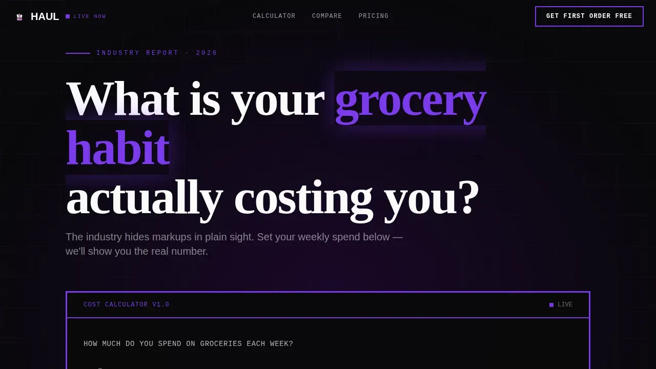
Haul is a bold brutalist grocery delivery landing page template built for same-hour delivery apps. It pairs a live cost-calculator hero with brutalist comparison tables, exposing the real price of traditional grocery shopping. The Void and Violet color system, oversized slab typography, and a persistent free-trial call-to-action make this grocery landing page impossible to scroll past.
by Rocket studio
Quick summary
This is a single-page grocery delivery landing page designed to convert cost-conscious shoppers through data. The landing page design opens with an interactive calculator, then walks visitors through sourced comparison tables. Every section earns trust by showing numbers, not claims. The result is a grocery landing page that feels like an industry exposé.
Who this template is for
This grocery delivery landing page is built for founders and product teams who love data-forward persuasion. It suits apps targeting busy urban households, non-standard-schedule workers, and family accounts.
- Grocery delivery startups launching a freemium or free-trial product
- Consumer app teams who want a grocery landing page design that leads with proof
- Developers and no-code builders who need a ready grocery delivery website to customize quickly
What problem this template solves
Most grocery delivery website designs bury their value proposition. Visitors leave before they understand why the app is worth trying. This landing page solves that by making the cost of inaction visible.
- Shoppers do not know how much traditional grocery shopping costs them annually
- Legacy delivery apps hide markup percentages and substitution rates
- Sign-up flows with too many steps in one screen increase drop-off
What you get with this template
You get a complete, single-page grocery delivery landing page with every section pre-built and ready to fill with your own content. The template is mobile-first and structured for a clear user journey from calculator to conversion.
- A live calculator hero, three brutalist comparison table sections, a final call-to-action block, and a minimal footer
- A three-step sign-up modal with zip code, email, and phone screens built in sequence
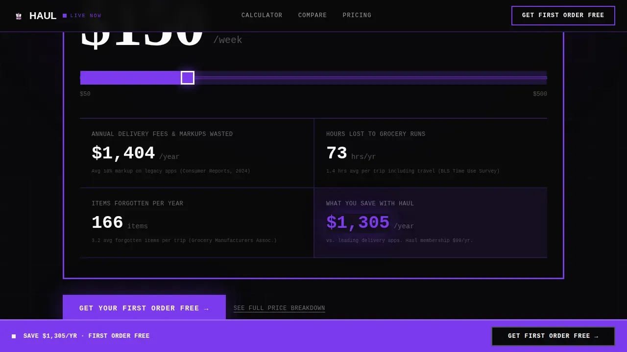
- A persistent violet call-to-action bar locked to the bottom of the viewport on every scroll position
Feature list
This grocery delivery landing page template includes six core features grounded in its source brief.
Live Cost-Calculator Hero
A brutalist slider input lets visitors set their weekly grocery spend. The page instantly detonates their annual delivery fees wasted, hours lost, and items forgotten per trip as oversized slab-serif counters on a void-black background.
Brutalist Comparison Table System
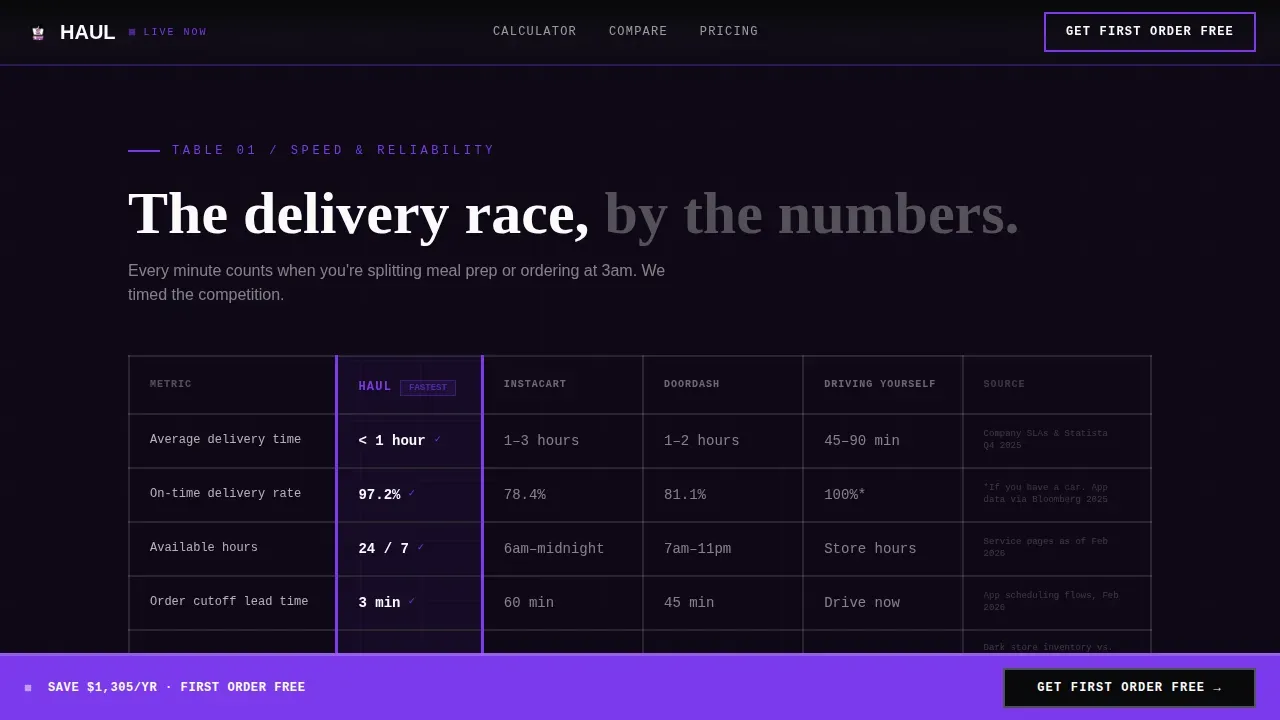
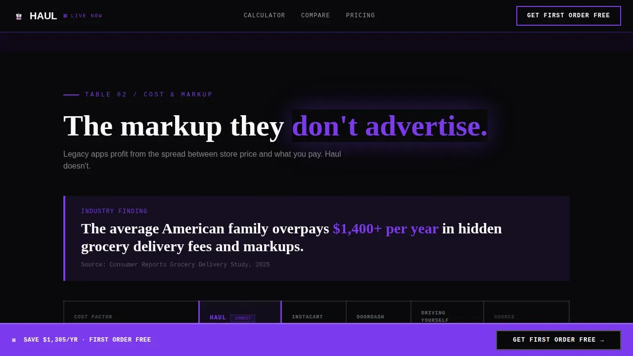
Three data tables compare the app against legacy delivery platforms and self-driving across delivery speed, markup percentage, substitution rate, and annual cost. Thick violet borders, no rounded corners, and sourced stats anchor every row.
Persistent Call-to-Action Bar
A violet bar stays fixed to the bottom of the viewport throughout the entire scroll. It carries the primary "Get Your First Order Free" message so the offer is always within reach regardless of scroll depth.
Echoed Savings Final Block
After the last comparison table, the page reflects the visitor's original calculator figure back to them as a personalized savings statement. This inline call-to-action reinforces the decision with their own number.
Three-Step Sign-Up Modal
The sign-up flow splits across three focused screens: zip code for coverage, email, then phone. Each step appears alone to reduce commitment anxiety and keep completion rates high.
Secondary Price Breakdown Path
A "See Full Price Breakdown" link offers a data-motivated secondary conversion path for visitors who need one more table before committing.
Page sections overview
| Section | Purpose |
|---|---|
| Calculator Hero Block | Expose personal grocery cost with live slider |
| Speed Comparison Table | Compare delivery time across app and alternatives |
| Cost and Markup Table | Show annual fees and hidden markup percentages |
| Quality Substitution Table | Highlight freshness checks and substitution rates |
| Final Call-to-Action Block | Echo savings figure and trigger three-step sign-up |
| Minimal Footer | Horizontal flow links, clean and low-distraction |
Design & branding system
The landing page design uses a Void and Violet color system. High-contrast monochromatic palettes are standard in brutalist design, and this template delivers exactly that: no soft gradients, no safe pastels, no rounded corners.
- Absolute black (#09090B) dominates every background; electric violet (#7C3AED) owns every button and interactive state; bruised plum (#3B0764) sits behind secondary sections; searing white (#FAFAFA) renders all data text
- Typography uses JetBrains Mono for numbers, Fraunces for display headlines in oversized all-caps, and DM Sans for body copy
- The raw interface deliberately rejects the glossy look of polished web design in favor of a confrontational, unapologetic aesthetic
Mobile & speed optimization
This grocery delivery landing page is mobile-first by intent. Night-shift users ordering at 3 a.m. on a phone need the page to load clean and respond immediately. The template is structured to support that priority.
- The layout adapts to all screen sizes, keeping the calculator slider and comparison tables fully readable on small viewports
- GSAP ScrollTrigger animations drive stat counters and scroll-reveal table rows without heavy asset overhead
- Server Components power the static comparison tables while the calculator and modal run as Client Components
How this template helps you convert
The landing page is engineered around a freemium trial model. Every section moves the visitor one step closer to starting their first free order.
- The calculator makes the cost of inaction personal and immediate, giving the visitor a reason to act before they reach the first comparison table
- The three comparison tables build cumulative proof, escalating from personal cost to systemic inefficiency so the visitor arrives at the final call-to-action already convinced
- The echoed savings figure in the final call-to-action block personalizes the offer, and the persistent violet bar ensures the primary action is never more than a glance away
Other information about this template
This template is part of a grocery delivery website design category focused on ecommerce and consumer app landing pages. It suits any online grocery or online store product launch that needs a delivery website with confrontational clarity.
- The Haul bold brutalist grocery delivery app landing page template is listed under the landing page landingpage category for Consumer App and Platform
- No-code builders can customize this template by replacing default text and images without extensive coding knowledge, and many teams love how quickly they can launch
- The ui ux approach follows a design ui philosophy where website ui hierarchy is maintained even within a raw, chaotic layout
- This design e commerce template fits any ecommerce grocery delivery website that wants to convey speed, authenticity, and a non-conformist brand attitude through honest ux design and strong app design choices
- Teams who love a clean data story with a product that markets itself through numbers will find this grocery landing page design well suited to their goals
Theme
Bold Brutalist
Creative direction
Industry Report
Color system
Void & Violet
Style
Comparison Table
Direction
Freemium/Trial
Page Sections
Live Cost-calculator Hero
Brutalist Comparison Table System
Persistent Call-to-action Bar
Echoed Savings Final Block
Three-step Sign-up Modal
Secondary Price Breakdown Path
Related questions
Can I edit the comparison table data without coding?
Is this landing page mobile-friendly?
How does the three-step sign-up modal work?
Can I use this template for a grocery delivery app in a different city?
Does this template include trust signals for credibility?



