Cart — Conversion Shop Landing Page Template
Inbox is a modular, card-grid landing page template built for e-commerce welcome email services. It uses a dark Carbon Fiber palette with electric green accents to mirror a performance dashboard. Versus-style card modules, animated metrics, and a progressive three-field form guide Shopify founders, direct-to-consumer brand managers, and solo operators from first scroll to conversion.
by Rocket studio
Quick summary
Inbox is a single-page, card-grid template designed to sell an automated welcome email service to e-commerce operators. It opens with a scrolling logo bar, escalates through versus-style proof modules, and closes with a focused lead-capture form. The Carbon Fiber visual system keeps every element sharp, technical, and purposeful.
Who this template is for
This template speaks directly to people who know their welcome sequence is underperforming and want to do something about it today. It is built for operators who move fast and need proof before they commit.
- Shopify store founders running lean teams who need their first email to work immediately
- Direct-to-consumer brand managers managing complex email flows who want a cleaner, higher-converting starting point
- Solo operators who suspect their welcome email is losing them revenue every night
What problem this template solves
Most welcome emails are generic. They get opened once, ignored, and forgotten. This template exists to show that gap clearly and give visitors a path to fix it.
- Visitors arrive without context about how much revenue a weak welcome email costs them
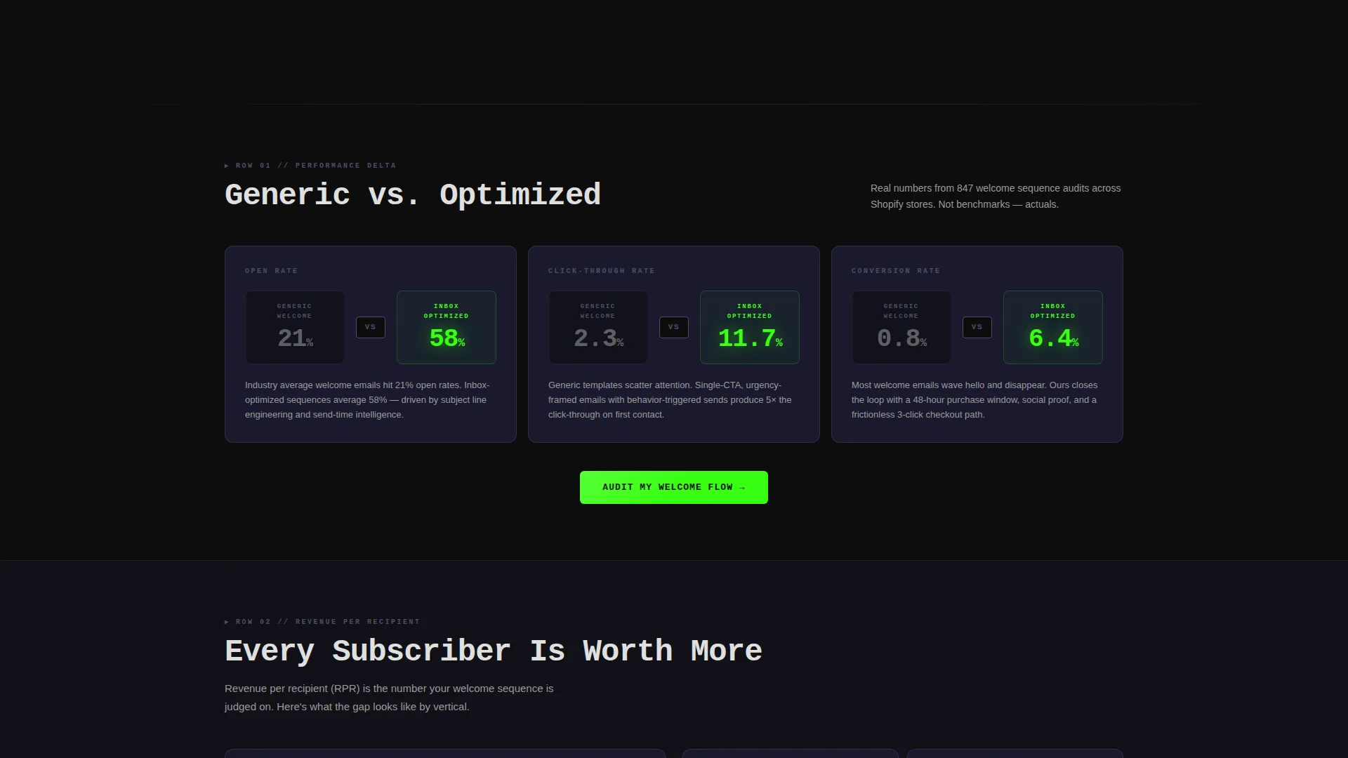
- Side-by-side comparison cards make the gap between average and optimized results impossible to dismiss
- The progressive lead form removes friction by asking only what is necessary, in the right order
What you get with this template
You get a fully structured, single landing page built around escalating proof. Every section is self-contained, so skimmers and deep readers both reach the call to action.
- A scrolling platform logo bar that establishes credibility before the headline
- Animated versus-card rows comparing open rates, click rates, and revenue per recipient
- A three-field progressive lead form and a secondary gated PDF teardown path
Feature list
This template packages several purpose-built components into one cohesive landing page flow.
Animated Revenue Counter Headline
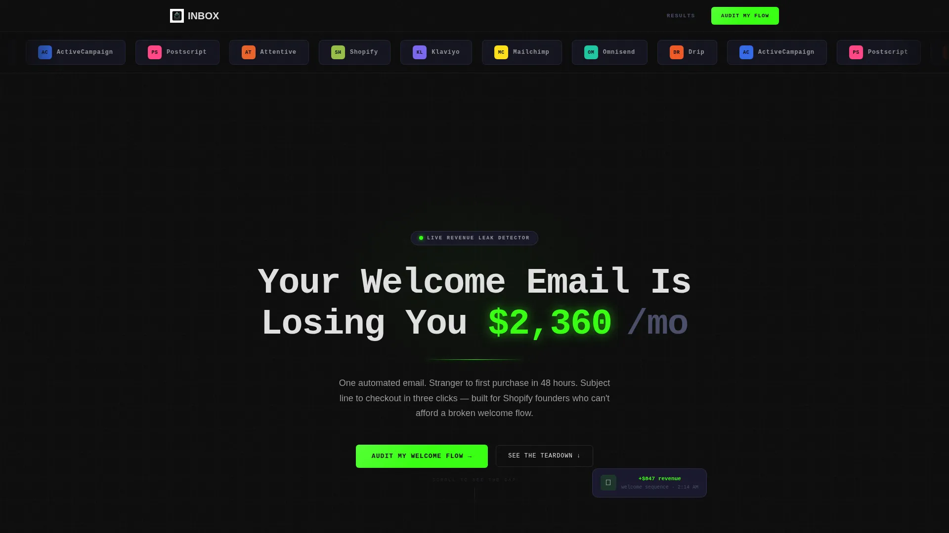
The hero headline reads "Your Welcome Email Is Losing You $____ a Month" with the dollar figure animating upward like a live leak. The number pulses in electric green against pure black, creating an immediate and visceral sense of urgency that frames every card below it.
Versus-Style Card Grid Modules
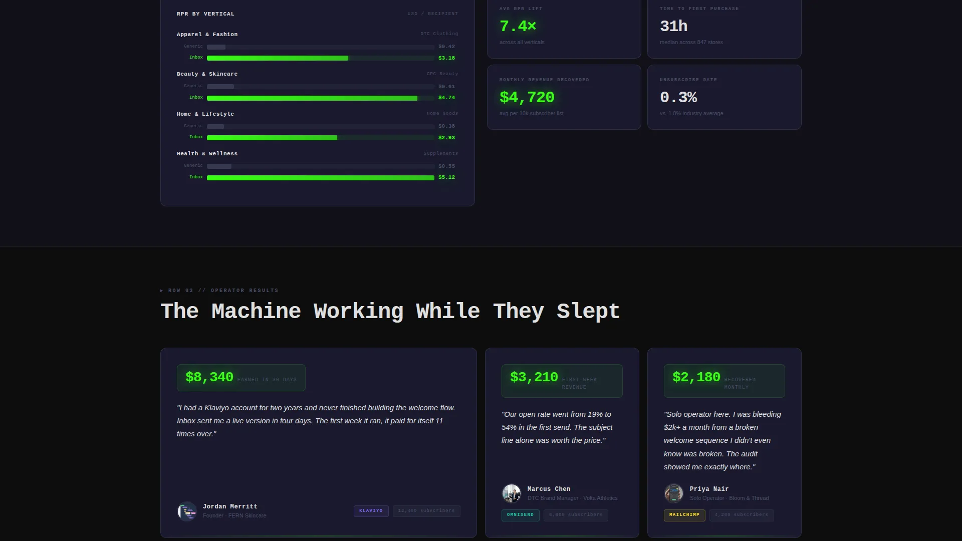
Three rows of modular cards run head-to-head comparisons: generic versus optimized open rates and click rates, revenue-per-recipient bar charts, and testimonial cards showing actual dollar figures. Each card is self-contained proof. The grid escalates in density and green frequency as the visitor scrolls, building toward a natural click.
Scrolling Platform Logo Bar
A horizontal ribbon of email and e-commerce platform logos scrolls at a calm, mechanical pace at the very top of the page. It communicates platform familiarity to the visitor before a single word of copy is read, lowering skepticism early.
Progressive Three-Field Lead Form
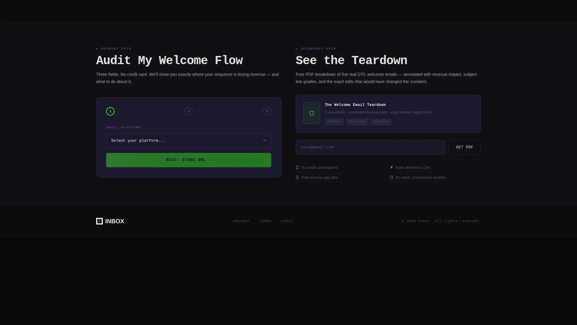
The primary form captures platform choice first via dropdown, then store URL, then monthly list size. Three fields, no credit card required. The progressive structure reduces abandonment by asking for low-commitment information first and building toward a higher-intent answer.
Floating call to action Button
After the second scroll, the primary call-to-action button pins itself as a floating element so it is always visible. It stays in electric green on black, matching the dashboard aesthetic while ensuring the invite to act is never out of reach.
Secondary Gated PDF Path
A second conversion path offers a free teardown of five real welcome emails with annotated revenue impact. Gated by email only, it gives hesitant visitors a lower-stakes first step while still capturing a lead.
Page sections overview
| Section | Purpose |
|---|---|
| Platform Logo Bar | Establish email platform credibility immediately |
| Animated Hero Headline | Surface the revenue cost of a weak welcome email |
| Versus Row One | Compare open rates and click rates side by side |
| Revenue Bar Charts | Show animated revenue-per-recipient comparisons |
| Testimonial Cards | Stack real dollar-figure social proof |
| Primary call to action Block | Drive form submissions after first proof row |
| Progressive Lead Form | Capture platform, store URL, and list size |
| Floating call to action Button | Keep the primary action visible after scroll |
| Secondary PDF Path | Offer a gated teardown for lower-intent visitors |
Design & branding system
The visual identity follows a Startup Velocity theme built on the Carbon Fiber color system. Every color choice is intentional and functional, not decorative.
- Deep cockpit black (#0D0D0D) as the base background, woven carbon gray (#1A1A2E) for card surfaces, and titanium mid-tone (#4A4E69) for structural dividers
- Electric ignition green (#39FF14) used exclusively for calls to action, live metrics, and hover states to preserve its signal value
- Signal white (#E0E0E0) body text and a 1px carbon-gray card border that glows green on hover, making the grid feel like a control panel
Mobile & speed optimization
The modular card grid adapts naturally to smaller screens. Each card is self-contained, so the layout reflows without losing the versus structure or the animated elements.
- Card modules stack vertically on mobile while retaining their side-by-side comparison logic within each card
- The floating call to action button remains accessible on all screen sizes, staying anchored above the fold after the second scroll trigger
How this template helps you convert
The entire page is structured as an escalating proof engine. Each layer earns the next click.
- The animated headline creates immediate loss-aversion, framing inaction as a daily cost before the visitor reads anything else.
- The versus card rows deliver verifiable comparison data row by row, so both skimmers and careful readers reach the form with the same understanding of the gap.
- The progressive lead form and the secondary PDF path offer two conversion routes at different commitment levels, reducing the chance a hesitant visitor leaves empty-handed.
Other information about this template
This template is built for the e-commerce welcome email niche and is consistent with the flows and platform expectations of tools like Klaviyo, Mailchimp, and Omnisend. It is particularly relevant for anyone building or selling welcome email services in that ecosystem.
- The template style is Card Grid (Modular), making it straightforward to reorder, replace, or expand individual proof sections without redesigning the full page
- The Launch Energy creative direction means the page is intentionally designed to accelerate as the visitor scrolls, with denser cards, larger numbers, and more frequent green accents toward the bottom
- The Comparison/Versus landing page direction is the structural backbone: every row is a mirror showing the visitor the gap between what they have and what is possible
Theme
Startup Velocity
Creative direction
Launch Energy
Color system
Carbon Fiber
Style
Card Grid (Modular)
Direction
Comparison/Versus
Page Sections
Animated Revenue Counter Headline
Versus-style Card Grid Modules
Scrolling Platform Logo Bar
Progressive Three-field Lead Form
Floating Primary Call to Action Button
Secondary Gated PDF Teardown Path
Related questions
Can I edit the versus card content to match my own data?
Does the template include the animated dollar-figure counter in the headline?
Is the floating call to action button included out of the box?
Can I use both conversion paths at the same time?
Do I need a specific email platform to use this template?



