E-Commerce Software & SaaS Professional Website Template
Cart is a bold brutalist ecommerce mobile app landing page template built for Shopify founders and direct-to-consumer brand managers who lose revenue to slow mobile experiences. It uses a bento grid layout, a Void and Violet color system, and a Problem-to-Solution arc to move potential customers from awareness to action in a single scroll.
by Rocket studio
Quick summary
Cart is a single-page, high converting ecommerce mobile app landing page template designed to turn mobile browsers into buyers. It pairs a dark glass bento grid header with brutal scoreboard-style pain metrics, an architecture reveal, and merchant proof sections. Every element pushes one desired action: clicking through to onboarding.
Who this template is for
This template is built for founders and brand managers who sell on mobile but bleed revenue every time a shopper bounces. It is a focused tool for anyone who needs an effective landing page that earns clicks rather than just displaying a product.
- Shopify founders watching abandoned shopping carts pile up on mobile devices
- Direct-to-consumer brand managers whose mobile landing page conversion rates are falling
- Solo makers with well-designed stores that perform poorly on mobile traffic
What problem this template solves
Most ecommerce landing page templates treat the mobile experience as a scaled-down desktop version. That mismatch costs real money. This template treats the mobile landing page as the primary canvas, not an afterthought, so the page design reflects how real shoppers actually behave on a phone screen.
- Slow-loading product page experiences that push potential customers away before they ever see the offer
- No clear call to action structure that guides a visitor from pain recognition to a confident click
- Generic layouts that fail to communicate value propositions quickly enough for mobile landing visitors
What you get with this template
You get a ready to use landing page built around a single, disciplined goal: driving clicks to an onboarding flow. Unlike regular web pages that scatter attention across navigation menus and category pages, this template keeps every scroll focused. It is one of the clearest real life examples of a promotional landing page designed specifically for a mobile app product.
- A full bento grid layout with five distinct section types: hero, pain stats, mechanism, proof, and call to action
- A sticky bottom bar with a persistent call to action that remains visible as users scroll, keeping the desired action easily accessible
- High quality images and high quality visuals inside dark glass panel bento cards that showcase the app in action
Feature list
This section covers the key elements built into the template. Each feature serves the single goal of helping you convert visitors who arrive from paid advertisements, organic search results, or targeted marketing campaigns.
Dark Glass Bento Header
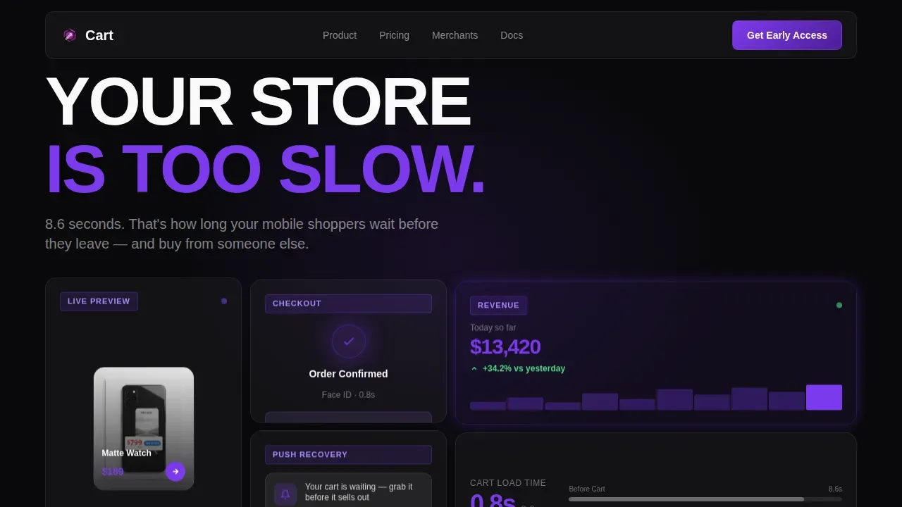
The header section arranges frosted, semi-transparent glass panels in a bento cluster against a pure void black background. Each panel shows a different fragment of the app in action: a product card mid-swipe, a one-tap checkout confirmation, a real-time revenue ticker, and a push notification preview. This approach captures visitor's attention immediately and delivers key product details before a single line of text appears. High quality images inside the panels replace the physical inspection that potential customers would perform in a store, making the visual argument before copy even begins.
Pain Stats Scoreboard Section
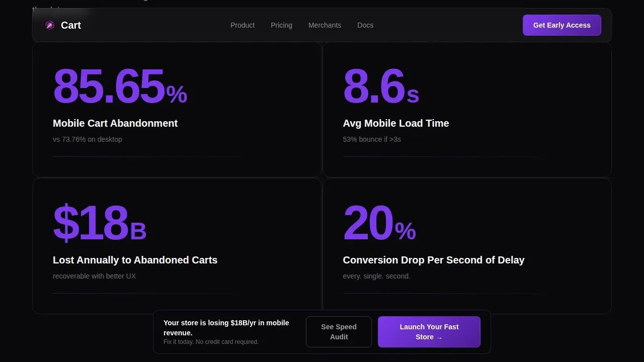
The second section renders oversized violet-on-black metric blocks showing mobile load time averages, cart abandonment percentages, and revenue lost per second of delay. These numbers function like a scoreboard in the decision making process, making slowness feel expensive before the visitor sees any feature list. A clear and concise headline punches in from the left in heavy uppercase type after the panels load, giving the section a strong concise headline anchor that captures attention and encourages visitors to keep reading.
Mechanism Bento Grid Reveal
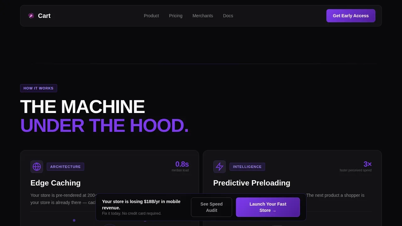
The third section reconfigures the bento grid to show the app architecture. Each panel covers a specific capability: edge caching, predictive preloading, and one-thumb checkout. Scroll-linked micro-animations play as each panel enters the viewport. This section functions as the product landing page moment where interested shoppers move from pain awareness to understanding the solution. The layout highlights key features in a visual grid format designed for quick scanning on mobile devices.
Merchant Proof Section
The proof section presents real merchant screenshots and revenue before-and-after comparisons alongside a live counter of transactions processed. This is where social proof does the heavy lifting. Customer testimonials paired with user generated content and before-and-after revenue data give prospective customers and prospective clients the trust signals they need to act. Using customer testimonials effectively builds credibility in a way that product descriptions alone cannot.
Sticky Call to Action System
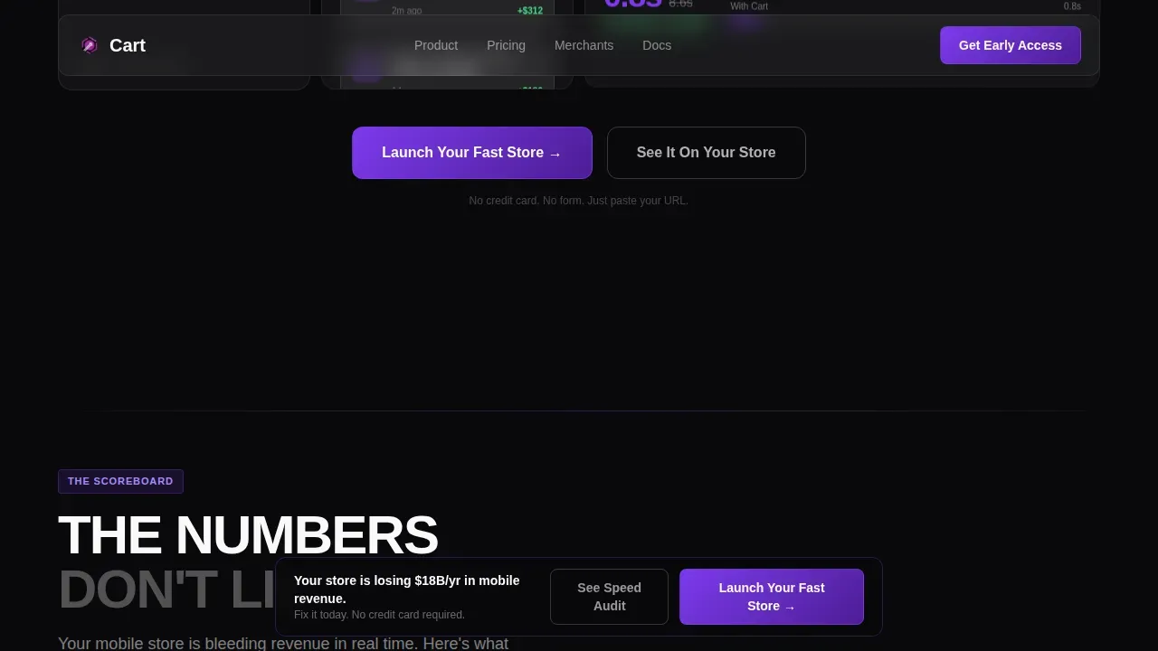
The primary call to action, "Launch Your Fast Store," appears first as a violet pill button inside the header and then reappears in a sticky bottom bar after the first scroll. A secondary ghost-outline button, "See It On Your Store," offers a live speed audit requiring only a URL. Implementing sticky call to action elements that remain visible as users scroll ensures conversion points are always accessible, which is one of the proven strategies for high converting landing pages. No form appears on this page; the signup process begins only after the click.
Footer Pattern Layout
The footer follows a horizontal flow pattern that closes the page cleanly without redirecting attention away from the primary call to action. It keeps the brand story consistent, maintains brand identity through the Void and Violet palette, and avoids introducing navigation that could pull visitors toward category pages or other distractions.
Page sections overview
| Section | Purpose |
|---|---|
| Hero Bento Header | Glass panels + brutalist headline introduce the app and capture visitor's attention |
| Pain Stats Block | Violet scoreboard metrics make mobile slowness feel expensive |
| Mechanism Grid | Bento reconfiguration reveals app architecture with scroll micro-animations |
| Merchant Proof | Before-and-after revenue screenshots and live transaction counter provide social proof |
| Call to Action Panel | Full-width dark panel with primary and secondary call to action buttons |
| Sticky Bottom Bar | Persistent call to action bar keeps the desired action visible throughout scroll |
| Footer Flow | Horizontal footer closes the page without redirecting to regular web pages or category pages |
Design & branding system
The page design follows a Bold Brutalist visual identity that makes the darkness feel deliberate and the violet feel earned. The Void and Violet color system dominates every surface, with electric violet reserved for the moments that demand attention: metric numbers, button fills, and notification indicators. White is used surgically for typography and grid borders that slice the layout into clear, visible seams. This palette reinforces the brand identity of a tool built for serious ecommerce businesses that have no tolerance for slow, generic-looking sales pages.
- Color system: void black (#09090B) as the base, deep ultraviolet (#7C3AED) for call to action elements and metric highlights, bruised plum (#4C1D95) for depth layers, and bare phosphor white (#FAFAFA) for text and dividers
- Typography: Manrope for body copy and user interface text, Fraunces as a serif accent; no generic system fonts
- Layout: bento grid structure with frosted glass panel cards, scroll-linked violet reflections at panel edges, and brutal uppercase type for section anchors
Mobile & speed optimization
A mobile landing page for a mobile optimization product has to feel fast itself. This template is built mobile-first, with a single-column layout for narrow screens, large touch-friendly buttons placed within the natural thumb zone, and short paragraphs that are easy to read on small displays. Mobile landing pages that fail on mobile devices undermine the product's own argument, so the template treats mobile-first execution as a non-negotiable constraint. High quality visuals are sized and structured to load contextually as sections enter the viewport, keeping the mobile landing page experience sharp and uninterrupted.
- Single-column, thumb-zone-aware layout ensures all buttons and links are easily tapped on mobile devices
- Scroll-linked animations are client-rendered only; static server components handle the structural content to keep the mobile landing page performant
- The desktop version maintains the full bento grid layout with expanded panel arrangements and wider scoreboard displays while preserving the same visual hierarchy
How this template helps you convert
This template is designed as a high converting landing page, not a general product page. Unlike regular web pages that distribute attention across product descriptions, category pages, and navigation, this template keeps every element pointed at one outcome. Effective landing pages minimize distractions and focus on a singular call to action, and Cart executes that principle across every section.
- The Pain-to-Solution arc makes slowness feel costly in the first two sections, creating urgency before the visitor reaches the mechanism or proof sections. This is one of the essential components of effective landing page strategy: earn the click by making the problem vivid before offering the solution.
- The sticky bottom bar and the violet pill button inside the header create two always-visible conversion points. Sticky call to action elements are a critical element in high converting landing pages because they ensure the desired action is never more than a thumb-tap away, regardless of how far the visitor has scrolled.
- Social proof in the form of customer testimonials, revenue comparisons, and a live transaction counter addresses the final objection before the click. Trust signals, such as customer testimonials and concrete data, help encourage visitors to complete the desired action with confidence.
Other information about this template
This template is a strong candidate for product launches, seasonal campaigns, and paid advertisement traffic because its focused structure matches the intent of visitors arriving from a specific marketing campaign. Unlike category pages or general product page layouts, this ecommerce landing page is designed to handle targeted messaging from a single source and convert that traffic cleanly.
- The template supports marketing efforts tied to a particular event, a particular product push, or an ongoing direct-to-consumer acquisition campaign
- Building landing pages for paid advertisements works best when the page design eliminates distractions; this template removes navigation, shipping costs disclosures, and unrelated product details that would dilute focus
- The page can serve as a promotional landing page for new app feature announcements, functioning like a promotional landing tied to a specific release moment
- The layout suits ecommerce businesses running marketing campaigns across mobile traffic channels, including social and paid advertisements in feeds where mobile landing page destinations are critical
- The template is one of the more complete ready to use landing page options for mobile app sales pages: it covers hero, stats, mechanism, proof, and call to action in a single scroll without requiring additional page templates
- Product landing pages for mobile apps benefit from high resolution mockups, and this template includes bento panel card slots sized specifically for device mockup imagery
- The best performing pages for mobile app products use clear value propositions, prominent social proof, and a sticky call to action; Cart includes all three as built-in structural elements
- For teams running A/B testing across landing page templates, the bento grid structure makes it straightforward to swap stat block content, product image panels, and call to action copy without restructuring the layout
- The page can also support encourage visitors flows driven from organic search results when the URL audit secondary button is connected to a live speed-check tool
- Pet owners, fashion founders, wellness brands, and any direct-to-consumer category can adapt the template's brand story slots and product descriptions to their own niche while keeping the brutalist frame intact
- This cart high converting ecommerce mobile app landing page template is designed to be the last landing page template a mobile app product team needs before launch
Theme
Bold Brutalist
Creative direction
Problem→Solution Arc
Color system
Void & Violet
Direction
Click-Through
Page Sections
Dark Glass Bento Header with Pain Metrics
Scroll-linked Mechanism Bento Grid
Merchant Proof and Live Transaction Counter
Sticky Bottom Bar Call to Action
Bold Brutalist Visual Identity System
Mobile-first Single-column Layout
Related questions
Does this template include a form for collecting emails?
Is this template suitable for desktop as well as mobile?
Can I use this template for product launches or seasonal campaigns?
How does this template handle social proof?
What makes this different from a standard product page?



