Vibrant Restaurant Online Store Landing Page Template
Carte is a modular card-grid landing page built for restaurants that sell signature products directly to their fans. The layout combines a stats-first hero, filterable product cards, and a sticky call-to-action bar to drive confident click-throughs into the catalog. The Void and Violet color system gives every product card gallery-quality presence on a dark background.
by Rocket studio
Quick summary
Carte is a single-page restaurant online store template designed around discovery and click-through. It leads with social proof stats, flows into a filterable card grid, and ends every scroll position with a reason to click. The Void and Violet palette makes products pop like lit windows on a dark street. Built for restaurants ready to sell online.
Who this template is for
This template is built for restaurants and food brands that already have an audience and want to turn that loyalty into direct sales. It fits teams who need a polished storefront front-end without starting from scratch.
- Restaurant owners selling sauces, spice blends, meal kits, or branded merchandise to regulars and out-of-town fans
- Food brand operators who want a directory-style product landing page with strong visual identity
- Designers and developers building a restaurant digital presence for clients who need a click-through-first layout
What problem this template solves
Most restaurant product pages look like afterthoughts. They bury the catalog behind forms, hide prices, and give buyers no reason to keep scrolling. Carte solves the discovery problem by making the product grid the entire experience.
- Buyers arriving from social media or word of mouth find products immediately, without navigating menus or filling out forms
- Restaurants lose repeat customers when there is no easy way to reorder a favorite item, the sticky call-to-action bar and filterable grid keep that path frictionless
- Generic store layouts erase brand identity, the Void and Violet system gives every restaurant product a flagship retail feel from the first scroll
What you get with this template
You get a complete single-page layout structured around one goal: getting a visitor to click into a product. Every section is pre-built and ready to fill with your products, numbers, and brand assets.
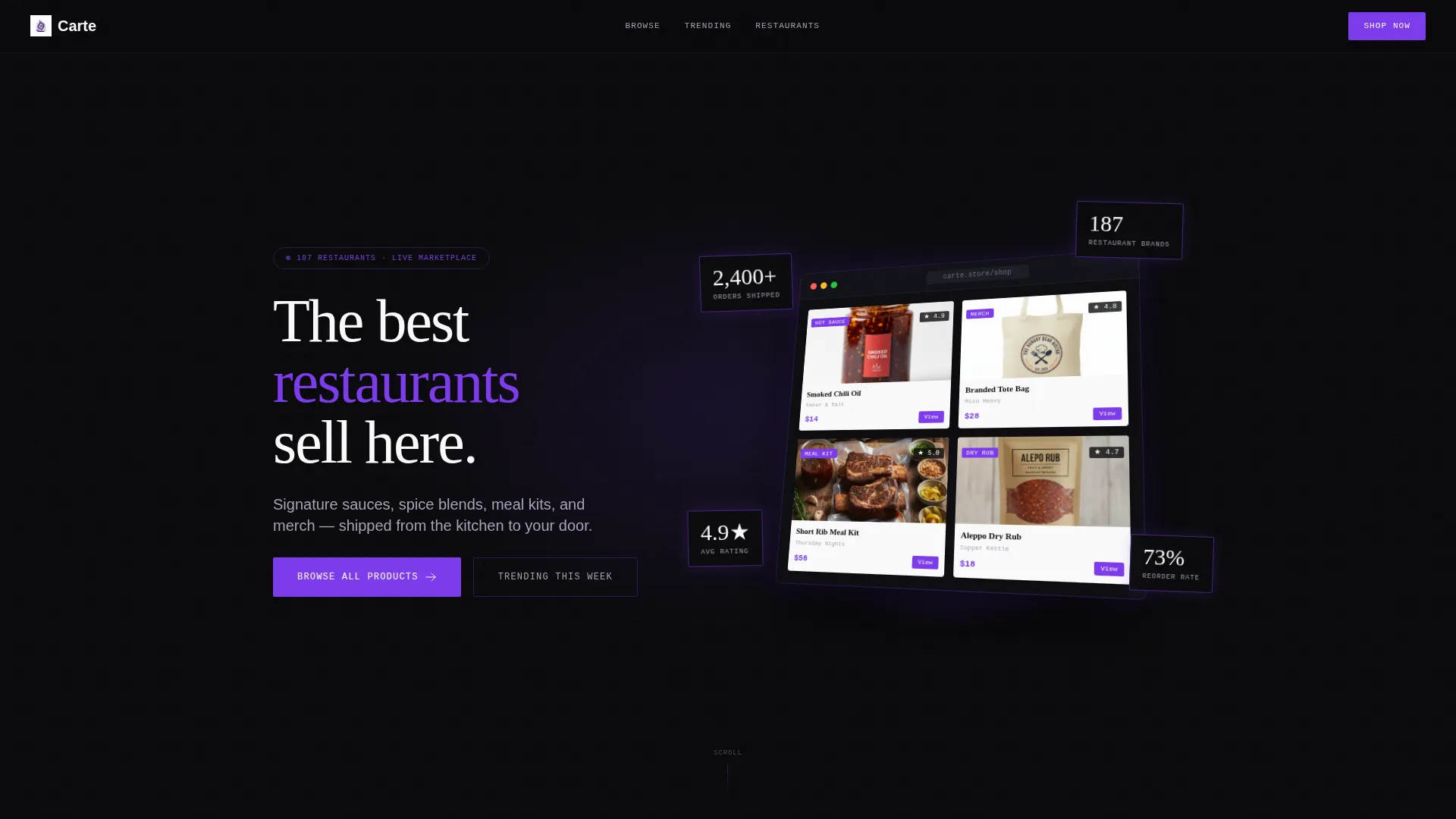
- A stats-first hero with a product screenshot header, floating social proof badges, and a headline area designed to establish credibility above the fold
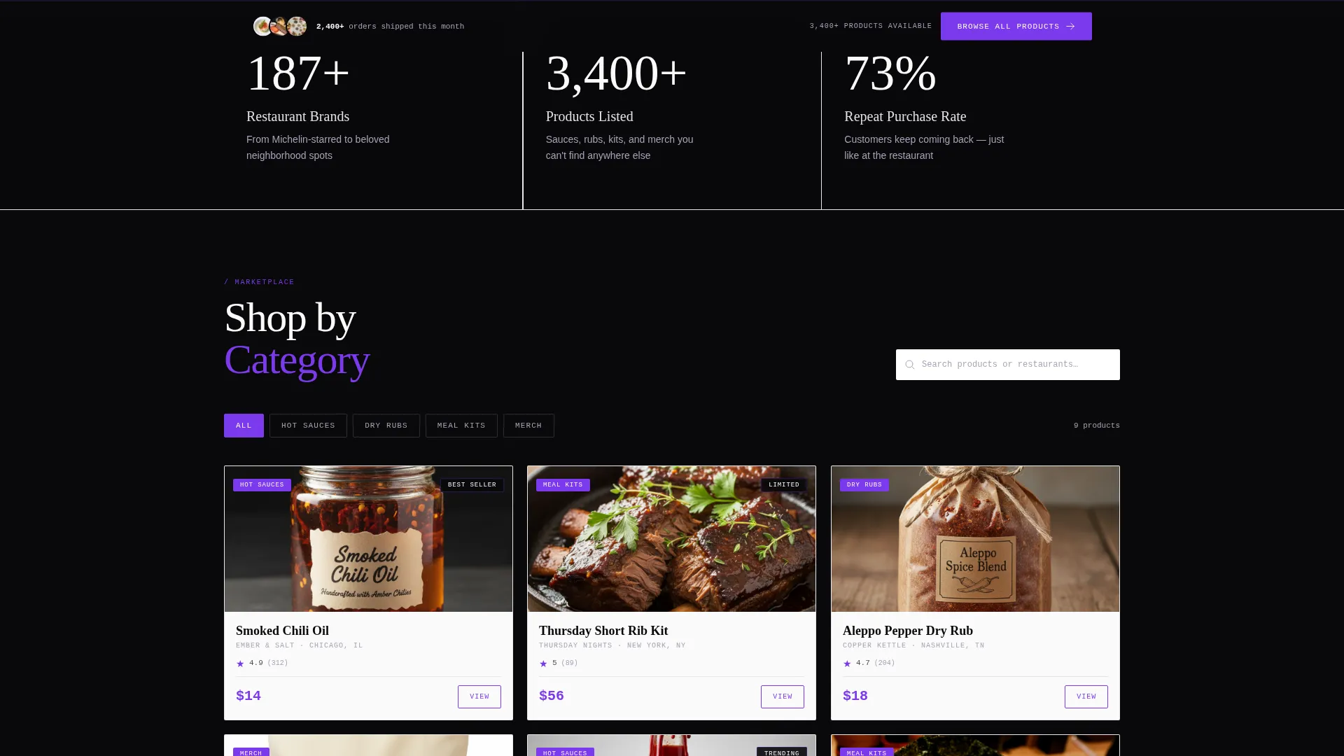
- A modular, filterable card grid organized by category (Hot Sauces, Dry Rubs, Meal Kits, Merch) with product image, restaurant name, price, and a violet View button on each card
- Single-stat interstitial sections, a Trending This Week row, a restaurant brand logo strip, and a sticky bottom bar with a persistent Browse All Products call to action
Feature list
This template is built around a clear set of purposeful components that work together to move visitors from curiosity to click.
Stats-First Hero Section
The header opens with a high-fidelity product screenshot rendered at a slight isometric tilt on the void background. Floating violet-outlined badges display key numbers, orders shipped, restaurant brands, and average rating, large enough to read before the eye reaches the headline. This layout puts social proof before the sales pitch.
Modular Filterable Card Grid
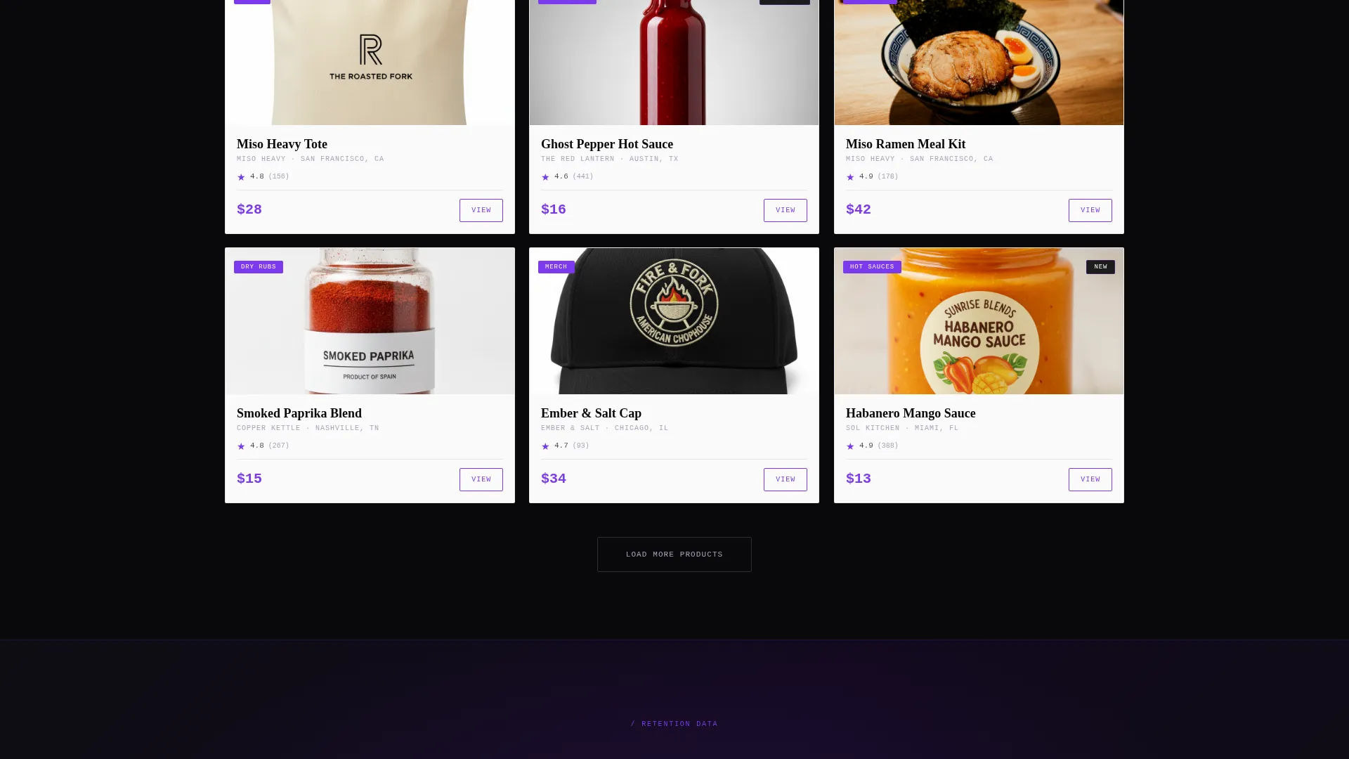
Product cards are organized into filterable category tiles. Each card shows a product image, the restaurant name, the price, and a violet View button. Categories include Hot Sauces, Dry Rubs, Meal Kits, and Merch. The grid is the core of the page and designed to feel like a living directory.
Animated Scroll Statistics Row
Below the hero, three oversized statistics sit in a horizontal row. Each number animates up from zero as the section enters the viewport. The row covers restaurants onboard, products listed, and repeat purchase rate, giving the page immediate volume and momentum signals.
Single-Stat Interstitial Breaks
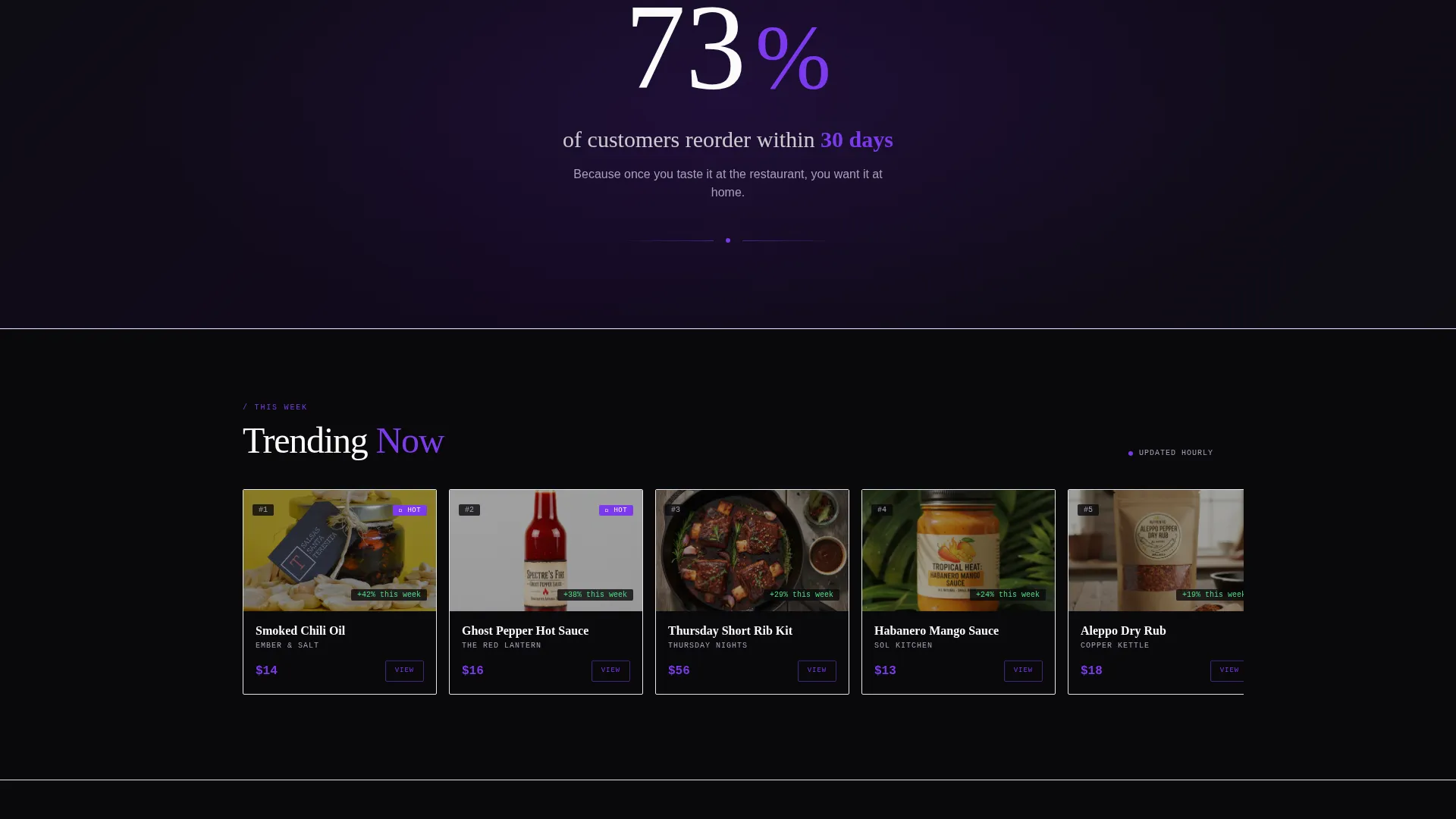
Between grid sections, full-width interstitial panels display one large number with a short supporting line. An example from the brief: "73% of customers reorder within 30 days." These breaks build cumulative proof without interrupting the browsing rhythm.
Trending This Week Row
A dedicated discovery row surfaces high-momentum products labeled as trending. This section creates a sense of scarcity and real-time activity, encouraging visitors to act before an item sells out or rotates off the list.
Sticky Bottom Call-to-Action Bar
A bottom bar becomes visible after the first scroll and stays fixed throughout the session. It carries a single persistent action: Browse All Products. There is no cart and no form on this page, the entire architecture funnels visitors toward one confident click into the catalog.
Page sections overview
| Section | Purpose |
|---|---|
| Product Screenshot Header | Opens with isometric store screenshot and floating social proof stat badges |
| Above-Fold Headline | Delivers the core brand statement in white on black below the screenshot |
| Scroll Statistics Row | Animates three key marketplace numbers on scroll entry |
| Category Filter Bar | Lets visitors filter the card grid by product type |
| Modular Product Grid | Displays product cards with image, name, price, and View button |
| Interstitial Stat Break | Interrupts grid sections with a single oversized proof number |
| Trending This Week | Highlights high-momentum products to signal activity and scarcity |
| Restaurant Logo Strip | Shows brand logos mid-page to reinforce trust and variety |
| Sticky Bottom Bar | Persists Browse All Products call to action after the first scroll |
Design & branding system
The Void and Violet color system is the visual backbone of this template. It is built to feel like a flagship retail space after dark, where products float on white surfaces against absolute black walls and violet neon traces every interactive element.
- Core palette: absolute black (#09090B) for the background, electric violet (#7C3AED) for links, hover states, price tags, and category pills, muted lavender gray (#A8A2B8) for supporting text, and bright white (#FAFAFA) for card surfaces
- Every product card is designed to read like a lit window on a dark street, with the white card surface providing gallery-quality contrast against the void background
- Violet is applied consistently to all interactive touchpoints so buyers always know what to click next
Mobile & speed optimization
The card grid layout is built to reflow cleanly on smaller screens. Product cards stack vertically, filter controls remain accessible, and the sticky bottom bar stays visible on mobile throughout the session.
- The modular grid structure adapts to single-column display on mobile without losing product image, price, or the View button on each card
- The isometric header screenshot and floating stat badges are sized to remain readable at mobile viewport widths
- The sticky bottom bar is always within thumb reach on a phone, keeping the primary call to action persistent even during fast scrolling
How this template helps you convert
The entire page is architected around a single conversion action: getting one visitor to click into a product detail page. There is no cart, no form, and no checkout on this landing page. That simplicity removes friction and keeps buyers focused.
- Trust is built above the fold through the stats-first header, large numbers with social proof badges establish credibility before the visitor reads a single product description
- The distributed violet View buttons across every product card mean the conversion opportunity is never more than one glance away, no matter where the visitor is on the page
- The sticky Browse All Products bar ensures that even a visitor who scrolls past the grid without clicking still has a low-effort path back to the catalog at any moment
Other information about this template
Carte is categorized under Technology and the Restaurant Digital Presence subcategory, with a primary niche focus on restaurant online stores. The template style is Card Grid (Modular) and the theme is Directory and Discovery. The creative direction is Stats-First Impact, the header concept is Product Screenshot, and the landing-page direction is Click-Through.
- This template is designed as a single landing page, not a multi-page website, so it is optimized for one clear user journey from hero to catalog click
- The layout supports restaurants selling a range of physical goods: bottled condiments, spice blends, branded apparel, and multi-serving meal kits are all natural fits for the card grid format
- The template is built for buyers with strong existing brand affinity, regulars, out-of-town visitors who remember a dish, and gift-givers looking for something personal and specific
Theme
Directory & Discovery
Creative direction
Stats-First Impact
Color system
Void & Violet
Style
Card Grid (Modular)
Direction
Click-Through
Page Sections
Stats-first Hero with Social Proof Badges
Modular Filterable Product Card Grid
Animated Scroll Statistics Row
Single-stat Interstitial Panels
Trending This Week Discovery Row
Sticky Browse All Products Bar
Related questions
Does this template include a shopping cart or checkout flow?
Can I customize the product categories in the filter bar?
Who is this template designed for?
Can I replace the floating stats in the header with my own numbers?
What makes the sticky bottom bar useful on this landing page?



