Home Services Case Management Landing Page
Caseload is a single-page landing page template built for home services platforms that need to prove their operational edge fast. It opens with a live-data dashboard header, moves through a twelve-row feature comparison table, and closes with a clear call to action. The glassmorphic dark-mode design makes complex workflow data feel immediate and credible.
by Rocket studio
Quick summary
Caseload is a high-impact landing page template designed for home services case management platforms. It leads with a rendered stats dashboard, walks visitors through a structured twelve-dimension comparison table, and drives them toward a demo with a persistent call to action. The dark glassmorphic design creates a control-room atmosphere that communicates platform confidence instantly.
Who this template is for
This template is built for teams that run field service operations at scale. It speaks directly to the people making real-time decisions under pressure, not marketing generalists.
- Operations managers tracking dozens of open work orders simultaneously
- Dispatchers routing field crews across wide service territories
- Franchise owners who need revenue-per-truck visibility without manual check-ins
What problem this template solves
Home services businesses lose time and credibility when their coordination tools are scattered. Spreadsheets, phone trees, and disconnected invoicing create blind spots that cost jobs and clients. This template confronts that pain head-on by structuring the entire page around a side-by-side contrast between the old workflow and the platform's unified approach.
- Visitors arrive with a real operational problem and immediately see it named
- The comparison table maps twelve specific workflow failures to concrete platform solutions
- The page removes friction by skipping forms and routing qualified visitors straight to a demo
What you get with this template
The template delivers a complete single-page layout structured for maximum evidence density. Every section is intentional and ordered to build trust before asking for a click.
- An animated stats header showing live-style metrics including open cases, resolution rate, and dispatch time
- A twelve-row glassmorphic comparison table contrasting legacy workflows against platform capabilities
- A dual call-to-action system with a fixed nav button and a repeated bottom placement, plus a secondary video walkthrough link
Feature list
This template ships with purpose-built sections and interaction patterns that are specific to home services case management positioning.
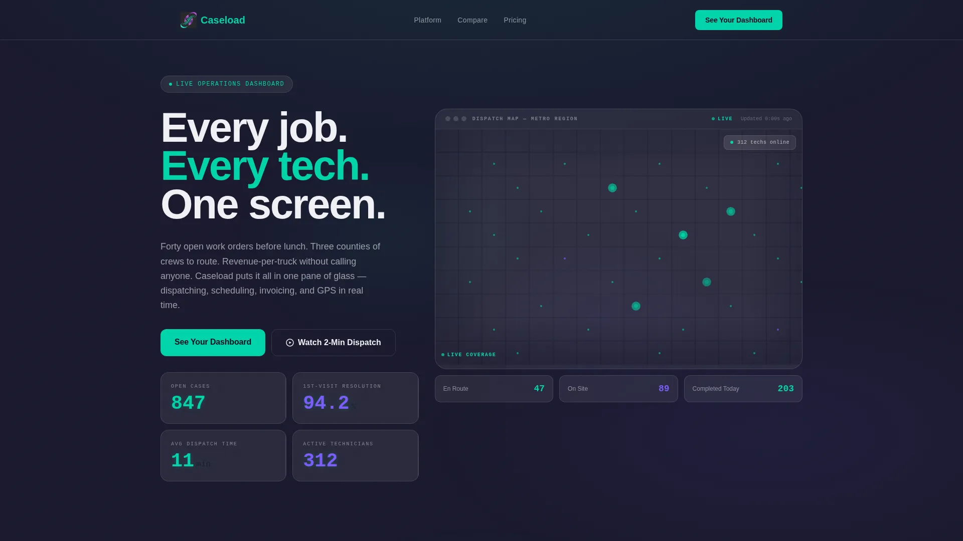
Animated Metrics Dashboard Header
The header renders a live-style user interface showing 847 open cases, a 94.2% first-visit resolution rate, and an average dispatch time of 11 minutes. Numbers animate upward on page load. A technician map with pulsing dots across a metro grid fills the background. No stock photography is used anywhere in this section.
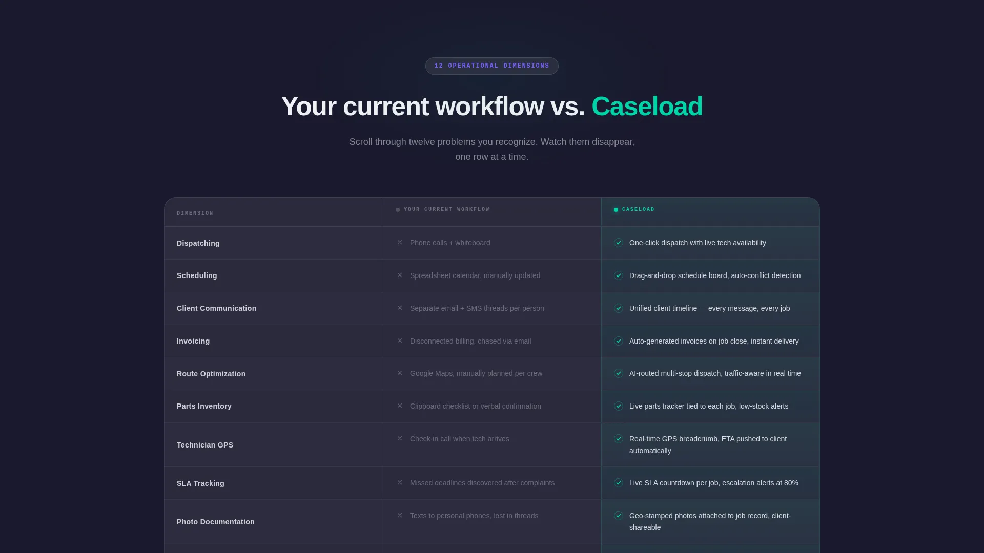
Twelve-Row Feature Comparison Table
The comparison table covers twelve operational dimensions: dispatching, scheduling, client communication, invoicing, route optimization, parts inventory, technician GPS, SLA tracking, photo documentation, permit management, reporting, and multi-location oversight. Legacy workflow cells appear in muted gray. Platform capability cells glow in electric teal with animated checkmarks that reveal on scroll.
Scroll-Triggered Row Animations
Each comparison row enters the viewport with a reveal animation as the visitor scrolls. The sequential rhythm creates a cumulative effect. By the time a visitor reaches the eighth row, the pattern of teal checkmarks against gray gaps makes the argument visually self-evident.
Fixed Navigation Call to Action
The primary call to action, "See Your Dashboard," is anchored in the top navigation bar and stays visible throughout the full scroll. This placement means no visitor ever has to scroll back up to take the next step. The button routes to a personalized demo environment.
Secondary Video Walkthrough Link
A second conversion path, "Watch a 2-Minute Dispatch," is available for visitors who need to see the platform in motion before committing to a demo. This link targets a different decision stage without disrupting the primary conversion flow.
Glassmorphic Card System
Frosted-glass panels float over the deep charcoal base layer throughout the template. Cards use a 12% opacity white fill with subtle blur and light-catching borders. The effect creates visual depth without adding layout complexity, keeping data readable at every scroll position.
Page sections overview
| Section | Purpose |
|---|---|
| Sticky Nav Bar | Anchors primary call to action throughout scroll |
| Stats Dashboard Header | Opens with live-style operational metrics |
| Headline Fade-In | Delivers core value message below the metrics |
| Feature Comparison Table | Contrasts legacy workflow against platform across twelve dimensions |
| Bottom call to action Block | Repeats primary call to action after the table |
| Video Walkthrough Link | Offers a secondary path for motion-first visitors |
Design & branding system
The visual identity uses a Dashboard Pro theme built on a glassmorphic color system. Every design choice reinforces the feeling of a professional operations environment at peak readiness.
- Deep workspace charcoal (#1A1A2E) as the base, frosted panel white at 12% opacity (#FFFFFF1F) for cards, electric teal (#00D4AA) for live indicators and primary actions, and soft violet (#7C5CFC) for secondary data highlights
- Crisp white (#F0F0F5) body text on dark surfaces, with teal used on interactive states and violet reserved for comparative metric callouts
- No photography in the layout; all visual proof comes from rendered user interface elements, animated numbers, and the pulsing technician map
Mobile & speed optimization
The template is built to load cleanly and stay readable across device sizes. The glassmorphic layer effects and animation triggers are structured to avoid layout breakage on smaller screens.
- Frosted-glass cards and the comparison table reflow for mobile viewports without losing the teal-versus-gray contrast that drives the table's argument
- Scroll-triggered row animations are tied to viewport entry, so they fire correctly on both desktop and mobile regardless of scroll speed
- The fixed navigation call-to-action bar is designed to remain accessible and non-obstructive across screen sizes
How this template helps you convert
The page is engineered around a single conversion goal: earn the demo click through evidence, not persuasion. Every layout decision supports that sequence.
- The animated header delivers three credibility data points in the first three seconds, establishing platform competence before the visitor reads a single word of copy.
- The twelve-row comparison table builds cumulative conviction by naming specific operational problems the visitor already lives with, then showing each one resolved in the platform column.
- The dual call-to-action placement, fixed at the top and repeated at the bottom, ensures the "See Your Dashboard" button is always within reach the moment a visitor decides they have seen enough.
Other information about this template
This template is a strong fit for home services software companies presenting their case management platform to a technically aware, operations-focused audience. It is equally suited to plumbing dispatch software, HVAC service platforms, and electrical inspection management tools looking to replace fragmented legacy workflows.
- The template style is a Comparison Table layout, which is particularly effective for platforms competing against spreadsheet-based or multi-tool workflows
- The header concept follows a Stats and Metrics pattern, making it reusable for any platform that can surface real operational numbers as a proof point
- The click-through landing page direction means no lead form stands between the visitor and the demo, reducing drop-off for high-intent traffic
- The Dashboard Pro theme and glassmorphic color system can be adapted to other field service verticals that use similar dark-mode operational interfaces


Theme
Dashboard Pro
Creative direction
Feature Matrix
Color system
Glassmorphic
Style
Comparison Table
Direction
Click-Through
Page Sections
Animated Metrics Dashboard Header
Twelve-row Comparison Table
Scroll-triggered Row Reveals
Fixed Navigation Call to Action
Secondary Video Walkthrough Path
Glassmorphic Card System
Related questions
Does this template include a contact form or lead capture form?
Can the comparison table rows be edited to reflect different platform features?
Who is the ideal visitor this page is designed to convert?
Is the technician map in the header a live data component?
Can the secondary video walkthrough link be removed if not needed?


