Nonprofit Software & SaaS Directory Website Template
Casework is a bold, brutalist-styled nonprofit client management landing page built for organizations that need clarity, not clutter. It features an interactive caseload dashboard, a problem-to-solution scroll arc, and a freemium signup flow. The template speaks directly to case managers, program directors, and volunteer coordinators who are done losing clients to bad systems.
by Rocket studio
Quick summary
Casework is a single-page nonprofit client management landing page template. It drops visitors straight into a live caseload preview, walks them through three raw operational pain points, then resolves each one inside the product interface. The design is bold brutalist with a midnight blue and electric teal palette. The primary goal is freemium trial conversion.
Who this template is for
This template is built for nonprofit technology platforms that serve frontline human services staff. If your users manage people, not just data, this landing page speaks their language.
- Case managers at domestic violence shelters tracking bed availability and client status in real time
- Program directors at workforce development organizations reporting grant outcomes to multiple funders at once
- Volunteer coordinators at food banks monitoring family attendance and flagging missed visits
What problem this template solves
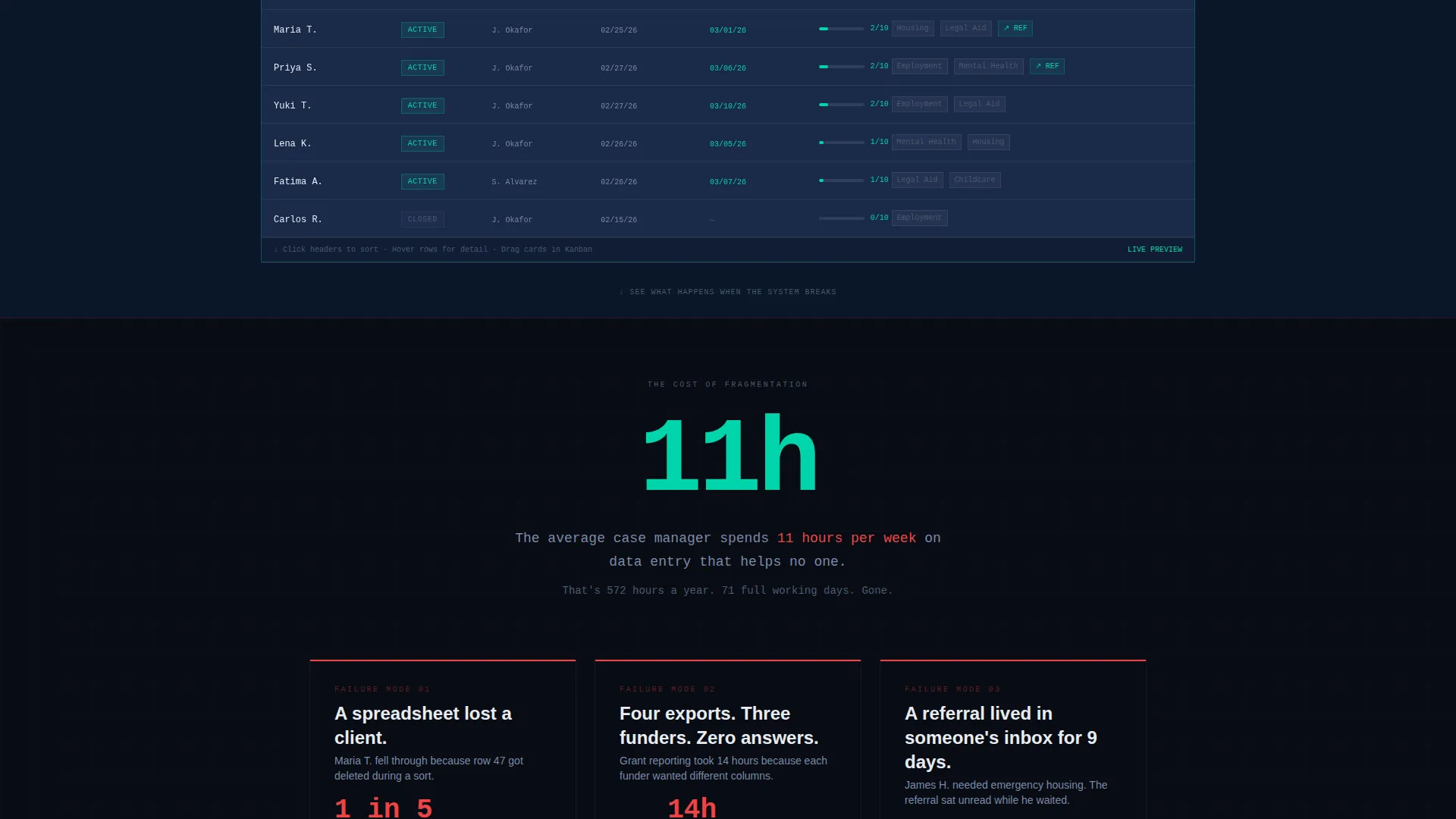
Nonprofit case management teams drown in fragmented tools. Spreadsheets lose rows. Referrals rot in inboxes. Funder reports get assembled from four incompatible exports the night before a deadline. The average case manager spends 11 hours per week on data entry that helps no one. This template gives that problem a face, then shows the way out.
- Client records scattered across sticky notes, intake call logs, and disconnected spreadsheets
- Funder reporting that requires manually reconciling data from multiple sources
- Clients who fall through the cracks because follow-ups live in someone's personal email
What you get with this template
You get a fully structured, single-page landing experience designed around one conversion goal: getting nonprofit staff to start a free account. Every section earns the next scroll. Every design choice reinforces operational credibility.
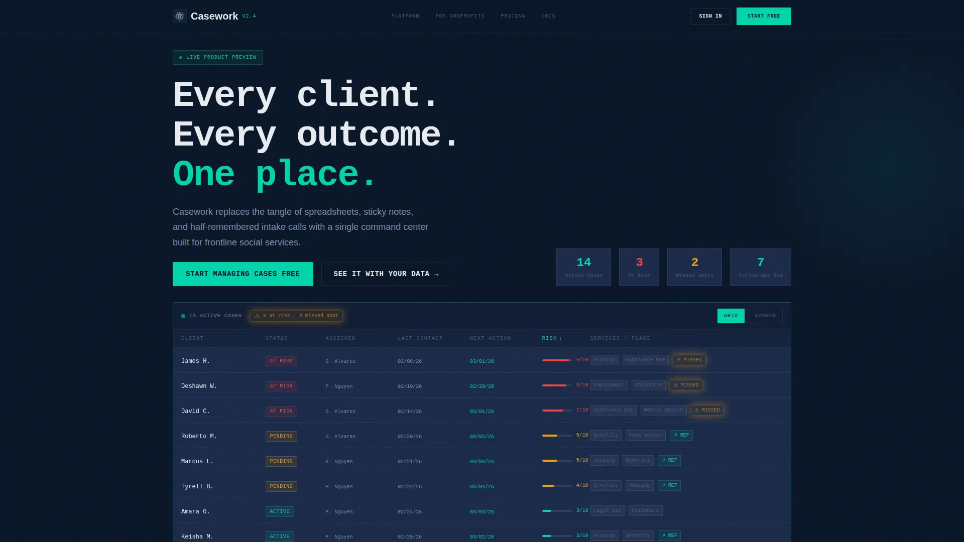
- An interactive data grid header with a fictional caseload, sortable columns, row popovers, and drag-and-drop status lanes
- A problem-to-solution scroll arc with three matched before-and-after panel pairs
- A freemium signup form asking only for work email, organization name, and caseload size
Feature list
This template ships with purpose-built components that reflect how nonprofit software actually gets evaluated and adopted.
Interactive Caseload Dashboard Header
The header is a functioning data grid, not a screenshot. It displays 14 fictional active clients with color-coded service statuses, teal-highlighted upcoming follow-ups, and a pulsing amber missed-appointment alert. Visitors can sort columns, hover rows to trigger detail popovers, and drag client cards between status lanes before they ever read a headline.
Problem-to-Solution Scroll Arc
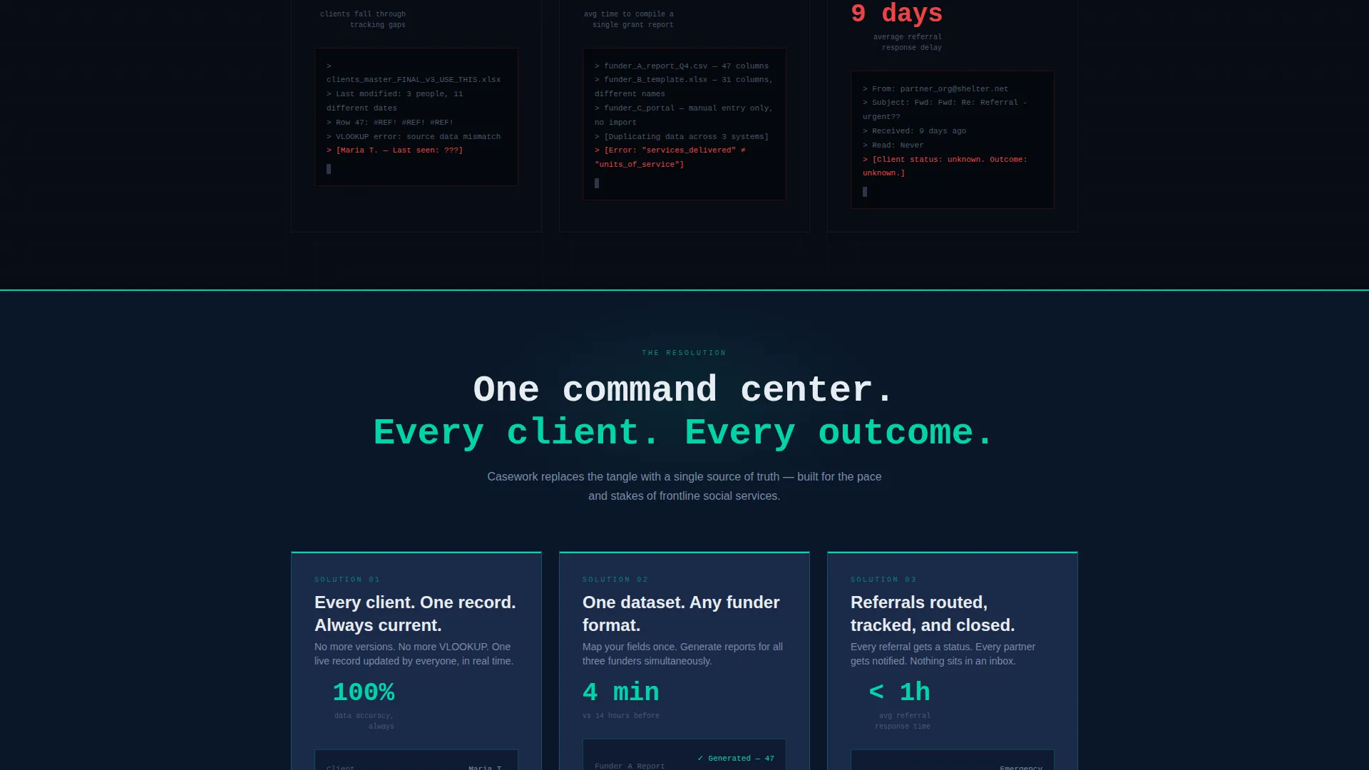
The page opens with a single brutal statistic, then descends through three escalating pain points. Each problem panel uses monospaced text, exposed grid lines, and harsh contrast to make the dysfunction feel real. At the arc's turning point, the background shifts from pure black to deep navy and the teal accent floods in. Each solution section mirrors the problem above it, resolved inside the product interface.
Freemium Conversion Flow
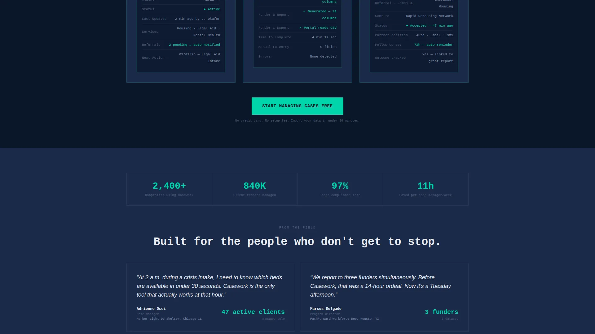
The primary call to action, "Start Managing Cases Free," appears three times: inside the interactive header, at the arc's turning point, and at the bottom of the page. The signup form asks only three fields, keeping friction minimal. A secondary path offers "See It With Your Data," linking visitors to a guided import tool.
Color-Coded Status Indicators
Every client row and status lane in the dashboard uses a deliberate color system. Teal marks upcoming follow-ups. Amber fires on missed-appointment alerts. Cold white text punches through the dark background at full contrast. Nothing is decorative; every color carries operational meaning.
Exposed Grid Typography System
Brutalist oversized monospaced type anchors every problem panel and data label. Borders are visible and unapologetic. The grid structure is exposed like rebar, making the architecture of the interface the aesthetic. This design choice signals to nonprofit tech buyers that the product is built for density and clarity, not marketing gloss.
Page sections overview
| Section | Purpose |
|---|---|
| Interactive Dashboard Header | Lets visitors use the product immediately; anchors the primary call to action |
| Opening Statistic Panel | Lands the 11-hours-per-week data entry problem in a single brutal line |
| Pain Point: Lost Spreadsheet | Shows the row-deletion failure state in raw monospaced contrast |
| Pain Point: Funder Report Chaos | Renders the four-export reconciliation problem as a failing system |
| Pain Point: Inbox Referral | Depicts the client who slipped away because a referral never left someone's email |
| Arc Turning Point | Background shifts to deep navy; teal floods in; the page crosses into solution territory |
| Solution: Unified Client Record | Mirrors the spreadsheet problem, resolved inside the product interface |
| Solution: Funder Reporting View | Mirrors the export chaos panel with a single consolidated report screen |
| Solution: Referral Tracking Panel | Shows the referral now logged, tracked, and flagged inside the platform |
| Freemium Signup Section | Three-field form with primary and secondary conversion paths |
| Bottom Call to Action | Final "Start Managing Cases Free" button with reinforcing proof context |
Design & branding system
The visual identity is bold brutalist built on a midnight blue color system. Every design decision prioritizes density and operational clarity over decoration.
- Color palette: deep terminal navy (#0A1628) background, steel-blue (#1B2A4A) card surfaces, cold white (#E8ECF1) typography, and electric teal (#00D4AA) on all interactive elements and status indicators
- Typography: oversized monospaced type for problem panels and data labels; brutalist scale with unapologetic visible borders throughout
- Accent system: amber (#F59E0B) reserved for missed-appointment alerts and urgency states; teal used consistently for progress bars, follow-up flags, and calls to action
Mobile & speed optimization
The template is structured to deliver a coherent experience across screen sizes without sacrificing the data-dense dashboard that makes it compelling.
- The interactive data grid header is built to scale gracefully, preserving column sorting and row hover behavior on touch-capable devices
- Problem and solution panels use a single-column flow on smaller screens, keeping the before-and-after arc readable without horizontal scrolling
- The three-field signup form collapses cleanly to a stacked layout, keeping the conversion path accessible at any viewport width
How this template helps you convert
The conversion strategy in this template is built around earned trust. Visitors use the product before they read about it, which removes skepticism faster than any testimonial block.
- The interactive header lets visitors sort, hover, and drag inside a live dashboard, creating hands-on product familiarity before the first paragraph is read
- The problem-to-solution arc mirrors the exact operational reality of case managers and program directors, making the platform feel like it was built specifically for them
- The freemium signup asks only three fields, removing every non-essential barrier between interest and activation
Other information about this template
This template is designed for nonprofit technology platforms operating in the human services sector. It works particularly well for client management tools positioning against spreadsheet-based workflows or legacy case management systems.
- The template style is a dashboard and data grid landing page with a bold brutalist theme
- The creative direction follows a problem-to-solution arc, making it effective for audiences who respond to operational empathy before product features
- The header concept is an interactive preview, which is a differentiated approach compared to static hero images or video backgrounds common in nonprofit software marketing
- This template is a strong fit for platforms offering freemium or free-trial entry points in the nonprofit client management category
Theme
Bold Brutalist
Creative direction
Problem→Solution Arc
Color system
Midnight Blue
Style
Dashboard/Data Grid
Direction
Freemium/Trial
Page Sections
Interactive Caseload Dashboard Header
Problem-to-solution Scroll Arc
Freemium Conversion Flow
Color-coded Status and Alert System
Bold Brutalist Typography and Grid
Related questions
Can I customize the fictional client data in the dashboard header?
Does the interactive dashboard require special coding knowledge to set up?
Is this template only suitable for domestic violence shelters and food banks?
Can I edit the call-to-action text and signup form fields?
What makes this different from a standard software landing page template?



