Higher Education Digital Presence Directory Website Template
The Catalog Bold Brutalist Higher Education Directory Landing Page Template is a dense, modular card-grid landing page built for serious college research. It maps universities, community colleges, and trade schools onto a single filterable grid, surfacing tuition, acceptance rates, and program details that admissions brochures routinely hide. Built in Electric Indigo on a raw charcoal base, the page lets visitors compare schools before they ever fill out a form.
by Rocket studio
Quick summary
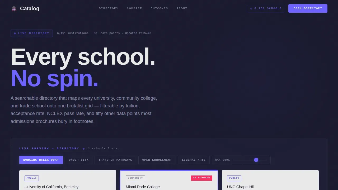
This landing page drops visitors straight into a live, manipulable directory of colleges and universities. No stock campus photography, no vague mission statements. Three school cards load immediately in the header, filters are already active, and the comparison engine is one click away. The design is bold, heavy, and honest, built for students who need real data fast.
Who this template is for
This template serves every researcher who finds standard university websites too polished and too thin on facts. The page is built for the late-night decision maker, not the campus tour visitor.
- High school juniors toggling between state flagships and small liberal arts colleges at midnight
- Community college students hunting articulation agreements and transfer pathways
- Parents comparing nursing program outcomes, including NCLEX pass rates, across institutions
What problem this template solves
Most higher education websites bury the numbers prospective students actually need. Tuition figures, acceptance rates, campus size, program-specific outcomes, and course articulation details are scattered across footnotes, PDF downloads, and separate institution pages. That friction costs users time and costs directories conversions.
- Students cannot easily compare a range of schools side by side on one page
- Critical data points like cost and acceptance rate are not displayed together in one view
- Visitors leave before they reach a sign-up form because the product never proves its value first
What you get with this template
This template gives builders a fully structured education landing page that leads with the product itself. The design earns engagement before asking for anything. Every section adds one more layer of data intelligence, rewarding the scroll.
- A live interactive header with three pre-loaded school cards, filter chips, and a compare toggle
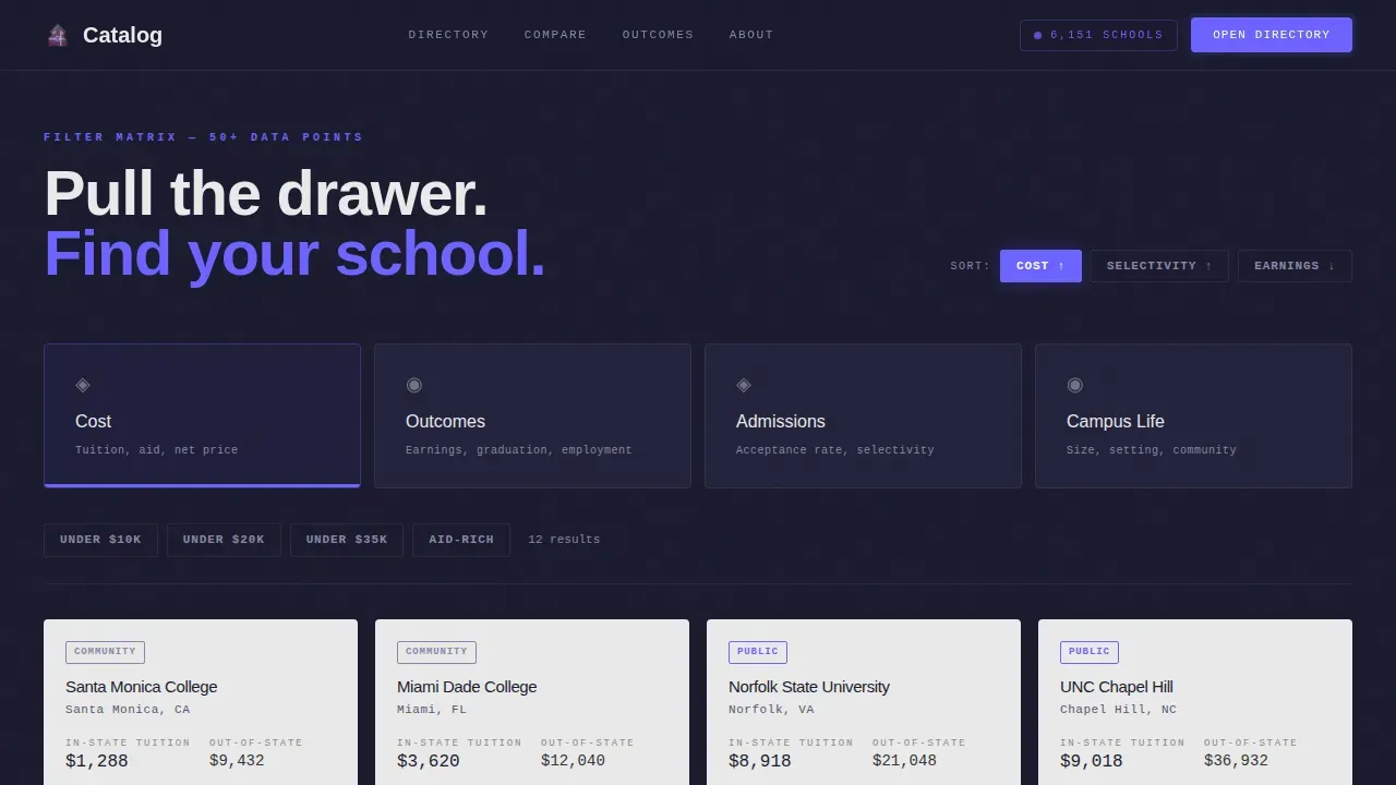
- A Feature Matrix of brutalist concrete-slab category sections covering Cost, Outcomes, Admissions, and Campus Life
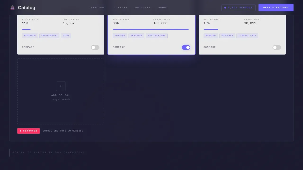
- A pinned comparison bar that pulses indigo once two or more cards are selected, plus a lightweight "Save My List" email form
Feature list
This template delivers six structured, purpose-built features drawn directly from the project brief. Each one reflects a deliberate design decision built to serve students and inspire confidence in the directory.
Interactive Header Preview
The header is the product. Three school cards are pre-loaded on a charcoal surface, each showing a real institution name, tuition figure, and acceptance rate. Visitors can drag a fourth card into the frame or tap a filter chip before they scroll a single pixel. A massive stark heading states the directory's purpose directly, with no ambiguity.
Live Filter Matrix
Scrolling past the header reveals filter categories that fan out like brutalist concrete slabs: Cost, Outcomes, Campus Life, and Admissions. Each category drives a dense modular grid of school cards that re-sort in real time as sliders and toggles adjust. The scroll teaches the system rather than telling a story, and data density grows with every section.
Modular School Card Grid
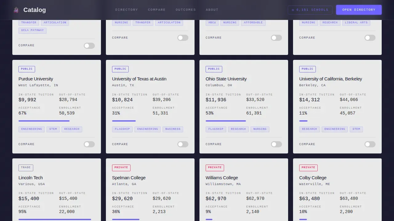
School cards follow a clean, bento-style grid layout with thick borders and bold typography. Each card surfaces the details that matter: tuition in USD, acceptance rate, campus size, and program focus. Live sort indicators show users exactly how cards are ranked at any moment. The grid is the page's core visual and functional engine.
Pinned Comparison Engine
Once two cards are selected, a comparison bar pins to the bottom of the viewport. It expands into a full side-by-side breakdown with the primary call-to-action "Compare These Schools Now" displayed prominently. The bar uses bold, large-format button design with no rounded corners, consistent with brutalist web design conventions.
Save My List Form
The secondary conversion path is a lightweight email form framed as a bookmark. Visitors who have already built a shortlist are invited to save their work with just an email address. Keeping the form visible before the fold and using the electric indigo color as a signal color improves focus and encourages completion.
Social Proof and Scale Section
A dedicated section displays the directory's scope: 6,151 institutions indexed, data source badges, and user engagement counts. This section functions as a trust layer, giving prospective students and parents confidence that the directory is authoritative and comprehensive. Student testimonials can be placed here to reinforce credibility.
Page sections overview
| Section | Purpose |
|---|---|
| Hero Interactive Preview | Loads three live school cards with filters and compare toggle active from pixel one |
| Filter Matrix | Brutalist category slabs for Cost, Outcomes, Admissions, and Campus Life |
| School Card Grid | Dense modular bento grid with live sort indicators and per-card data |
| Comparison Engine | Side-by-side breakdown panel with pinned primary call-to-action bar |
| Social Proof Scale | Directory scope stats, data badges, and student testimonials |
| Footer Linear Row | Single-row footer with essential links and secondary navigation |
Design & branding system
The visual identity is Bold Brutalist, built to feel like a 1972 university library with electric spray paint on the stairwell. The color palette is heavy where structure lives and luminous where interaction happens. Typography follows the same principle: dense and raw in headings, precise and monospaced in data fields.
- Background: deep slab charcoal (#1A1A2E); primary interactive color: electric indigo (#6C63FF) for hover states, toggles, and the pinned comparison bar
- Card surfaces and body text use raw exposed white (#EAEAEA); comparison badges and versus indicators use signal magenta (#FF2E63) exclusively
- Typography pairs DM Sans for headings and body with JetBrains Mono for data values, creating a clean design contrast between editorial and technical content
Mobile & speed optimization
The template is designed desktop-first, matching the late-night laptop research behavior of its core audience. A mobile fallback layout ensures the card grid and filter chips remain usable on smaller screens. The architecture separates static shell rendering from interactive grid components.
- Server Components handle the static page shell for faster initial load
- Client Components power the interactive grid, filter chips, compare toggles, and slider simulation independently
- The responsive layout collapses the bento grid gracefully, keeping school card details readable on mobile viewports
How this template helps you convert
This landing page is built around a single insight: let users manipulate real data before asking for anything. The conversion process is gradual, honest, and earned. Design decisions at every stage reduce friction and build trust.
- The interactive header lets visitors use the directory immediately, so by the time the indigo call-to-action pulses, they have already built a shortlist and the sign-up simply saves their work
- The pinned comparison bar surfaces the primary call-to-action only after two or more cards are selected, meaning the page waits for demonstrated intent before it asks visitors to convert
- The "Save My List" email form is the secondary path, framed as a practical tool for the research session already in progress rather than a cold lead capture form
Other information about this template
This template draws from the same design philosophy that makes brutalist websites distinctive in today's web design landscape. The brutalist design trend is often seen as a reaction against the polished, corporate aesthetics of mainstream sites, and that contrast is intentional here. Art and design schools have long drawn inspiration from brutalist aesthetics to signal creativity and honesty in their digital presence.
The catalog bold brutalist higher education directory landing page template is a compelling example of what bold web design can accomplish when it prioritizes function over decoration. Brutalist websites tend to use non-standard navigation and intentional asymmetry, reflecting structural aspects of brutalist architecture. The same honesty that defines poured-concrete buildings defines this page: no striking imagery for its own sake, no white space used purely for polish, no unnecessary links diluting the user journey.
Builders who want to redesign an existing higher education directory site will find this template an immediate source of inspiration. It can also serve as a reference for anyone studying the best higher ed sites for examples of how to balance data density with engagement. Explore how higher ed sites increasingly use bold visuals, raw graphics, and eye catching design to reach the younger generation of college seekers.
Key takeaways for anyone evaluating this template:
- Career outcomes are a critical part of what prospective students evaluate, and this template surfaces that data prominently at the card level
- The strongest course recommendation experiences simplify decisions for students, and the comparison engine is built precisely to serve that goal
- Student testimonials placed in the social proof section give the directory a human voice alongside its data-dense world of numbers
- The page can inspire teams planning a redesign of any education landing experience that needs to balance information access with clean design
Theme
Bold Brutalist
Creative direction
Feature Matrix
Color system
Electric Indigo
Style
Card Grid (Modular)
Direction
Comparison/Versus
Page Sections
Interactive Header with Live School Cards
Live Filter Matrix by Category
Modular Bento School Card Grid
Pinned Comparison Engine
Save My List Email Form
Social Proof and Directory Scale Section
Related questions
Who is the primary audience for this template?
Does the template include a school comparison feature?
What visual style does this template use?
Is there a form included for capturing visitor information?
Can this template support a large directory of institutions?



