E-Commerce Platform Pricing Tiers & Plan Comparison Website Template
Tier is a hub-and-spoke pricing landing page built for e-commerce merchants who need to compare plans fast. Anchor navigation links jump to four dedicated tier sections, each opening with a real merchant pain point and resolving it with that plan's feature set. A billing toggle, sticky mini-bar, and a three-question micro-quiz make the right choice obvious before the visitor reaches the bottom.
by Rocket studio
Quick summary
Tier is a single-page pricing template designed for e-commerce stores. It lays every plan side by side in a parts-catalog layout, with anchor navigation, comparison cards, and a micro-quiz that surfaces the right tier in under sixty seconds. The Slate & Sky color system keeps everything sharp, functional, and easy to read at a glance.
Who this template is for
This template is built for merchants and operators who need a pricing page that does the selling without hand-holding. It fits teams where the decision-maker is busy and the CFO needs a clear line-item justification.
- Solo founders fulfilling orders from a home or garage who need a quick, confident plan choice
- Growing direct-to-consumer brands managing subscription boxes, wholesale portals, or multiple sales channels
- Operations managers at mid-market retailers who need to present plan costs clearly to leadership
What problem this template solves
Most pricing pages force visitors to read walls of features before they can compare anything useful. Merchants running lean operations do not have time for that. This template removes the guesswork by structuring every plan comparison around a real problem the visitor already feels.
- Visitors cannot tell which plan matches their actual order volume without digging
- Feature differences between tiers are buried in identical-looking rows with no visual hierarchy
- There is no guided path for undecided buyers who need a nudge before committing
What you get with this template
The template delivers a complete, structured pricing landing page with four dedicated tier zones, each connected by anchor navigation. Every component is purpose-built to move a visitor from "not sure" to "start free" without friction.
- A hub-and-spoke anchor nav with four spokes: Starter, Growth, Scale, and Enterprise
- Per-tier comparison cards showing features against the tiers above and below
- A billing toggle, sticky mini-bar, micro-quiz recommendation engine, and tooltip-linked feature rows
Feature list
This template is built around components that make plan comparison fast and the decision feel earned.
Anchor Navigation Hub
A pinned navigation bar appears immediately below the header and stays visible as the visitor scrolls. Each link, Starter, Growth, Scale, and Enterprise, smooth-scrolls to its dedicated comparison zone, turning a long page into a guided, spoke-by-spoke experience.
Problem-to-Solution Section Arc
Every tier section opens with a one-line pain point real merchants recognize, then immediately answers it with that tier's feature set. The problems escalate in cost and complexity as the visitor scrolls, making the value of upgrading feel logical rather than pushed.
Comparison Cards with Visual Hierarchy
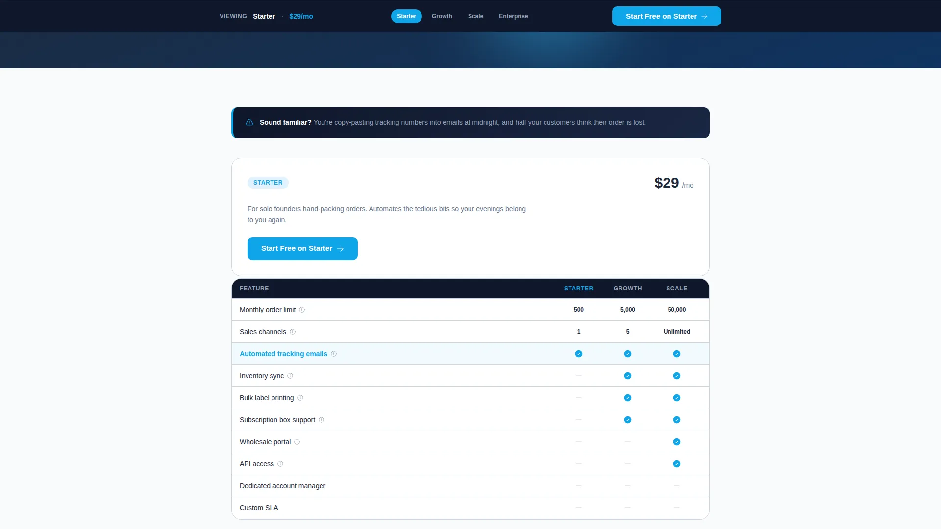
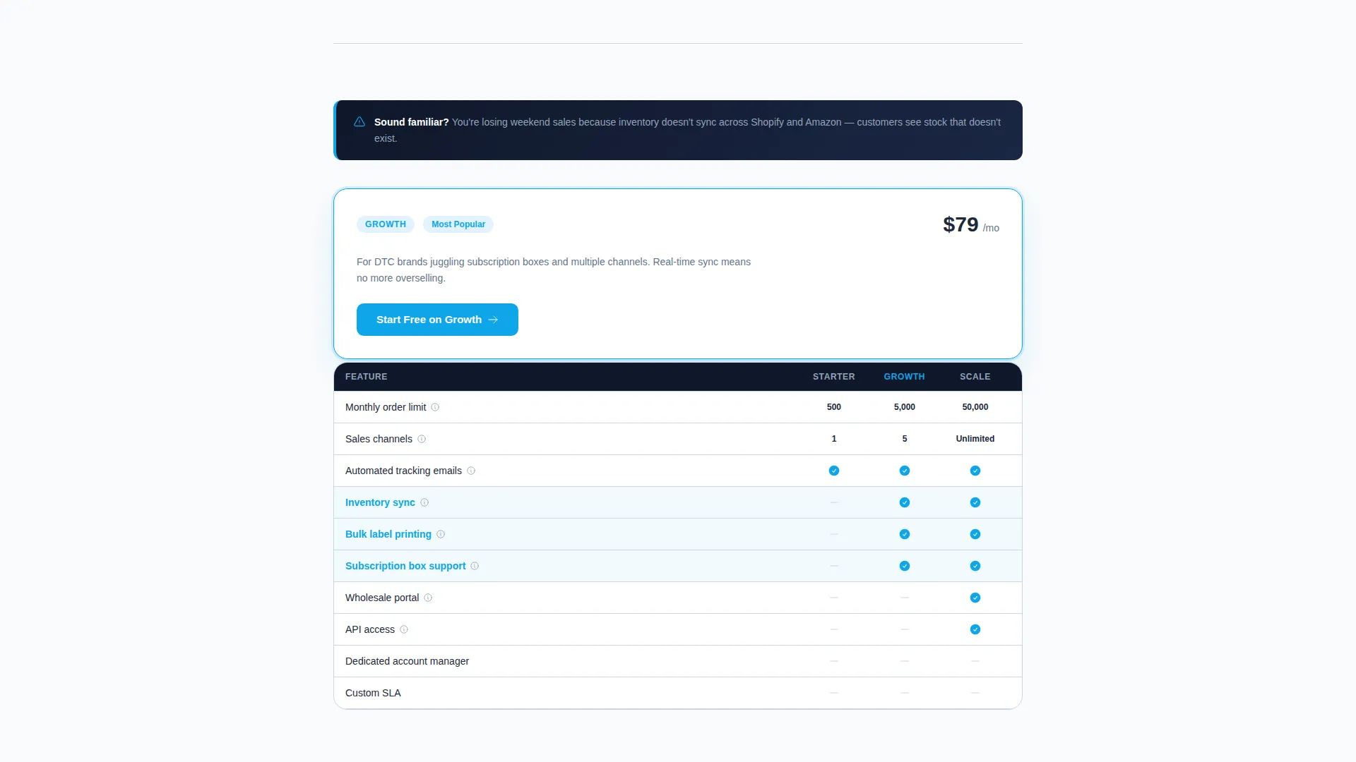
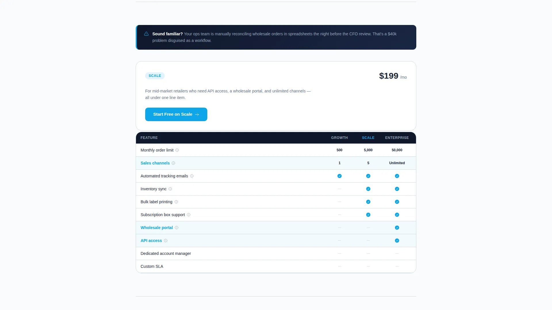
Each tier displays a compact comparison card that shows the current plan's features alongside the tiers directly above and below. Highlighted rows and sky-blue checkmarks make the feature delta between plans visually obvious without requiring the visitor to scroll back and forth.
Monthly and Annual Billing Toggle
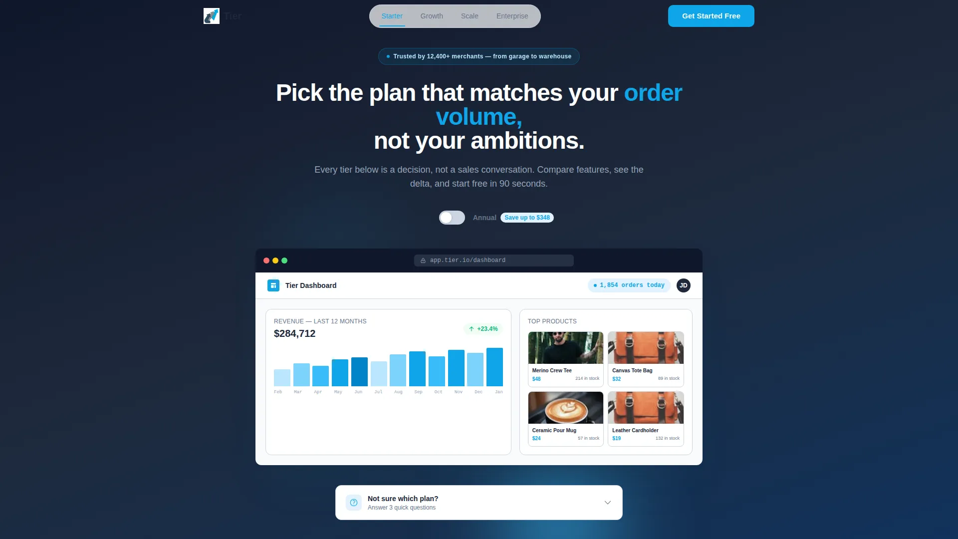
A toggle at the top of the page switches between monthly and annual pricing. Savings are shown in real dollar amounts, not percentages, so merchants can quickly calculate what the discount means for their actual budget.
Three-Question Micro-Quiz
A secondary conversion path labeled "Not sure? Answer 3 questions" walks visitors through monthly order volume, number of sales channels, and whether they need API access. The quiz then highlights the recommended tier with a pulsing sky-blue border, giving undecided buyers a clear, personalized nudge.
Sticky Mini-Bar and Enterprise Calendar
A sticky bar at the bottom of the viewport shows the currently viewed plan and its price, creating passive comparison as the visitor moves between spokes. The Enterprise spoke replaces the standard button with a "Talk to Sales" call to action and a calendar embed showing next-available slots.
Page sections overview
| Section | Purpose |
|---|---|
| Header Screenshot Zone | Anchors trust with a live-dashboard product screenshot and the page headline |
| Anchor Navigation Bar | Pins to the top and links each tier as a smooth-scroll spoke |
| Billing Toggle Row | Lets visitors switch between monthly and annual pricing with real dollar savings |
| Starter Tier Spoke | Opens with a Starter-level pain point and resolves it with tier features and a comparison card |
| Growth Tier Spoke | Escalates to a channel-sync problem and presents Growth plan features against adjacent tiers |
| Scale Tier Spoke | Addresses higher-volume operations pain and shows Scale plan's expanded feature delta |
| Enterprise Tier Spoke | Replaces the call to action button with Talk to Sales and a calendar embed for next-available slots |
| Micro-Quiz Module | Asks three questions and highlights the recommended tier with a pulsing border |
| Sticky Mini-Bar | Displays the active tier name and price as a persistent comparison anchor |
Design & branding system
The template follows a Directory & Discovery theme built on the Slate & Sky color system. Every color choice serves function first, keeping fine print readable and key actions unmissable.
- Deep charcoal slate (#1E293B) for primary text and table headers, cool mid-gray (#64748B) for secondary copy and divider lines, and open-sky blue (#0EA5E9) for calls to action and the active anchor-nav indicator
- Cloud white (#F8FAFC) card backgrounds give each tier section breathing room and prevent visual fatigue across a long comparison page
- The header centers a pixel-perfect product screenshot in a native-feeling browser chrome, set on a subtle slate gradient with a single semibold white headline beneath it
Mobile & speed optimization
The layout is designed to stay readable and functional on smaller screens, where most busy merchants will scan pricing between tasks. Every interactive component translates cleanly to touch-based navigation.
- The anchor nav and sticky mini-bar remain accessible on mobile, keeping tier context visible without consuming too much screen space
- Comparison cards and feature rows reflow into a vertically stacked format so the tier delta remains clear without horizontal scrolling
How this template helps you convert
Every design decision on this page is aimed at removing hesitation and shortening the time between arrival and action.
- The per-tier call to action reads "Start Free on [Tier Name]" rather than a generic button label, making the action feel specific and already chosen by the visitor.
- The micro-quiz replaces passive browsing with an active recommendation, giving undecided visitors a result they trust because they supplied the inputs themselves.
- The Problem-to-Solution arc builds stakes progressively through the scroll, so by the time a visitor reaches their natural tier, the upgrade case has already been made by the page content itself.
Other information about this template
This template is categorized under e-commerce store website templates in the Technology category, with a focused niche intent around e-commerce store pricing pages. It is designed for single-page deployment and requires no multi-page routing setup.
- The template style is Hub & Spoke with anchor navigation, making it straightforward to adapt the spoke labels and pain-point copy to match any software-as-a-service or platform pricing structure
- Tooltip links on every feature row are included in the layout, giving merchants a built-in space to add one-sentence clarifications without cluttering the comparison card
- The template is well-suited for use with e-commerce platforms where plan differentiation is driven by order volume, channel count, or API access needs
Theme
Directory & Discovery
Creative direction
Problem→Solution Arc
Color system
Slate & Sky
Style
Hub & Spoke (Anchor Nav)
Direction
Comparison/Versus
Page Sections
Anchor Navigation with Four Spokes
Problem-to-solution Section Arc
Comparison Cards with Visual Hierarchy
Billing Toggle with Dollar Savings
Three-question Micro-quiz
Sticky Mini-bar and Enterprise Calendar Embed
Related questions
How many pricing tiers does this template support?
Can I change the billing toggle to show different pricing periods?
What happens when a visitor completes the micro-quiz?
Is the Enterprise section different from the other tier spokes?
Who is this pricing landing page template best suited for?



