Higher Education Digital Presence Professional Website Template
This hub-and-spoke landing page template turns a complex university's departments, programs, and research centers into one clean, navigable surface. Built around an anchor navigation bar and filterable card grids, it guides prospective students, transfer applicants, and parents from curiosity to action. A persistent floating call-to-action and a low-friction info request form close the loop without pressure.
by Rocket studio
Quick summary
This template is a single-page catalog hub for higher education institutions. It organizes colleges, programs, research centers, and campus life into anchor-linked spoke sections, each holding a filterable card grid. Visitors explore at their own pace, guided by a pinned navigation bar and nudged toward action by a floating call-to-action button that appears only after engagement.
Who this template is for
Universities and colleges that need a single navigable entry point for a wide range of academic offerings will find this template directly useful. It is designed for institutions whose existing web presence has grown difficult to navigate, and whose prospective visitors arrive with very different needs.
- High school students comparing degree paths across multiple disciplines at once
- Transfer applicants searching for credit equivalency information by program or level
- Parents trying to understand what broad academic fields mean for graduate outcomes
What problem this template solves
A large university website often grows into a maze over time. Departments add their own pages, research centers live in separate subdomains, and a first-time visitor has no clear starting point. This template replaces that fragmented experience with one organized, discoverable surface.
- Visitors land in one place instead of bouncing across disconnected department pages
- Each spoke section keeps related content grouped, filterable, and easy to compare
- Every card leads clearly to a full department page, so no dead ends slow the journey
What you get with this template
The template delivers a fully structured hub-and-spoke landing page with five core spoke sections, a pinned anchor navigation bar, and a floating call-to-action. Each section is pre-built around a specific audience need, from program discovery to application entry.
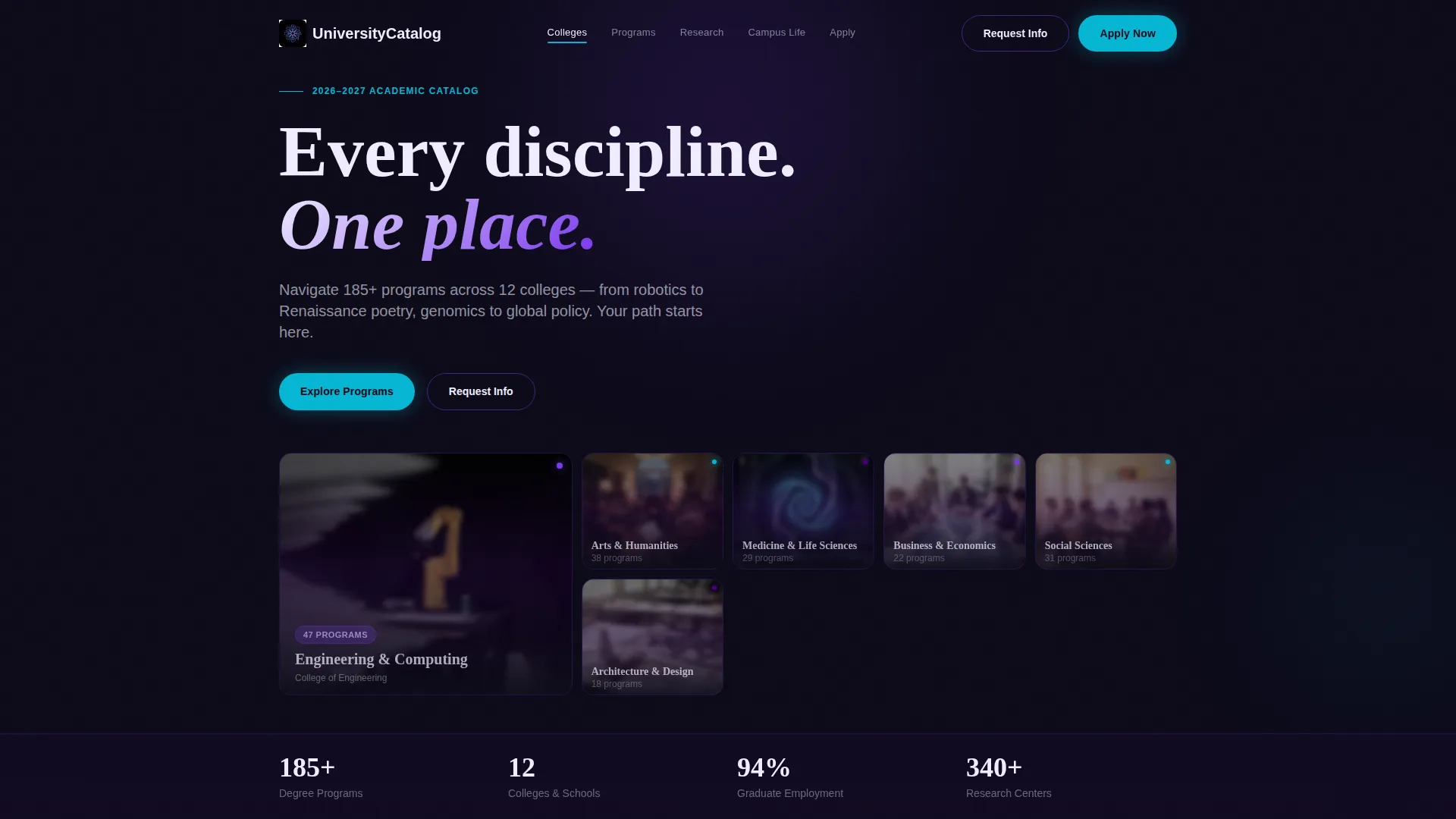
- A frosted Dark Glass Panels header grid with hover-activated focus effects on each panel
- Five anchor-linked spoke sections covering Colleges, Programs, Research, Campus Life, and Apply
- A lightweight three-field info request form collecting first name, email, and intended major
Feature list
This template's interactive and visual features are drawn directly from the brief. Each one serves the goal of turning passive browsing into genuine exploration.
Pinned Anchor Navigation Bar
A sticky navigation bar sits at the top of the page at all times. It contains five labeled links: Colleges, Programs, Research, Campus Life, and Apply. Clicking any link smooth-scrolls the visitor to the matching spoke section without a page reload.
Filterable Card Grids Per Spoke
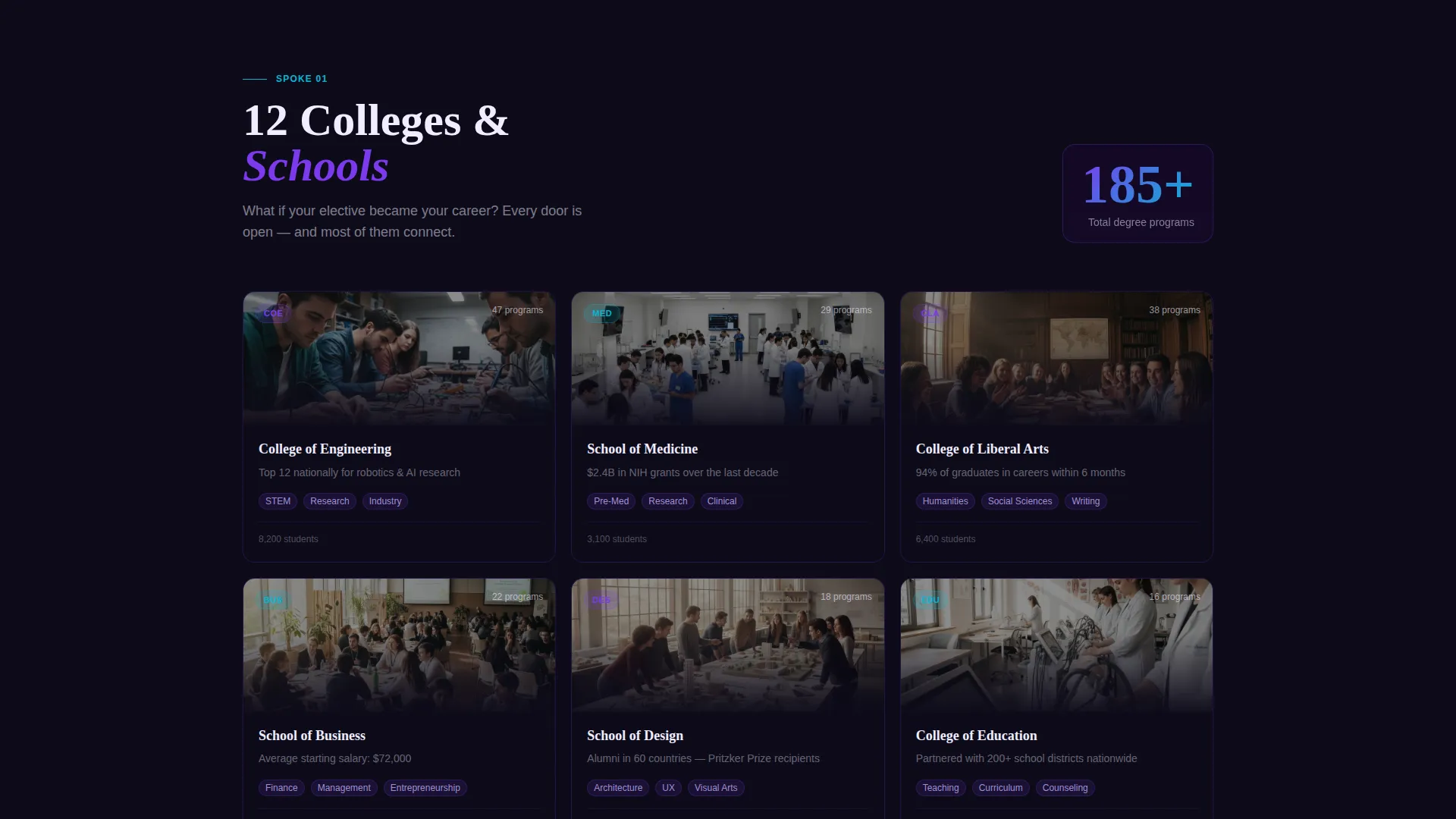
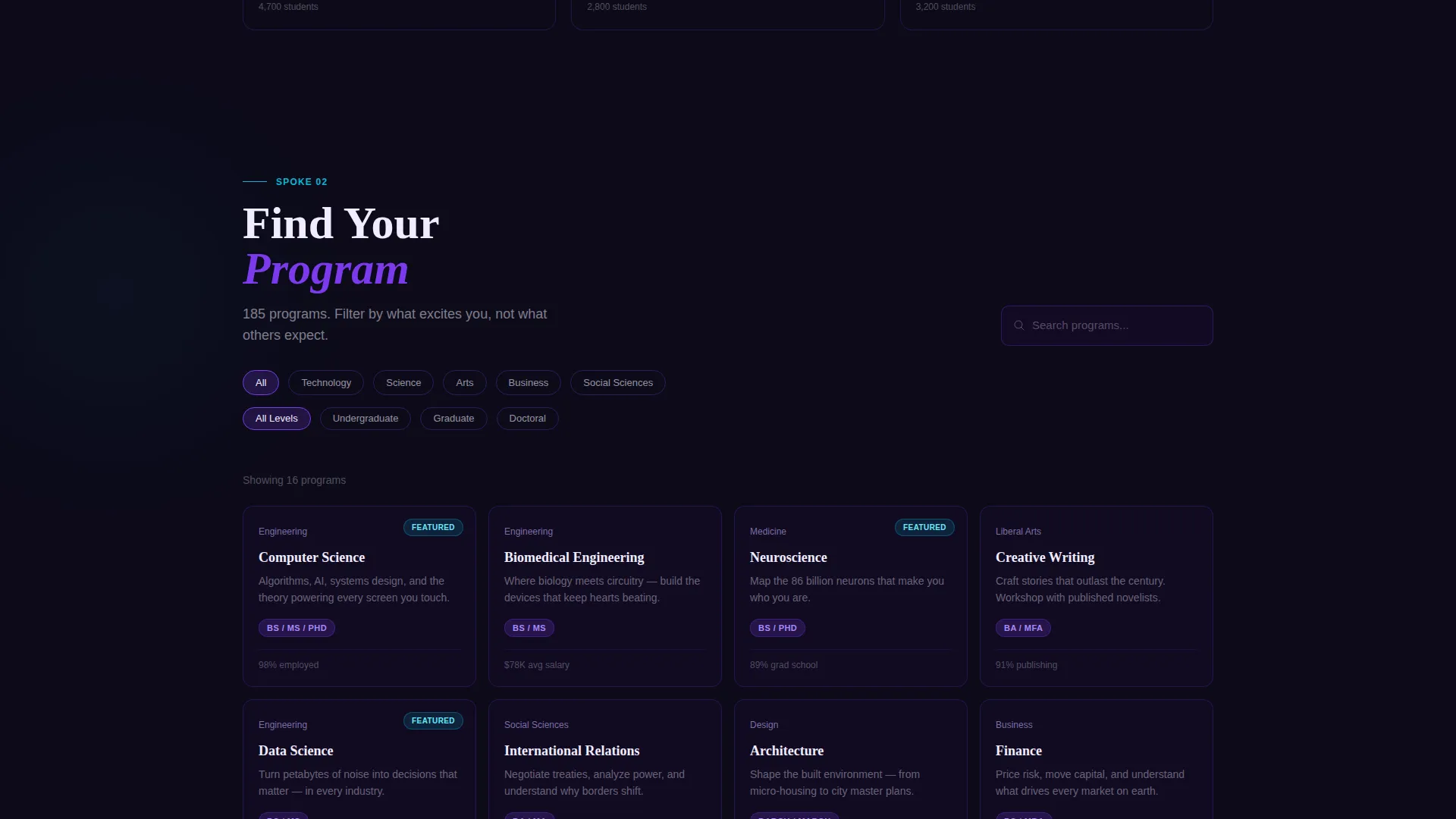
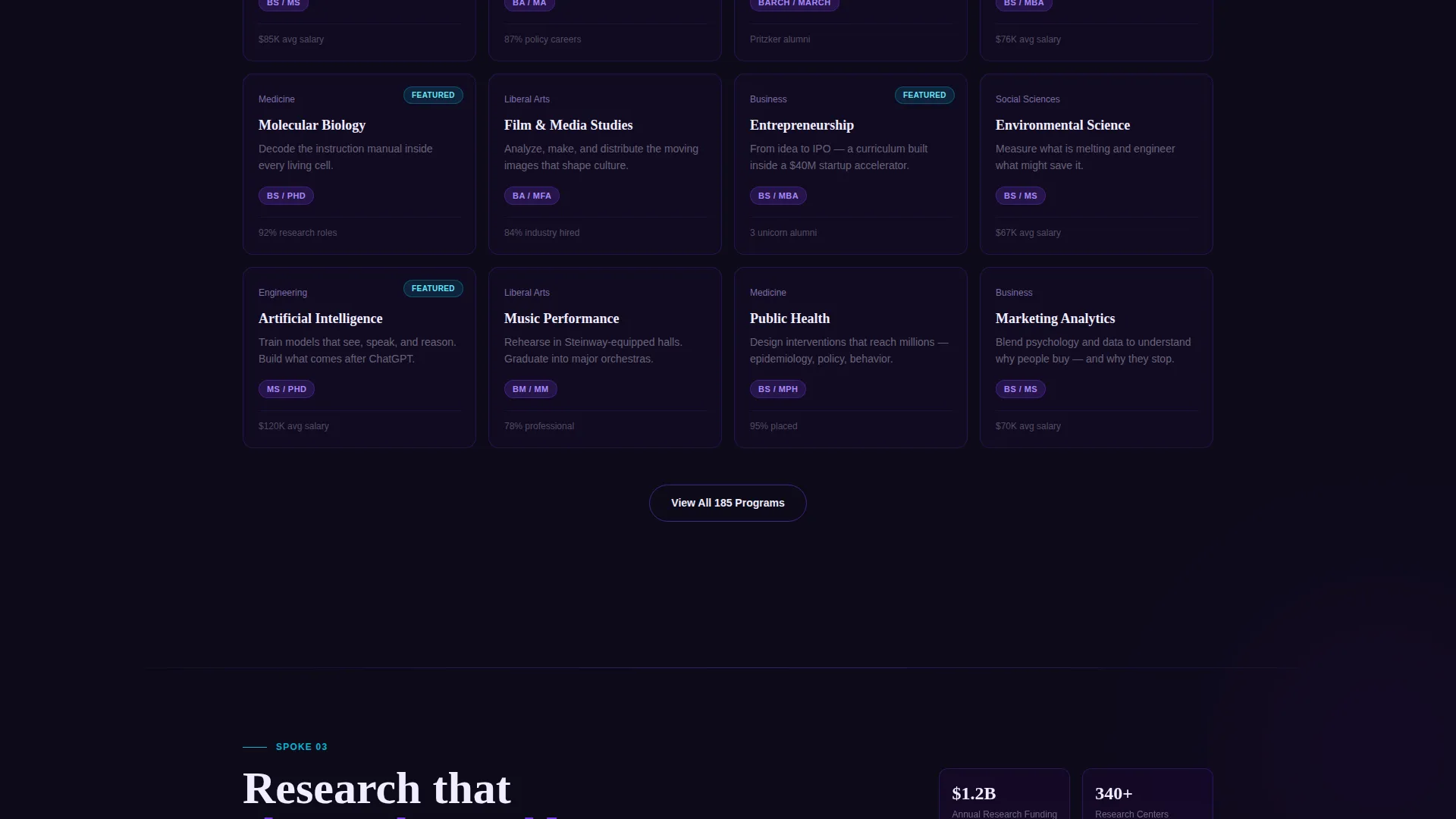
Each spoke section opens with a short provocative hook, then presents a card grid. Visitors can sort cards by interest, degree level, or keyword, letting them narrow a large catalog to only what is relevant to them.
Dark Glass Panels Header
The header is a grid of translucent frosted-glass rectangles. Each panel sits against a deep black background, reveals a different academic scene beneath its surface, and sharpens from a blurred state to full focus as the cursor moves across it. Program name and college appear in chalk white on focus.
Persistent Floating Call-to-Action
A floating "Start Your Application" button in electric cyan appears only after the visitor has interacted with at least one spoke section. This timing keeps the prompt feeling earned rather than intrusive.
Low-Friction Info Request Form
A secondary conversion path offers a simple form with three fields: first name, email, and intended major. No account creation or lengthy questionnaire is needed. The form serves visitors who want to learn more before committing to the application flow.
Section-Opening Engagement Hooks
Each spoke section begins with a single statistic or question designed to create curiosity before revealing the card grid beneath it. Examples like "What if your elective became your career?" frame the content emotionally before presenting it logically.
Page sections overview
| Section | Purpose |
|---|---|
| Dark Glass Header | Introduces the institution through a grid of hover-activated frosted panels representing different disciplines |
| Anchor Navigation Bar | Pins to the top and links to each of the five spoke sections for fast access |
| Colleges Spoke | Displays a filterable card grid of colleges within the institution |
| Programs Spoke | Lets visitors browse and sort degree programs by interest, level, or keyword |
| Research Spoke | Showcases research centers with individual cards linking to full detail pages |
| Campus Life Spoke | Presents student life, clubs, and campus experience content in card format |
| Apply Spoke | Guides application-ready visitors toward the primary conversion action |
| Floating Apply Button | Appears after engagement and persists as a sticky call-to-action in electric cyan |
| Info Request Form | Offers a three-field secondary path for visitors not yet ready to apply |
Design & branding system
The visual identity follows a Directory and Discovery theme built on an Electric Indigo color system. The palette is intentionally atmospheric, evoking a campus after dark where each lit window represents a different area of knowledge.
- Core palette: deep lecture-hall black (#0D0B1A), charged indigo (#4B0082), phosphor violet (#7C3AED), and chalk white (#F0EDFF) for text and card surfaces
- Accent color: electric cyan (#06B6D4) applied to hover states, active navigation markers, and the floating call-to-action button
- Card and panel surfaces use translucent frosted-glass styling with thin indigo edge borders that catch light, keeping the aesthetic cohesive across every section
Mobile & speed optimization
The layout is structured to remain functional and clear on smaller screens. The anchor navigation, card grids, and floating button are each designed to adapt to the single-column mobile context without losing their navigational purpose.
- The pinned anchor nav collapses cleanly so it does not consume vertical space on phone-sized viewports
- Card grids reflow from multi-column to single-column, keeping each card fully readable without horizontal scrolling
- The floating call-to-action remains accessible at all scroll depths on mobile, preserving the conversion path throughout the session
How this template helps you convert
The template is built around a Click-Through landing page direction. Every design and structural decision serves the goal of moving visitors from passive browsing to active exploration, and from exploration to a conversion action.
- The filterable spoke sections keep visitors engaged longer by letting them self-sort and discover relevant programs, making the "Explore This Program" card link feel like a natural next step rather than a push.
- The floating "Start Your Application" button appears only after a visitor has engaged with at least one spoke, so the prompt arrives at the right moment and feels contextually appropriate rather than premature.
- The three-field info request form provides a secondary conversion path for visitors who are not yet ready to apply, capturing interest with minimal friction and keeping the institution's pipeline active.
Other information about this template
This template is built for the higher education digital presence category within the broader Technology vertical. It is a strong fit for institutions looking to consolidate their academic catalog into a modern, single-page discovery experience.
- The Interactive Explorer creative direction means each scroll interaction feels like opening a new drawer in an organized system, rewarding curiosity at every level
- The Hub and Spoke structure with anchor navigation is a proven pattern for catalog-style pages where visitors arrive with different goals and need to self-direct quickly
- The template is designed to pass contextual data forward, so clicking "Explore This Program" can carry the visitor to the relevant department page with their browsing context intact
- It suits institutions of varying sizes, from mid-sized liberal arts colleges building their first unified catalog page to large research universities simplifying a fragmented web presence
Theme
Directory & Discovery
Creative direction
Interactive Explorer
Color system
Electric Indigo
Style
Hub & Spoke (Anchor Nav)
Direction
Click-Through
Page Sections
Pinned Anchor Navigation Bar
Filterable Card Grids Per Spoke
Dark Glass Panels Header
Persistent Floating Call-to-action
Low-friction Info Request Form
Section-opening Engagement Hooks
Related questions
Can this template handle a large number of programs and departments?
What happens when a visitor clicks a program card?
How does the floating call-to-action button work?
Is the info request form easy to customize?
Who is this template best suited for?



