SaaS Product Homepage Library & Feature Showcase Website Template
Catalog is a modular, card-grid landing page template built for SaaS homepage libraries. It pairs a dark iridescent visual identity with a spec-sheet browsing experience, letting founders, growth leads, and agency designers browse, filter, and download pixel-perfect SaaS homepage components before their next standup.
by Rocket studio
Quick summary
Catalog is a single-page, card-grid template designed for SaaS homepage template libraries. It uses a Directory and Discovery theme with an AI Iridescent color palette to create a browsing experience that feels fast, ambient, and immediately useful. Users scroll through filterable template cards, flip any card for technical specs, and download or preview their pick with minimal friction.
Who this template is for
This template is built for people who need to ship fast without starting from zero. The browsing-first layout suits anyone managing a library of design or code assets.
- Solo founders who need a polished SaaS homepage live before their next standup
- Growth leads who require a launch page faster than a sprint cycle allows
- Agency designers tired of rebuilding hero sections, card grids, and call to action sections from scratch
What problem this template solves
Most SaaS homepage starting points are either too generic or too scattered across disconnected resources. Catalog solves the blank-canvas problem by presenting ready-to-use homepage components in one organized, browsable interface.
- No clear way to compare templates side by side before committing to one
- Too much time lost rebuilding the same layout components across client projects
- High commitment friction that makes visitors leave before they download anything
What you get with this template
You get a fully structured, single-page landing page built around a card-grid layout that inventories SaaS homepage templates the way a parts catalog inventories components. Every section is built to let visitors browse, compare, and act.
- A dark full-bleed hero with a 3D rotating template card, animated user interface elements, and a glow-bloom headline
- A filterable card grid where each card flips to reveal a technical spec panel with responsive breakpoints, component counts, and export options
- A persistent floating download bar with a two-step modal for platform selection and email capture
Feature list
This template ships with a focused set of interactive and visual features drawn directly from the Catalog brief.
Animated Full-Bleed Header
The header places a single template card center-frame, softly rotating in 3D space inside a violet-cyan glow bloom. The card's own user interface elements animate live: a navigation bar highlights, a hero headline types out, and a call-to-action button pulses. The headline "Every SaaS homepage. One library." fades up beneath the card.
Filterable Template Card Grid
The main content area is a modular card grid where every card is tagged by industry, layout type, and conversion goal. Visitors filter and compare the way a mechanic moves through a catalog: fast, lateral, and comparison-driven. No long-scroll narrative, just an organized inventory.
Card Flip Spec Panel
Clicking any card flips it to reveal a technical spec panel. The panel displays responsive breakpoints, component count, and available export options such as Figma, Framer, and HTML formats. This gives visitors the detail they need to evaluate fit before committing.
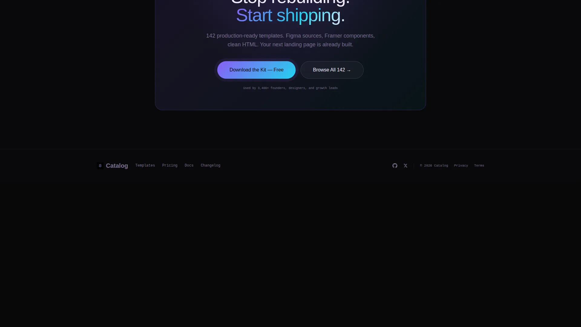
Floating Download Bar
After the first grid scroll, a slim floating bar pins to the viewport and displays the primary call-to-action: "Download the Kit." The bar stays visible as users browse, keeping the conversion path accessible at all times without interrupting the browsing experience.
Two-Step Download Modal
Tapping the download call-to-action opens a two-step modal. Step one asks the visitor to select their preferred platform: Figma, Framer, or HTML. Step two collects an email address to deliver the download link. The split-step approach reduces cognitive load and increases completion rates.
Browser Preview Path
Every individual template card includes a secondary "Preview in Browser" option. This lower-commitment path lets visitors interact with a real template before downloading, reducing install hesitation and building confidence in the product before the email gate.
Page sections overview
| Section | Purpose |
|---|---|
| Animated hero header | Introduces the library with a live, rotating template card and glow-bloom headline |
| Filterable card grid | Lets visitors browse and compare template cards by industry, layout, and goal |
| Card flip spec panel | Reveals technical details including breakpoints, component count, and export formats |
| Floating download bar | Keeps the primary download call-to-action pinned and visible after the first scroll |
| Two-step download modal | Guides platform selection and email capture in two low-friction steps |
| Browser preview path | Offers a commitment-free way to preview any template live before downloading |
Design & branding system
The visual identity follows an AI Iridescent color system layered over a Directory and Discovery theme. The overall feel is dark and ambient until a card or accent element catches the eye, then suddenly prismatic.
- Void black (#09090B) as the base canvas, holographic violet (#8B5CF6) and shimmer cyan (#22D3EE) as accent and glow colors, and soft pearl (#F0EAFF) for card surfaces and body text
- Cards sit on the dark background with iridescent border gradients that shift on hover, creating a backlit vending-machine effect
- Accent buttons pulse between violet and cyan, and the header glow bloom bleeds into the black like a monitor in a dark room
Mobile & speed optimization
The card-grid layout and modular component structure are designed to adapt across screen sizes without breaking the browsing experience. Each card and its flip panel respond to the viewport independently.
- Modular card components scale and reflow for tablet and mobile viewports
- The floating download bar and two-step modal are designed to remain accessible and usable on touch screens
- Lightweight hover and animation states keep visual interactions smooth across devices
How this template helps you convert
Catalog earns the download tap by letting visitors interact with real specs before hitting any gate. The conversion flow is built around reducing hesitation at every step.
- The card flip spec panel delivers immediate technical value, giving visitors confidence that a template fits their needs before they commit to downloading.
- The floating download bar maintains constant visibility of the primary call-to-action, so the path to conversion is never more than one tap away.
- The "Preview in Browser" secondary path removes the biggest barrier to download by letting visitors experience the template live, making the email gate feel like a fair trade.
Other information about this template
Catalog is part of the Pixelperfect template collection and is positioned as a template factory built for speed-first teams. A few additional details worth knowing before you use it:
- The template style is Card Grid (Modular), making it straightforward to extend or reorder cards as your library grows
- The creative direction is Spec Sheet, meaning the scroll experience is inventory-led rather than story-led, which suits technical buyers and comparison-driven visitors
- Export format options surfaced in the spec panel include Figma, Framer, and HTML, giving teams flexibility based on their preferred workflow
- The template is categorized under Technology, specifically the SaaS Company Homepage Template niche, and is suited to any team building or selling a SaaS homepage design system


Theme
Directory & Discovery
Creative direction
Spec Sheet
Color system
AI Iridescent
Style
Card Grid (Modular)
Direction
App Download
Page Sections
Animated Full-bleed Hero Header
Filterable Template Card Grid
Card Flip Spec Panel
Persistent Floating Download Bar
Two-step Download Modal
Commitment-free Browser Preview
Related questions
What formats can visitors download from this template?
Can visitors explore templates before giving their email?
How does the card flip interaction work?
Is this template suited for a full library or a single product?
Who is this landing page template built for?


