Specialist Advanced Tech & AI Platforms Professional Website Template
Catalog is a split-screen landing page template built for ad creative optimization platforms. It pairs a Stats/Metrics header wall with a Stats-First Impact scroll flow, using the Teal Catalyst color system to make performance data feel urgent and undeniable. It is designed to convert performance marketers, creative strategists, and direct-to-consumer founders who need proof before they act.
by Rocket studio
Quick summary
Catalog is a 50/50 split-screen landing page template for ad creative intelligence platforms. It leads with raw performance metrics, builds an evidence wall through alternating comparison panels, and closes with a sticky dual-call to action bar. The Teal Catalyst palette keeps the layout sharp, focused, and dashboard-ready from the first scroll.
Who this template is for
This template is built for teams and founders who live inside ad performance data. It speaks directly to people who need to prove creative decisions with numbers, not instinct.
- Performance marketers managing multiple ad sets who need a page that matches their data-driven mindset
- Creative strategists who defend concepts with evidence and want a template that reflects that authority
- Direct-to-consumer founders who need to communicate fast creative iteration and measurable results
What problem this template solves
Most landing pages for creative tools bury the proof and lead with feature lists. Visitors leave before they trust the platform. This template flips that structure entirely.
- It surfaces the metrics first, letting numbers make the argument before any headline appears
- It replaces vague benefit statements with side-by-side comparisons that make the old way versus the platform way visceral and immediate
- It structures every scroll section as a standalone proof point, so trust builds continuously rather than all at once at the bottom
What you get with this template
You get a fully structured single-page layout designed around evidence-first conversion. Every section serves a specific persuasion role, from the opening metric wall to the gated library call to action.
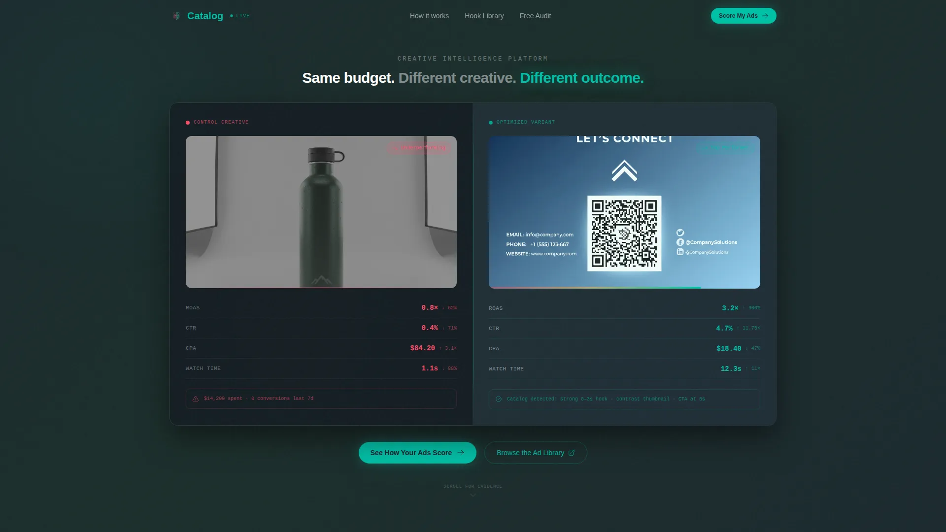
- A split-screen header showing a losing ad panel versus an optimized ad panel with live-style teal metrics
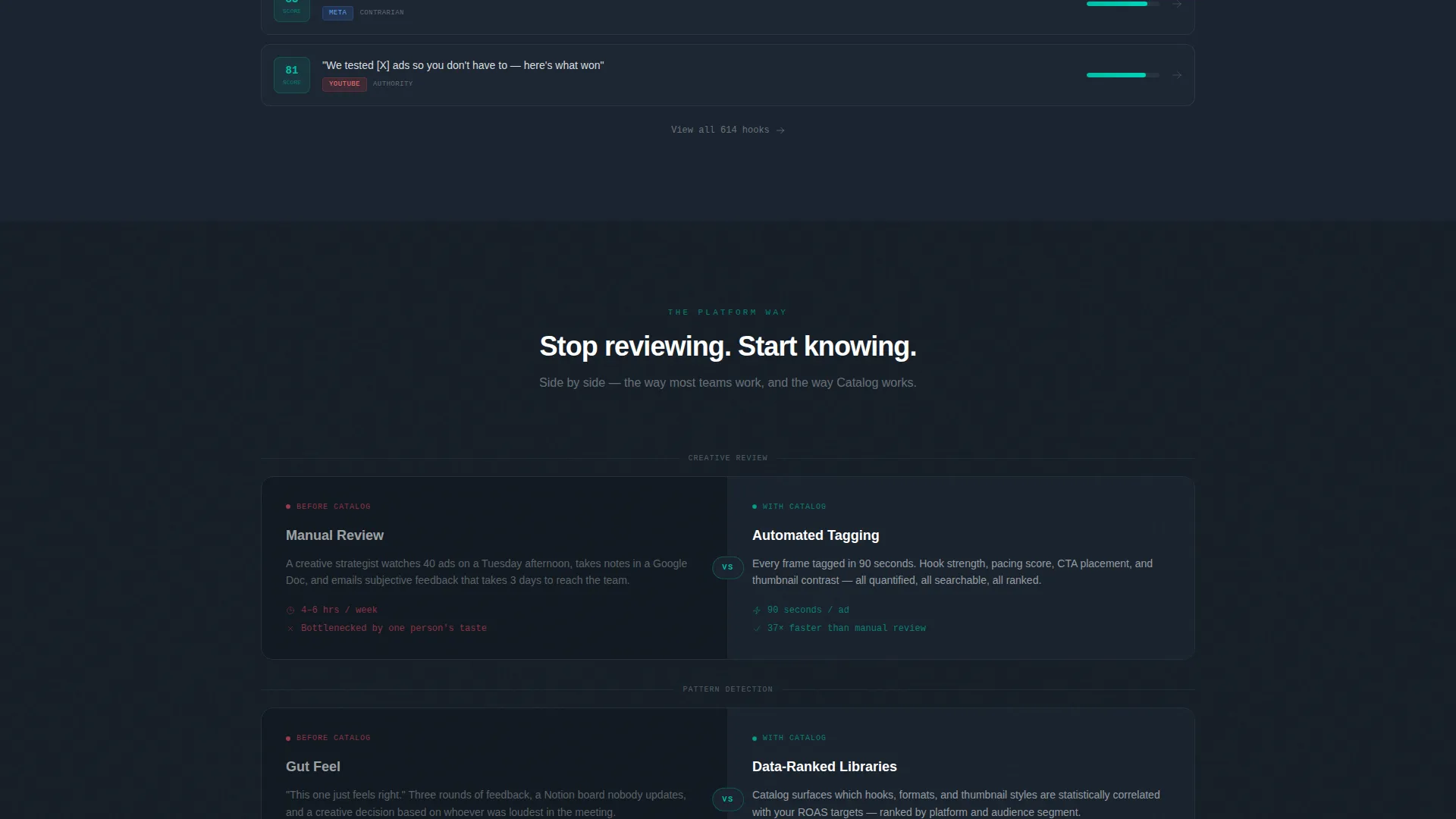
- Alternating left-right comparison sections that contrast manual creative review with platform-powered pattern detection
- A sticky bottom bar with two side-by-side calls to action: a primary audit form and a secondary gated ad library link
Feature list
This template includes a focused set of visual and structural features grounded in the source brief.
Split-Screen Metrics Header
The header divides into two equal panels. The left panel displays a faded, underperforming ad creative overlaid with declining click-through rate, rising cost per acquisition, and a red spend-to-conversion ratio. The right panel glows with teal metrics showing 3.2 times return on ad spend, 47 percent lower cost per acquisition, and 12-second average watch time. A single fade-in line bridges the two sides after a two-second delay.
Stats-First Scroll Architecture
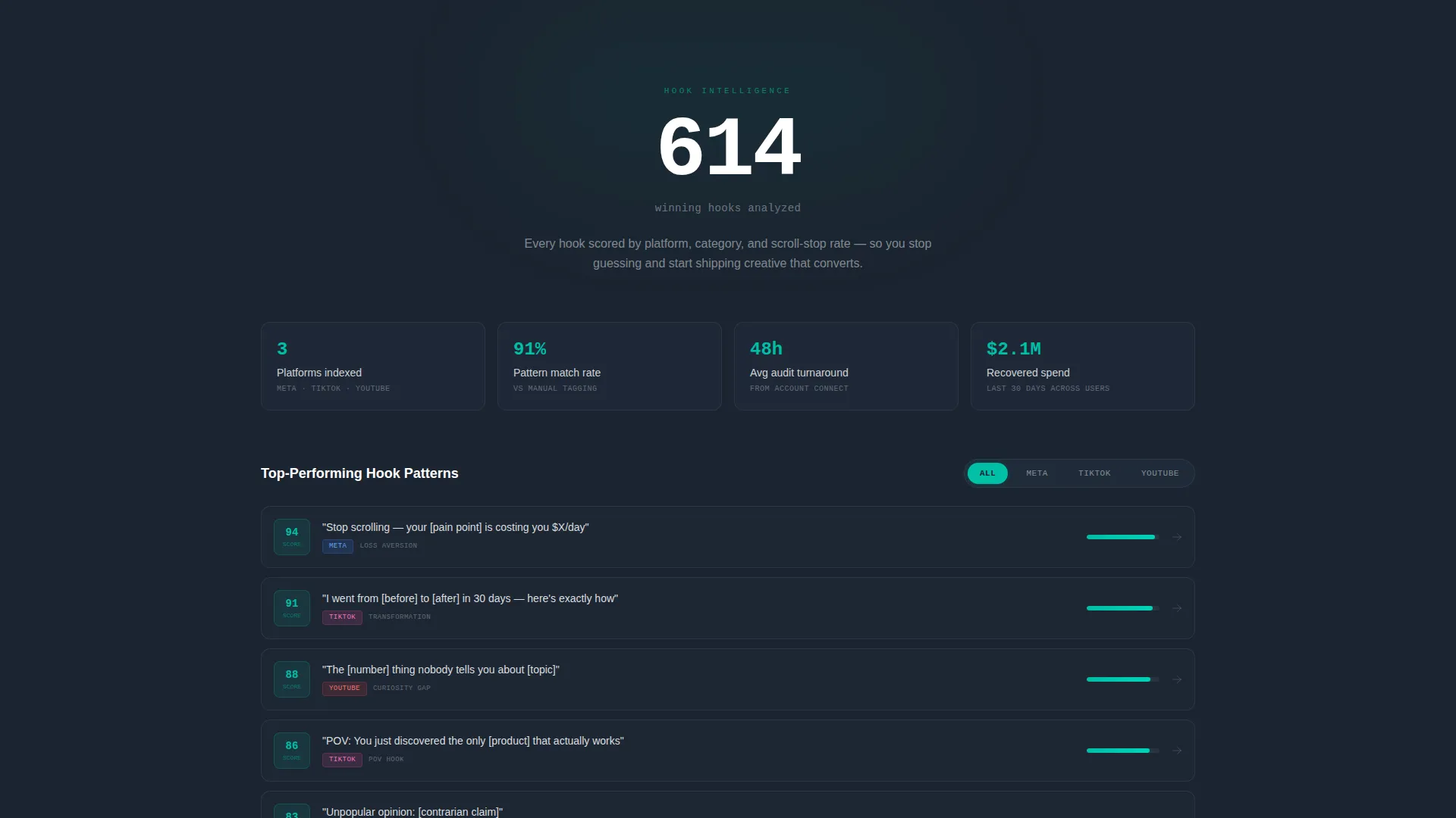
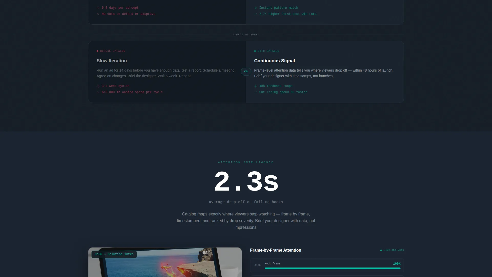
Every scroll section opens with a bold, isolated metric before revealing the supporting context beneath it. Numbers like "614 winning hooks analyzed" or "2.3 seconds" land alone first, then the surrounding visual or library element appears. This rhythm builds an evidence wall that feels like a courtroom brief, not a feature tour.
Comparison Panel Sections
Left-right alternating panels place the old workflow on one side and the platform approach on the other. Manual review and subjective feedback face off against automated tagging and data-ranked creative libraries. The comparison is structural, not just written, making the contrast impossible to ignore.
Sticky Dual-call to action Bar
A persistent bottom bar holds two calls to action side by side throughout the scroll. The primary call to action in teal leads to a free creative audit form that collects ad account URL, monthly spend range, and primary platform selection. The secondary outlined call to action opens a gated sample ad library directory.
Directory and Discovery Layout
The template follows a Directory and Discovery theme, meaning the layout is built around surfacing and organizing information rather than narrating it. Hook libraries, heatmap panels, and metric callouts behave like dashboard widgets, giving the page a tool-like feel rather than a brochure feel.
Teal Catalyst Interactive States
Every interactive element uses the electric teal accent color. Toggles, hover states, and progress bar-style indicators all carry the same teal treatment, creating a consistent visual language that signals interactivity without needing labels. Charcoal grounds the layout between these moments so the eye rests naturally.
Page sections overview
| Section | Purpose |
|---|---|
| Split-Screen Header | Opens with losing versus winning ad metrics side by side |
| Fade-In Tagline | Delivers the core message after a two-second metric pause |
| Hook Library Panel | Surfaces the searchable hook library below an isolated stat |
| Attention Heatmap Section | Shows where viewer attention drops using a 2.3-second anchor |
| Comparison Scroll Panels | Alternates old workflow versus platform approach across sections |
| Sticky call to action Bar | Holds audit form call to action and gated library call to action throughout scroll |
Design & branding system
The Teal Catalyst color system is designed for long sessions in front of a screen. It balances dark authority with high-contrast data clarity, so the page feels like a mission-control interface rather than a marketing brochure.
- Deep command-center charcoal (#1B2430) forms the base background, keeping the layout grounded and easy on the eyes during extended viewing
- Electric teal (#00BFA6) carries all interactive and metric elements, making every data point feel live and actionable against the dark ground
- Soft interface fog (#E8EDEF) fills content panels to separate information zones, while signal white (#FFFFFF) handles primary typography for maximum readability
Mobile & speed optimization
The split-screen layout is structured to reflow cleanly on smaller screens without losing the side-by-side impact of the comparison panels.
- The 50/50 split transitions to a stacked single-column format on mobile, preserving the metric-first reveal order
- Teal interactive states and sticky call to action bar remain functional and clearly visible at all viewport sizes
- The Stats-First section architecture keeps individual units short and self-contained, which supports fast load behavior and clean rendering across devices
How this template helps you convert
The template is engineered around one conversion principle: earn the click by proving intelligence before asking for anything. By the time a visitor reaches the audit form, they have already watched the platform think.
- The metrics header removes hesitation immediately by showing quantified outcomes before any copy appears, shifting the visitor's question from "does this work" to "what would it find in my account"
- The evidence-wall scroll structure means every section adds a new proof point, so trust compounds with each panel rather than depending on a single persuasive moment at the bottom
- The sticky dual-call to action bar keeps both conversion paths visible throughout the entire page, so visitors can act at peak conviction without needing to scroll back up
Other information about this template
This template is part of the Advanced Tech and AI Platforms subcategory within the Technology category on the marketplace. It is tagged under the Ad Creative Optimization niche, making it a strong fit for platforms that analyze ad performance, surface creative patterns, or provide data-ranked creative intelligence tools.
- The template uses a Directory and Discovery theme, which is well suited for platforms presenting organized libraries of creative data, hook taxonomies, or ad performance archives
- The Comparison/Versus landing page direction is the structural spine of the layout, making it especially useful when the platform's core value is demonstrating a before-and-after or old-way-versus-new-way narrative
- The Intersection Match Score for this template is 13, reflecting a high alignment between the color system, creative direction, header concept, template style, and landing page direction across all matched context fields
Theme
Directory & Discovery
Creative direction
Stats-First Impact
Color system
Teal Catalyst
Style
Split Screen (50/50)
Direction
Comparison/Versus
Page Sections
Split-screen Metrics Header
Stats-first Scroll Architecture
Alternating Comparison Panels
Sticky Dual-cta Bar
Directory and Discovery Layout
Teal Catalyst Interactive States
Related questions
Can I customize the metric values shown in the header panels?
Is this template suitable for a SaaS product outside of ad creative tools?
How does the sticky call to action bar behave during scroll?
Does the template include the gated ad library content?



