E-Commerce Course Landing Page Template
Catalog is a scroll-reveal landing page template built for e-commerce course and training platforms. It opens with a logo ticker and a bold headline, then leads visitors through an interactive Revenue Projection Calculator before progressively revealing course modules, a side-by-side comparison table, and a value-first email capture. The result is a page that earns trust before it asks for anything.
by Rocket studio
Quick summary
Catalog is a single-page, scroll-reveal landing page template designed for e-commerce training platforms. It combines a Revenue Projection Calculator, a progressive module reveal, and a twelve-dimension comparison table into one cohesive flow. The Monochrome Steel color system and Directory and Discovery theme give every section the quiet authority of a precision tool catalog.
Who this template is for
This template is built for course creators and training platform founders who teach people how to start, launch, and grow online stores. If your students are real people with day jobs and side-hustle ambitions, this layout speaks their language.
- Online store educators who need a landing page that proves value before pitching a course
- Platform founders whose audience includes working parents, retail owners, and first-time sellers
- Digital product creators who want a high-intent page that converts skeptical, research-minded visitors
What problem this template solves
Most course landing pages describe what is inside the course. They list modules, name the instructor, and ask for the sale. Visitors leave unconvinced because they never felt the cost of not knowing. Catalog solves that by letting visitors calculate their own numbers first.
- Side-hustlers and new sellers cannot picture the opportunity until they see revenue and fee projections built from their own inputs
- Retail owners moving online need proof that a knowledge gap is costing them money, not just a list of lesson titles
- Course creators need a page structure that builds trust progressively, earning each scroll before presenting the next ask
What you get with this template
You get a fully structured scroll-reveal landing page that moves visitors from curiosity to commitment through a sequence of interactive and visual moments. Each section is intentionally ordered to deliver value before making an ask.
- An interactive Revenue Projection Calculator as the first major content block, before any course description appears
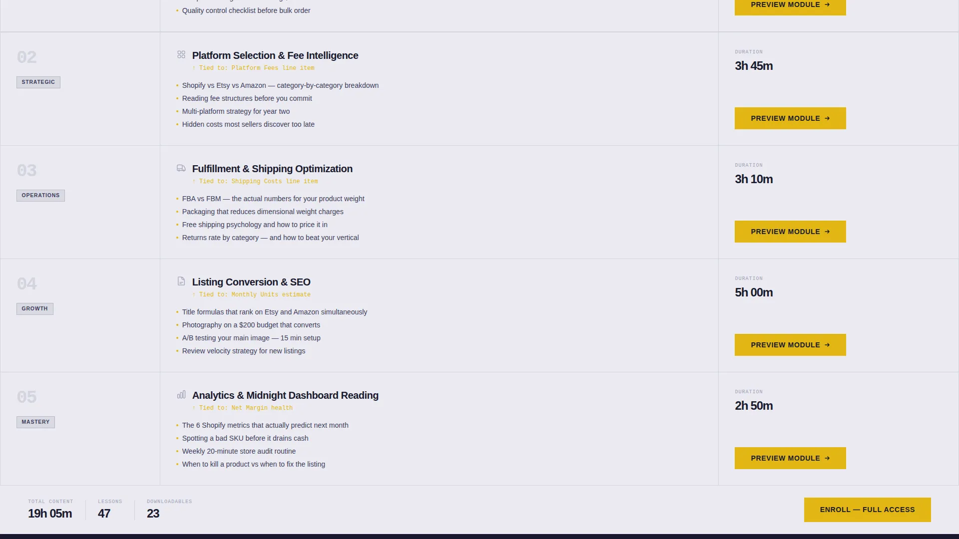
- A progressive module reveal that connects each course section to a specific line item from the calculator output
- A persistent, scroll-building side-by-side comparison table contrasting independent learning against guided learning across twelve specific dimensions
Feature list
This template is built around four core capabilities that work together to reduce drop-off and increase the quality of every conversion.
Interactive Revenue Projection Calculator
Visitors enter their product price, estimated monthly units, and chosen platform. The calculator instantly returns projected revenue, platform fees, shipping estimates, and net margin. Seeing real numbers from their own inputs makes the opportunity concrete before the course pitch begins.
Scroll-Reveal Progressive Layout
Content sections slide up from a dark gunmetal background into chrome-white clarity as the visitor scrolls. Course modules appear in sequence, each one tied to a specific line item the calculator surfaced. The effect feels like shelves being stocked in real time.
Twelve-Dimension Comparison Table
A persistent side-by-side table builds as the visitor scrolls, contrasting learning alone against learning with the platform. It covers twelve specific dimensions including time to first sale, average platform fee mistakes, and return rate from poor listings.
Dual call to action Architecture
The primary call to action, "See Your Store's Numbers," anchors inside the calculator and repeats as a sticky bottom bar after the tool section. A secondary call to action, "Compare All 6 Platforms," gates a downloadable fee-comparison PDF behind a single-field email capture.
Logo Bar Header with Ticker
The page opens with a horizontal scrolling ticker of e-commerce platform logos rendered in monochrome steel against forge black. A bold sans-serif headline fades in beneath the ticker, establishing ecosystem authority without relying on instructor celebrity.
Value-First Email Capture
The email capture form appears only after visitors have received a personalized revenue projection and watched the comparison table reveal a measurable knowledge gap. One field, one clear offer, no friction before value has been delivered.
Page sections overview
| Section | Purpose |
|---|---|
| Logo ticker header | Establish platform ecosystem authority and set the headline |
| Revenue projection calculator | Give visitors personalized numbers before any course pitch |
| Progressive module reveal | Connect course content to each calculator output line item |
| Comparison table build | Contrast independent learning against guided learning across 12 dimensions |
| Sticky call to action bar | Keep the primary action visible after the calculator section |
| Email capture gate | Collect one email field in exchange for a downloadable fee-comparison PDF |
Design & branding system
The visual identity follows a Directory and Discovery theme built on a Monochrome Steel color system. Every color has a defined role and earns its placement through function, not decoration.
- Forge black (#1A1A2E) and brushed gunmetal (#3D3D5C) form the dark base layers where content progressively emerges
- Machined aluminum (#A0A0B8) and polished chrome white (#EAEAF0) provide readable contrast for body text and revealed content panels
- Signal yellow (#E2B714) is reserved exclusively for interactive elements, calls to action, and progress indicators, making every clickable moment immediately recognizable
Mobile & speed optimization
The scroll-reveal layout is structured to work cleanly across screen sizes. Progressive disclosure keeps the initial page weight focused, loading content sections as the visitor reaches them rather than all at once.
- The sticky bottom call to action bar is designed to remain accessible on smaller screens without covering critical content
- The calculator inputs and comparison table are structured for clear legibility on mobile viewports
- Section-by-section reveal reduces visual clutter on narrow screens, keeping each moment focused
How this template helps you convert
The page is engineered around a clear principle: give real value before asking for anything. Every conversion moment is positioned after a value delivery, not before.
- The Revenue Projection Calculator delivers personalized output first, making the primary call to action feel like a natural next step rather than a cold ask
- The twelve-dimension comparison table quantifies the knowledge gap visitors already suspect, giving them a concrete reason to act before the email capture form appears
Other information about this template
This template is part of a broader e-commerce education niche and is well-suited for platforms that cover the full journey from product sourcing to store management. It pairs naturally with course content that addresses platform selection, fulfillment strategy, and listing optimization.
- The fee-comparison PDF gated behind the email capture references all six major selling platforms covered in the course ecosystem
- The logo ticker is designed to render platform logos including those from major e-commerce and social commerce ecosystems in a consistent monochrome style
- The template style is Scroll Reveal (Progressive), the theme is Directory and Discovery, and the creative direction is Calculator and Tool First, making it a strong fit for data-curious, research-led buyers
- The comparison table dimensions include time to first sale, platform fee mistakes, and return rate from poor listings, among nine additional factors specific to the e-commerce learning journey


Theme
Directory & Discovery
Creative direction
Calculator/Tool First
Color system
Monochrome Steel
Style
Scroll Reveal (Progressive)
Direction
Comparison/Versus
Page Sections
Interactive Revenue Projection Calculator
Scroll-reveal Progressive Layout
Twelve-dimension Comparison Table
Dual Call to Action Architecture
Logo Bar Ticker Header
Value-first Email Capture
Related questions
Can I customize the calculator inputs for my specific course offer?
Does this template work for a platform that covers multiple selling channels?
How does the email capture work within this layout?
Is this template suitable for a brand-new training platform with no existing audience?
Can the sticky call to action bar label be updated for different enrollment campaigns?


