Catalog - Powerful Higher Education Landing Page Template
Catalog is a higher education membership landing page built around instant comparison. Visitors run side-by-side school comparisons and a net-cost calculation before they ever read a pitch. A live stats header, sortable comparison table, and frosted data teasers build trust fast, then guide users toward downloading the full-access app.
by Rocket studio
Quick summary
Catalog is a single-page landing page for a higher education membership platform. It opens with an animated stats dashboard and a live two-school comparison tool. Visitors experience the product's value immediately. Progressive data reveals, a net-cost calculator, and a prominent app download call to action turn curious browsers into committed members.
Who this template is for
This template is built for founders and teams running a higher education membership platform. It works especially well when the core product is a searchable, data-rich comparison engine for students and families.
- High school students, community college transfer applicants, and parents researching multiple universities at once
- Teams who want to lead with product utility rather than a traditional hero pitch
- Membership platforms that drive growth through an app download rather than a web sign-up form
What problem this template solves
College research is fragmented and exhausting. Students bounce between dozens of browser tabs trying to compare tuition, aid packages, and admission rates. This template gives that chaos a single, organized home.
- There is no easy way to preview a comparison product's value without creating an account first
- Families struggle to decode net-price calculators spread across multiple university websites
- Platforms lose visitors who never see enough of the product to trust it enough to download
What you get with this template
You get a fully structured single-page landing page designed to demonstrate the membership platform's value before asking for any commitment. Every section adds a more powerful tool, and every tool builds the case for full access.
- An animated stats header with live-style counters and an embedded two-school comparison mini-tool
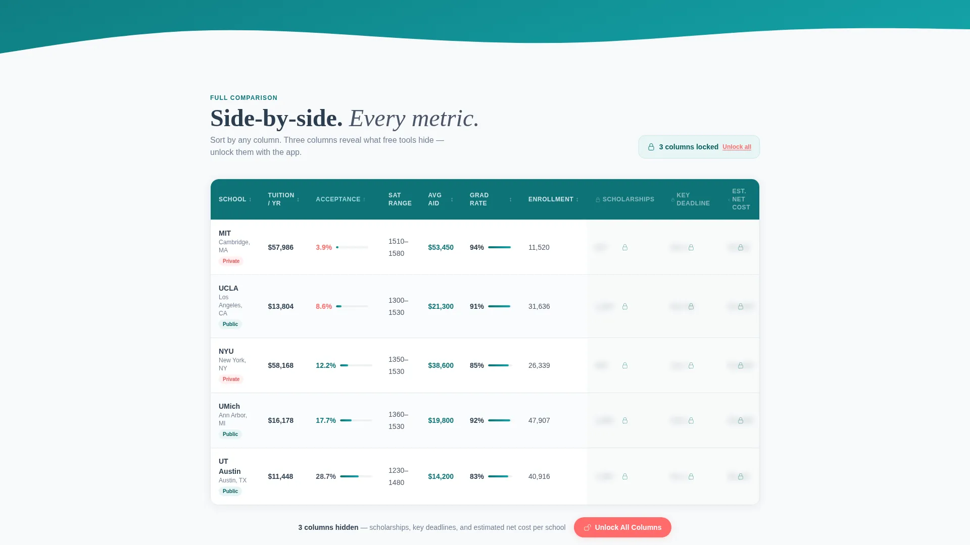
- A sortable five-school, twelve-column comparison table with frosted-glass overlays on locked premium columns
- An interactive net-cost calculator, a sticky mobile download bar, and a desktop "Text Me the Link" secondary path
Feature list
This template is built around escalating utility. Each section delivers a sharper tool than the last, pulling visitors deeper into the page through genuine usefulness.
Animated Stats Dashboard Header
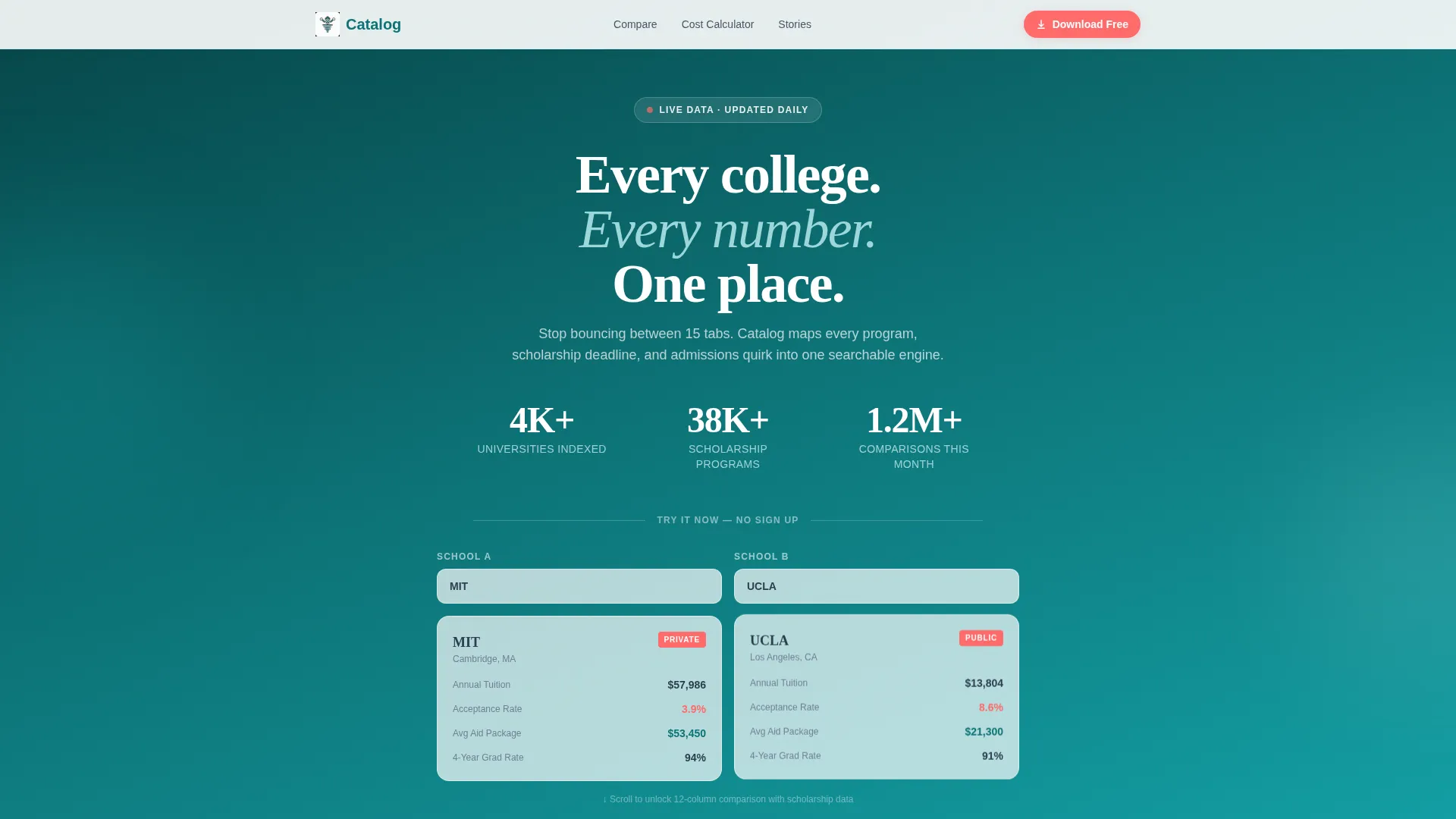
Three animated counters display universities indexed, scholarship programs tracked, and member comparisons run this month. The numbers tick upward on load, signaling that the data is live and the platform is active. It sets credibility before the visitor reads a single word of copy.
Live Two-School Comparison Mini-Tool
Two dropdown selectors let visitors pick any two schools. The tool instantly renders a side-by-side snapshot card showing tuition, acceptance rate, average aid package, and four-year graduation rate. No account or sign-up is required to run this first comparison.
Sortable Comparison Table with Locked Columns
A full comparison table stacks five schools across twelve data columns with sortable headers. Three columns carry a frosted-glass overlay and a subtle lock icon, letting visitors see the shape of the data they are missing. The visual contrast between free and premium data is immediate and persuasive.
Interactive Net-Cost Calculator
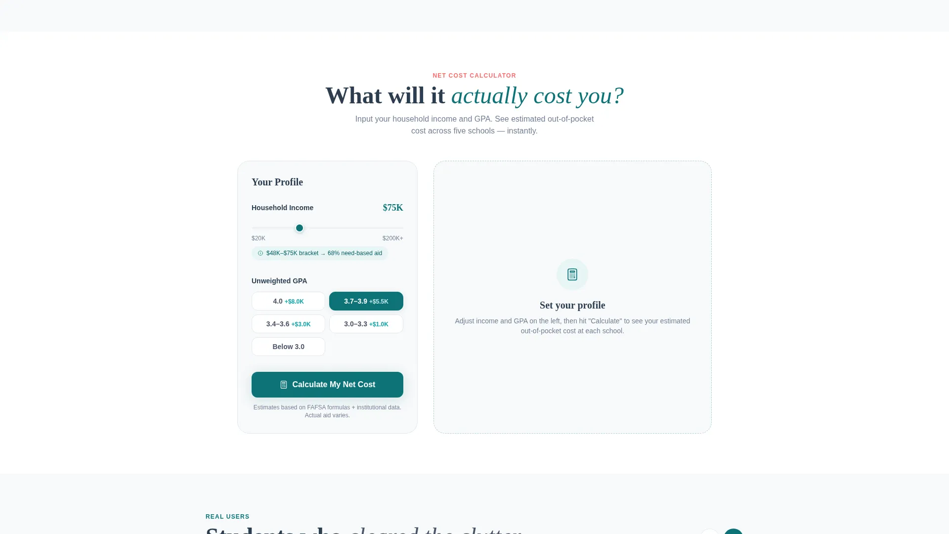
Visitors enter household income and grade point average to surface an estimated out-of-pocket cost for each school in the table. The calculator runs directly on the page without a redirect. It is the third free tool delivered before any download prompt appears.
Sticky App Download Bar with Dual Badges
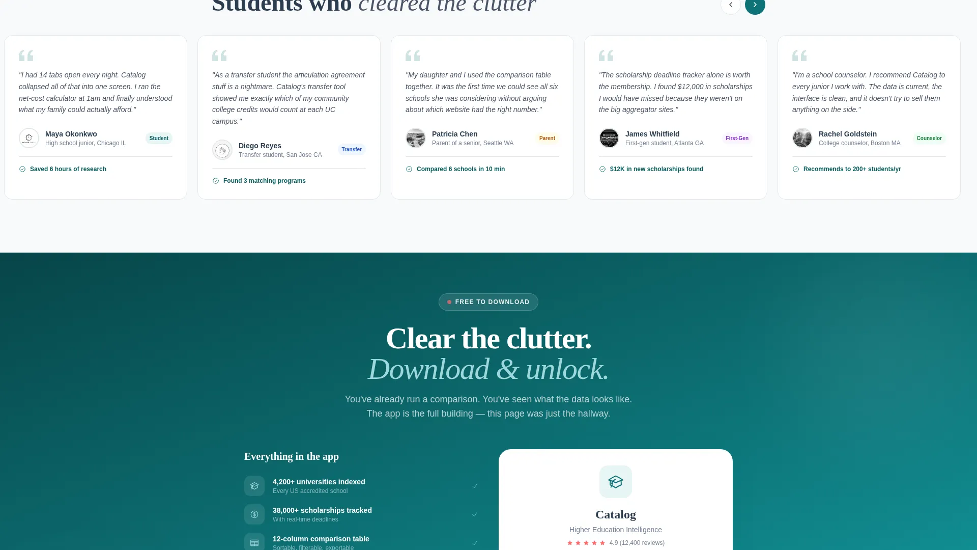
A persistent bottom bar on mobile displays the primary call to action alongside App Store and Google Play badges side by side. The bar pulses once after two free comparisons and one net-cost calculation, nudging without blocking. Desktop visitors see a "Text Me the Link" field with a single phone number input as a secondary path.
Page sections overview
| Section | Purpose |
|---|---|
| Stats Dashboard Header | Shows live platform scale and delivers the first comparison instantly |
| Two-School Mini-Tool | Lets visitors compare two schools before reading any copy |
| Full Comparison Table | Displays five schools across twelve columns with premium columns softly locked |
| Net-Cost Calculator | Collects income and GPA to estimate out-of-pocket cost per school |
| App Download call to action Bar | Drives the primary conversion with dual app badges and a desktop text-link option |
Design & branding system
The visual identity follows a Directory and Discovery theme. It feels like a well-funded university library that has just installed modern digital kiosks: institutional enough to trust, clean enough to navigate quickly.
- Deep academic teal (#0D7377) leads all primary headers and active interface states; chalk-dust white (#F7F9FA) fills table backgrounds for easy scanning; graphite (#2C3E50) keeps body text dense but readable
- Catalyst coral (#FF6B6B) appears exclusively on interactive triggers, toggle switches, the download call to action button, and the app download badge to draw the eye without overwhelming the layout
- The frosted-glass overlay on locked table columns uses the same restrained palette, making the premium data boundary feel designed rather than obtrusive
Mobile & speed optimization
The landing page is structured to perform well on the mobile devices most likely used by its audience. High school students and transfer applicants are predominantly on phones, often late at night.
- The sticky bottom bar pins the app download call to action and both store badges at the base of the screen throughout the entire scroll
- The two-dropdown comparison mini-tool and the net-cost calculator are both laid out to function cleanly within a narrow mobile viewport
- Section-by-section progressive disclosure keeps the visual load manageable, revealing each tool only as the visitor scrolls into it
How this template helps you convert
The template earns the download rather than demanding it. Every design and copy decision is sequenced to deliver genuine value before presenting the primary call to action.
- The animated stats header and instant two-school comparison tool give visitors a real product experience within seconds of arriving, establishing trust before any pitch is made.
- The frosted comparison columns and net-cost calculator reveal exactly what premium membership unlocks, making the value of a full download concrete and personal rather than abstract.
- The sticky mobile bar pulses only after two free comparisons and one calculation, so the nudge arrives at the moment the visitor has already proven to themselves that the product works.
Other information about this template
This template is built specifically for the higher education niche and the intersection of technology and educational discovery platforms. It suits teams building membership products where the core value is organized, comparable data.
- The Teal Catalyst color system and Directory and Discovery theme are defined in the matched intersection context and carry through every section of the page
- The template style is Comparison Table, meaning the data grid is the central content unit rather than a traditional hero image or testimonial layout
- The creative direction is Calculator and Tool First, so every section is anchored by an interactive element rather than static copy blocks
- The landing page direction targets an app download as the single primary conversion goal, with a text-link secondary path serving desktop visitors who prefer not to download immediately
Theme
Directory & Discovery
Creative direction
Calculator/Tool First
Color system
Teal Catalyst
Style
Comparison Table
Direction
App Download
Page Sections
Animated Stats Dashboard Header
Live Two-school Comparison Mini-tool
Sortable Comparison Table with Locked Columns
Interactive Net-cost Calculator
Sticky App Download Bar with Dual Store Badges
Desktop Text-link Secondary Path
Related questions
Does a visitor need to create an account to use the comparison tool?
How does the template show visitors what premium membership includes?
Can this landing page support both mobile and desktop visitors?
Is the net-cost calculator fully interactive on the page?
What makes this template different from a standard program listing page?



