Fitness Inventory Management Landing Page Template
Catalog is a fitness inventory management landing page template built for multi-location gym operators, franchise owners, and equipment procurement managers. It uses head-to-head comparison blocks, a tab-switching dashboard header, and data-dense tables to show visitors exactly why their current tracking method is costing them money, before asking for a single click.
by Rocket studio
Quick summary
Catalog is a single-page fitness inventory management template designed around comparison and conversion. It opens with a three-tab dashboard header showing equipment tracking, side-by-side spec comparisons, and a procurement queue. Every section below is a data-driven head-to-head block that makes the visitor's current method look expensive. The primary call to action is "Audit My Inventory Free."
Who this template is for
This template is built for operations-focused buyers who manage physical fitness equipment across more than one site. They need hard numbers, not lifestyle photography. They answer to budget committees and procurement approvals.
- Regional franchise operators running fifteen or more gym locations who need unified asset visibility
- Boutique studio owners expanding into a second or third site and facing their first real inventory complexity
- Equipment procurement managers at university athletic departments who track serial numbers and depreciation schedules
What problem this template solves
Fitness businesses lose money on duplicate orders and ghost inventory, equipment that appears in a spreadsheet but has been lost, broken, or relocated. The problem gets worse at scale. A landing page that only describes features does not make that cost feel real. This template makes it feel real in every table row.
- Visitors arrive with a vague sense that their tracking is inefficient; the comparison blocks give that feeling a dollar figure
- Multi-location operators have no single source of truth for asset location and condition; the template visualizes what that clarity looks like
- Procurement managers need to justify a software purchase to a budget committee; the switching cost calculator gives them a document to bring into that meeting
What you get with this template
The template delivers a complete, single-page layout structured around the Comparison/Versus conversion model. Every element is purposeful and grounded in operational data rather than marketing language.
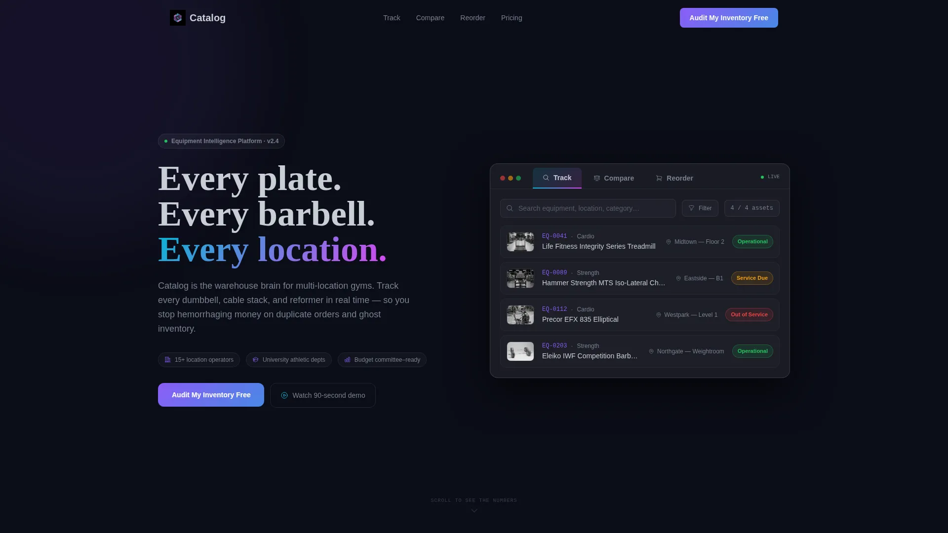
- A Feature Tab Switcher header with three states: Track, Compare, and Reorder, each revealing a different live-style dashboard view
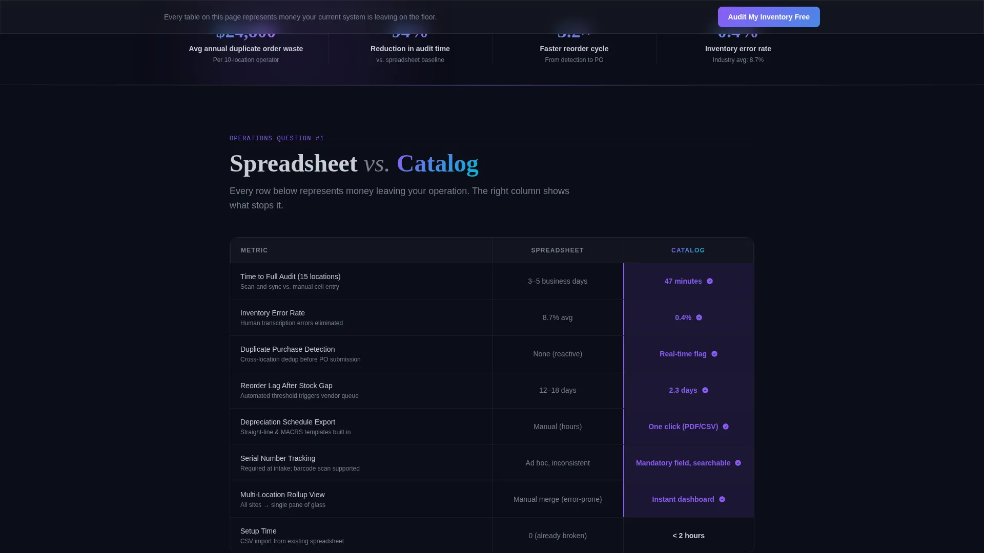
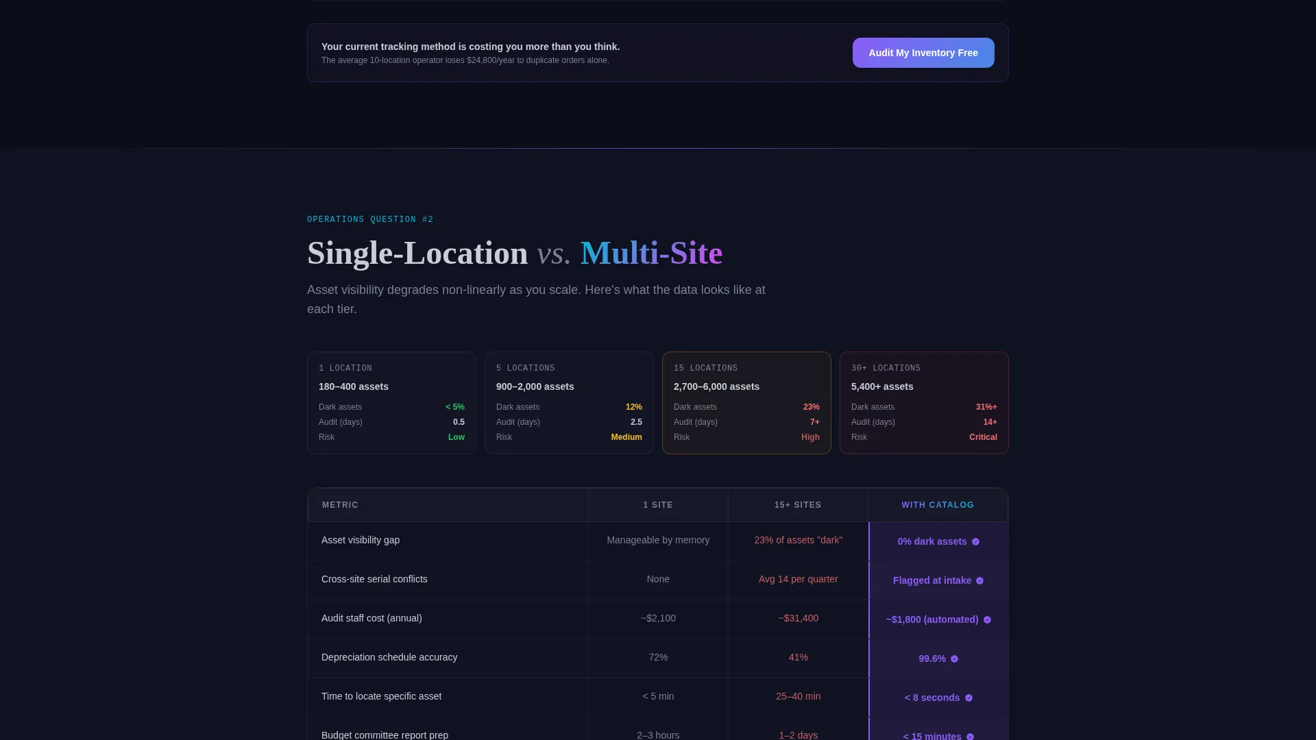
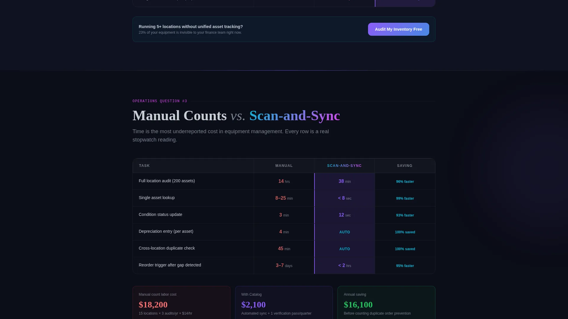
- Four or more comparison blocks including "Spreadsheet versus. Catalog," "Single-Location versus. Multi-Site," and "Manual Counts versus. Scan-and-Sync," each with a two-column table and highlighted winner cells
- A two-step lead capture form for the primary call to action and a secondary gated download path for the switching cost calculator
Feature list
This template is built around a specific set of components drawn directly from the brief. Each one serves a defined role in moving a skeptical operations buyer toward action.
Three-Tab Dashboard Header
The header opens on an equipment directory view with thumbnail images, condition badges in green, amber, and red, and location tags. Clicking "Compare" restructures the view into a side-by-side spec sheet. Clicking "Reorder" reveals a procurement queue with vendor pricing and lead times. Transitions are instantaneous and visually smooth.
Head-to-Head Comparison Blocks
Each scroll section answers one specific operations question using a two-column table. Highlighted winner cells direct the eye without requiring explanation. The data is the persuasion, row by row, the visitor's current method is shown to be slower, more error-prone, and more expensive.
Two-Step Lead Capture Form
The primary call to action opens a two-step form. Step one collects number of locations and primary equipment category from a dropdown. Step two asks for current tracking method and work email. The form is short enough to complete in under a minute.
Persistent Bottom call to action Bar
A slim bar pins the "Audit My Inventory Free" call to action to the bottom of the screen as the visitor scrolls. It remains visible across every comparison block so the conversion path is never more than one click away.
Gated Switching Cost Calculator
A secondary conversion path offers a downloadable switching cost calculator gated behind email only. This captures visitors who are still in the benchmarking phase and not yet ready for the primary commitment.
Searchable Equipment Directory View
The default tab state shows a structured equipment directory. Each item has a thumbnail image, a condition badge, and a location tag. This view demonstrates the software's organizational logic before any explanatory copy is read.
Page sections overview
| Section | Purpose |
|---|---|
| Tab Switcher Header | Show Track, Compare, Reorder dashboard states |
| Spreadsheet versus. Catalog | Compare audit time, error rates, reorder lag |
| Single versus. Multi-Site | Show asset visibility change at scale |
| Manual versus. Scan-and-Sync | Pair time cost against real savings |
| Primary call to action Block | Prompt "Audit My Inventory Free" form open |
| Switching Cost Download | Capture benchmarking visitors via email gate |
| Pinned Bottom Bar | Keep call to action visible throughout full scroll |
Design & branding system
The visual identity follows a Directory and Discovery theme using the AI Iridescent color system. The palette is clinical and precise, with shimmer reserved for interactive moments rather than decoration.
- Base colors are void black (#0B0D17) and liquid chrome (#C8CDD5), giving the layout the feel of a server room at low light
- Prismatic violet (#8B5CF6) anchors primary interactive elements and active states
- A cyan-to-magenta gradient (#06B6D4 to #D946EF) activates on hover states and active tab indicators, signaling interactivity without demanding attention
Mobile & speed optimization
The template is designed to remain functional and visually coherent on smaller screens. The comparison tables and tab-switching header are the most layout-intensive components, and both are structured to adapt cleanly.
- Comparison tables reflow into vertically stacked views on narrow screens so no data is hidden or truncated
- The pinned bottom call to action bar remains visible on mobile scroll, keeping the conversion path intact regardless of device
- Tab transitions are built for immediate response so the dashboard header feels fast on any connection
How this template helps you convert
The entire page is architected around a single idea: make the visitor's current tracking method look expensive before asking for anything. Every layout decision reinforces that objective.
- The comparison blocks build cumulative pressure. Each table row adds another cost or inefficiency to the visitor's mental ledger, so by the time they reach the call to action they have already done the math.
- The two-step form reduces friction at the moment of commitment. Asking for location count and equipment category first feels operational, not salesy, which makes the work email request in step two feel like a natural next step.
Other information about this template
This template is a strong fit for any fitness software or SaaS product that needs to justify a purchase decision to an operations-minded buyer rather than a lifestyle consumer. It is built for the Fitness Inventory Management niche but the Comparison/Versus structure and Spec Sheet creative direction adapt well to adjacent categories.
- The template sits at the intersection of Technology, Fitness Software and SaaS, and the Directory and Discovery theme, making it a match for catalog-style asset management tools
- The Feature Tab Switcher header concept can be repurposed for any SaaS product with multiple core workflow states
- The switching cost calculator download path is a proven secondary conversion mechanic for buyers who are benchmarking multiple vendors before committing
Theme
Directory & Discovery
Creative direction
Spec Sheet
Color system
AI Iridescent
Style
Comparison Table
Direction
Comparison/Versus
Page Sections
Three-tab Dashboard Header
Head-to-head Comparison Blocks
Two-step Lead Capture Form
Persistent Bottom Call to Action Bar
Gated Switching Cost Calculator
Searchable Equipment Directory View
Related questions
Who is this landing page template designed for?
What conversion actions does the template support?
Can I update the comparison blocks for a different equipment category?
Does the tab-switching header require a live backend connection?
How does the pinned call to action bar behave on smaller screens?



