Nonprofit Digital Presence Directory Website Template
Catalog is a comparison table landing page built for nonprofit directories and listing sites. It opens with an animated logo bar indexing over 1.8 million organizations, then loads a live side-by-side comparison table, animated donation distribution charts, and a versus breakdown section. The design follows a Data Command theme in Midnight Blue, built to convert serious donors, foundation officers, and corporate giving managers.
by Rocket studio
Quick summary
Catalog is a single-page nonprofit directory landing page designed around data-driven comparison. It leads with a scrolling logo bar, a pre-loaded hero comparison table, animated bar charts, and a sticky call-to-action bar. The Midnight Blue color system and Data Command theme give it the visual authority that serious donors and grant decision-makers expect.
Who this template is for
This template is built for organizations running nonprofit directories, donor research tools, or giving platforms where credibility and data depth are the core value proposition.
- Foundation program officers who need fast, verifiable grantee profiles
- Corporate social responsibility managers building shortlists for major partnerships
- Individual donors who want financial transparency before committing funds
What problem this template solves
Most nonprofit discovery pages ask visitors to trust first and verify later. That approach fails with experienced donors and institutional funders who have been burned before. This template reverses that dynamic by leading with real data.
- Donors arrive and immediately see financials, not just mission statements
- The comparison layout removes the need to visit multiple sites
- Gated content is minimal, so trust builds before any email is asked for
What you get with this template
You get a fully structured comparison landing page ready to present nonprofit data with visual clarity and conversion intent. Every section is purpose-built for a research-driven audience.
- Animated logo bar with a live organization count metric
- Hero comparison table with four columns, including one interactive prompt column
- Donation distribution bar charts, a versus breakdown section, and social proof quotes
Feature list
This template delivers a tightly coordinated set of visual and interactive components, all grounded in the Data Command theme.
Animated Logo Bar Header
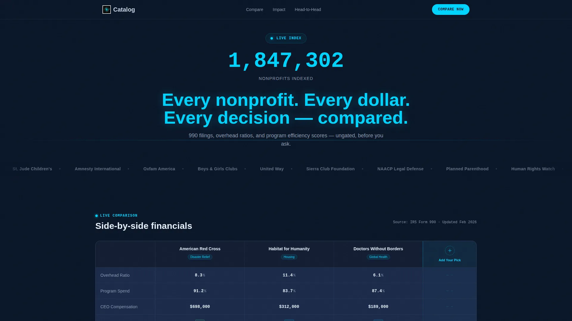
A horizontal scrolling bar streams monochrome silver nonprofit logos from left to right. Above it, a counter animates upward to 1,847,302 indexed organizations. A single electric cyan headline sits below the scroll, making comprehensiveness visible within the first two seconds of the page load.
Hero Comparison Table
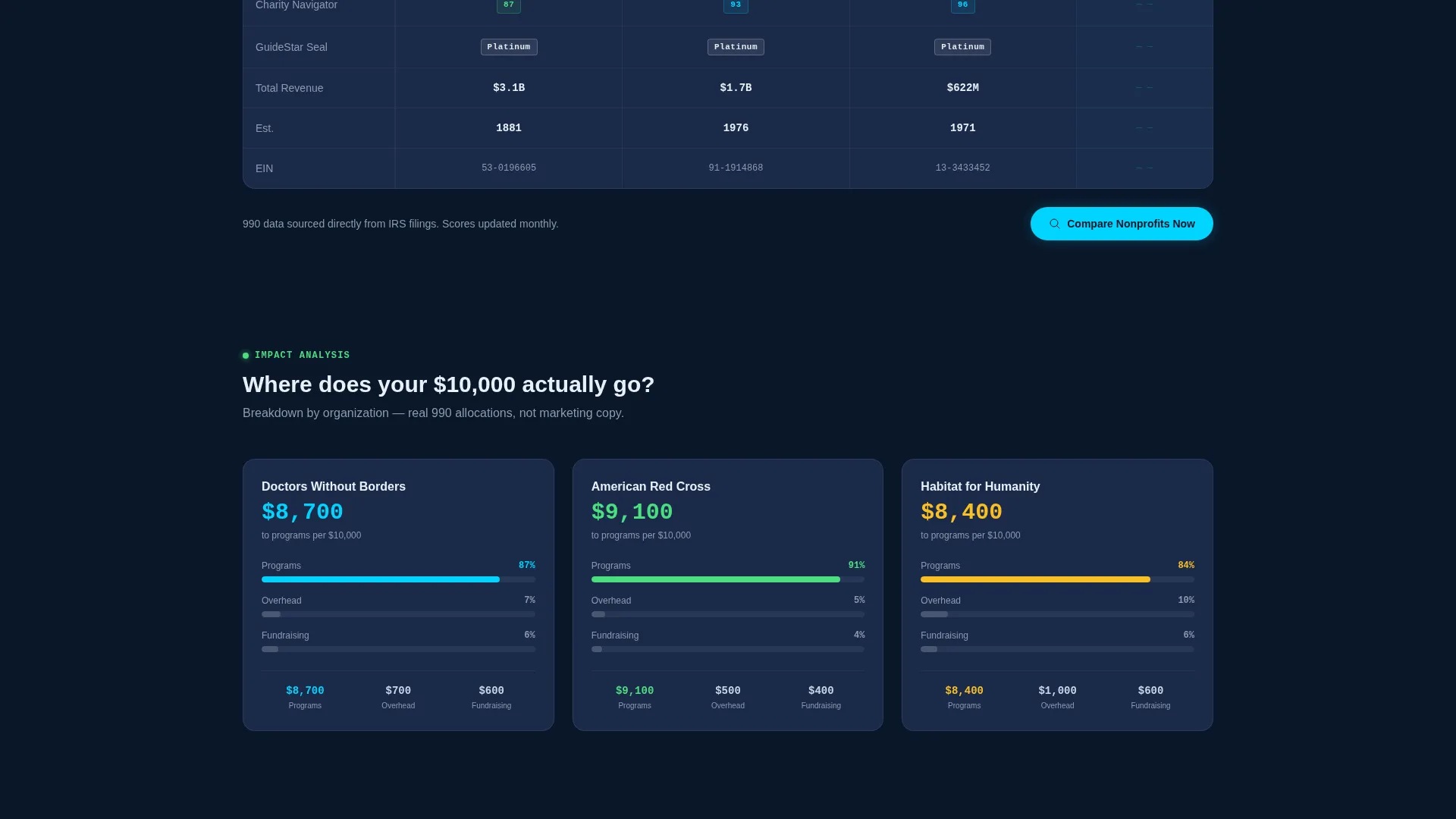
Three well-known nonprofits load side by side in the hero section. The table displays overhead ratio, program spend percentage, executive compensation, Charity Navigator score, and GuideStar seal. A fourth column pulses with an "Add Your Pick" prompt, directly inviting comparison activity.
Animated Donation Distribution Charts
A dedicated section shows how a ten-thousand-dollar donation distributes differently across three organizations. Bar charts build in real time as the visitor scrolls into view, making the financial differences tangible and immediate rather than abstract.
Versus Breakdown Section
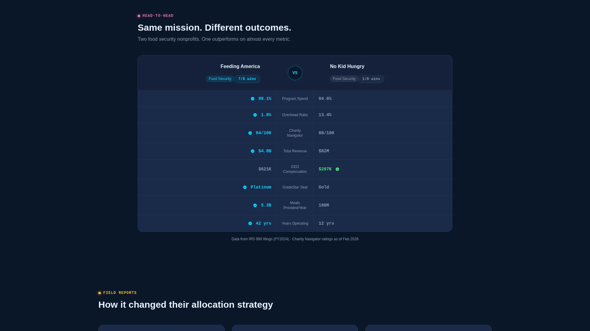
Two nonprofits with similar missions are placed head to head. One outperforms the other across every displayed metric. This section communicates the value of comparative research better than any written explanation could.
Search Modal with Category Filters
The primary call-to-action opens a search modal with autocomplete across all indexed organizations. Visitors can filter by category, including health, education, environment, arts, and mutual aid, and narrow results by budget range.
Email-Gated PDF Report
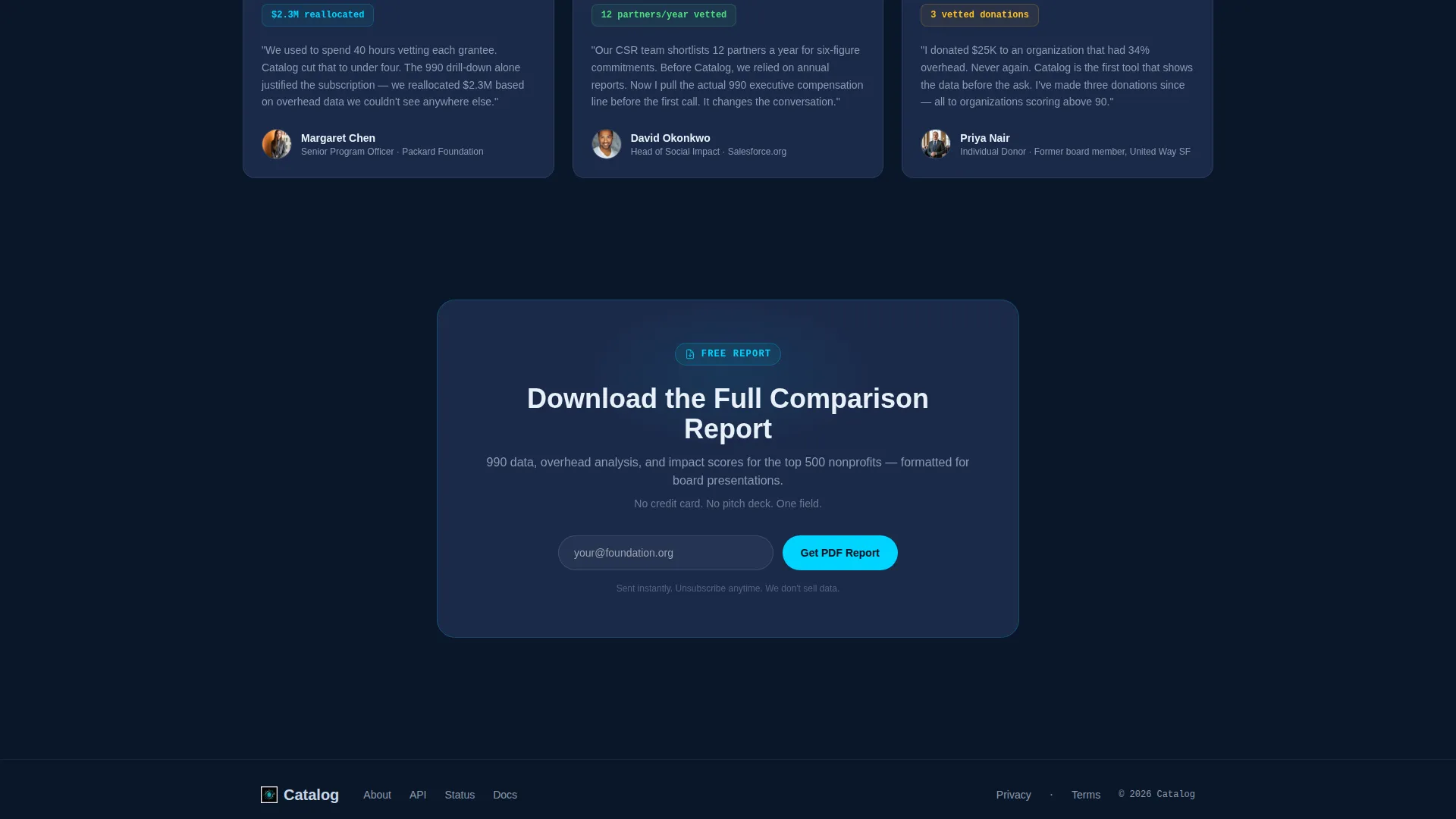
A secondary conversion path offers a downloadable full comparison report. It is gated behind a single email field with no additional form friction. The page shows real data first, so the ask feels earned rather than forced.
Page sections overview
| Section | Purpose |
|---|---|
| Logo Bar Header | Proves directory scale instantly with scrolling logos and an animated count |
| Hero Comparison Table | Shows three live nonprofit profiles side by side with an open fourth column |
| Donation Distribution Charts | Visualizes how identical donation amounts split differently across organizations |
| Versus Breakdown | Compares two similar-mission nonprofits metric by metric |
| Testimonial Quotes | Builds credibility through real foundation officer perspectives |
| Sticky call to action Bar | Keeps the primary comparison prompt visible after the second scroll |
Design & branding system
The visual identity follows a Data Command theme using a Midnight Blue color system. Every color choice serves legibility and authority in equal measure.
- Void-black (#0A1628) as the primary background, reading like a live mission control terminal
- Deep naval blue (#1B2A4A) for card surfaces and table row backgrounds
- Electric cyan (#00D4FF) for accent elements including hover states, sort arrows, and active filters, with cool silver (#C8D6E5) used for all body text
Mobile & speed optimization
Every section uses upward thrust scroll animations that load progressively as the visitor moves down the page. The layout is structured to remain readable and functional across screen sizes.
- The comparison table is designed to reflow cleanly on smaller viewports
- Animated bar charts trigger on scroll entry, so they only load when visible
- The sticky bottom call to action bar remains accessible regardless of scroll depth
How this template helps you convert
The conversion architecture is built on a show-first, ask-second philosophy. Visitors see verified data before any prompt appears, which makes the call to action feel like a natural next step.
- The hero table and pulsing fourth column create an immediate interactive pull, drawing the visitor toward the "Compare Nonprofits Now" button before they have finished reading the headline
- The sticky bottom bar repeats the primary call to action after the second scroll, catching visitors who moved past the hero but stayed engaged with the content
- The PDF report captures secondary leads through a single email field, converting research-mode visitors who are not yet ready to act but want to keep the data
Other information about this template
This template is designed for the nonprofit digital presence category and sits at the intersection of technology and mission-driven giving tools. It suits teams building donor-facing platforms, giving portals, or institutional research directories.
- The template style is a Comparison Table, making it directly suited to nonprofit listing and ranking sites
- The Launch Energy creative direction means every scroll interaction builds forward momentum rather than presenting static information
- The landing page is designed for a Comparison and Versus conversion goal, with two distinct paths: an active comparison flow and a passive PDF download flow
Theme
Data Command
Creative direction
Launch Energy
Color system
Midnight Blue
Style
Comparison Table
Direction
Comparison/Versus
Page Sections
Animated Logo Bar with Live Count
Hero Comparison Table
Real-time Donation Distribution Charts
Versus Breakdown Section
Search Modal with Filters
Low-friction PDF Report Capture
Related questions
Who is this landing page template built for?
Can I customize the comparison table columns?
Does the page include real nonprofit data out of the box?
How does the email capture for the PDF report work?
Is this a single landing page or a multi-page template?



