Catalog - Powerful Plugin Landing Page Template
Catalog is a split-screen landing page template built for Notion plugin and extension directories. It features a Feature Tab Switcher header, data-driven Industry Report sections, and a sky-blue click-through design system. Ops managers, freelance consultants, and startup founders can browse rated, tagged, and workflow-sorted plugins before ever hitting a signup gate.
by Rocket studio
Quick summary
Catalog is a single-page landing page template designed for Notion plugin and extension directories. It uses a 50/50 split-screen layout, a Feature Tab Switcher header, and an Industry Report scroll cadence. The visual identity pairs deep workspace charcoal with cloud-white and a sharp sky-blue accent. Visitors browse ranked, filtered, and contextualized plugin data from the first scroll.
Who this template is for
This template was designed with a specific, underserved audience in mind. These are people who have already committed to Notion as a core work tool and now need to extend it further without wasting hours on scattered searches.
- Ops managers looking to connect disconnected tools inside a single Notion workspace
- Freelance consultants building client dashboards who need vetted, ready-to-install plugins fast
- Startup founders who have made Notion their entire operating system and need it to do more
What problem this template solves
Finding the right Notion plugin today means opening five browser tabs, reading outdated blog posts, and hoping a Reddit thread is still accurate. There is no single place that rates, tags, and sorts plugins by the actual workflows they fix. That friction costs real time.
- Visitors arrive without a curated, authoritative index they can trust at a glance
- Plugin discovery feels like guesswork rather than a guided, data-backed process
- There is no visual proof of ecosystem depth before a visitor commits to exploring further
What you get with this template
This template gives you a fully structured, interaction-rich landing page layout ready to present your plugin and extension directory with authority. Every section is built to show depth before asking for any action.
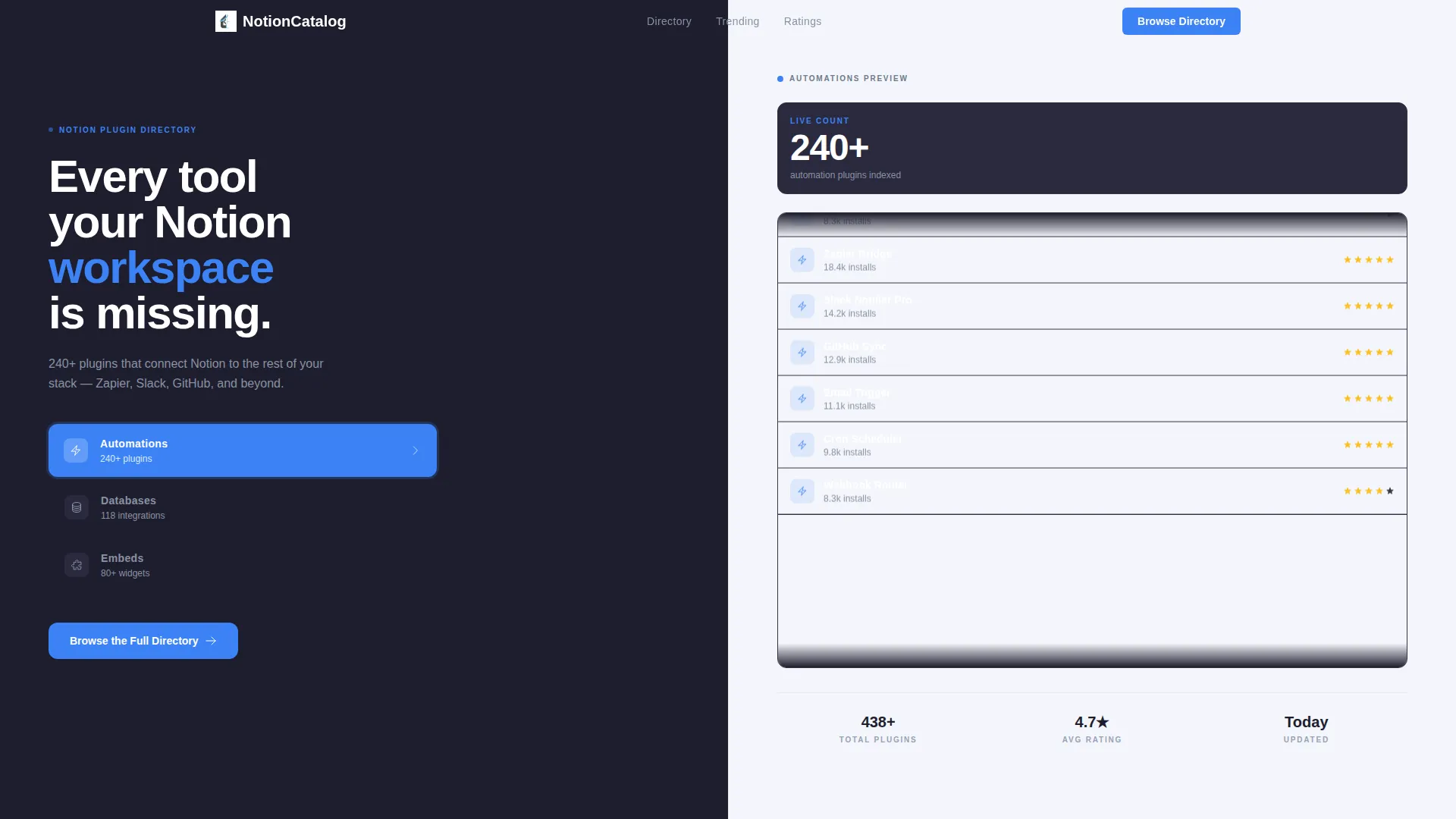
- A 50/50 split-screen layout with a Feature Tab Switcher header showing three live category tabs
- Industry Report data sections including a bar chart block, sparkline trend block, and a comparison grid
- A persistent bottom bar with a fixed "Browse the Full Directory" call-to-action button on scroll
Feature list
This template ships with a focused set of purpose-built layout components. Each one is grounded in the plugin directory use case and designed to move visitors from curiosity to a confident click.
Feature Tab Switcher Header
The header splits the screen down the middle. The left panel holds three vertically stacked category tabs: Automations, Databases, and Embeds. Each tab lights up in sky-blue on hover. The right panel transforms instantly with each tab selection, showing a scrolling card grid, a sortable table preview, or a mosaic of widget thumbnails inside a Notion page frame. No page reload is needed.
Live Count and Card Grid Block
The Automations tab state includes a live-count ticker displaying 240-plus plugins alongside a miniature card grid that scrolls upward. This gives visitors immediate visual proof of directory volume before they have read a single line of body copy.
Sortable Table Preview
The Databases tab state reveals a table layout with star ratings and install counts. Visitors can see at a glance how plugins rank against each other. This data-forward presentation builds credibility fast.
Industry Report Data Sections
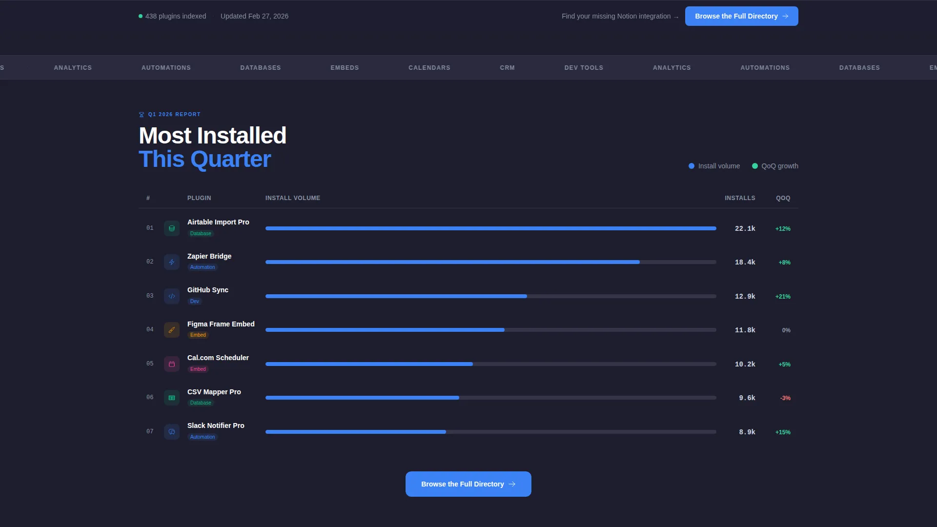
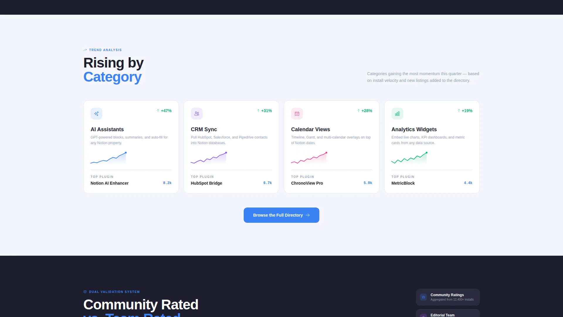
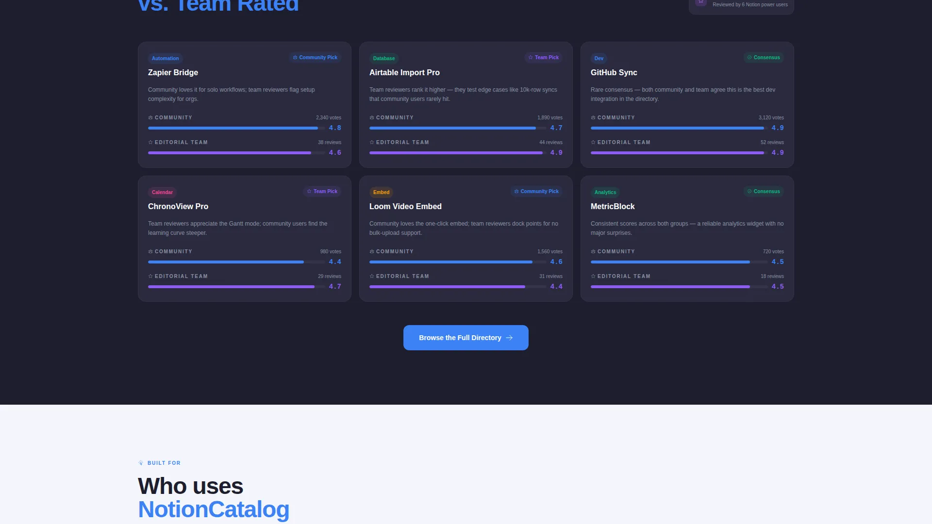
Three scroll sections follow the header in an editorial cadence. "Most Installed This Quarter" uses a horizontal bar chart. "Rising by Category" uses sparkline trend visuals. "Community Rated versus. Team Rated" presents a split comparison grid. Together they make the directory feel like an insider ecosystem report, not a plain list.
Plugin Card Click-Throughs
Every plugin card teased on the page links to its own dedicated listing page. Each listing includes install instructions, reviews, and compatibility tags. These secondary click-throughs keep visitors engaged and moving deeper into the directory without requiring a form or signup.
Fixed Bottom Bar call to action
A slim bottom bar stays anchored at the base of the viewport as visitors scroll. It holds the primary "Browse the Full Directory" call-to-action button rendered in sky-blue. The button reappears as a wide standalone element at the bottom of each data section as well, creating consistent conversion touchpoints throughout the page.
Page sections overview
| Section | Purpose |
|---|---|
| Feature Tab Switcher | Hook curiosity with instant category browsing |
| Live Count Ticker | Show directory volume at a glance |
| Card Grid Preview | Tease plugin cards before full browse |
| Sortable Table Preview | Display ratings and install counts |
| Widget Thumbnail Mosaic | Render Embeds inside a Notion frame |
| Most Installed Chart | Present top plugins via bar chart |
| Rising by Category | Show trends with sparkline visuals |
| Community versus. Team Grid | Compare rating sources side by side |
| Fixed Bottom Bar | Anchor call to action across full scroll depth |
Design & branding system
The color system follows a Slate & Sky palette that feels deliberately disciplined. Deep workspace charcoal on the left panel creates focus, while cloud-white on the right keeps the content open and breathable. A single sky-blue accent ties every interactive element together.
- Deep workspace charcoal (#1E1E2E) for the left split panel and primary dark backgrounds
- Cloud-white (#F4F6FB) for the right split panel and readable content areas, with navigation steel (#6C7A8D) for secondary text and dividers
- Sky-blue (#3B82F6) applied exclusively to every clickable, filterable, and sortable element as the guiding accent
Mobile & speed optimization
The layout is built with a scroll-first experience in mind. The fixed bottom bar and section-level call to action buttons ensure the primary action is always reachable without scrolling back to the top. The split-screen structure adapts gracefully to narrower viewports by stacking panels vertically.
- The fixed bottom bar remains visible across all scroll depths, keeping the call to action accessible at every point
- Plugin card teasers and tab states are designed to load inline without triggering page reloads
How this template helps you convert
This template earns the click rather than demanding it. Visitors build confidence through ranked and contextualized data before they ever see the primary call to action. By the time they reach the bottom bar, the directory has already proven its value.
- The Feature Tab Switcher lets visitors browse live plugin categories instantly, creating engagement before any commitment is required
- The Industry Report sections layer authority with charts, trends, and comparison grids that position the directory as a trusted ecosystem lens
Other information about this template
This template sits within the Documentation and Support category, specifically targeting the Notion documentation and Notion plugin and extension directory niche. It is a strong fit for teams or indie builders who want to launch a credible plugin index quickly.
- The template style is Split Screen (50/50), matching the Directory and Discovery theme throughout
- The creative direction follows an Industry Report cadence, making it suitable for quarterly ecosystem roundups or evergreen plugin catalogues
- The landing page direction is Click-Through, meaning no forms or signup gates interrupt the browsing flow
- The header concept is a Feature Tab Switcher, which can support any multi-category directory beyond plugins, including widget libraries, integration hubs, or tool comparison pages
Theme
Directory & Discovery
Creative direction
Industry Report
Color system
Slate & Sky
Style
Split Screen (50/50)
Direction
Click-Through
Page Sections
Feature Tab Switcher Header
Industry Report Data Sections
Live Count Ticker and Card Grid
Plugin Card Click-throughs
Fixed Bottom Bar Call to Action
Slate and Sky Color System
Related questions
Does this template require a signup form to convert visitors?
Can I adapt the three category tabs for a different type of directory?
What makes the Industry Report sections different from a plain plugin list?
Are the plugin cards on the page linked to individual listing pages?
Who is this landing page template best suited for?



