Museum Vertical SaaS Portfolio & Case Study Website Template
The Catalog Precision Collection Management Landing Page Template is a split-screen, dark-institutional layout built for museum management software. It combines an animated metrics dashboard, a role-filtered feature matrix, and a focused lead-generation form to showcase a living collection database. Every section speaks directly to registrars, curators, and directors who need accurate, real-time catalog data to do their jobs.
by Rocket studio
Quick summary
This catalog precision collection management landing page template delivers a high-impact, single-page experience for a museum vertical software platform. It uses a 50/50 split-screen layout, live-updating metrics, and a role-filtered feature matrix to present a single source of truth for collection data. The template is built to generate qualified demo requests from registrars, curators, and directors.
Who this template is for
This template is designed for teams that need to showcase a product catalog of institutional complexity. It speaks directly to professionals managing large, data-heavy collections where accuracy and speed define daily operations. If your software helps institutions track, move, or report on objects at scale, this landing page communicates that power clearly.
- Registrars and collection managers who need to demonstrate how the software tracks incoming loans, accession records, and location data across multiple storage buildings.
- Museum directors and board-facing staff who require real-time data displays and board-ready analytics to present at leadership meetings.
- Software teams and designers building a product catalog website for cultural institution clients who want a polished, institutional-grade landing page that can generate leads and build trust on first contact.
What problem this template solves
Museum collection software is difficult to sell because the product is complex and the audience is skeptical. A generic landing page fails to speak the language of a registrar juggling six active loans before a blockbuster opening. This template solves that mismatch by making the product feel immediately credible and role-specific before a single form field is filled.
- Complexity without clarity is the core problem. This template breaks down a platform that links provenance records, loan agreements, conservation reports, and gallery placement into a layout that visitors can absorb in seconds, section by section.
- Low-converting lead pages often ask for too much too soon. This template earns the click first by displaying real outcome data and role-relevant feature details, then offers two clear paths: a demo request or a gated downloadable resource.
What you get with this template
You get a fully structured, single-page layout that functions as a product catalog landing page for museum management software. Every section is purposefully sequenced to move visitors from awareness to action. The template consolidates essential information about the platform into one coherent, scannable experience that teams can customize and publish quickly.
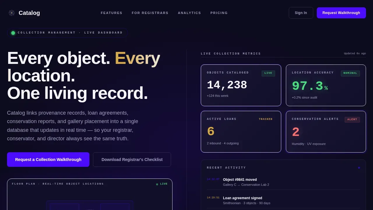
- A live metrics hero section with a split-screen floor plan visualization on the left and animated, real-time statistics on the right, including object counts, location accuracy rates, active loan tallies, and conservation alerts.
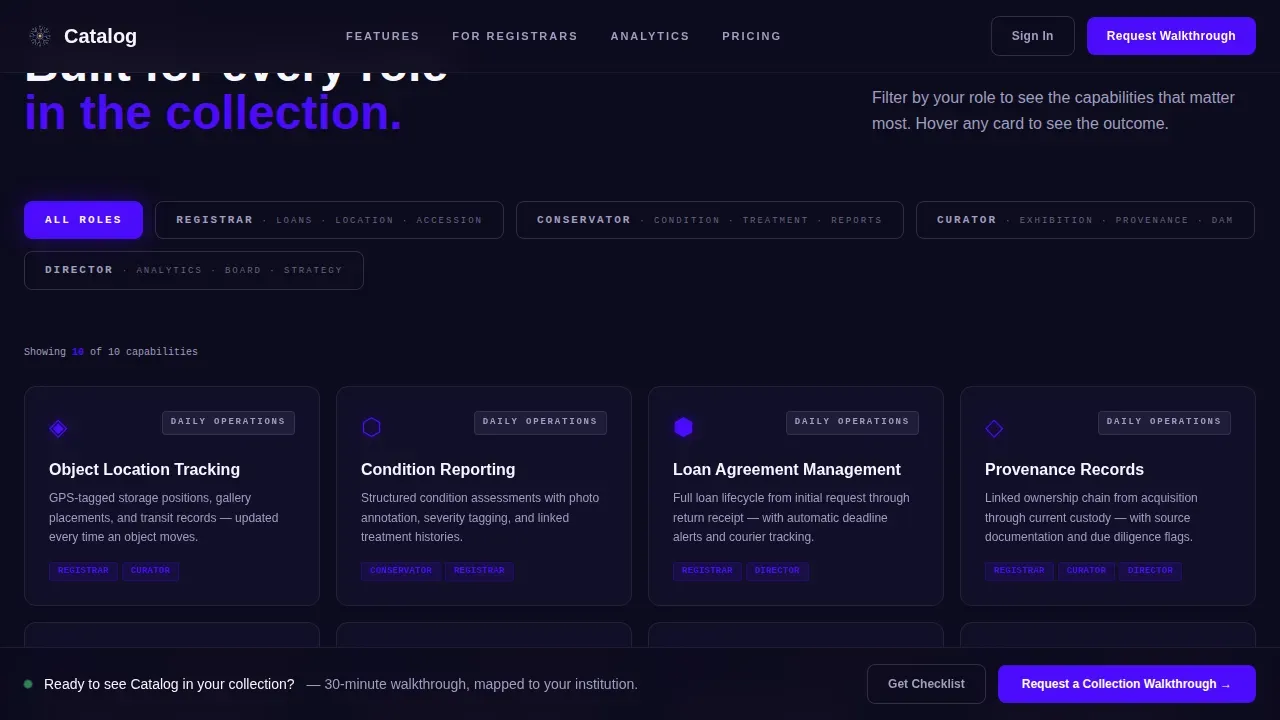
- A role-filtered feature matrix that reshuffles dynamically when visitors toggle between registrar, conservator, curator, and director roles, each card splitting on hover to display an interface screenshot alongside an outcome statement.
- A dual lead-generation section with a primary form to request a collection walkthrough demo and a secondary gated PDF download path for visitors who prefer to browse before committing.
Feature list
This template includes six core features that generate meaningful engagement and showcase the platform's catalog depth. Each one is grounded in the brief and designed to do specific conversion work.
Animated Split-Screen Metrics Dashboard
The header opens with a real-time stats display that splits the screen evenly. The left panel shows a museum floor plan with pulsing dots that represent object locations across galleries, storage, conservation labs, and outgoing loans. The right panel displays live-updating numbers with easing animations: 14,238 objects cataloged, 97.3% location accuracy, 6 active loans, 2 conservation alerts. Monospaced fonts render the data; clean sans-serif labels provide context. This above-the-fold section immediately communicates the scale and precision of the product catalog to any visitor who lands on the page.
Role-Filtered Feature Matrix
The feature matrix is the scroll engine of this landing page. Visitors toggle between four professional roles: registrar, conservator, curator, and director. Each toggle reshuffles the feature grid with kinetic transitions, reorganizing feature cards so the most relevant capabilities rise to the top. Features escalate from daily operations such as object tracking and condition reporting to strategic capabilities such as exhibition planning analytics, insurance valuation dashboards, and digital asset management. Each card splits on hover to reveal a left-side interface screenshot and a right-side outcome statement, giving potential customers concrete proof of product value.
Dual Lead-Generation Forms
The template includes two distinct conversion paths. The primary form captures institution name, collection size range, primary role, and a short-text operational pain point field, and it reads "Request a Collection Walkthrough." This form appears after the feature matrix and again as a persistent bottom bar, keeping the call to action visible throughout the scroll. The secondary path offers a gated PDF download, the Registrar's Checklist, which captures only email address and institution type, making it a low-friction entry point for visitors who are not yet ready to book a demo. Keeping each form to essential fields only reduces abandonment.
Dynamic Motion Animation System
Every animation in this template mirrors the act of cataloging: objects sliding into place, snapping to grids, finding their correct position. The animation system uses scroll-triggered behavior so elements activate as visitors reach each section. The pulsing indigo glow behind each metric card provides a visual heartbeat that signals a live, connected system. Motion never feels decorative; it reinforces the idea that data is always in motion and always organized. This purposeful animation system helps the page build trust by making the software feel active rather than static.
Institutional Dark-Theme Visual Design
The template uses a dark-vault aesthetic that feels native to cultural institutions. Deep vault black forms the primary background, electric indigo provides accent color and interactive highlights, gallery white delivers readable body text and labels, and conservation gold is reserved for hover states and active metric indicators. This palette communicates precision and authority without looking like a generic enterprise software page. High-resolution images and visuals are positioned to show the product in action rather than as decorative filler, supporting the catalog's role as a serious data tool.
Trust and Social Proof Section
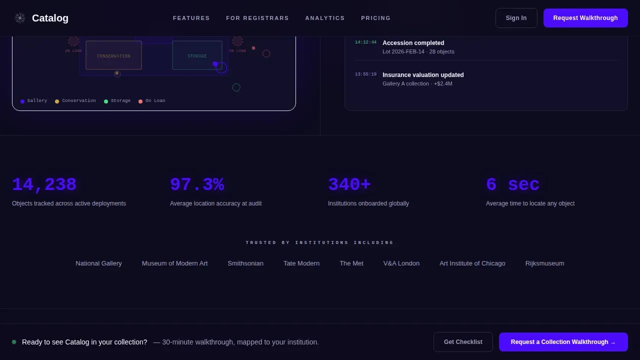
Between the feature matrix and the lead form, the template includes a dedicated section for trust signals. This section displays institution-type logos, key outcome statistics, and a registrar testimonial quote. Placing social proof near the lead form is a deliberate structural choice: it increases user confidence at the moment of decision. Contextual proof data such as the 97.3% location accuracy metric reinforces that the product catalog delivers real, measurable outcomes for customers before they are asked to act.
Page sections overview
| Section | Purpose |
|---|---|
| Split-screen hero | Display live collection metrics and animated floor plan |
| Role filter matrix | Showcase features by user role with kinetic transitions |
| Trust and proof | Present institution logos and outcome statistics |
| Lead generation form | Capture demo requests with a focused, short form |
| Persistent bottom bar | Keep the primary call to action visible throughout scroll |
| Gated PDF offer | Offer a secondary download path for not-yet-ready visitors |
| Footer layout | Close the page with navigation links and brand details |
Design & branding system
The visual identity follows a Dynamic Motion theme anchored in the Electric Indigo color system. The design feels like a darkened exhibition hall where a single ultraviolet beam catches the edge of a gilded frame: charged, institutional, and unmistakably modern. Every color choice reinforces the platform's brand identity as a precise, data-forward tool built for serious collection management. Designers and content teams can customize the palette, fonts, and layout to match their brand without touching the structural logic of the page.
- Color palette: deep vault black (#0D0B1E) for backgrounds, electric indigo (#4B0CFC) for accents and interactive states, gallery white (#F7F6FB) for body text and labels, and conservation gold (#D4A843) reserved strictly for hover and active metric states.
- Typography: JetBrains Mono for all data and metrics display, ensuring the catalog numbers feel precise and technical; DM Sans for all labels, descriptions, and body copy, keeping the page readable and approachable.
Mobile & speed optimization
The template is built desktop-first because primary users, registrars and collection managers, work at fixed workstations. Tablet support is included for directors and curators who review data during walkthroughs or board meetings. The layout adapts responsively across device types using a modular grid structure, so the catalog data remains legible and the page structure holds even on smaller screens. Fast load performance is a structural goal: landing pages in data-heavy catalog environments should target load times that minimize bounce, and the template achieves this through component architecture that separates static sections from animated, interactive ones.
- Desktop-first grid: the 50/50 split-screen layout is optimized for wide displays where registrars spend most of their working day, with the floor plan and metrics panel each using exactly half the viewport.
- Tablet-responsive adaptation: the feature matrix grid and hero panel reflow gracefully on tablet-sized devices, preserving the role-toggle interaction and keeping all essential information above the readable threshold on each device.
How this template helps you convert
A polished, professional landing page that speaks the specific language of its audience converts at a higher rate than a generic one. This template is engineered to generate qualified leads by earning attention before asking for anything. The page follows F-pattern layout principles, placing the value proposition and primary call to action in the natural reading path so visitors absorb the most important information without effort.
- Role-specific relevance before the ask: the feature matrix reshuffles to match each visitor's professional identity, making the page feel personally relevant. A registrar sees loan tracking and accession workflows. A director sees board-ready analytics. This targeted display of product details increases the likelihood that visitors recognize their own pain point reflected in the page, which directly supports higher conversion rates.
- Two conversion paths for two buyer stages: the primary "Request a Collection Walkthrough" form targets visitors ready to evaluate the software now. The gated PDF download captures email addresses from visitors who are still in research mode. Both paths build trust and keep potential customers inside the funnel without pressuring them, reducing drop-off and increasing the total volume of leads the page can generate.
Other information about this template
This template can serve as a strong reference example for any team looking to create a catalog landing page that balances institutional gravitas with modern interactivity. It demonstrates how a product catalog template can transform a static document into a dynamic workflow that speaks to multiple audience segments at once. Teams across industries, from retail and e-commerce to cultural institutions, can study this layout to understand how a well-structured catalog site generates engagement and builds pipeline.
- The template uses a search-first structural philosophy: the feature matrix acts as a navigable product catalog where visitors filter by role rather than browsing an undifferentiated list of features. This mirrors best practices for online catalog design, where advanced search and filtering enable potential customers to reach the details most relevant to them.
- The single source principle is built into the page architecture. Every feature description, metric, and outcome statement links back to a single, unified platform narrative. This prevents duplication and ensures that the catalog data displayed on the page remains consistent whether a visitor arrives via a sales email, a digital ad, or an organic search result.
- Product catalog templates like this one work across various industries, including retail, manufacturing, and museum services. The core pattern: role-filtered features, live data display, and dual lead capture, is adaptable to any vertical where a complex product catalog needs to generate qualified leads at scale.
- Teams can customize fonts, colors, layout density, and category labels to fit their brand identity without rebuilding the underlying page structure. This makes the template a reusable asset for designers who manage catalog pages across multiple product lines or client accounts.
- The template supports a sales catalog use case as well: the same role-toggle pattern can be repurposed to generate different catalog views for different customer segments, functioning like dynamic pricing catalogs that display only the features and price points relevant to a given buyer type.
- For e-commerce teams, the layout pattern is directly applicable to online catalog pages where visitors need to browse high-resolution images, read detailed descriptions, review specifications, and find a price before they commit. The hover-split card behavior works equally well for showcasing product details in a retail or e-commerce context.
- The persistent bottom bar call to action pattern is a proven tool for increasing form submission rates on long-form landing pages, particularly for software services where the sales cycle is longer and visitors need multiple exposures to the call to action before they act.
- The gated PDF offer functions as a secondary sales catalog asset: it delivers value, captures contact data, and gives the sales team a warm lead to follow up with qualified feedback about what operational pain points the visitor identified.
- Teams looking to publish new products or expand their catalog can use this template as a library starting point, adapting the feature matrix to display new product lines, updated specifications, or promotional content without redesigning the full page.
- The template is built for a B2B audience that values data integrity and precision. Every design choice, from the monospaced fonts for metrics to the conservation gold reserved for active states, reinforces that the platform behind the page is a serious tool for serious collection management, not a generic commerce solution.

Theme
Dynamic Motion
Creative direction
Feature Matrix
Color system
Electric Indigo
Style
Split Screen (50/50)
Direction
Lead Generation
Page Sections
Animated Split-screen Metrics Dashboard
Role-filtered Feature Matrix
Dual Lead-generation Paths
Dynamic Motion Animation System
Institutional Dark-theme Visual Design
Contextual Social Proof Section
Related questions
Can I customize this template for a non-museum product catalog?
What roles does the feature matrix support out of the box?
How does the dual lead-capture system work?
Is this template suitable for desktop and tablet users?
Can I add or remove sections before I publish?



