Federal Intelligence Analytics Landing Page Template
Catalyst is a government AI analytics dashboard landing page template built for federal and state agency teams who need to move from legacy reporting to real-time insight. It features an animated isometric dashboard header, a side-by-side comparison table, three agency scenario panels, and a minimal three-field deploy form, all wrapped in a secure operations center visual identity.
by Rocket studio
Quick summary
Catalyst is a single-page landing page template designed for government AI analytics platforms. It guides agency decision-makers from a lived pain point straight to a clear deployment action. The layout combines an animated dashboard header, a structured comparison table, scrolling scenario panels, and a frictionless form, delivering a complete Problem-to-Solution arc in one focused scroll.
Who this template is for
This template is built for teams marketing federal and state government analytics platforms. It speaks directly to the people sitting across the table from oversight committees, not just the developers building the product.
- Agency Chief Information Officers and program managers who need to justify data investments before budget reviews
- State-level directors responsible for proving that a multi-million-dollar initiative actually moved measurable needles
- Government software vendors and platform teams selling AI capabilities into the federal market
What problem this template solves
U.S. government organizations are data-rich, but insight-poor. Federal agencies generate vast amounts of data from internal systems, field operations, partner networks, and public interfaces, yet that data sits trapped in siloed spreadsheets and time-consuming manual audit cycles. The operational cost of managing data this way is growing, along with national risk.
Marketing an analytics platform to agency buyers is particularly difficult because the audience is skeptical of vendor claims and sensitive to security and compliance concerns. A generic product page does not do the work. This template solves the conversion problem specific to government AI platforms.
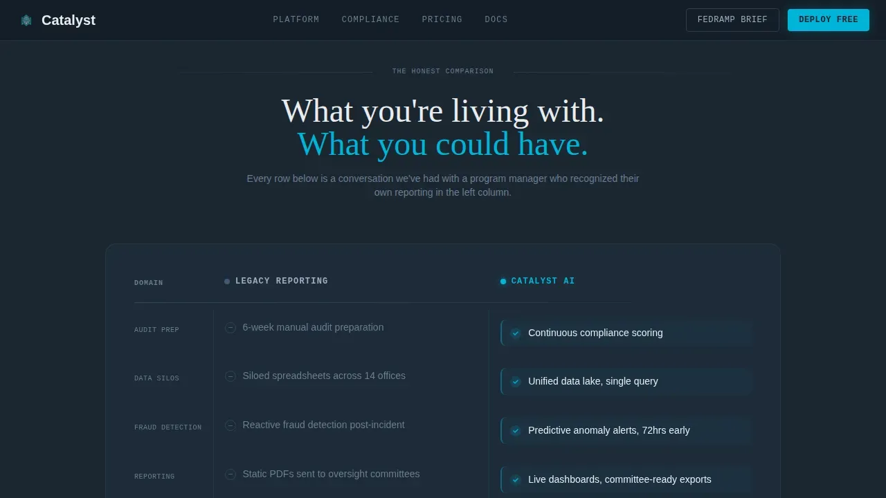
- Replaces vague feature lists with a brutal, row-by-row comparison that names the actual pain: six-week audit prep cycles, siloed reporting across dozens of offices, reactive fraud detection that catches problems only after the damage is done
- Gives visitors a visual experience that mirrors the clarity the platform itself promises, so the design and the product message reinforce each other
- Reduces procurement friction by surfacing compliance credentials and limiting the signup form to three fields, because every extra field kills a government conversion
What you get with this template
This template delivers a fully structured, single-page layout ready to be configured for any government analytics product. Every section is purposeful. Nothing is decorative.
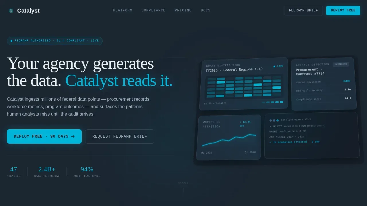
- An animated isometric dashboard header with a typewriter headline, parallax depth layers, a geospatial heat map in motion, a live attrition trend line, and a pulsing anomaly detection card
- A sequentially animated comparison table with Legacy Reporting and Catalyst AI columns, each row wiping from slate to teal as the visitor scrolls, making the case visually before they finish reading
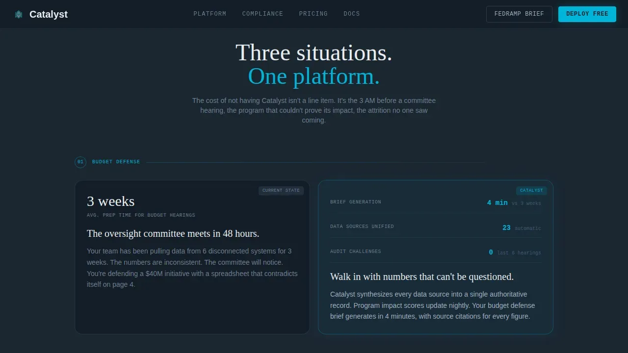
- Three agency scenario panels covering budget defense, program evaluation, and workforce planning, each opening as a dark static problem view and dissolving into an animated solution view with live chart elements, a metrics bar for social proof, agency-role testimonials, and a three-field deployment form paired with FedRAMP and IL-4 credential displays
Feature list
This template is built around a small number of high-impact feature areas. Each one serves a specific conversion role in the page flow.
Animated Isometric Dashboard Header
The hero section presents an isometric view of the analytics platform in motion. A geospatial heat map shifts to show grant distribution across locations. A workforce attrition trend line draws itself in real time. A procurement anomaly detection card pulses signal teal when it flags an outlier. Parallax camera drift separates the dashboard panels into dimensional depth, giving the header the kinetic energy of a system that never stops processing data. The headline types itself character by character, like a command-line entry, establishing the platform's voice before the visitor reads a single feature.
Sequential Comparison Table
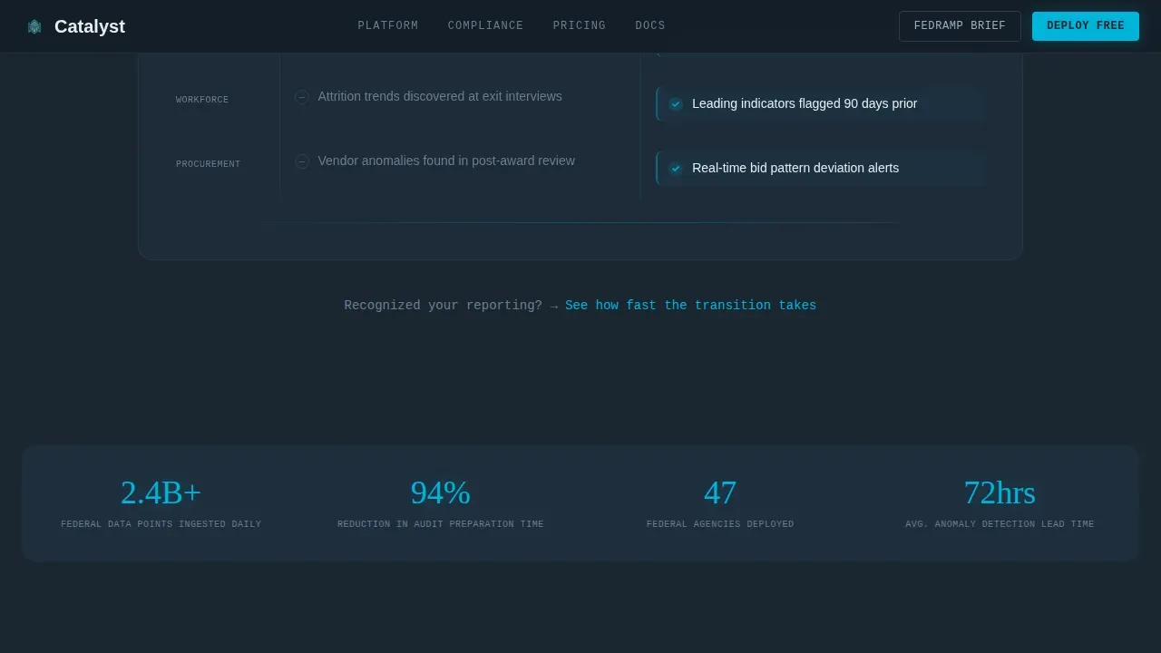
The comparison table is the core selling engine of this landing page. It is structured with two clearly labeled columns. The left column is titled Legacy Reporting and lists specific, time-consuming pain points familiar to any agency analyst. The right column is titled Catalyst AI and maps each pain point to a direct solution. Each table row animates in with a horizontal wipe from slate to teal as the visitor scrolls, building a visual rhythm that turns a static feature list into a live demonstration of problems being solved. Hover states on each row keep interactions responsive and reinforce the platform's data-forward character.
Three-Panel Agency Scenario Arc
Below the comparison table, three scrolling scenario panels escalate the stakes of the page. Each scenario covers a distinct use case: defending a budget allocation before an oversight committee, evaluating whether a program actually delivered results, and managing workforce planning decisions backed by real data analysis. Each panel opens as a dark, static problem state and transitions into an animated solution view alive with chart motion and glowing data nodes. The arc builds a deep understanding of the cost of not acting, by the final panel, the visitor is not comparing features. They are feeling the consequences.
Minimal Three-Field Deploy Form
The call-to-action section asks for agency name, role title, and a dot-gov or dot-mil email address in that exact order. Three fields, no more. This limit is deliberate. Procurement friction kills government conversions, and every additional form field is a reason for a busy program manager to close the tab. The primary call to action reads "Deploy Catalyst Free for 90 Days." A secondary tap target offers "Request a FedRAMP Brief" for visitors who are not yet ready to deploy but want to continue the conversation through official channels.
Compliance Credential Display
A FedRAMP authorization badge and an IL-4 (Impact Level 4) compliance seal sit directly beneath the call-to-action form. These credentials are not tucked into a footer. They are positioned at the exact moment the visitor is deciding whether to submit their information. The placement neutralizes the security objection before it can form. Designing a landing page for real-time federal intelligence analytics requires a focus on clarity, trust, and security, and this template handles that by making compliance visible at the conversion point.
Social Proof Metrics Bar and Testimonials
Between the scenario panels and the deploy form, a metrics bar surfaces specific data points: volume of records processed, number of agencies where the platform is deployed, and reduction in audit preparation time. Agency-role testimonials appear alongside the metrics, each one attributed to a recognizable role type (program manager, state director, compliance officer) rather than a generic name. This combination of quantitative proof and role-specific voice gives the visitor the peer validation that government buyers require before they act.
Page sections overview
| Section | Purpose |
|---|---|
| Animated Hero Header | Establishes platform identity and hooks attention with live dashboard motion and typewriter headline |
| Comparison Table | Converts legacy pain into platform value, row by row, with sequential wipe animations |
| Agency Scenario Panels | Escalates stakes across three real use cases with dark-to-teal dissolve transitions |
| Social Proof Bar | Delivers quantitative metrics and role-specific testimonials to build credibility |
| Deploy Call to Action | Drives form submission with a three-field form, dual call to action options, and compliance badges |
| Single-Row Footer | Closes the page cleanly with minimal navigation, legal links, and brand mark |
Design & branding system
The visual identity follows a Dynamic Motion theme built around the Teal Catalyst color system. Every color is earned by the data it represents. Nothing on this page is decorative.
- Deep operational charcoal (#1B2631) covers the primary background, signal teal (#00B4D8) marks data highlights and interactive elements, muted slate (#415A77) defines secondary panels and table borders, and briefing white (#E8ECEF) carries all primary text and card surfaces
- Typography pairs Fraunces as the serif display face for headlines, JetBrains Mono for data and code elements including the typewriter animation and metric readouts, and DM Sans for all body copy, creating a layered typographic system that feels operational rather than decorative
- Animation intensity is high throughout: typewriter headline entry, sequential row wipes on the comparison table, isometric parallax on the hero, animated chart lines in the scenario panels, and pulsing teal on the anomaly detection card, all triggered by scroll-based IntersectionObserver events using client-side components
Mobile & speed optimization
This template is built desktop-first, matching the primary user environment of agency CIOs and program managers working on workstations. Mobile-responsive behavior is included for all sections, enabling access across devices from tablets to phones without layout breakage.
- Responsive column stacking ensures the comparison table, scenario panels, and form fields reflow cleanly on smaller screens and mobile devices
- Animation and motion elements are implemented using client-side components and IntersectionObserver so that scroll-triggered effects activate correctly across all modern devices without blocking page rendering
- The three-field form is optimized for touch input on mobile devices, with appropriately sized tap targets for the primary deploy button and the secondary FedRAMP brief request
How this template helps you convert
This template is built around a specific conversion theory. By the time the visitor reaches the form, the comparison table and the scenario panels have already done the selling. The form is just the final step in a journey the page has carefully constructed.
- The animated isometric header creates immediate visceral engagement. The typewriter headline and the live dashboard give the visitor the feeling of clarity and momentum before they have read a single word of body copy, making them receptive to what comes next.
- The comparison table converts abstract platform value into specific, recognizable pain. Each row names a real reporting burden that agency analysts know intimately: time-consuming audit prep cycles, siloed data systems, reactive compliance processes. Watching each row wipe from slate to teal builds emotional momentum toward the solution.
- The FedRAMP badge and IL-4 seal positioned directly beneath the form remove the final objection at the exact moment it would otherwise form, enabling the visitor to act without having to navigate away to verify security credentials separately.
Other information about this template
This section covers additional context about the template's design philosophy, technical approach, and positioning within the government analytics category, including facts about the broader market and platform services this template is designed to represent.
- U.S. government agencies are data-rich but insight-poor. Federal agencies generate vast amounts of data from internal systems, field operations, partner networks, and public interfaces, yet the tools available for analysis have historically been time-consuming and siloed. This template is designed to communicate the contrast between legacy and modern analysis clearly.
- The template's comparison table structure reflects a well-established truth about government software marketing: buyers need to see their current pain named before they will believe a solution is real. Each row in the table is a specific category of reporting burden, not a generic feature comparison.
- This template is appropriate for platforms that support deployment options including cloud, on-premise, or edge processing configurations. The design can be configured to reflect whichever deployment scope is relevant to the platform being marketed.
- The landing page structure is built to support platforms that incorporate machine learning models, anomaly detection, and automated compliance reporting into their core services. The scenario panels and comparison table sections provide natural locations to surface these ai capabilities in concrete, use-case terms.
- No-code and low-code platforms are increasingly being adopted by federal agencies to streamline operations and reduce the backlog of time-consuming IT requests. This template can support marketing for platforms that offer no-code onboarding experiences, enabling non-technical users such as analysts and administrators to access advanced workflows without programming knowledge.
- Data governance is a critical concern for any federal analytics product. The template is structured to give compliance and data governance messaging prominent placement, from the comparison table rows that call out traceable data sources to the credential badges at the conversion point. Sound data governance across systems reduces risk and builds the institutional trust that government buyers require before committing to a platform.
- The template includes a search bar element in the hero dashboard mockup, enabling visitors to see how analysts would query the platform in practice. A drop down list component is also visible in the animated dashboard preview, showing how filters and date selectors can be configured to refine data scope and define specific time spans for analysis.
- A drop down list in the scenario panel controls allows visitors to see how different agency roles and use cases can be selected, making features grouped by user category easy to navigate. This detail reinforces the platform's depth without requiring a lengthy feature catalogue.
- Metadata tagging is an important part of how modern federal analytics platforms manage large asset libraries. The template is designed for platforms where metadata is central to organizing processed records, tagging procurement anomalies, and enabling fast search across millions of data points. Proper metadata structure is what makes a unified data lake queryable in real time, replacing the fragmented log files and manual tagging that slow down legacy systems.
- The template's social proof section is designed to surface quantitative progress metrics: records processed, agencies served, and audit cycle time reductions. These are the details that government buyers look for before they will act. Generic testimonials are replaced by role-attributed quotes that create immediate peer recognition for the visitor.
- The EmergeGen Data Central platform, referenced in the broader government analytics market, represents the category of services this template is built to market. Such platforms enable interagency data fusion, transform unstructured intelligence into standardized query-ready assets, and provide real-time error detection in data management processes. The template's design philosophy aligns with the principles those platforms embody: clarity, auditability, and scale.
- This template is part of a broader rise in government-focused analytics marketing assets. Agencies and their vendors are increasingly looking for landing page designs that communicate complex data insight clearly while addressing the security and compliance needs of federal stakeholders. The Catalyst template is built specifically for this category, making it a relevant and practical choice for teams operating in this era of federal data modernization.
- For teams who want to expand their page's scope beyond a single call to action, the template's section structure supports adding additional channels of engagement, such as a resource download, a case study link, or a scheduled briefing request, without disrupting the primary conversion flow. The footer pattern keeps the page closed and focused while still providing essential contact and legal details.
Theme
Dynamic Motion
Creative direction
Problem→Solution Arc
Color system
Teal Catalyst
Direction
App Download
Page Sections
Animated Isometric Dashboard Hero
Sequential Comparison Table
Three-panel Agency Scenario Arc
Minimal Three-field Deploy Form
Compliance Credential Display
Social Proof Metrics and Testimonials
Related questions
Who is the primary audience for this template?
Can I configure the comparison table rows to match my platform's specific features?
Does this template support mobile devices?
How does the compliance badge placement work?
Is this template suitable for platforms that use machine learning or automated analysis?



