Power BI Course Landing Page Template
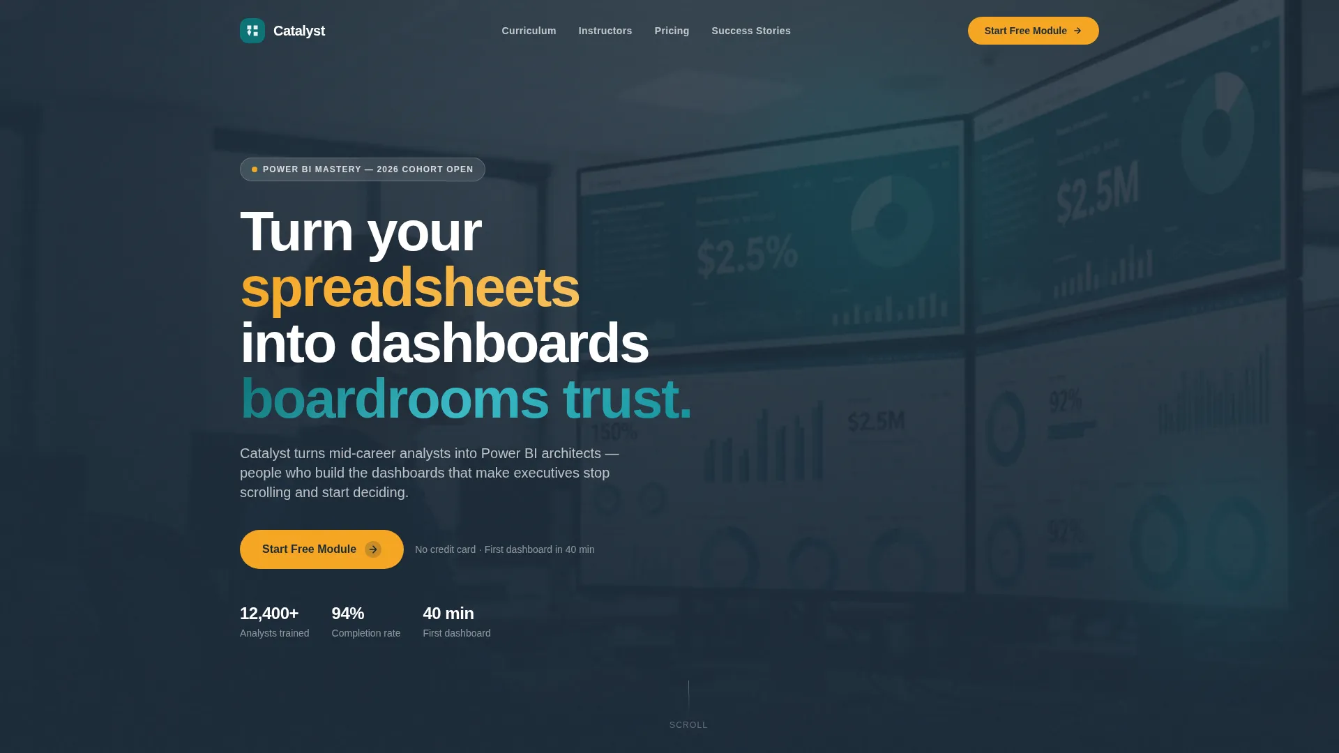
Catalyst is a single-page landing page template built for Power BI online courses. It combines a scrolling logo bar, three-tier comparison table, instructor profiles, and a no-credit-card free-module funnel into one authoritative layout. The design uses a deep teal and charcoal palette that signals credibility while amber accents keep every call to action impossible to miss.
by Rocket studio
Quick summary
Catalyst is a comparison table landing page template designed for a Power BI online course. It guides visitors from instructor credibility to tier selection to student transformation in one focused scroll. The Teal Catalyst color system and Institutional Authority theme make the page feel rigorous and modern. The freemium funnel starts with a zero-friction free module, then earns the Pro upgrade naturally.
Who this template is for
This template is built for course creators, training businesses, and educators selling a technical skills program online. It works especially well when the offer has a free entry tier and a clear paid upgrade path.
- Data educators and Power BI trainers who need to demonstrate curriculum depth before asking for payment
- Online course platforms or independent instructors launching a structured skills program with multiple enrollment tiers
- Consultancies or training teams offering team licenses alongside individual course access
What problem this template solves
Most course landing pages either oversell with vague promises or undersell by burying the actual curriculum. Neither builds the trust a technical buyer needs before enrolling. Catalyst solves this by structuring the page around proof first, then value, then conversion.
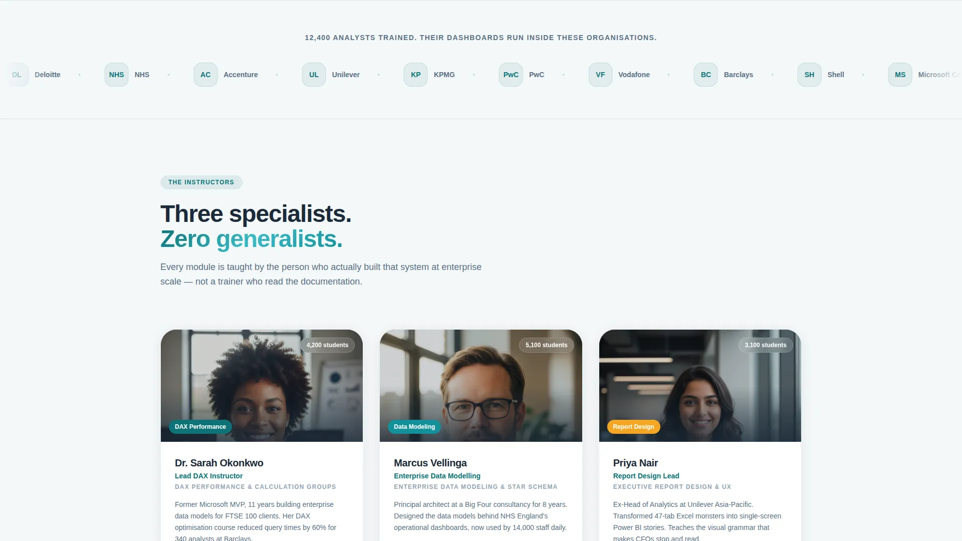
- Visitors arrive skeptical; the logo bar and instructor credentials answer that skepticism before a single feature is listed
- Buyers comparing tiers get lost without a clear visual structure; the comparison table makes Free, Pro, and Team differences immediately readable
- Potential students need social proof beyond star ratings; named before-and-after transformations with real job titles fill that gap
What you get with this template
Catalyst gives you a fully structured single-page layout ready to populate with your course content, instructor details, and tier pricing. Every section has a clear job to do, and the flow is intentional from top to bottom.
- A scrolling logo bar header section, three instructor profile cards with circular portrait frames, and a three-column comparison table with granular row items
- A student transformation section with named individuals, before-and-after job titles, and dashboard screenshot placeholders
- A freemium conversion block with an email field, role selector, primary and secondary calls to action, and a 7-day money-back badge on the Pro column
Feature list
This section covers the core functional and design capabilities built into the Catalyst template.
Scrolling Logo Bar Header
A horizontal ribbon beneath the main headline slowly scrolls employer and certification logos. This positions social proof at the very top of the page so credibility lands before any feature claim.
Three-Instructor Profile Block
Circular portrait frames sit side by side against a charcoal background. Each card carries a name, title, and one-line specialization, giving visitors a fast read of who is teaching and why they are qualified.
Three-Tier Comparison Table
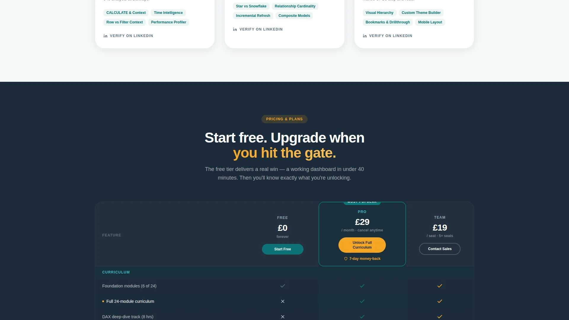
The Free, Pro, and Team columns are built around granular row items. The table is designed so the free tier reads as genuinely useful while the Pro tier feels like the logical next step. Secondary calls to action are embedded directly in the Pro column.
Student Transformation Section
Named students, their job titles before and after completing the course, and dashboard screenshot placeholders are presented in a structured layout. This section replaces generic testimonials with verifiable career evidence.
Freemium Conversion Block
The primary call to action requires only an email address and a role selector. No credit card is requested. The block is designed to lower enrollment friction and channel qualified leads toward the free module first.
Reactive Amber Call-to-Action System
Amber (#F5A623) is reserved exclusively for calls to action, progress indicators, and hover states. This creates a consistent visual language where every interactive element is immediately recognizable against the teal and charcoal base.
Page sections overview
| Section | Purpose |
|---|---|
| Logo Bar Header | Establishes social proof and headline impact at page entry |
| Instructor Profile Block | Introduces the three lead instructors with credentials and specializations |
| Tier Comparison Table | Compares Free, Pro, and Team tiers with row-level feature detail |
| Student Transformation Stories | Shows real before-and-after outcomes with job titles and dashboard visuals |
| Free Module call to action Block | Captures email and role, routes to the free module with no payment barrier |
Design & branding system
Catalyst uses the Teal Catalyst color system inside an Institutional Authority visual theme. The combination feels like a well-funded university lab rendered for a modern screen: authoritative, focused, and energized at the edges where interaction happens.
- Core palette: deep lecture-hall teal (#0D7377) for primary surfaces, blackboard charcoal (#1B2A38) for section backgrounds, and clean whiteboard (#F4F7F9) for content areas
- Reactive amber (#F5A623) appears only on calls to action, hover states, and progress indicators, keeping the interactive layer visually distinct from informational content
- Circular portrait frames, a slow-scrolling logo ribbon, and short video loops in the instructor section reinforce the Team and People creative direction throughout the scroll
Mobile & speed optimization
The template is built with a single-page, section-led layout that keeps the structure predictable on smaller screens. The comparison table and instructor block are the two most layout-intensive sections, and both are designed to reflow clearly at mobile widths.
- The comparison table collapses to a card-style layout on narrow screens so tier differences remain readable without horizontal scrolling
- Instructor portrait frames and the logo bar ribbon are sized to maintain visual weight on mobile without requiring large image files
- The freemium conversion block is placed near the bottom of the scroll so mobile users who reach it have already seen the key proof points
How this template helps you convert
Catalyst is structured as a deliberate persuasion sequence. Each section does a specific conversion job before handing off to the next.
- The logo bar and instructor block resolve trust objections first, so the visitor is receptive by the time they reach the tier table
- The comparison table makes the Pro tier feel inevitable by showing granular row-level value rather than vague feature categories, with the secondary call to action embedded directly in the column
- The free module entry point removes the final barrier by asking only for an email and a role, delivering an immediate win (a working dashboard in under 40 minutes) that naturally motivates the paid upgrade
Other information about this template
Catalyst is a purpose-built template for the Power BI online course market. A few additional details are worth noting for buyers evaluating fit.
- The role selector in the conversion block covers four audience types: analyst, manager, consultant, and student, matching the primary learner profiles described in the course brief
- The 7-day money-back badge is a built-in layout element in the Pro column, giving course creators a ready placement for their refund policy without custom design work
- The template style is Comparison Table, meaning the tier table is the structural centerpiece of the page rather than a secondary section
- The page direction is Freemium and Trial, so the entire layout hierarchy is tuned to earn the upgrade through demonstrated value rather than leading with a hard sell
- Microsoft Certified is one of the logo bar credential types included in the header concept, making the template a strong fit for courses aligned with recognized industry certifications

Theme
Institutional Authority
Creative direction
Team & People
Color system
Teal Catalyst
Style
Comparison Table
Direction
Freemium/Trial
Page Sections
Scrolling Logo Bar Header
Three-instructor Profile Cards
Three-tier Comparison Table
Student Transformation Section
Freemium Conversion Block
Reactive Amber Interaction Layer
Related questions
Is this template suitable for a course with only two pricing tiers?
Does the template include real instructor photos or placeholder content?
Can I use this template for a technical course topic other than Power BI?
What makes the freemium conversion block different from a standard sign-up form?
Where does the 7-day money-back badge appear in the layout?



