Catalyst - Brutalist Analytics Landing Page Template
Catalyst is a bold brutalist landing page template built for travel AI analytics platforms. It features an animated comparison table, case-study metric blocks, and a targeted lead-capture form. Designed for revenue managers, airline strategists, and hotel CMOs, it turns data-gap frustration into a compelling reason to request a revenue audit.
by Rocket studio
Quick summary
Catalyst is a single-page, lead-generation landing page template for travel AI analytics dashboards. It uses a brutalist comparison table at its core, animating from broken data states to precise, timestamped insights. The design is raw, command-center dark, and built to make a visitor's current data blindness feel immediately expensive.
Who this template is for
This template is built for travel technology companies that sell intelligence products to the commercial side of the industry. It speaks directly to buyers who live inside spreadsheets and pricing models that lag behind real market movement.
- Revenue managers at mid-size online travel agencies (OTAs) who rely on stale reports
- Airline commercial strategists whose pricing models run hours behind live demand signals
- Hotel chain chief marketing officers who sense demand shifting but lack real-time proof
What problem this template solves
Most analytics platforms struggle to communicate urgency on a landing page. They default to feature lists and product screenshots, missing the moment when a buyer recognizes their own problem. Catalyst is structured to close that gap fast.
- It shows the exact contrast between vague, delayed data and precise, actionable intelligence row by row
- It makes the cost of inaction visible before asking for any commitment
- It frames the lead-capture form as a diagnostic, not a sales call, lowering friction at the critical decision point
What you get with this template
You get a fully structured, single-page layout ready to represent a travel AI analytics dashboard. Every section serves a deliberate role in moving a skeptical commercial buyer toward submitting a lead.
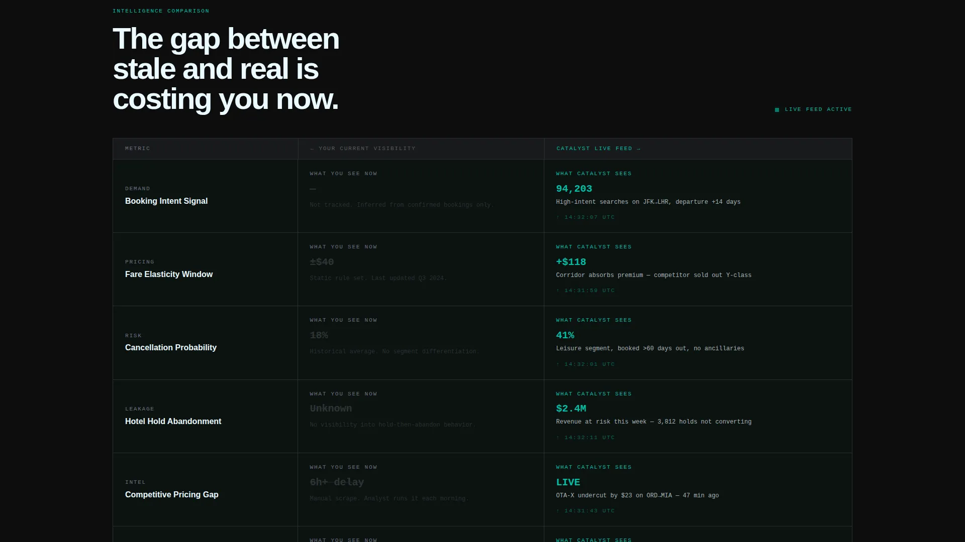
- An animated brutalist comparison table with "What You See Now" versus "What Catalyst Sees" rows covering booking intent, fare elasticity, and cancellation probability
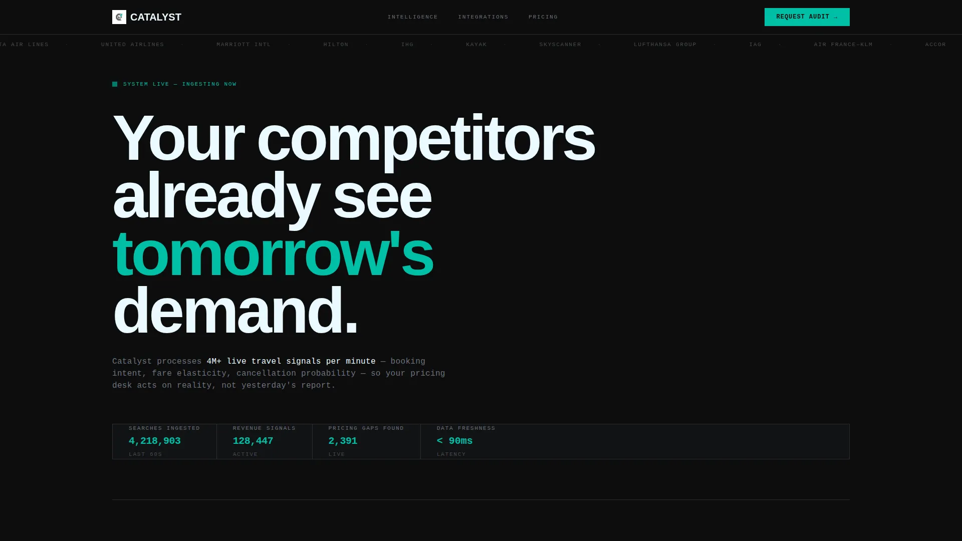
- Scrolling logo bar header with monochrome travel industry brand marks establishing integration credibility
- Two strategically placed "Request Your Revenue Audit" calls to action with a qualified lead-capture form
Feature list
The template's components are purpose-built for a high-stakes B2B audience in travel technology. Each element reinforces the core message: your current data is costing you revenue.
Animated Comparison Table
The centerpiece of the page is a two-column brutalist table. The left column shows vague or missing data states. The right column reveals precise, teal-highlighted, timestamped numbers. Each row animates from broken to resolved as the visitor scrolls, building cumulative tension before delivering relief.
Scrolling Logo Bar Header
A horizontal strip of monochrome travel industry brand marks scrolls continuously across the black header. It signals integration depth and industry reach without a single word of explanation. Above it, one line of oversized stencil-weight type sets the competitive tone immediately.
Case-Study Metric Blocks
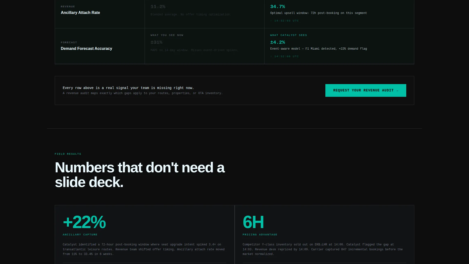
Below the comparison table, concrete slab-style blocks each carry a single metric improvement. Examples like "+22% ancillary capture" and "6-hour pricing advantage" land without decoration. Each block pairs the number with a short story, letting the result speak before the pitch begins.
Targeted Lead-Capture Form
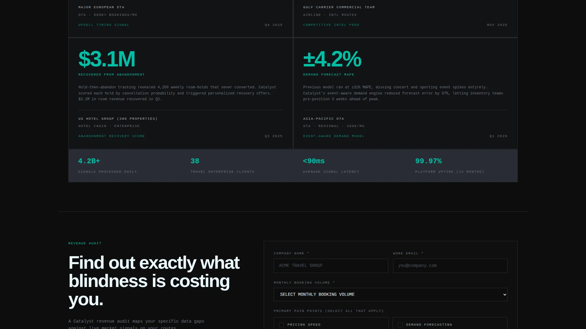
The form collects company name, monthly booking volume via dropdown (under 50K, 50K to 500K, 500K and above), primary pain point via multi-select (pricing speed, demand forecasting, competitive intelligence, abandonment recovery), and work email. The specificity of the fields signals that this is a diagnostic tool, not a generic demo request.
Dual Call-to-Action Placement
"Request Your Revenue Audit" appears once directly below the comparison table and once at the page bottom. This placement captures both early-convinced visitors and those who scroll the full page before deciding.
Bold Brutalist Visual System
No gradients, no rounded corners, no illustrations. The layout uses hard edges, slab typography, and a strict teal, black, and gray palette. Every interactive element uses reactive teal to draw attention without visual noise.
Page sections overview
| Section | Purpose |
|---|---|
| Stencil headline bar | Sets competitive urgency above the logo strip |
| Scrolling logo bar | Establishes integration credibility with industry brand marks |
| Comparison table | Animates the gap between stale data and live intelligence |
| Case-study blocks | Proves value with single-metric real-world outcomes |
| Mid-page call to action form | Captures qualified leads at peak frustration-to-relief moment |
| Bottom call to action form | Re-engages visitors who scroll the full page before deciding |
Design & branding system
The visual identity is built around a Teal Catalyst color system applied to a bold brutalist layout structure. The palette deliberately evokes a control tower at midnight, where every illuminated data point matters.
- Deep command-center black (#0D0D0D) as the base surface, cold slab gray (#2A2D35) for card and table row fills, and signal white (#EAFAFF) for body typography
- Reactive teal (#00BFA6) owns every active state: hover effects, toggle switches, comparison table right-column values, and chart lines
- No gradients, no soft corners, no decorative illustration; the brutalist structure is the design
Mobile & speed optimization
The template is structured with a mobile-first layout hierarchy so the comparison table and form remain fully usable on smaller screens. The brutalist grid adapts cleanly without sacrificing visual weight or readability.
- Single-column stacking for the comparison table on narrow viewports keeps row-by-row contrast intact
- The lead-capture form fields and dropdowns are sized for touch interaction, reducing input friction on mobile devices
How this template helps you convert
The page is engineered around a Problem to Solution Arc that moves a skeptical commercial buyer through recognition, evidence, and action in a single scroll.
- The comparison table creates personal recognition fast. Visitors see their own data gaps reflected in the left column, making the cost of their current tools viscerally clear before any product claim is made.
- The case-study metric blocks deliver third-party-style proof in the most minimal format possible. A single number plus a short story is harder to dismiss than a feature list or a demo video.
- The lead-capture form is framed as a revenue audit, not a sales call. The specificity of the booking-volume dropdown and pain-point multi-select signals that the diagnostic is real, which increases form completion from qualified buyers.
Other information about this template
Catalyst is part of a broader template family built around the Bold Brutalist theme with the Teal Catalyst color system. It sits within the AI for Travel subcategory and is specifically designed for travel AI analytics dashboard use cases in the technology category.
- The template style is Comparison Table, making it well-suited for platforms that need to contrast legacy approaches with AI-powered alternatives
- The header concept is a Logo Bar, which works particularly well for platforms with established integration networks in the airline, OTA, hotel group, and global distribution system (GDS) provider space
- The creative direction follows a Problem to Solution Arc, a proven structure for high-consideration B2B technology offers where the buyer needs to feel the pain before they value the solution
- The landing page direction is Lead Generation, with no free trial or demo video path; the entire page earns the click through demonstrated diagnostic value
Theme
Bold Brutalist
Creative direction
Problem→Solution Arc
Color system
Teal Catalyst
Style
Comparison Table
Direction
Lead Generation
Page Sections
Animated Brutalist Comparison Table
Scrolling Industry Logo Bar
Concrete Case-study Metric Blocks
Qualified Lead-capture Form
Dual Call-to-action Placement
Teal Catalyst Color and Typography System
Related questions
What type of business is this template designed for?
Can I adapt the comparison table rows to match my platform's specific metrics?
Does the template include the lead-capture form fields described in the brief?
Is this a single-page layout or a multi-page site?
How does the scrolling logo bar work?



