Dental Digital Presence Professional Website Template
Catalyst is a modular card grid landing page built for dental course and training platforms. It combines a metrics-driven header, a filterable course explorer, and a freemium conversion flow into one clean, clinical layout. The Teal Catalyst color system keeps the design sharp and navigable, while inline card expansion and sticky call-to-action elements guide visitors from browsing to signing up.
by Rocket studio
Quick summary
Catalyst is a single-page dental learning platform template built around a filterable card grid. It opens with a live-metrics header, moves visitors into an interactive course explorer, and closes with a friction-free freemium sign-up flow. The design draws on a clinical teal and navy palette to feel authoritative, organized, and immediately trustworthy.
Who this template is for
This template is built for dental educators, course creators, and platform operators who need a professional online presence that converts browsers into learners. It suits teams launching structured continuing education programs or board-prep libraries.
- Associate dentists and educators building mentorship-led video course platforms
- Practice owners creating team-wide protocol training for aligners, endodontics, or implants
- Overseas-qualified practitioners and course providers targeting board exam preparation audiences such as the Overseas Registration Examination (ORE) or the National Board Dental Examination (NBDE)
What problem this template solves
Most dental training pages dump a long course list on the visitor and hope they scroll far enough to find something relevant. That approach loses browsers before they ever reach a sign-up prompt. Catalyst solves the discovery and conversion problem together.
- Learners cannot easily filter by specialty, format, or difficulty on generic templates
- Visitors leave before committing because they cannot preview real content before registering
- Platforms struggle to move free browsers toward paid or registered users without a clear conversion path
What you get with this template
You get a fully structured, single-page layout that combines data-forward header design, interactive course discovery, and a low-friction sign-up experience in one deployable template.
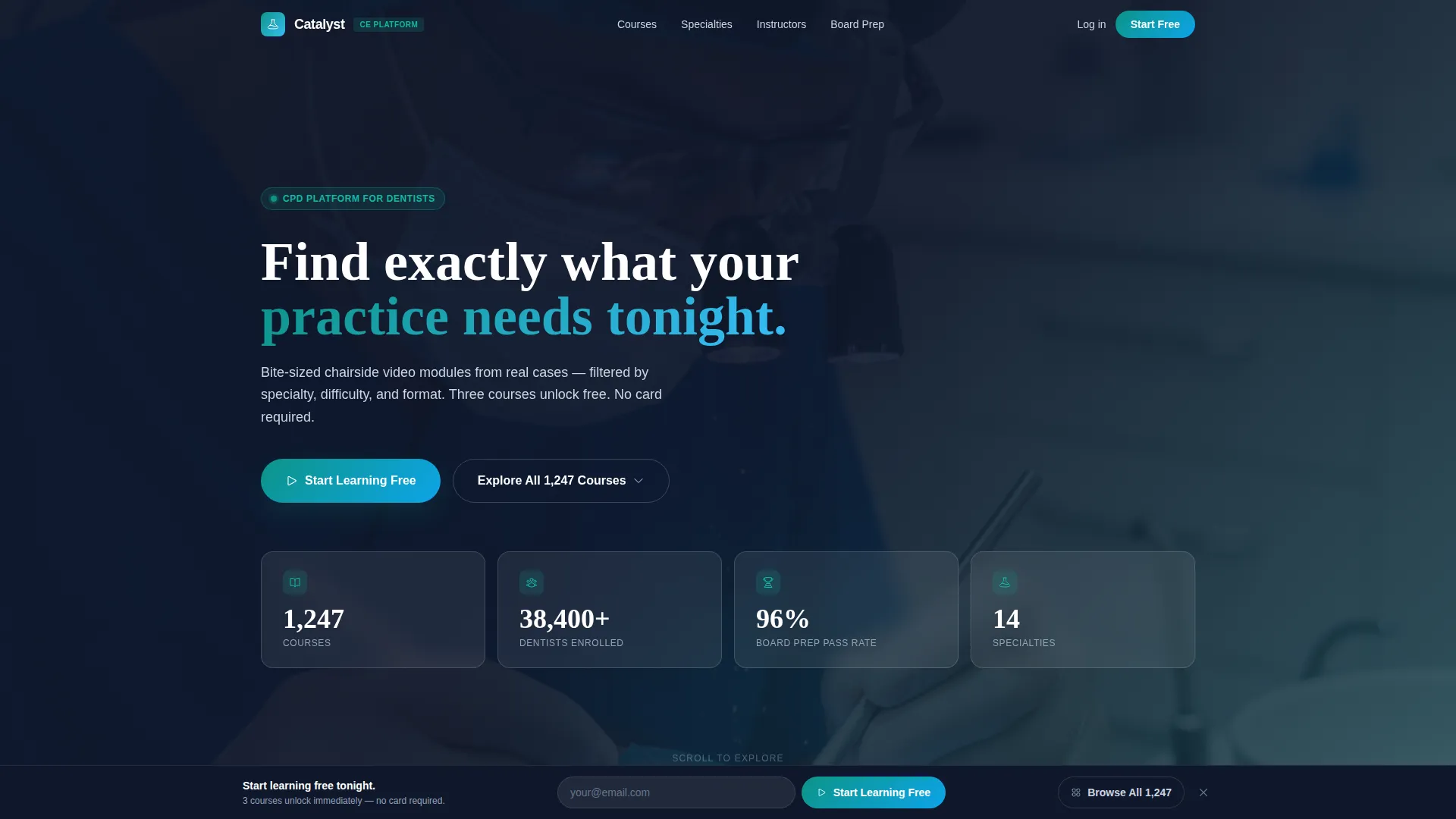
- A Stats and Metrics header with animated counters, background video overlay, and a headline fade-in
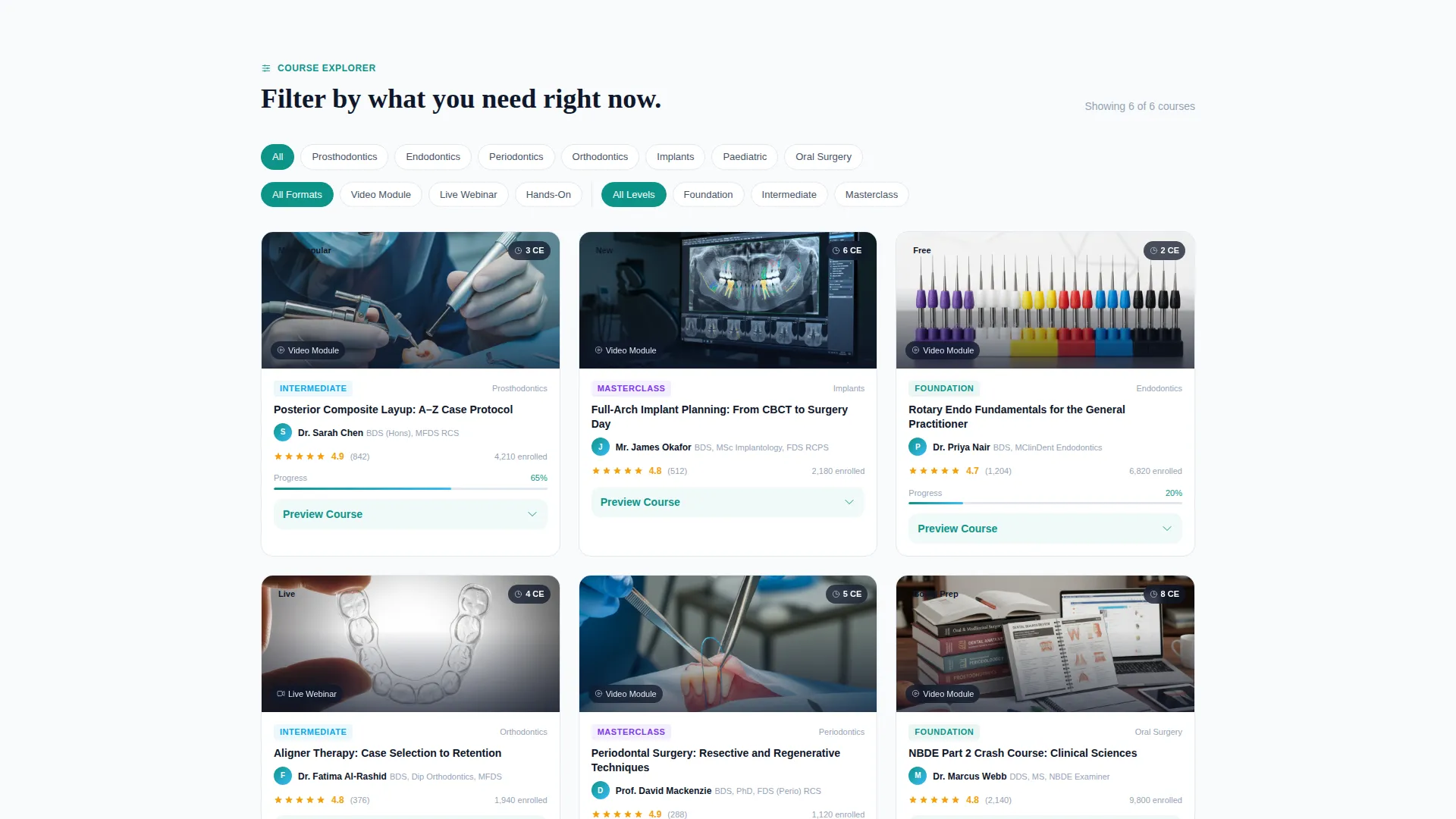
- A filterable card grid with toggle chips, inline card expansion, module breakdowns, and sample clip placeholders
- A sticky freemium conversion bar with an email field, a social sign-on button, and a ghost button path back to the course grid
Feature list
This template ships with purpose-built components designed for dental learning platforms. Each section works independently and together to keep visitors engaged from the first scroll to the final sign-up.
Animated Stats Header
The header displays four oversized metric cards showing course count, enrolled dentists, board exam pass rate, and specialty count. A soft-focus looping video plays behind the numbers at reduced opacity, and the headline fades in below, setting authority before the visitor reads a single course title.
Filterable Course Card Grid
The core of the page is a modular card grid with toggle chips organized by specialty, format, and difficulty. Each card shows a procedure thumbnail, instructor name with credentials, continuing education (CE) credit hours, and a completion percentage bar for returning learners. The grid shifts from popular courses to personalized recommendations as the visitor scrolls deeper.
Inline Card Expansion
Clicking a course card does not navigate the visitor away from the page. Instead, the card expands inline to reveal a module breakdown, a sample thirty-second clip placeholder, and peer ratings, letting visitors assess course quality before committing to registration.
Sticky Freemium Conversion Bar
A bottom bar appears after the first scroll interaction and stays pinned throughout the session. It includes a single email input field, a Google single sign-on (SSO) button, and a "Start Learning Free" call-to-action. Three foundation courses are shown as immediately accessible with no payment required.
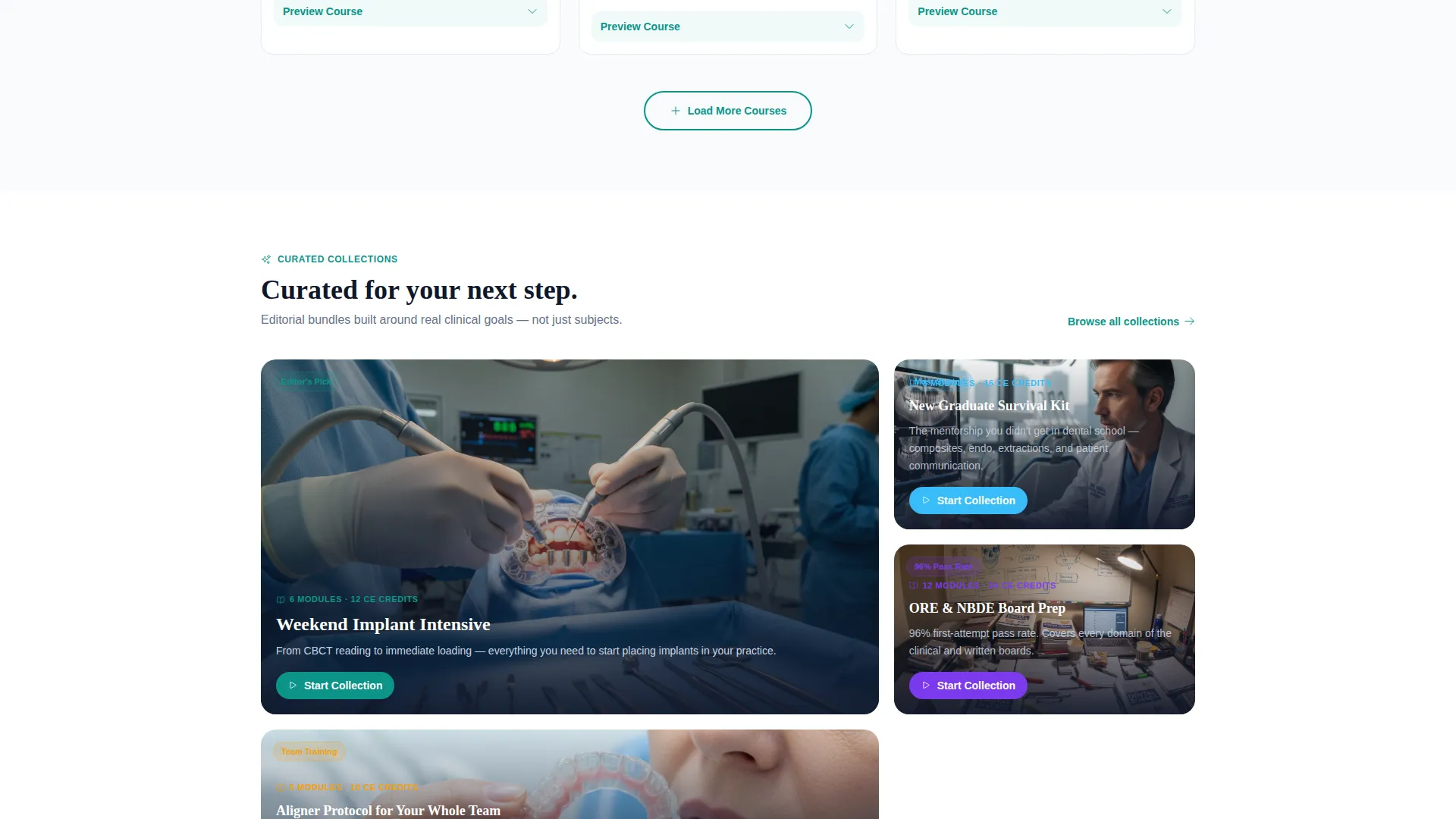
Editorial Course Collections
Below the recommendation layer, the grid surfaces curated collections such as "Weekend Implant Intensive" and "New Graduate Survival Kit." These editorial groupings make browsing feel purposeful and reduce decision fatigue for new visitors exploring the platform.
Ghost Button Secondary Path
A secondary "Explore All 1,247 Courses" ghost button keeps engaged browsers cycling back to the filter grid instead of leaving the page. This secondary path supports visitors who are not yet ready to register but want to keep exploring.
Page sections overview
| Section | Purpose |
|---|---|
| Stats Metrics Header | Establish platform credibility with animated course and enrollment data |
| Background Video Banner | Add visual depth with a soft-focus procedural video overlay |
| Headline Fade-In | Anchor visitor intent with a focused value statement |
| Specialty Filter Chips | Let visitors narrow courses by prosthodontics, perio, endo, or ortho |
| Format Filter Chips | Toggle between video, live webinar, and hands-on course formats |
| Difficulty Filter Chips | Sort results by foundation, intermediate, or masterclass level |
| Course Card Grid | Display filterable course cards with thumbnails and instructor details |
| Inline Card Expansion | Reveal module breakdown and sample clip without leaving the page |
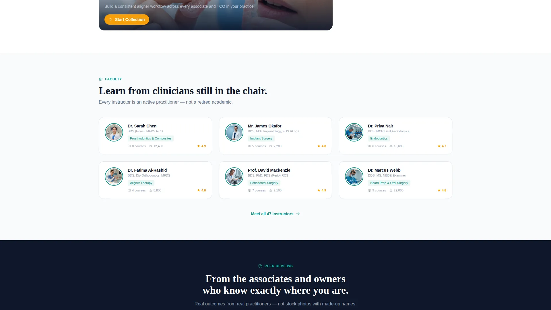
| Peer Ratings Display | Surface social proof directly on expanded course cards |
| Recommendation Scroll Layer | Shift grid to personalized suggestions as the visitor scrolls |
| Editorial Collections Row | Present curated course bundles for targeted learner goals |
| Sticky Conversion Bar | Pin a freemium sign-up prompt after the first scroll interaction |
| Ghost Button Path | Keep browsers engaged with a secondary return-to-grid action |
Design & branding system
The Teal Catalyst color system draws from the visual language of a clinical operatory. Every color choice reinforces trust and guides the eye without competing with course content.
- Clinical teal (#0D9488) used as the primary accent on cards and progress indicators; deep operatory navy (#0F172A) for headers and navigation
- Ceramic white (#F8FAFC) across card backgrounds and open space to maintain a clean, sterile feel throughout the layout
- Curing-light blue (#38BDF8) activates on hover states and interactive highlights, giving learners clear visual feedback as they explore the grid
Mobile & speed optimization
The modular card grid layout is structured to adapt naturally across screen sizes, keeping the course discovery experience usable whether a dentist is browsing between patients on a phone or reviewing content at a desktop.
- Card grid columns reflow to single-column layout on smaller screens, keeping course cards legible and tappable
- The sticky conversion bar is designed to remain accessible at the bottom of mobile viewports without obscuring card content
- Filter chip rows are laid out for horizontal scroll on narrow screens, preserving the full specialty and format toggle set
How this template helps you convert
Catalyst earns commitment from visitors before it asks for it. The conversion architecture is built around letting learners interact with real course structure first.
- The animated metrics header immediately communicates platform scale, showing over 38,400 enrolled dentists and a 96 percent board prep pass rate before a visitor reads any course description.
- Inline card expansion lets visitors preview module breakdowns and sample clips without registering, reducing the perceived risk of signing up.
- The sticky freemium bar paired with three free foundation courses removes every barrier to a first session, so the platform proves its value before asking for an email address.
Other information about this template
This template is part of the Catalyst template family, built under the Directory and Discovery theme with an Interactive Explorer creative direction. It is designed for dental digital presence use cases within the broader technology category.
- The template style is a Card Grid (Modular) layout, suited for platforms with large content libraries that require filterable, browsable interfaces
- The Freemium and Trial landing page direction embedded in the layout makes it suitable for any dental course platform launching a free-tier or trial-access model
- The Stats and Metrics header concept can be updated with real platform data once the page goes live, replacing placeholder numbers with verified enrollment and completion figures
Theme
Directory & Discovery
Creative direction
Interactive Explorer
Color system
Teal Catalyst
Style
Card Grid (Modular)
Direction
Freemium/Trial
Page Sections
Animated Stats and Metrics Header
Filterable Course Card Grid
Inline Card Expansion Panel
Sticky Freemium Conversion Bar
Editorial Course Collections
Secondary Ghost Button Path
Related questions
Can I customize the filter categories to match my course library?
Do I need a large course library to use this template effectively?
How does the inline card expansion work without a backend?
Is this template suitable for board exam preparation platforms?
Can the sticky conversion bar be connected to an email platform?



