Nonprofit Software Specialist Directory Website Template
Catalyst is a split-screen nonprofit proposal landing page template built for grant writers, development directors, and consultants racing funding deadlines. It pairs a Dynamic Motion visual style with a Teal Catalyst color system to showcase a side-by-side comparison engine, animated proposal assembly, and a qualifying conversion form, all designed to turn late-night RFP stress into a confident first submission.
by Rocket studio
Quick summary
Catalyst is a single-page landing page template purpose-built for nonprofit proposal and grant platforms. It uses a 50/50 split-screen layout, a Feature Matrix creative direction, and continuous scroll-driven animation to show visitors exactly how automated proposal generation outperforms manual processes. The design is bold, focused, and built to convert qualified nonprofit professionals fast.
Who this template is for
This template is designed for teams and individuals who live inside the grant cycle. It speaks directly to the pressure of funding deadlines, compliance requirements, and multi-funder submission schedules.
- Nonprofit program managers and development directors managing multiple RFP deadlines simultaneously
- Grant writing consultants handling concurrent foundation, federal, and corporate submissions
- Executive directors who need to present a credible, polished proposal platform to their boards and funders
What problem this template solves
Nonprofit proposal work is time-intensive and unforgiving. A single formatting error or missed compliance narrative can cost an organization six figures. Most platforms fail to communicate their speed advantage in a way that resonates with exhausted grant writers at 11 p.m.
- Visitors cannot quickly see how automated budget generation and logic model creation compare to manual approaches
- The cost of slow, error-prone proposal workflows is rarely made visible in a way that creates urgency
- Conversion forms that ask irrelevant questions lose qualified nonprofit buyers before they ever engage
What you get with this template
You get a fully structured, single-page layout that doubles as a persuasive argument for your platform. Every section is designed to move a skeptical nonprofit professional from awareness to action without requiring a sales call.
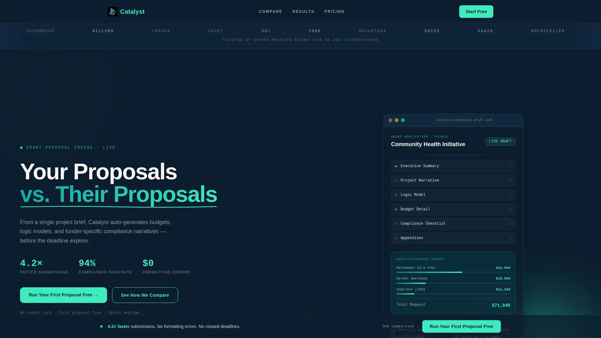
- A Logo Bar header with continuously scrolling funder logos, including foundation and federal agency marks, setting immediate credibility
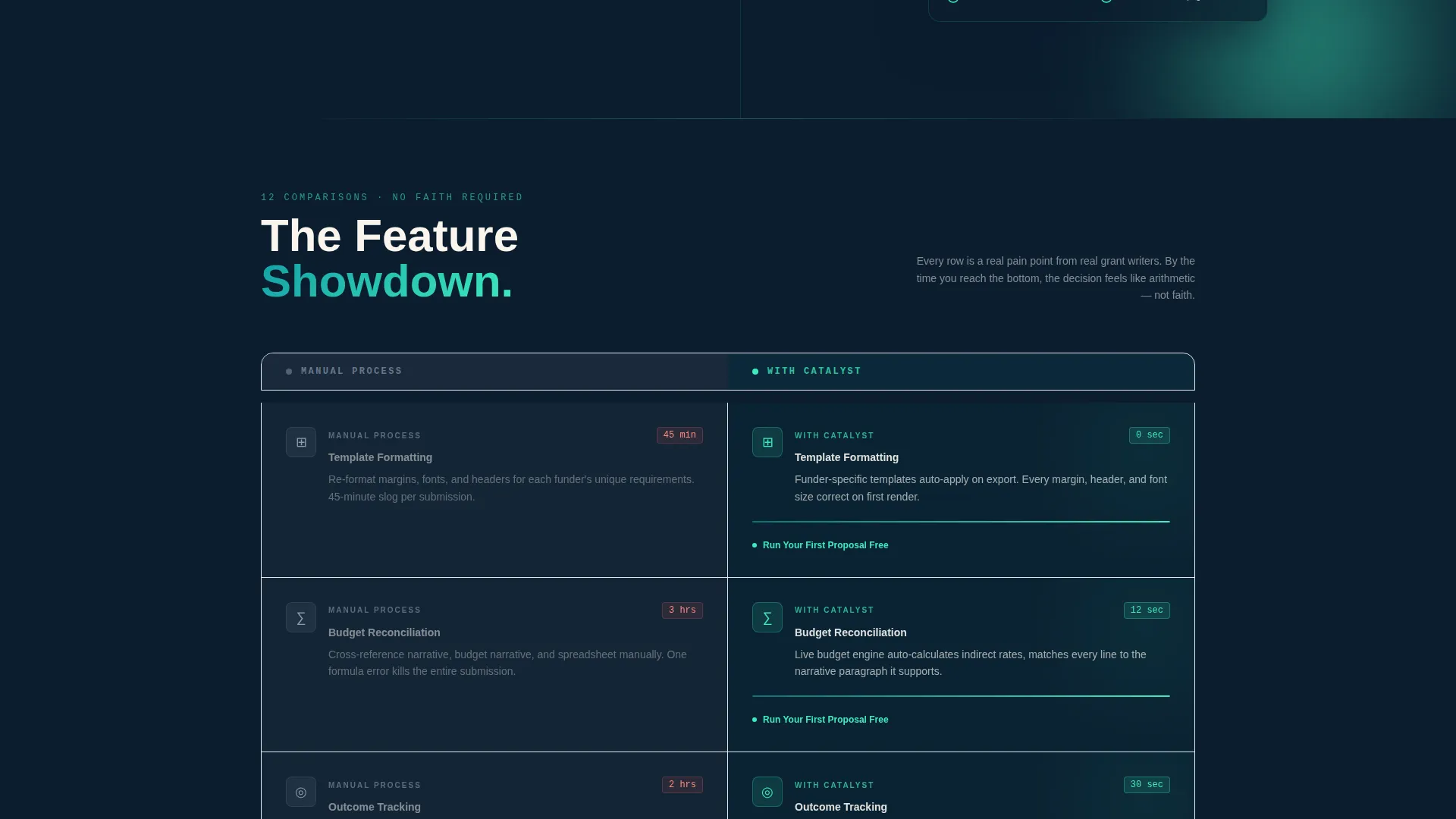
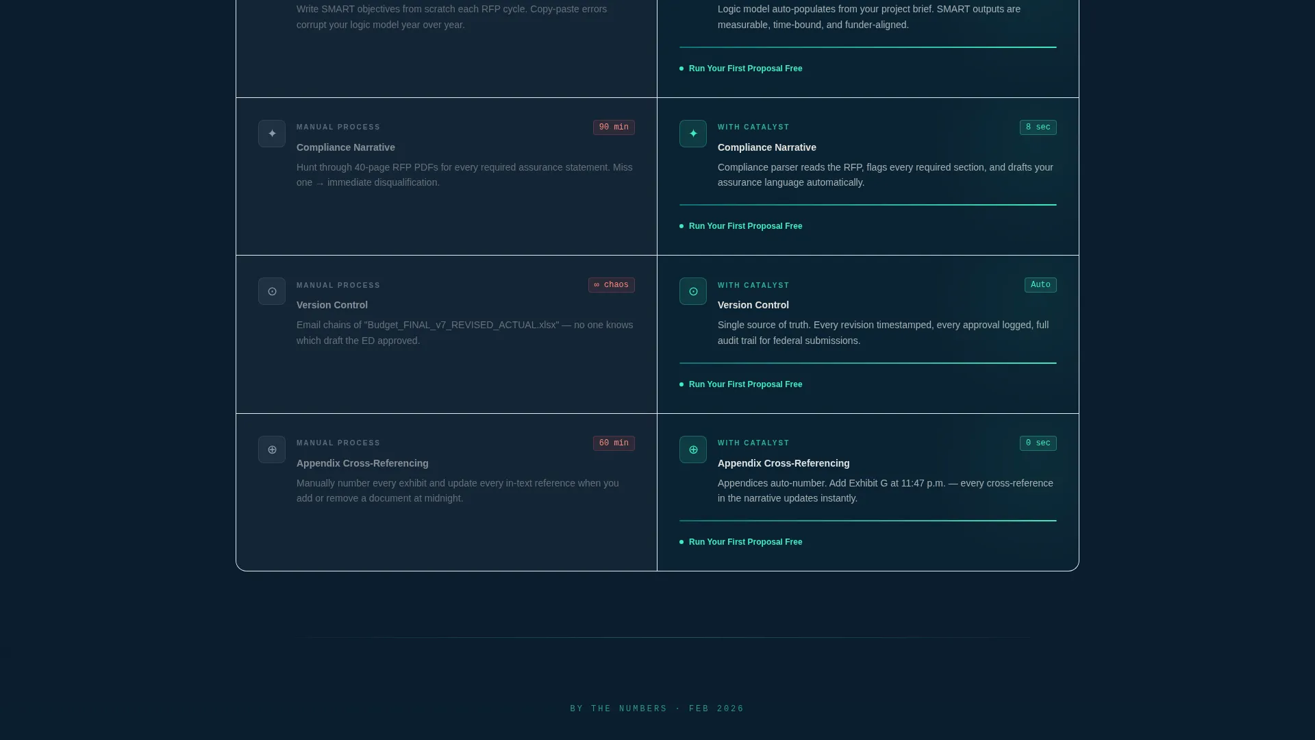
- A scroll-driven Feature Matrix with twelve side-by-side comparisons, animated row reveals, and a persistent floating call-to-action bar
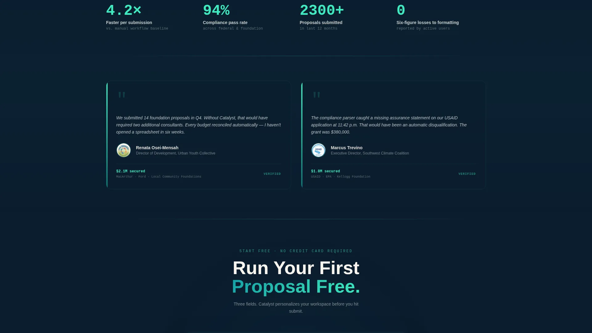
- A three-field qualifying conversion form capturing organization name, proposals per quarter, and primary funder type
Feature list
This section covers the core built-in components and design behaviors included in the Catalyst template.
Animated Split-Screen Header
The header divides into two equal halves. The left side displays the headline "Your Proposals versus. Their Proposals" in mission teal against midnight navy, with a kinetic underline that draws itself in catalyst spark green. The right side shows a proposal document assembling in real time, with budget rows auto-calculating and a compliance checklist ticking green as sections snap into place.
Continuous Logo Bar
A horizontal scroll strip sits at the top of the page. Foundation and funder logos glide left to right in a seamless loop, with each logo subtly pulsing as it crosses center frame. This creates instant recognition and social proof before the visitor reads a single line of copy.
Scroll-Driven Feature Matrix
Every comparison row animates in on scroll using a horizontal wipe from left to right. The manual process column appears in muted gray; the platform side blazes in teal and spark green. Progress bars fill, checkmarks appear, and timers count down, so visitors feel the speed difference rather than just reading about it.
Floating Call-to-Action Bar
After the third scroll, a fixed bottom bar appears with the primary call to action in catalyst spark on navy. It stays visible throughout the rest of the page, ensuring the conversion prompt is always within reach without interrupting the comparison experience.
Qualifying Conversion Form
The form asks three focused questions: organization name, average proposals per quarter, and primary funder type. These fields qualify intent while making the visitor feel the platform is already personalizing itself to their workflow.
Competitor Comparison Path
A secondary call-to-action link reading "See How We Beat [Competitor]" connects to a detailed feature-by-feature breakdown. This gives analytically minded buyers a deeper path without cluttering the main conversion flow.
Page sections overview
| Section | Purpose |
|---|---|
| Funder Logo Bar | Establish credibility with recognized foundation and federal logos |
| Split-Screen Header | Introduce the core value contrast with animated headline and proposal preview |
| Comparison Row: Formatting | Show manual template work versus automated formatting side by side |
| Comparison Row: Budgets | Contrast manual reconciliation against auto-generated budget rows |
| Comparison Row: Outcomes | Highlight measurable outcome tracking versus unstructured manual notes |
| Comparison Row: Compliance | Compare funder-specific narrative work against automated compliance generation |
| Comparison Row: Version Control | Show document chaos versus organized, version-tracked proposal drafts |
| Floating call to action Bar | Keep the primary conversion action visible after the third scroll |
| Qualifying Conversion Form | Capture organization name, proposal volume, and funder type |
| Competitor Breakdown Link | Route analytical buyers to a deeper feature comparison page |
Design & branding system
The Teal Catalyst color system is built around four intentional values. Deep mission teal (#0D7377) anchors section headers and navigation rails. Midnight grant navy (#0B1D2E) grounds text-heavy backgrounds and comparison tables. Catalyst spark (#3EEBBE) signals every interactive element, button, and progress indicator. Warm parchment (#FAF5EE) fills content panels to prevent visual fatigue across dense proposal content.
- Typography uses bold teal headlines against navy backgrounds, keeping hierarchy clear even at a glance during late-night reading sessions
- Motion is constant but disciplined: horizontal wipes, pulsing logos, filling progress bars, and ticking checklists create energy without distraction
- The overall palette evokes a late-night desk lamp over freshly printed proposals, focused and charged with quiet momentum
Mobile & speed optimization
The Dynamic Motion theme is designed with deliberate animation pacing so that scroll-driven effects remain legible and purposeful at smaller viewport sizes. The split-screen layout adapts to stack vertically on mobile, preserving the comparison logic without requiring side-by-side rendering.
- Comparison rows stack cleanly on narrow screens so the manual versus platform contrast reads top to bottom rather than left to right
- The floating call-to-action bar is sized and positioned for thumb-friendly interaction on mobile devices
- The qualifying form keeps its three-field structure on all screen sizes, reducing friction for visitors completing it on a phone
How this template helps you convert
Catalyst is engineered around a single conversion principle: by the time a visitor reaches the call to action, the decision should feel like arithmetic, not faith. The twelve-row Feature Matrix does the persuasion work so the form does not have to.
- The Logo Bar establishes funder recognition in the first two seconds, so nonprofit professionals feel they are in the right place before reading the headline
- Each animated comparison row builds a cumulative case for the platform, with the floating call-to-action bar appearing just as the argument reaches its peak
- The three-field qualifying form reduces commitment anxiety by asking only what the platform needs to personalize the experience, making "Run Your First Proposal Free" feel like a logical next step
Other information about this template
This template belongs to the Technology category under the Nonprofit Software subcategory, with a specific niche focus on nonprofit proposal and grant quote platforms. It is built as a single landing page using a 50/50 split-screen template style.
- The theme is Dynamic Motion, meaning animation is structural and purposeful rather than decorative
- The creative direction is a Feature Matrix, a format proven to work well for platforms competing against established manual workflows or legacy tools
- The header concept is a Logo Bar, which is particularly effective for platforms whose credibility depends on recognized funder relationships
- The landing page direction is Comparison/Versus, making this template a strong fit for any grant software or proposal automation platform that needs to differentiate itself visually and argumentatively
Theme
Dynamic Motion
Creative direction
Feature Matrix
Color system
Teal Catalyst
Style
Split Screen (50/50)
Direction
Comparison/Versus
Page Sections
Animated Split-screen Header
Continuous Funder Logo Bar
Scroll-driven Feature Matrix
Persistent Floating Call to Action Bar
Three-field Qualifying Form
Secondary Competitor Comparison Path
Related questions
Who is this landing page template designed for?
Can I customize the comparison rows for my specific platform features?
How does the qualifying conversion form work?
Does the floating call-to-action bar stay visible throughout the page?
Is this template suitable for platforms targeting federal grant writers as well as foundation funders?



