Nonprofit Organization Portfolio Website Template
Catalyst is a bold, data-forward nonprofit landing page template built for high-velocity organizations that need to prove impact fast. It features live metric panels, a head-to-head comparison table, and analyst-style case study cards. The dark Acid Digital palette and dashboard-like layout signal credibility to grant makers, corporate partners, and evidence-driven donors from the first scroll.
by Rocket studio
Quick summary
Catalyst is a single-page nonprofit landing page template designed for organizations that operate like startups. The layout leads with real-time impact metrics, moves into a sector comparison table, and closes with a freemium dashboard access offer. It is built for audiences who demand proof before they commit a dollar or a partnership conversation.
Who this template is for
This template is built for nonprofits that measure everything and can back it up. It speaks directly to the decision-makers who fund and partner with high-accountability organizations.
- Foundation program officers evaluating where to place six-figure grants
- Corporate social responsibility managers seeking partners who can demonstrate return on social investment
- Individual donors who want full transparency before giving
What problem this template solves
Most nonprofit pages bury their impact in annual reports and stock photography. Funders and partners arrive skeptical and leave unconvinced. Catalyst fixes that by leading with data and letting the numbers do the persuading.
- Replaces vague mission statements with live, visible impact metrics
- Removes the credibility gap between what a nonprofit claims and what it can prove
- Converts cautious, research-mode visitors into engaged insiders before asking for commitment
What you get with this template
You get a complete, single-page nonprofit landing page that is structured as a live mission briefing. Every section is designed to build the case for your organization systematically.
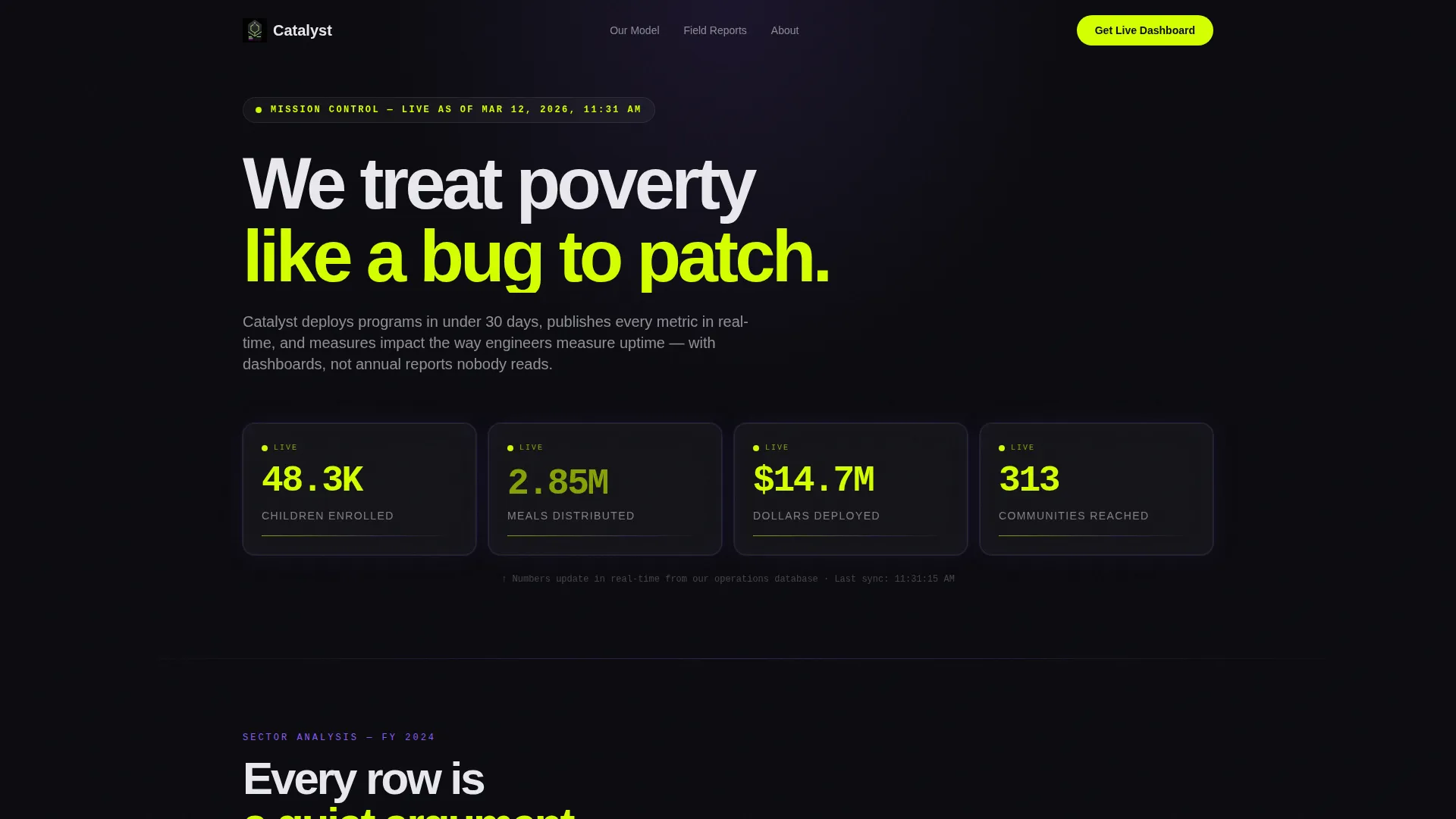
- A cockpit-style header with four live impact metric panels showing children enrolled, meals distributed, dollars deployed, and communities reached
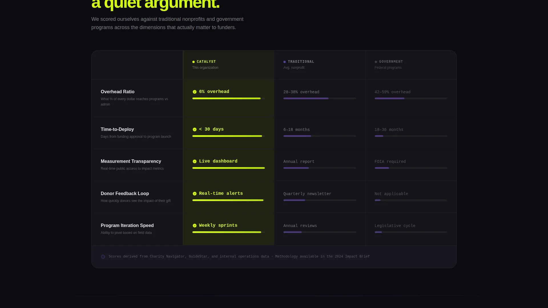
- A three-column comparison table scoring your organization against traditional nonprofits and government programs across overhead ratio, time-to-deploy, measurement transparency, and donor feedback loops
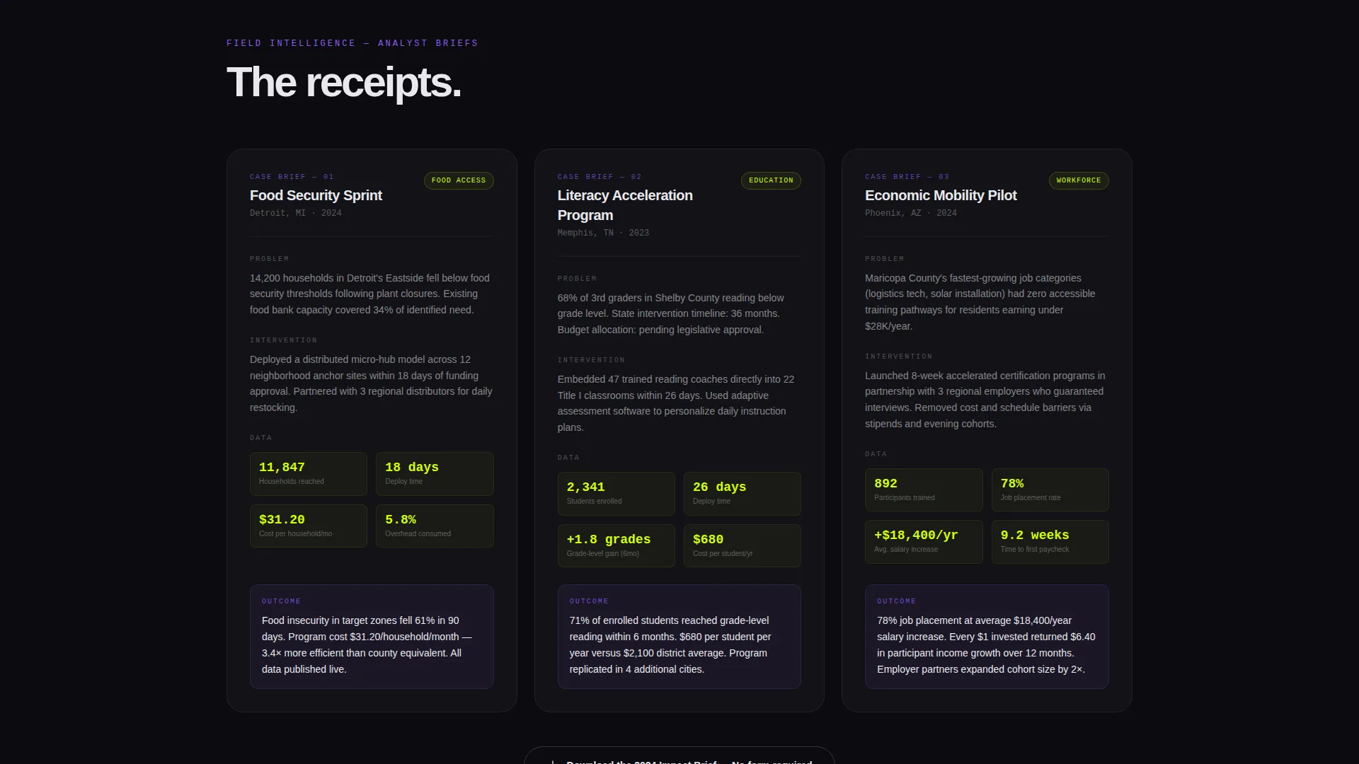
- Analyst-style mini case study cards formatted with problem, intervention, data, and outcome on each dark glass card
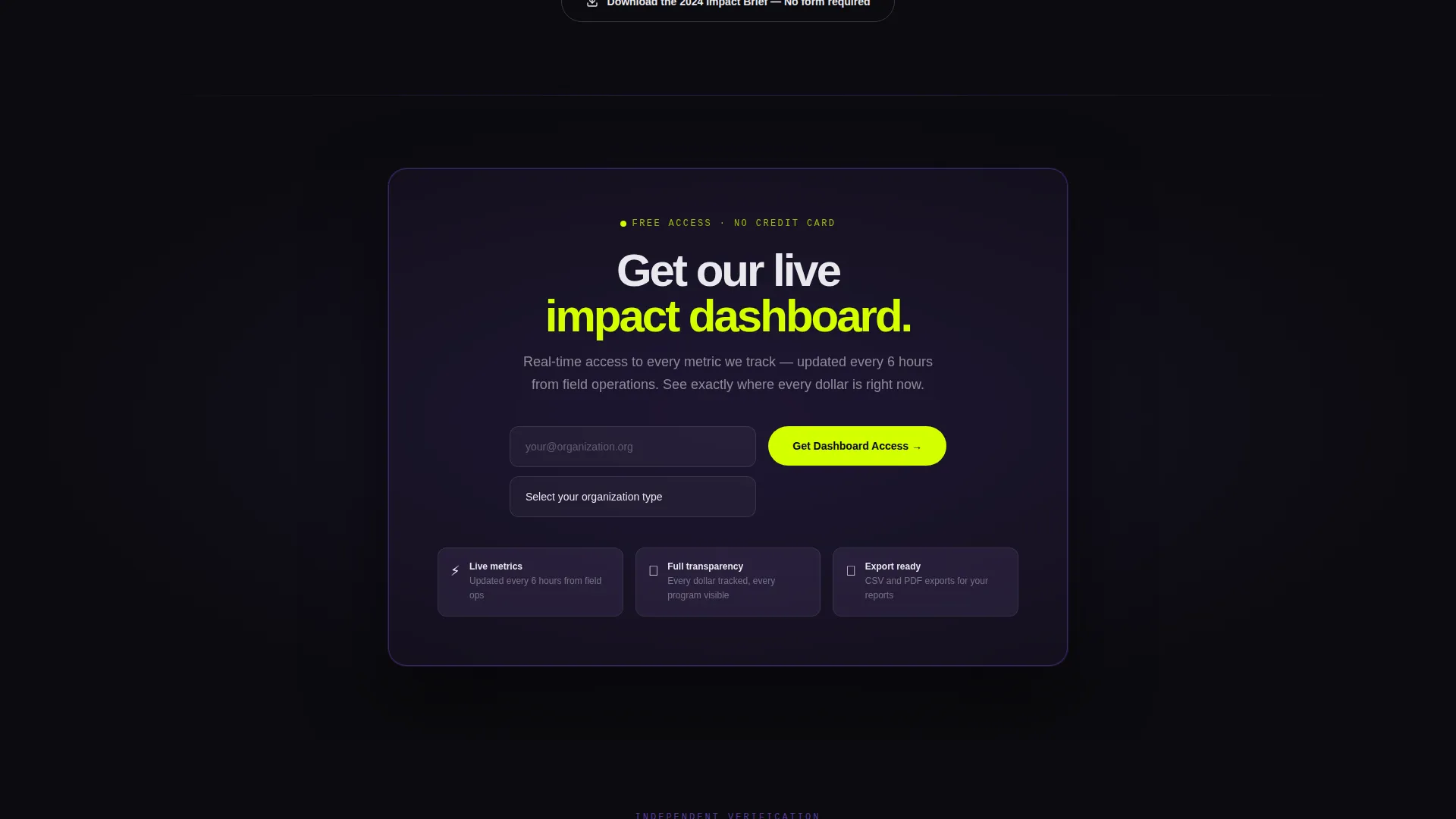
- A freemium conversion section with an email field, an organization-type dropdown, and a secondary no-form PDF download path
Feature list
This template delivers tightly integrated visual and structural elements, each earning its place on the page.
Live Impact Metric Header
Four frosted dark glass panels sit across the top of the page. Each panel holds a single glowing chartreuse number and a one-line label. The layout feels like a cockpit instrument cluster, signaling an organization that tracks everything in real time.
Head-to-Head Comparison Table
A structured three-column table scores your nonprofit against traditional nonprofits and government programs. Rows cover overhead ratio, time-to-deploy, measurement transparency, and donor feedback loops. Every row makes a quiet, evidence-based argument without a word of self-promotion.
Analyst-Style Case Study Cards
Past the comparison table, mini case studies are laid out on individual dark glass cards. Each card follows the same brief format: problem, intervention, data, outcome. The structure builds credibility fast for readers who skim like analysts.
Freemium Dashboard Access call to action
The primary call to action offers free, real-time access to the organization's metrics portal. A single email field and an organization-type dropdown gate the access. The offer positions the visitor as an insider rather than a passive donor.
No-Form PDF Download Path
A secondary conversion path below the fold lets visitors download the 2024 Impact Brief with a single click and no form required. This builds trust with skeptical visitors before asking for any personal information.
Acid Digital Visual System
The color palette uses void black for backgrounds, electric chartreuse for data points and calls to action, synthetic violet for section transitions and hover states, and terminal white for body text. The result is a page that looks and feels nothing like a conventional nonprofit site.
Page sections overview
| Section | Purpose |
|---|---|
| Live Metrics Header | Displays four real-time impact numbers inside dark glass panels |
| Comparison Table | Benchmarks the organization against sector peers across key performance rows |
| Case Study Cards | Presents analyst-brief-style evidence for specific program outcomes |
| Dashboard Access call to action | Gates free metrics portal access via email and organization-type dropdown |
| Impact Brief Download | Offers a no-form PDF download to build trust before commitment |
Design & branding system
The visual identity is built on the Acid Digital color system applied over a Startup Velocity theme. Nothing here resembles the muted blues and soft greens typical of nonprofit design.
- Void black (#0B0B0F) dominates every background, creating a focused, high-contrast reading environment
- Electric chartreuse (#D4FF00) marks calls to action, live data figures, and progress bars; synthetic violet (#8B5CF6) signals section transitions and hover states
- Terminal white (#E8E8ED) keeps body text crisp against dark surfaces, reading like a pitch deck projected in a dim conference room
Mobile & speed optimization
The layout is structured to remain readable and scannable on smaller screens. The cockpit-style grid and card-based sections adapt naturally to a stacked mobile view.
- Dark glass panel cards reflow cleanly into a vertical stack on mobile without losing their instrument-cluster feel
- The comparison table is designed to remain legible at smaller widths, keeping row labels and scores visible
- The freemium call to action section condenses to a single-column form that keeps the email field and dropdown accessible on any screen size
How this template helps you convert
The page is structured as a progressive proof engine. Each section adds a layer of evidence before presenting a conversion ask.
- The live metric header creates immediate credibility, showing real numbers the moment a visitor arrives, before they read a single word of copy
- The comparison table does the selling passively, letting data rows argue the case so the visitor arrives at the call to action already convinced rather than being pushed
- The two-path conversion model, a gated dashboard for committed visitors and a no-form PDF for the undecided, captures both ready and research-mode audiences in one scroll
Other information about this template
Catalyst is designed specifically for the nonprofit organization about us page use case, where trust and proof carry more weight than storytelling alone. It fits naturally within the broader category of nonprofit organization website templates aimed at technology-forward sector operators.
- The Industry Report creative direction structures the scroll as a state-of-the-sector briefing, not a charity appeal
- The Dark Glass Panels header concept is distinct from standard hero imagery and is well suited to organizations publishing live or frequently updated impact data
- The Freemium/Trial landing page direction makes this template a strong fit for nonprofits building an audience of foundation officers, corporate partners, and media contacts who want access to data before making contact
- The Comparison Table template style is rare in the nonprofit space, giving organizations that use it an immediate visual differentiator against peers
Theme
Startup Velocity
Creative direction
Industry Report
Color system
Acid Digital
Style
Comparison Table
Direction
Freemium/Trial
Page Sections
Live Impact Metric Header Panels
Three-column Sector Comparison Table
Analyst-style Case Study Cards
Two-path Freemium Conversion Section
Acid Digital Color System
Dark Glass Panel Visual Components
Related questions
Can I update the impact numbers in the metric header panels?
Do I need a developer to connect the dashboard access form?
Is this template a good fit for a nonprofit that is just starting out?
Can I customize the rows in the comparison table?
What is the difference between the two conversion paths on this page?



