Specialist Architecture Firm Software Comparison Website Template
Catalyst is a dark-glass dashboard landing page built for architecture firm software. It replaces the scattered mix of inboxes, spreadsheets, and coordination threads with a single command-center view. The template uses a Teal Catalyst color system, a live-metrics header, and a Comparison/Versus conversion flow to show architecture principals exactly what they are losing by staying fragmented.
by Rocket studio
Quick summary
Catalyst is a high-impact, single-page dashboard landing page designed for architecture firm case management platforms. It opens with a live-stats header displaying real project metrics, then walks visitors through a problem-versus-solution narrative. The Tech Glass visual theme, teal accents, and obsidian backgrounds create an interface that feels engineered rather than decorated.
Who this template is for
This template speaks directly to the people running architecture projects at a mid-size firm. It addresses the daily friction of tracking work across disconnected tools.
- Architecture principals managing large active project portfolios who need a single overview
- Project architects coordinating permit sets, submittals, and RFI (Request for Information) responses across multiple consultants
- Operations directors who currently monitor fee burn inside spreadsheets and want a cleaner, faster alternative
What problem this template solves
Most architecture firms reach a point where the tools multiply faster than the team. The result is a fragmented stack of inboxes, spreadsheets, shared folders, and messaging threads that no one fully trusts.
- Project status is scattered across at least six separate tools, making weekly check-ins slow and error-prone
- Deadlines, change orders, and consultant responses have no single home, so critical items slip without warning
- Fee tracking stays stuck in spreadsheets that are already out of date by the time anyone opens them
What you get with this template
Catalyst gives you a fully structured landing page layout designed around the architecture firm software buying decision. Every section is built to advance that specific conversation.
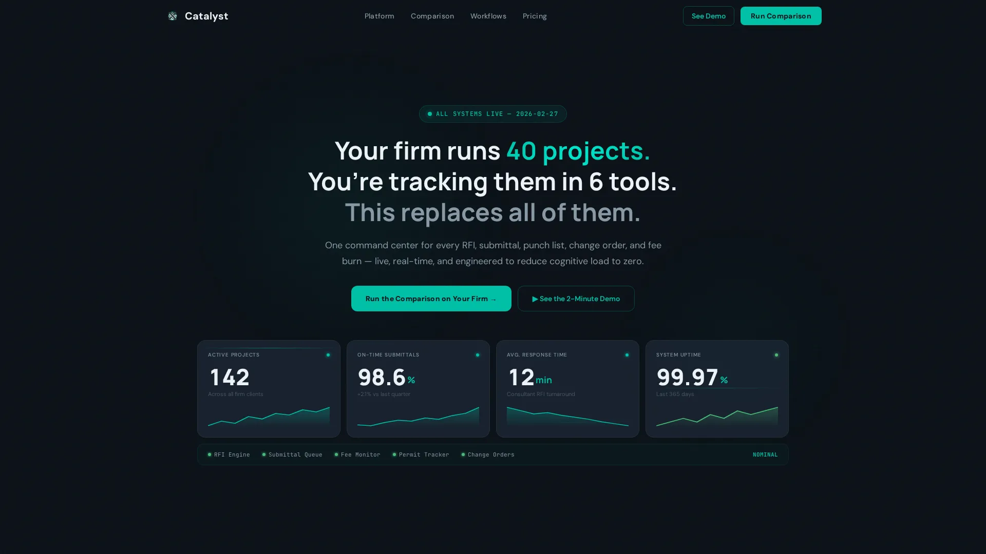
- A live-metrics header panel showing four key performance figures with teal sparkline graphs beneath each number
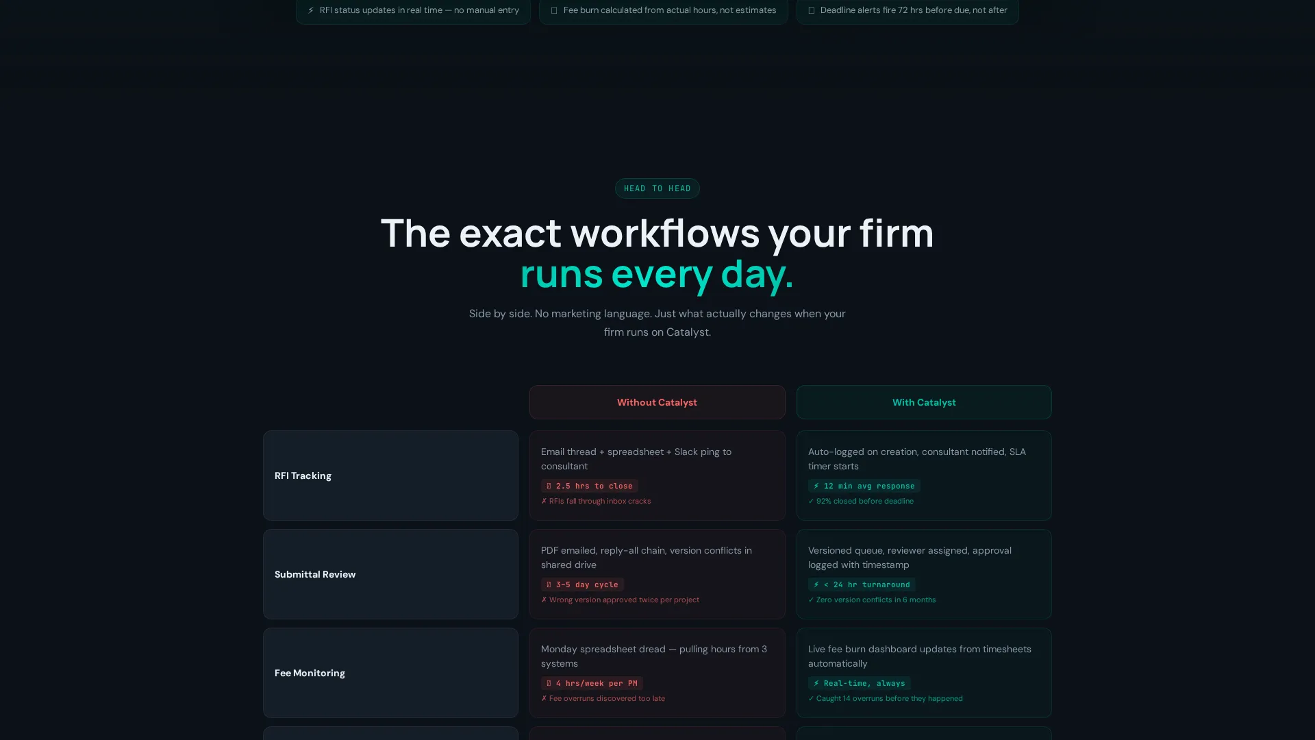
- A Comparison/Versus grid that contrasts the before and after across RFI tracking, fee monitoring, consultant coordination, and deadline alerts
- A three-step progressive form flow that qualifies visitors by firm size, active project count, and current tools before capturing contact details
Feature list
This template includes purpose-built layout blocks that support a persuasive, data-led narrative from scroll start to form submit.
Live Stats Header Panel
The header opens with a dark glass panel displaying four oversized metric values: active project count, on-time submittal rate, average response time, and a system-status indicator. Teal sparkline graphs animate subtly beneath each figure. No stock photography is used; the data itself is the visual.
Problem Visualization Section
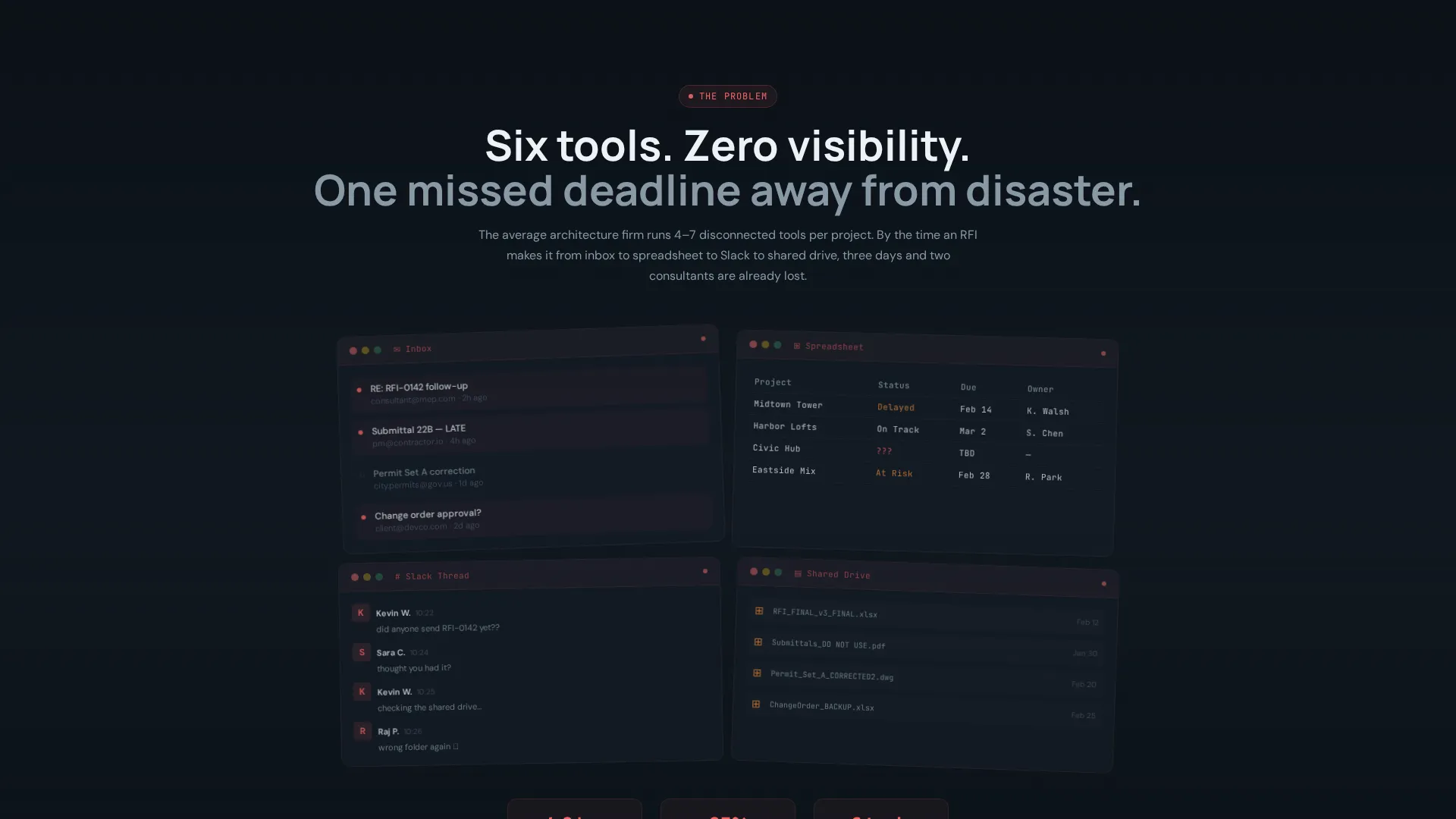
Section one renders a chaotic split-view of a real inbox, a spreadsheet, a messaging thread, and a shared drive folder. All four are grayed out and overlapping to make fragmentation immediately visible. This section sets up the contrast that drives the rest of the page.
Unified Dashboard View
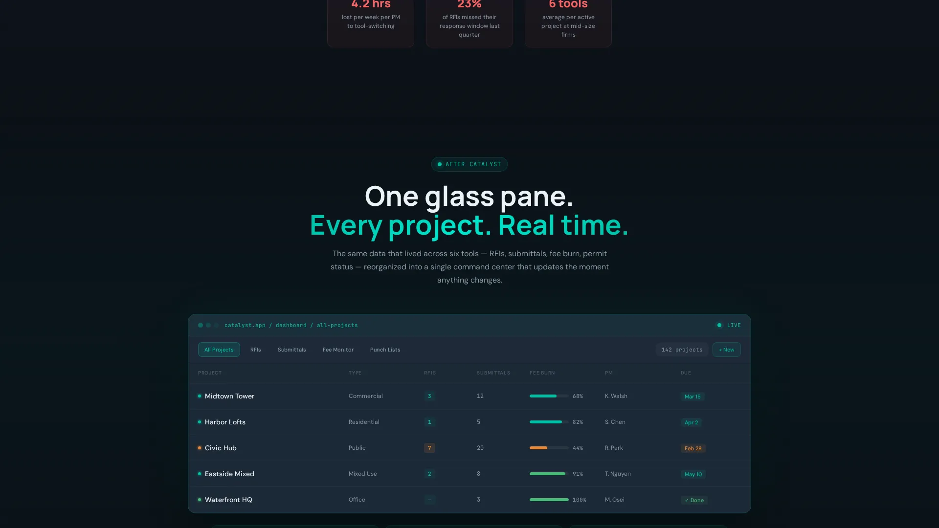
Section two replaces the chaos view with the product's clean data grid. Teal status indicators replace red flags, and the same information from the problem section reappears in organized form. The before-and-after transition makes the value proposition tangible without a word of explanation.
Comparison/Versus Grid
Two side-by-side columns, labeled "Without Catalyst" and "With Catalyst," animate row by row as the visitor scrolls. Each row addresses a specific workflow: RFI tracking, fee monitoring, consultant coordination, and deadline alerts. Time-saved metrics and friction points are highlighted per row.
Interactive Demo Screenshot
A full-width demo screenshot near the bottom of the page lets visitors hover over interface elements to trigger tooltip explanations. This section earns trust before the final form ask by letting the product explain itself.
Three-Step Progressive Form
The primary conversion form opens after the versus grid. Step one captures firm size and active project count. Step two presents checkboxes for current tools. Step three collects name and work email with a submit button labeled "Show Me the Difference."
Page sections overview
| Section | Purpose |
|---|---|
| Live Metrics Header | Opens with four real-time project stats in a dark glass panel |
| Headline Fade-In | Delivers the core problem statement above the metrics grid |
| Demo call to action Strip | Offers a two-minute narrated screen recording below the header |
| Problem Split View | Shows fragmented tools in a grayed-out chaos layout |
| Unified Dashboard View | Replaces chaos view with the clean product grid |
| Comparison/Versus Grid | Animates before-and-after rows for four core workflows |
| Interactive Demo Screenshot | Lets visitors hover elements to reveal tooltip context |
| Primary call to action Block | "Run the Comparison on Your Firm" positioned after versus grid |
| Progressive Conversion Form | Three-step form qualifying firm size, tools, and contact |
| Mobile Sticky call to action | Repeats primary call to action as a fixed bottom bar |
Design & branding system
The visual identity follows a Tech Glass theme built around the Teal Catalyst color system. Every palette decision reduces visual noise and keeps attention on the data.
- Deep obsidian (#0B1117) as the primary background, cool slate (#1E2A38) for card surfaces and data containers, and sharp white (#EDF2F7) for all typography and metric values
- Reactive teal (#00BFA6) drives every accent element: sparkline graphs, status indicators, hover states, and call to action buttons
- Typography is oversized on metric values to create immediate scanability, with teal sparklines providing motion without distraction
Mobile & speed optimization
The layout is designed to remain functional and persuasive on smaller screens. Key conversion elements adapt rather than disappear.
- The four-column metrics grid reflows gracefully on mobile viewports so no stat is hidden or clipped
- The primary call-to-action repeats as a sticky bottom bar on mobile, keeping the form entry point visible throughout the scroll
- The three-step form uses a progressive reveal pattern that keeps each step lightweight and easy to complete on a small screen
How this template helps you convert
Catalyst is built around a Comparison/Versus conversion strategy. Every section is sequenced to earn the form click rather than demand it.
- The live-metrics header proves the platform is real before the visitor reads a single sentence of copy, building instant credibility through data
- The two-minute demo video sits below the header as a low-commitment secondary path, letting skeptical visitors verify the interface before engaging with the form
- The versus grid builds specific, workflow-level contrast that moves the visitor from general interest to active comparison, making the "Run the Comparison on Your Firm" call to action feel like a logical next step rather than a sales push
Other information about this template
Catalyst is a Dashboard/Data Grid style template operating under the Launch Energy creative direction. This means each scroll section is sequenced like a countdown, building momentum rather than repeating the same message.
- The template falls under the Technology category, specifically the Architecture Firm Software subcategory, targeting architecture firm case management as its core niche
- The headline copy included in the template reads: "Your firm runs 40 projects. You're tracking them in 6 tools. This replaces all of them." This line is editable and sets the problem frame immediately
- The Tech Glass theme and Teal Catalyst color system are designed as a cohesive identity; changing one accent color may affect the visual logic of status indicators and sparklines throughout the page
- This template can support comparison-led campaigns for platforms in related architecture project management categories, including tools that compete in spaces where firms commonly use spreadsheets alongside dedicated project tracking software
Theme
Tech Glass
Creative direction
Launch Energy
Color system
Teal Catalyst
Style
Dashboard/Data Grid
Direction
Comparison/Versus
Page Sections
Live Stats Header Panel
Problem Visualization Section
Comparison/versus Grid
Interactive Demo Screenshot
Three-step Progressive Form
Mobile Sticky Call to Action Bar
Related questions
Who is this landing page template designed for?
Can I edit the metric values shown in the header?
What is the primary call to action on this page?
Does the template include the two-minute demo video?
Can this template support a different B2B software product?



