Catalyst - Powerful Clientmanagement Landing Page Template
Catalyst is a single-page SaaS client management landing page template built as a comparison table. It uses a dark dashboard aesthetic with a teal and slate color system to showcase Free, Pro, and Scale plan tiers. The layout guides visitors from a bold hero section through a sticky feature matrix, converting with a frictionless inline signup flow.
by Rocket studio
Quick summary
Catalyst is a focused, single-page landing page template for SaaS client management platforms. It opens with a glowing dark hero, moves into a sticky three-tier comparison table, and closes with inline signup forms for both free and trial conversions. The design feels like a live command dashboard, purposeful and composed from the first scroll to the last call to action.
Who this template is for
This template is built for SaaS founders, product marketers, and developers who need to communicate clear plan differentiation to a service-focused audience. It speaks directly to the daily reality of managing multiple client relationships at once.
- Agency account managers handling large retainer portfolios who need a clear product pitch
- Boutique consultancies where the founder still owns client relationships and wants fast signups
- Growing service firms launching or repositioning a client management platform to a new audience
What problem this template solves
Client management tools often lose potential users at the pricing or features page. Visitors cannot quickly map their current pain to a specific plan, so they leave without converting. This template solves that by making the comparison table the centerpiece of the page.
- Scattered feature comparisons buried in long copy make it hard for visitors to decide
- Vague calls to action and heavy signup forms add friction before the visitor is ready to commit
- No clear tier differentiation means prospects choose the wrong plan or choose nothing
What you get with this template
You get a complete, single-page landing page layout structured around a sticky, three-column feature comparison table. Every section is designed to reduce doubt and move visitors toward a free start or a trial.
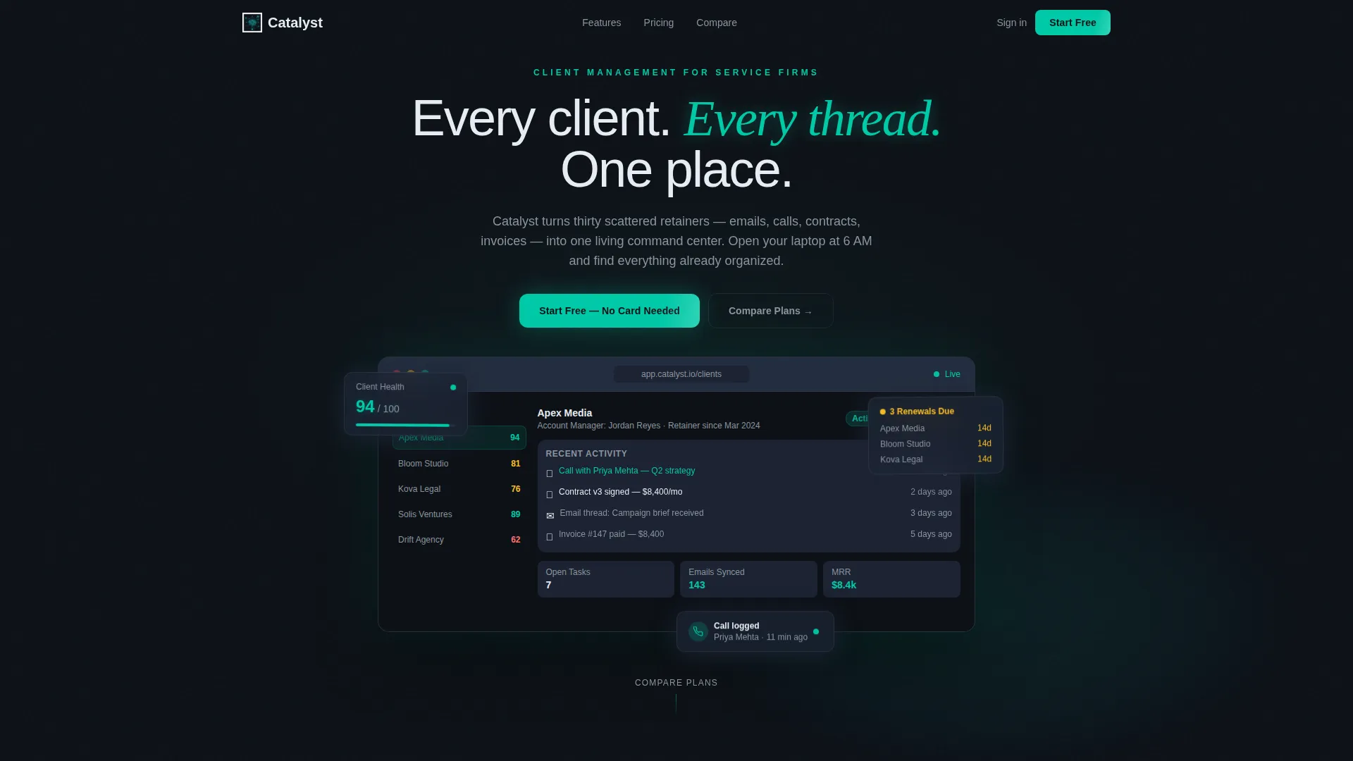
- A full-bleed dark hero section with a centered user interface mockup, teal radial glow, and a live-data dashboard preview
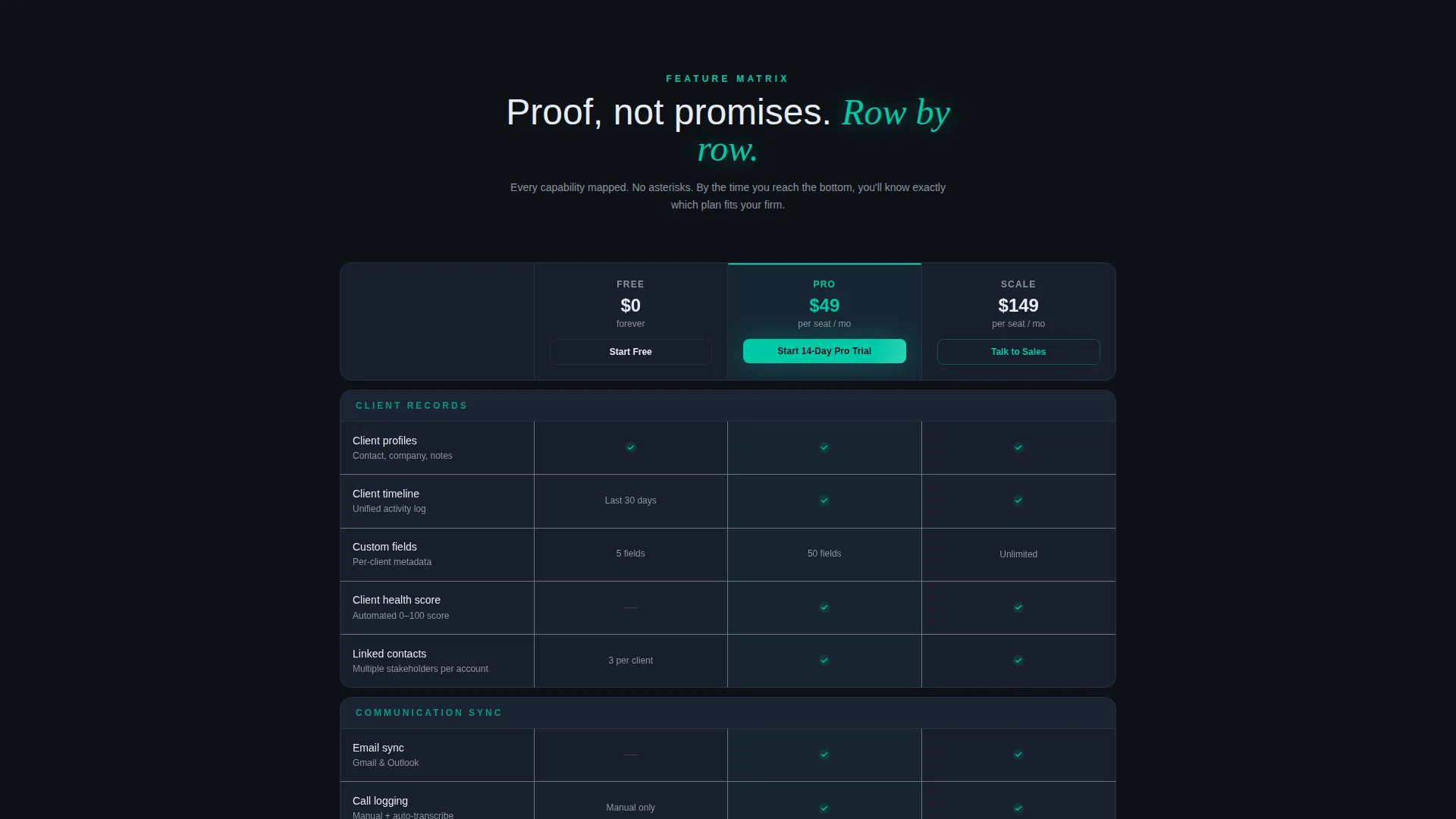
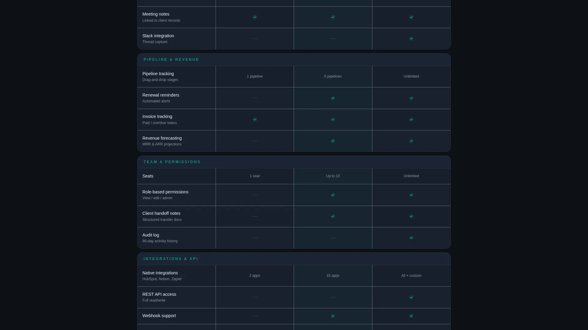
- A sticky comparison table covering Free, Pro, and Scale tiers with teal checkmarks and muted dashes for absent features
- Inline signup forms with minimal fields and a qualifying question, plus a calendar link option on the Pro column
Feature list
This template delivers a carefully sequenced set of sections and components, each grounded in the source brief.
Dark Full-Bleed Hero Section
The header fills edge to edge in deep command-screen black. A centered user interface mockup glows as the primary visual, with soft teal radial gradients giving the product gravitational pull. Real-feeling dashboard data, including a client health score, upcoming renewals, and a recent call log, makes the hero feel live rather than decorative.
Sticky Three-Tier Comparison Table
The core of the page is a sticky comparison table with Free, Pro, and Scale columns. Feature rows cover client timelines, email sync, pipeline tracking, custom fields, team permissions, and API access. Teal checkmarks confirm included features; muted dashes indicate unavailable ones, keeping the tone confident rather than apologetic.
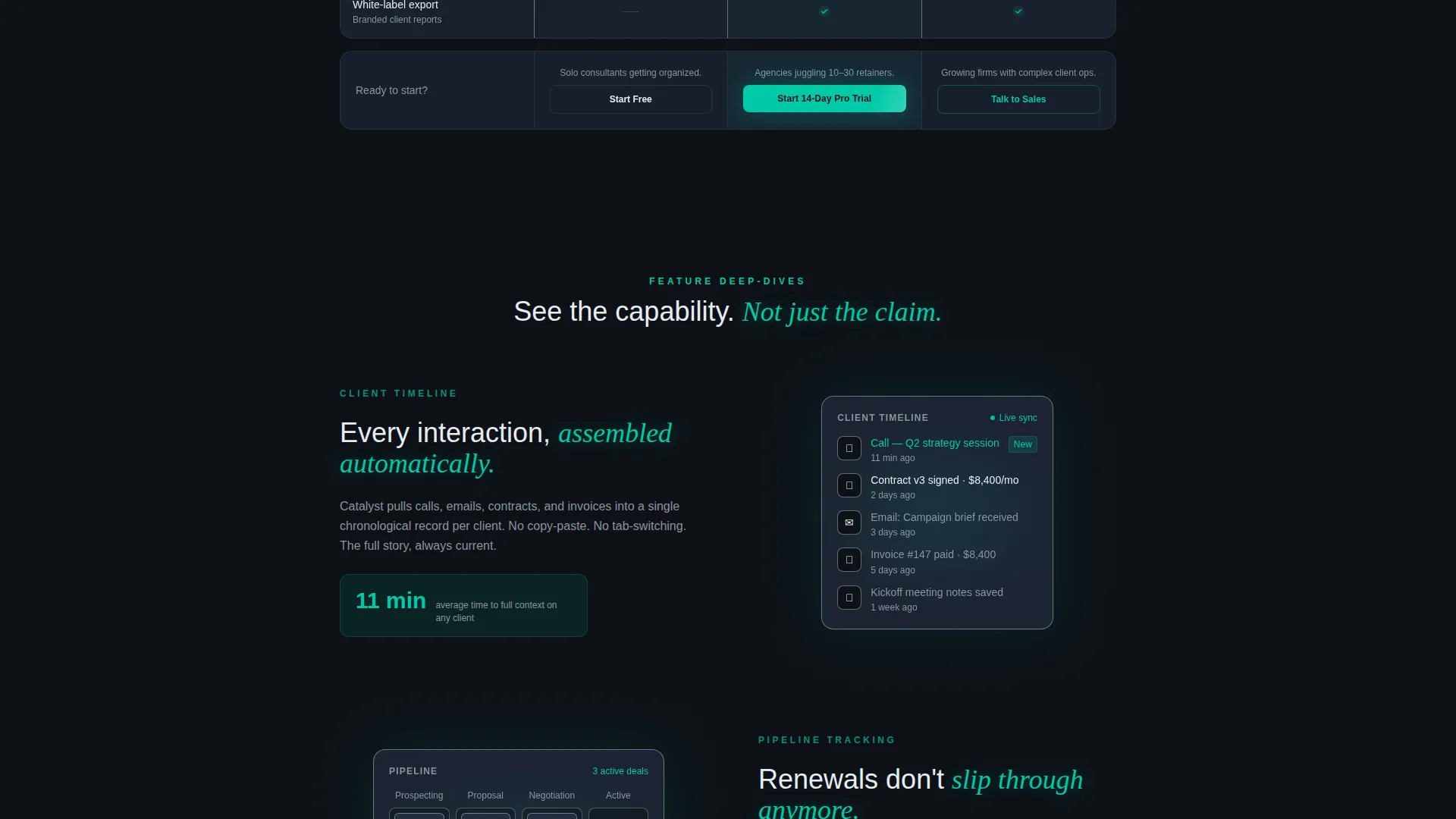
Feature Breakout Panels
Between table sections, single-screen breakout panels zoom into one feature at a time. Each panel uses micro-animations, such as a client timeline assembling entry by entry or a pipeline card moving across stages, to turn abstract features into visible proof of capability.
Inline Signup Forms by Tier
Every column header carries a call to action that opens an inline signup form. The Free tier asks for a work email, company size, and the tool being replaced. The Pro tier adds an optional calendar link for onboarding. The form is short by design, qualifying intent without adding friction.
Floating Mobile call to action Bar
On mobile, a persistent bottom bar keeps the primary call to action visible throughout the scroll. The bar reads "Start Free, No Card Needed" and remains accessible at every point in the page without interrupting the reading flow.
Teal-Accented Visual Hierarchy
The color system uses teal for every active state and call to action, electric cyan for hover moments, and slate card surfaces for depth. This hierarchy guides the eye from headline to table to form without relying on borders or decorative elements.
Page sections overview
| Section | Purpose |
|---|---|
| Dark Hero Header | Introduce the product with a glowing dashboard mockup and headline |
| Sticky Comparison Table | Present Free, Pro, Scale tiers side by side for fast plan decisions |
| Feature Breakout Panels | Zoom into individual features with micro-animations between table sections |
| Free Tier call to action | Capture low-friction signups with a minimal inline form |
| Pro Trial call to action | Convert higher-intent visitors with a trial form and optional onboarding link |
| Mobile Floating Bar | Keep the primary call to action persistent across the full mobile scroll |
Design & branding system
The visual identity follows a Dashboard Pro theme built on the Teal Catalyst color system. Every color choice is intentional, referencing a working command interface rather than a marketing page.
- Deep command-screen black (#0D1117) as the base, primary teal (#00C9A7) for calls to action and active states, muted slate (#1C2333) for card and table row surfaces, crisp interface white (#E6EDF3) for text, and electric cyan (#00E5FF) for hover accents
- Typography uses thin white type that steps back from the hero mockup, letting the product interface carry visual authority
- Teal dominates every actionable element; slate layers build depth without relying on borders or dividers
Mobile & speed optimization
The template is structured to stay functional and readable on smaller screens without sacrificing the comparison table experience. The layout adapts so the core selling tool remains usable on any device.
- The sticky comparison table is designed to scroll horizontally on mobile, keeping all three tiers in view
- A floating bottom bar replaces column-level calls to action on mobile, ensuring the primary action is always one tap away
- Breakout panels stack vertically on smaller screens, preserving the proof-by-feature rhythm of the desktop layout
How this template helps you convert
The conversion strategy is built into the page structure. Every element earns the click before asking for it, and the free tier removes the final objection at the moment of decision.
- The comparison table does the convincing first: by the time a visitor reaches the bottom row, they have already matched their specific pain to a feature, making the call to action feel like a natural next step rather than a sales push.
- The inline signup form is intentionally short: three fields for the free tier and one optional addition for Pro means there is almost no reason to abandon the form once a visitor has decided.
- The qualifying question, "What tool are you replacing?", captures intent data without adding perceived effort, helping teams understand which competitors visitors are leaving behind.
Other information about this template
This template is categorized under the Technology vertical, specifically within the SaaS Software and SaaS subcategory, with a niche focus on SaaS client management. It is designed for teams building or relaunching a client management product and needing a high-trust, low-friction conversion page.
- The template style is a Comparison Table layout, following the Feature Matrix creative direction
- The landing page direction follows a Freemium and Trial model, aligning with how most SaaS client management tools acquire users today
- The header concept is Dark Full-Bleed with a glow treatment, consistent with the Dashboard Pro theme used across the Teal Catalyst color system
- This template is well-suited for SaaS client management platforms competing in a crowded space where clear plan differentiation is a primary conversion driver
Theme
Dashboard Pro
Creative direction
Feature Matrix
Color system
Teal Catalyst
Style
Comparison Table
Direction
Freemium/Trial
Page Sections
Dark Full-bleed Hero with Glow
Sticky Three-tier Comparison Table
Animated Feature Breakout Panels
Inline Signup Forms by Plan Tier
Floating Mobile Call to Action Bar
Related questions
Can I customize the plan names and feature rows in the comparison table?
Does this template work for a solo consultant or a small team?
What conversion model does this template support?
How does the comparison table display on mobile devices?
Can I add more feature rows to the comparison table?



