Clinical Trial Vertical SaaS Professional Website Template
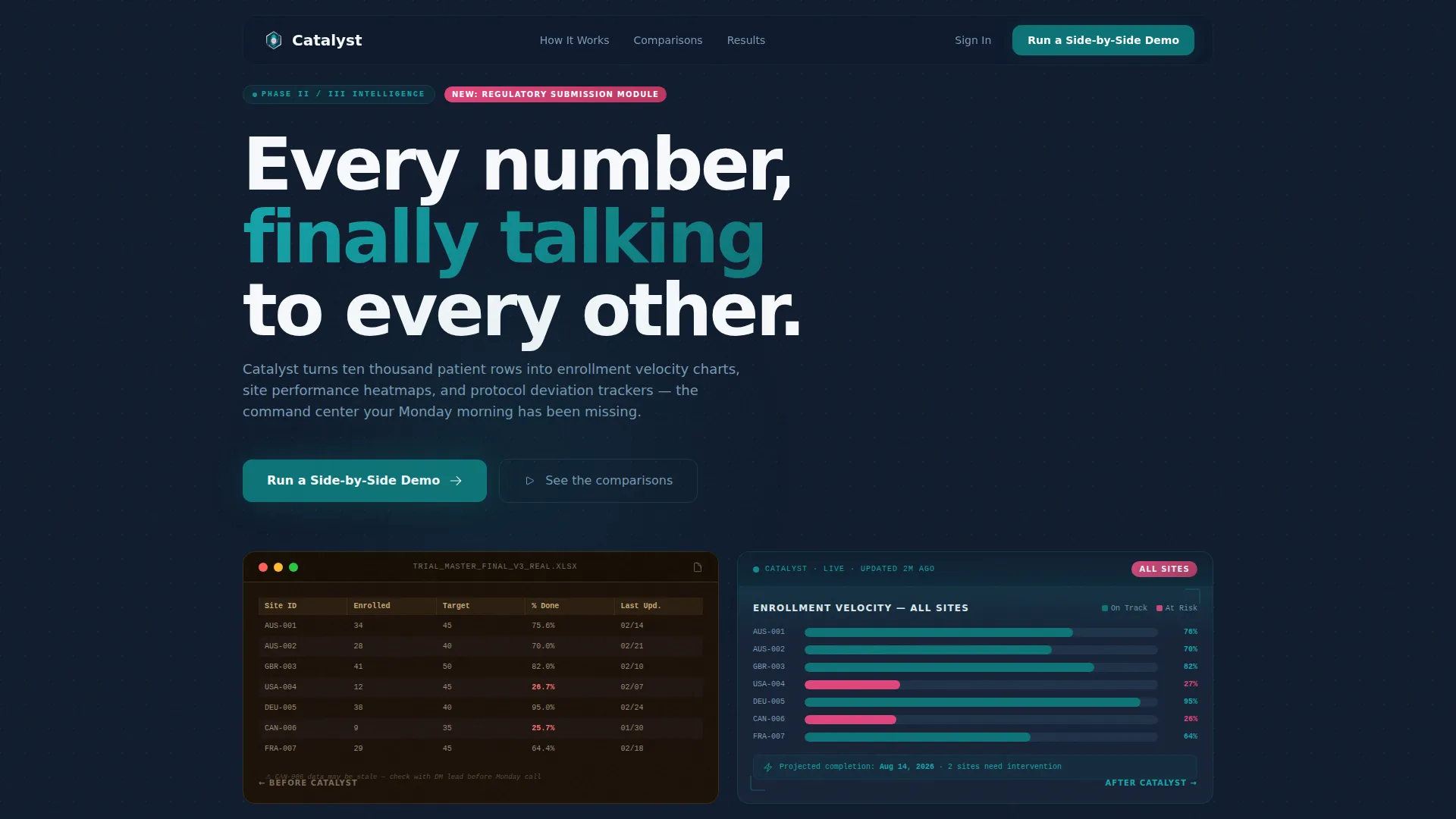
Catalyst is a modular card-grid landing page template built for clinical trial analytics dashboards. It uses a head-to-head comparison layout to show the gap between legacy spreadsheets and a modern visual intelligence platform. The design features a teal-and-midnight palette, a scrolling logo bar, and progressive-disclosure lead capture, all tuned for VP-level clinical operations audiences.
by Rocket studio
Quick summary
Catalyst is a single-page, card-grid landing page template purpose-built for clinical trial analytics platforms. It frames every section as a direct comparison, legacy workflow versus modern dashboard, so visitors feel the value gap before they read a single feature claim. The visual system is clean, data-confident, and built to move senior decision-makers toward a demo request.
Who this template is for
This template is designed for teams selling or showcasing clinical trial analytics software to senior stakeholders in pharmaceutical, biotech, and contract research organization (CRO) environments. If your buyers manage multi-site trials and distrust generic SaaS landing pages, this template speaks their language.
- VP-level clinical operations leaders overseeing Phase II and Phase III multi-site trials
- CRO project managers juggling overlapping sponsor timelines across multiple active studies
- Data management leads who currently consolidate insights from several disconnected spreadsheets each week
What problem this template solves
Clinical trial analytics platforms are hard to sell through words alone. Decision-makers have seen polished dashboards before and remain skeptical. The real pain is invisible until you show it side by side with the familiar chaos they live in every Monday morning. This template makes that contrast unavoidable.
- Visitors arrive skeptical and leave before seeing the value proposition on generic template layouts
- Busy clinical ops leaders need evidence, not just feature lists, to justify an internal business case
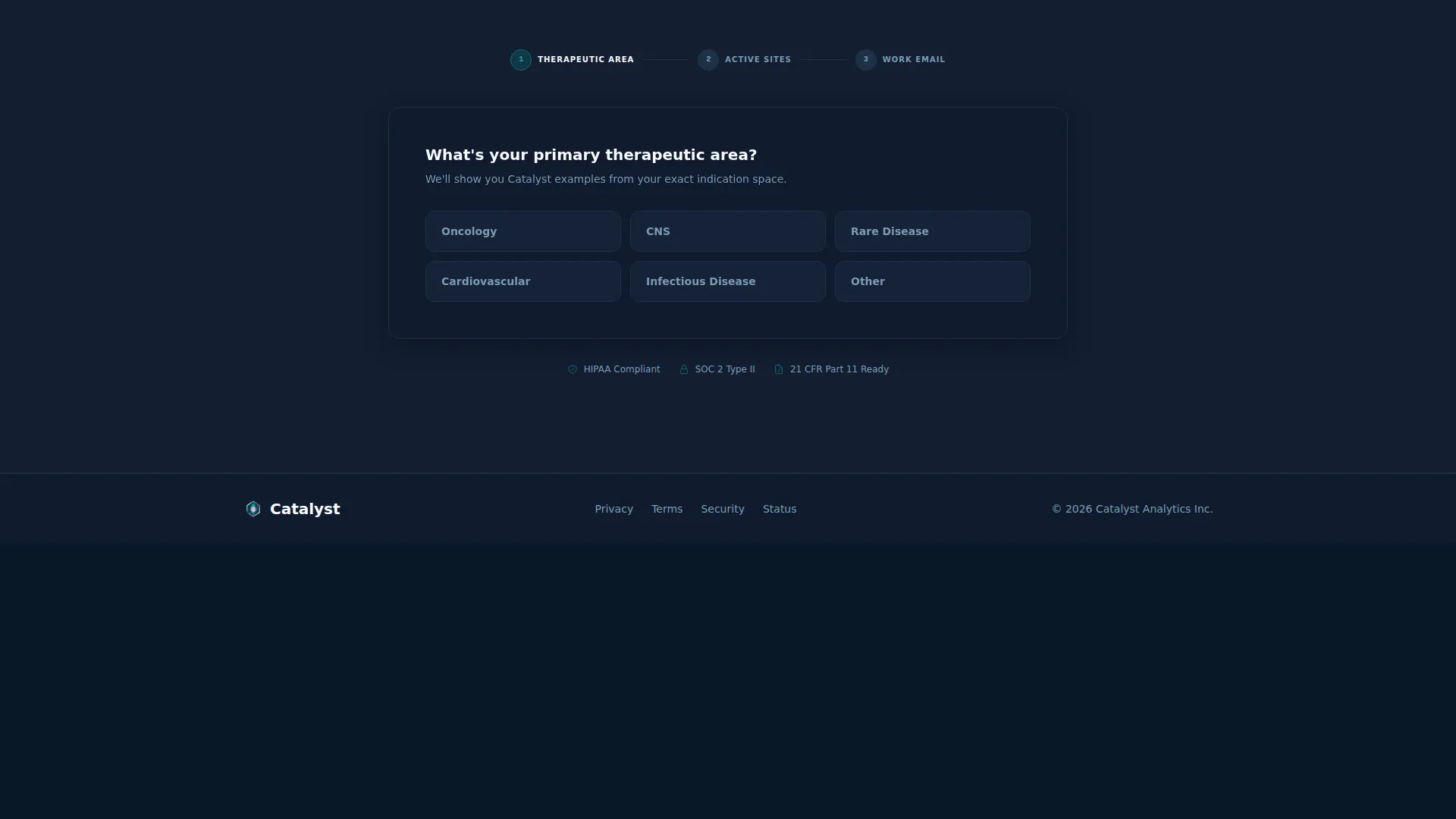
- Progressive qualification forms often feel like interrogations, causing high drop-off before a demo is booked
What you get with this template
Catalyst delivers a fully structured, modular landing page built around a versus architecture. Every visual decision serves the comparison narrative, from the opening logo bar to the final call-to-action form. You get a ready-to-customize layout that handles both primary demo conversion and secondary lead capture simultaneously.
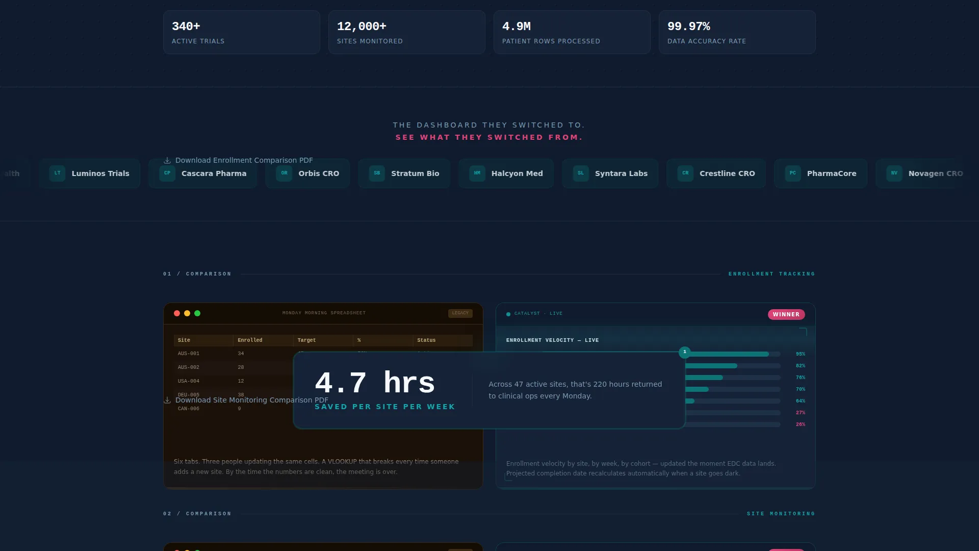
- A scrolling pharma and CRO logo bar header with translucent teal chips and two credibility lines above and below
- Four head-to-head comparison card rows covering enrollment tracking, site monitoring, adverse event flagging, and regulatory submission preparation
- Two distinct conversion paths: a primary demo request form with progressive disclosure and a secondary email-only PDF download gate below each comparison card
Feature list
This template is built around specific structural and visual components drawn directly from the brief. Each feature serves the comparison-driven conversion goal.
Scrolling Logo Bar Header
A horizontal ribbon of pharma and CRO logos scrolls at a slow, deliberate pace. Each logo sits inside a translucent teal chip. Above the bar, a single credibility line reads "The dashboard they switched to." Below it, a second line in signal magenta reads "See what they switched from." The logos accumulate like evidence, building trust before a feature is named.
Head-to-Head Comparison Card Grid
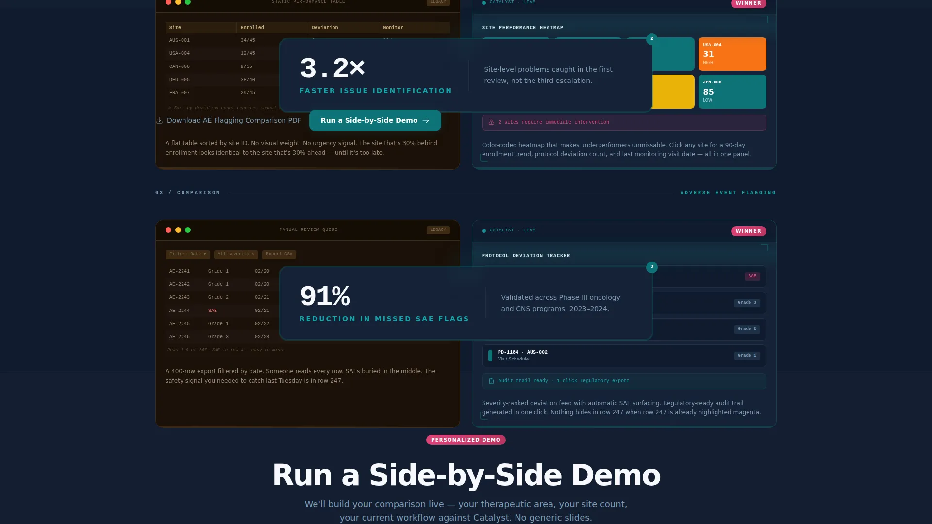
The core layout is a modular card grid structured as a versus architecture. Each row pairs a legacy spreadsheet screenshot on the left against a live-style dashboard view on the right. Rows cover enrollment tracking, site monitoring, adverse event flagging, and regulatory submission preparation. Each pair is designed to land harder than the last as the legacy pain becomes more specific.
Pulse Stat Callout Cards
Between comparison rows, single-stat callout cards appear with evidence-driven figures such as "4.7 hours saved per site per week." These cards give the scroll a heartbeat rhythm, mixing data evidence with emotional resonance to maintain engagement between visual comparisons.
Progressive Disclosure Demo Form
The primary call-to-action, labeled "Run a Side-by-Side Demo," appears after the third comparison row. The form uses progressive disclosure: it asks for therapeutic area first (oncology, central nervous system, rare disease, or other), then number of active sites, then a work email. This sequence qualifies the lead without feeling like an interrogation.
Email-Gated PDF Download Path
Below each comparison card, a secondary conversion path offers "Download the Full Comparison PDF" gated behind email-only capture. This path catches visitors who need internal ammunition for a business case before they are ready to book a demo call.
Teal Catalyst Visual System
The color system uses deep lab teal (#0D7377) as the primary action color, midnight clinical (#0F1B2D) for backgrounds and data-dense sections, sterile white (#F7F9FC) for card surfaces, and signal magenta (#E0457B) reserved for comparison highlights and winner badges. The palette feels purposeful and data-trustworthy.
Page sections overview
| Section | Purpose |
|---|---|
| Scrolling Logo Bar | Opens with social proof from pharma and CRO logos before any feature copy |
| Enrollment Tracking Row | First head-to-head comparison: spreadsheet chaos versus enrollment velocity chart |
| Site Monitoring Row | Second comparison: disconnected site reports versus site performance heatmap view |
| Adverse Event Row | Third comparison: manual flagging versus automated adverse event tracker layout |
| Regulatory Prep Row | Fourth comparison: fragmented prep workflow versus structured submission-ready view |
| Pulse Stat Cards | Single-stat callout cards between rows that maintain scroll rhythm with evidence |
| Primary Demo call to action | "Run a Side-by-Side Demo" form with progressive disclosure qualification fields |
| PDF Download Gates | Email-only capture below each comparison card for business-case document delivery |
Design & branding system
The Teal Catalyst color system is designed to feel like a hospital corridor at dawn: calm, luminous, and precise. Every color choice serves a specific role, so the visual hierarchy stays clear even on data-dense sections. Signal magenta appears only where contrast matters most, keeping it visually loud without becoming decorative noise.
- Deep lab teal (#0D7377) drives primary buttons, active states, and logo chip backgrounds
- Midnight clinical (#0F1B2D) anchors backgrounds and data-heavy card sections for depth and legibility
- Sterile white (#F7F9FC) surfaces card backgrounds for clean, trustworthy readability, while signal magenta (#E0457B) marks comparison winners and highlights exclusively
Mobile & speed optimization
A modular card-grid layout is well-suited to mobile reflow. Each card pair stacks vertically on smaller screens, preserving the comparison narrative without requiring horizontal scroll. The pulse stat callout cards remain legible as standalone elements between stacked comparison blocks.
- Card modules are independently structured, making them straightforward to reorder or resize per breakpoint
- The logo bar ribbon translates to a slower scroll or static display on narrow viewports without losing its credibility function
- Progressive disclosure form fields are designed as a short linear sequence, keeping the mobile form experience clean and low-friction
How this template helps you convert
Catalyst is built around a specific conversion psychology: let the visitor feel the pain of the status quo before presenting the solution. The layout earns the call-to-action rather than demanding it upfront.
- The versus architecture creates cumulative contrast across four comparison rows, so by the time the demo form appears, the visitor has already made an emotional decision about the gap between old and new.
- The dual-path lead capture catches visitors at two different buying stages simultaneously: those ready for a live demo and those who need internal approval first, reducing the number of visitors who leave without converting.
Other information about this template
Catalyst is categorized under Technology, specifically the Clinical Trial Vertical SaaS subcategory, with a niche focus on clinical trial analytics dashboards. The template theme follows a Directory and Discovery pattern, and the creative direction is built around Launch Energy. The header concept is a Logo Bar, and the landing page direction is Comparison/Versus. The template style is a Card Grid (modular) layout.
- This template is part of the Teal Catalyst color system family and is designed to align with the visual identity conventions of that system
- The Intersection Match Score for this template context is 13, reflecting a high degree of alignment between the template style, creative direction, color system, and niche use case
- Customization scope includes swapping logo assets in the header bar, updating comparison screenshot images in each card row, editing stat callout figures, and adjusting form field labels to match your therapeutic area focus areas
Theme
Directory & Discovery
Creative direction
Launch Energy
Color system
Teal Catalyst
Style
Card Grid (Modular)
Direction
Comparison/Versus
Page Sections
Scrolling Pharma Logo Bar
Versus Comparison Card Grid
Pulse Stat Callout Cards
Progressive Disclosure Demo Form
Email-gated PDF Download
Related questions
Who is the primary audience for this template?
Can the comparison card rows be customized for different use cases?
How does the dual-path lead capture work?
What does the progressive disclosure form ask for?
Is this template suitable for a biostatistician or data management audience?



