Catalyst - Powerful Fitness Landing Page Template
Catalyst is a bold, brutalist-styled fitness follow-up email landing page template built for lead generation. It uses a comparison table, stat panels, and data-driven case study cards to show personal trainers and studio owners the real cost of poor client follow-up. A two-step form and a PDF lead magnet work together to capture contacts at every readiness level.
by Rocket studio
Quick summary
Catalyst is a single-page, comparison-table landing page template for a fitness follow-up email tool. It is built around an Industry Report creative direction, using hard data, a head-to-head comparison table, and real-result case study cards to turn reader hesitation into form submissions. The design is Bold Brutalist with a deep charcoal and reactive teal palette.
Who this template is for
This template is designed for fitness professionals who have outgrown manual follow-up and need a sharper way to present their retention tool to prospective users.
- Independent personal trainers managing 30 to 60 clients from their phones
- Boutique studio owners dealing with class-pack drop-offs and recurring no-shows
- Online coaches scaling their business past the point where manual direct messages keep up
What problem this template solves
Most fitness professionals lose clients quietly. A missed session goes unacknowledged. A six-week ghost never gets a re-engagement message. The page frames this silence as a measurable revenue problem, not just an admin inconvenience.
- No clear way to show prospects the financial gap created by inconsistent follow-up
- Generic email platform pages that do not speak the language of personal training or studio management
- Lead generation pages that pitch features before proving the cost of inaction
What you get with this template
You get a fully structured, single-page layout that argues the case for automated fitness follow-up through data before it ever asks for a click. Every section is designed to escalate urgency without resorting to hype.
- A header with three Dark Glass Panel cards showing follow-up emails in mid-composition
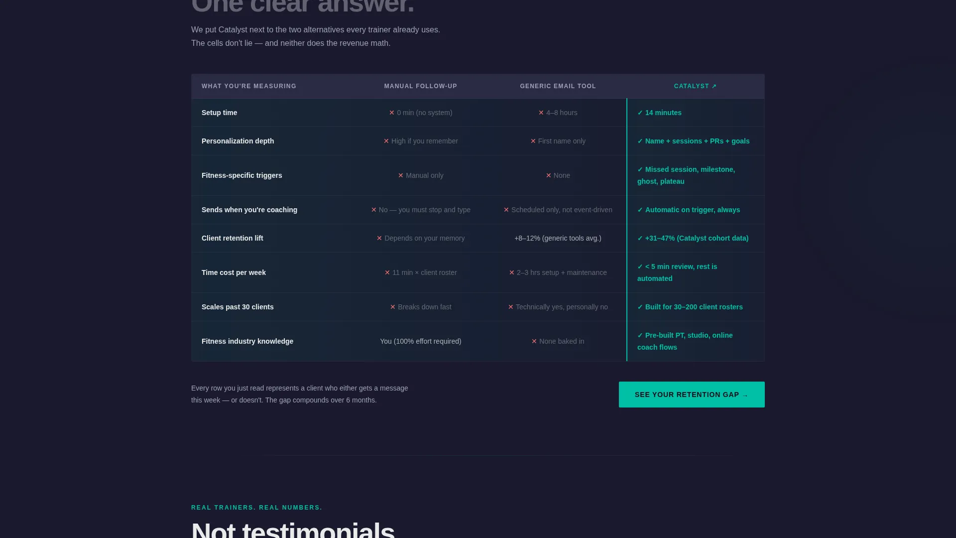
- A centerpiece comparison table measuring manual follow-up, generic email platforms, and the featured tool across four criteria
- A two-step lead generation form and a secondary PDF lead magnet download path
Feature list
This template comes with purpose-built sections and components drawn directly from the source brief. Each one contributes to a page experience that earns trust through evidence before it asks for commitment.
Dark Glass Panel Header
Three frosted, translucent cards float against a deep charcoal background. Each card shows a different follow-up email mid-composition: a missed-session check-in, a milestone congratulations pulling real workout data, and a winback sequence with an open-rate stat glowing in teal. A subtle depth-of-field blur at the card edges reinforces the feeling of a system running without you.
Stat Panel Section
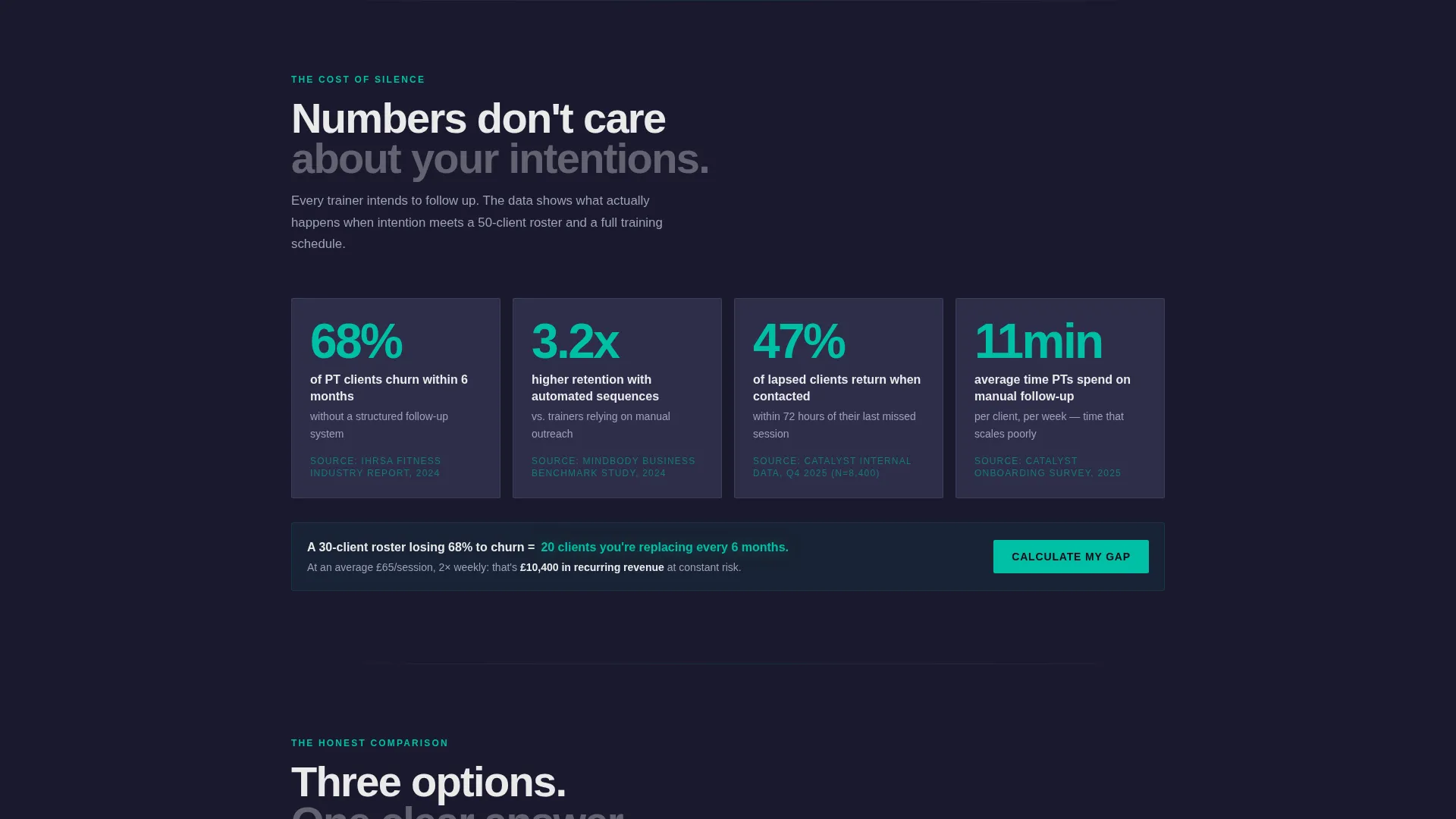
The first scroll section drops a focused data comparison: average client churn rate without follow-up versus with automated sequences. The stat is sourced and cited, making it a hard argument rather than a marketing claim. This section sets the tone for the entire Industry Report narrative.
Centerpiece Comparison Table
The comparison table is the structural core of the page. Rows compare manual follow-up, generic email platforms, and the featured tool. Columns cover setup time, personalization depth, fitness-specific triggers, and client retention lift. Every cell is written to be blunt and honest, letting the data do the persuading.
Data Card Case Studies
Below the comparison table, mini case studies appear as data cards. A personal trainer in Austin recovered 14 lapsed clients in one month. A studio in Manchester cut no-shows by 38 percent. These cards present outcomes as concrete evidence rather than testimonials, keeping the Industry Report tone consistent throughout.
Two-Step Lead Generation Form
The primary call to action, labeled "See Your Retention Gap," opens a two-step form. Step one asks for roster size and current follow-up method via a dropdown. Step two captures name and email to deliver a personalized retention report. The button repeats after the comparison table and again at the page bottom.
Secondary PDF Lead Magnet
A secondary conversion path offers a downloadable guide titled "The Fitness Follow-Up Playbook" for visitors not yet ready to commit to the main form. It captures email only, giving the page a lower-friction fallback that still builds the contact list.
Page sections overview
| Section | Purpose |
|---|---|
| Dark Glass Header | Introduce the tool with three email-preview cards and a bold brutalist headline |
| Stat Panel Block | Present churn rate data to frame the cost of no follow-up |
| Comparison Table | Show head-to-head results across four key criteria |
| Data Card Studies | Reinforce claims with real-world outcome snapshots |
| Primary call to action Form | Capture leads via a two-step retention gap assessment |
| PDF Lead Magnet | Offer a low-commitment download for earlier-stage visitors |
| Bottom call to action Repeat | Reinforce the primary call to action at page close |
Design & branding system
The visual identity follows a Bold Brutalist theme built around the Teal Catalyst color system. The palette is deliberately limited and high-contrast, making every teal accent hit with the force of a notification you cannot ignore.
- Deep gym-floor charcoal (#1A1A2E) as the base background, smoked glass gray (#2E2E4A) for card surfaces, and chalk white (#EAEAEA) for body text
- Reactive teal (#00BFA6) used exclusively for key stats, open-rate figures, call-to-action buttons, and glowing data highlights
- Heavy, unkerned brutalist typography for headings, creating a physical, high-impact presence on the page
Mobile & speed optimization
The template is structured for single-column readability on smaller screens. The comparison table and glass panel cards are laid out to remain scannable on mobile without horizontal scrolling.
- The comparison table adapts to narrower viewports so all four columns stay readable on a phone screen
- The two-step form is built for thumb-friendly interaction, with clear dropdown and input fields at comfortable tap size
- Data cards stack vertically on mobile, preserving the case study narrative flow without crowding the layout
How this template helps you convert
The page is engineered to make inaction feel more expensive than filling out a form. It does not lead with product features. It leads with the problem, then the proof, then the ask.
- The stat panel and comparison table build a data-backed case for change before a single product claim appears, so the visitor arrives at the call to action already convinced of the problem
- The two-step form lowers perceived commitment by starting with roster context rather than personal details, making the first click feel like a quiz rather than a sign-up
- The PDF lead magnet captures visitors who are not yet ready for the main form, ensuring the page earns a contact from nearly every engagement level
Other information about this template
This template is part of the Catalyst design system and sits within the Technology category, specifically the Fitness Email Templates subcategory. It is well suited to the fitness follow-up email niche and reflects the intersection of automated client communication and studio retention strategy.
- The template style is Comparison Table, a format that performs strongly when the product competes against both manual habits and generic tools
- The header concept, Dark Glass Panels, is a distinctive visual device that sets the page apart from standard fitness marketing layouts
- The creative direction, Industry Report, positions the product as a data-driven authority rather than a lifestyle brand, which suits the independent trainer and studio owner audience


Theme
Bold Brutalist
Creative direction
Industry Report
Color system
Teal Catalyst
Style
Comparison Table
Direction
Lead Generation
Page Sections
Dark Glass Panel Header
Data-led Stat Panel
Head-to-head Comparison Table
Case Study Data Cards
Two-step Lead Generation Form
PDF Lead Magnet Download
Related questions
Can I edit the comparison table rows and columns?
How does the two-step lead generation form work?
Is the PDF lead magnet file included in the template?
Who is this landing page template best suited for?
Can I change the teal color scheme to match my brand?



