Catalyst - Powerful Membership Landing Page Template
Catalyst is a split-screen B2B membership landing page template built for SaaS platforms that need to turn messy membership data into clear, actionable decisions. With a Data Command visual theme, stats-first storytelling, and a lead qualification form, it helps membership-focused teams present their product with authority and convert serious buyers.
by Rocket studio
Quick summary
Catalyst is a single-page, split-screen landing page template designed for B2B SaaS membership platforms. It combines a dark operational visual identity with stats-first content sections to move visitors from recognizing a problem to requesting a demo. Every section pairs a bold metric with a product story, ending in a focused lead-generation form.
Who this template is for
This template is built for teams that sell membership intelligence software to organizations managing large member rosters. The design and messaging are calibrated for buyers who live inside data and need to feel the product before they book a call.
- Membership directors at trade associations managing thousands of members across spreadsheets
- SaaS operations leads who inherited disconnected billing and CRM systems and need a cleaner pitch
- Revenue teams at professional communities who track renewal rates but struggle to explain the drop
What problem this template solves
Most SaaS landing pages for membership tools look like generic software demos. They list features, show a screenshot, and ask for an email. That approach fails buyers who are already overwhelmed by data chaos. Catalyst is structured to meet those buyers where they are.
- Visitors arrive with real pain: manual renewal tracking, silent churn, and engagement decay with no clear cause
- Generic templates cannot hold the attention of operations-minded buyers who need proof before trust
- Without a structured qualification flow, lead forms collect noise instead of the right prospects
What you get with this template
You get a fully structured, single-page landing page with a consistent split-screen layout running throughout. Every section is designed as a two-panel unit so visual storytelling and written content stay in balance from the first scroll to the final form.
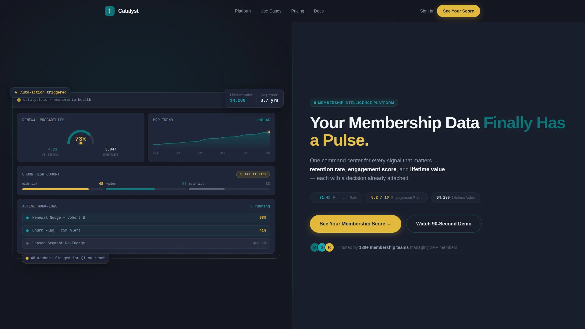
- A hero section with a live-fidelity dashboard mockup on the left and a headline-plus-subline on the right
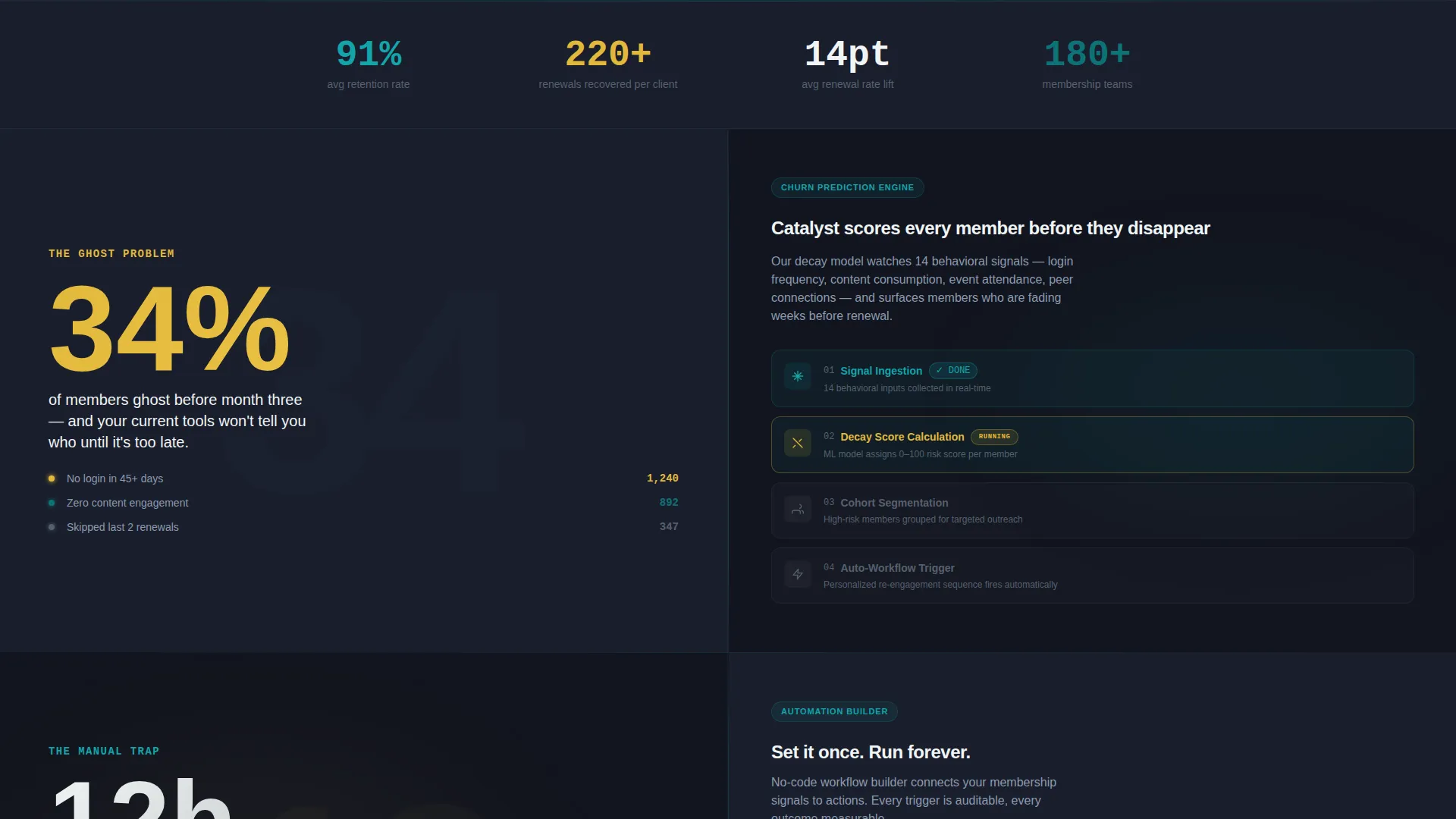
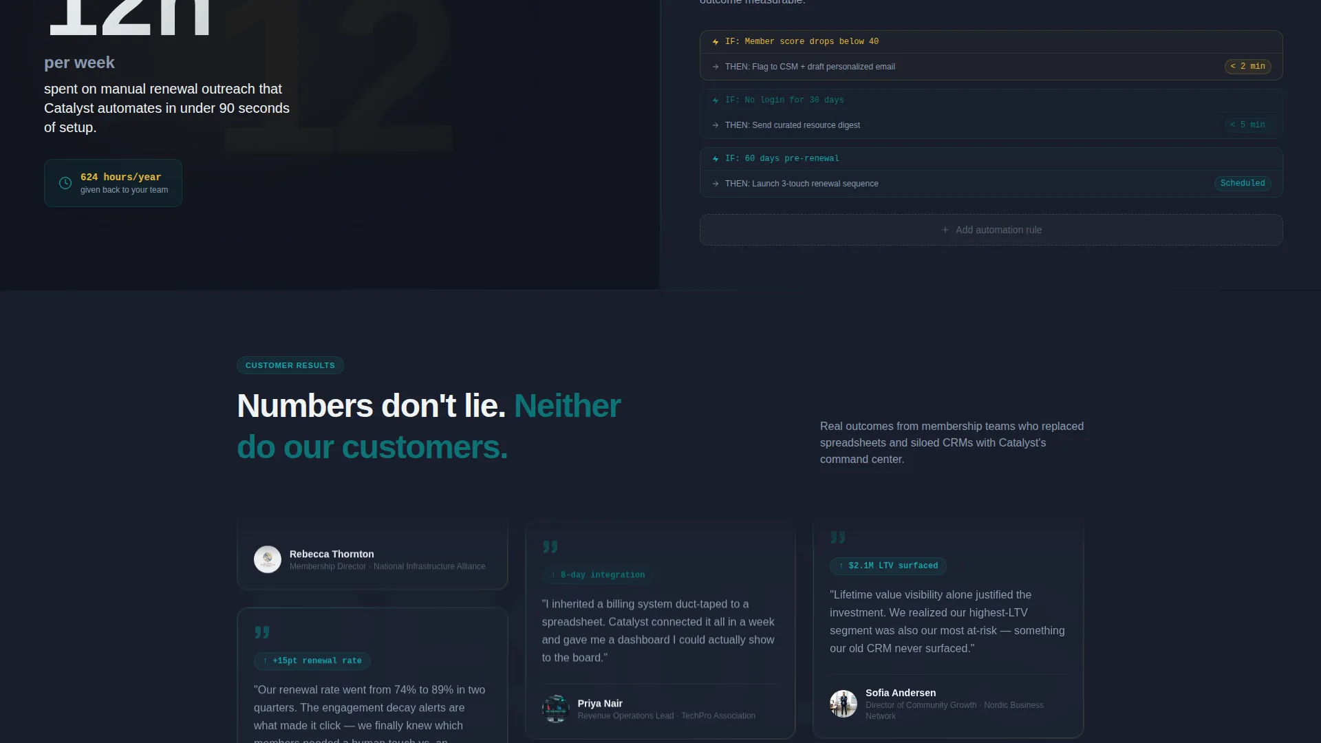
- Stats-first content blocks that pair oversized metrics with product screenshots and workflow illustrations
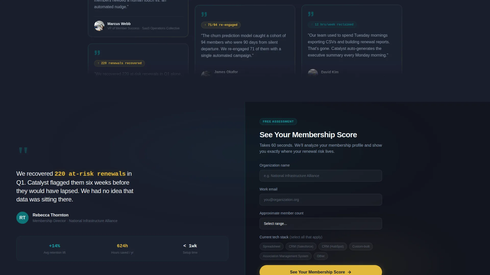
- A lead qualification form with organization name, member count dropdown, and tech stack multi-select inputs
- A sticky mobile bottom bar with a secondary call-to-action linking to an ungated product walkthrough
Feature list
This template ships with purpose-built sections and interaction patterns drawn directly from the brief. Each feature below reflects a specific design or structural decision in Catalyst.
Split-Screen Section Layout
Every section uses a strict 50/50 split. The left panel carries the data or evidence; the right panel carries the narrative or the action. This rhythm creates a predictable reading flow that keeps visitors oriented as they scroll.
Live-Fidelity Dashboard Hero
The header section places a detailed membership health dashboard mockup on the left half. It includes a renewal probability gauge, a churn-risk cohort flag, a monthly recurring revenue trendline, and a sidebar showing three automated workflows. All values use realistic figures, not placeholder text.
Parallax Dashboard Drift
The dashboard screenshot in the hero carries a subtle parallax drift on scroll. As visitors move down the page, the dashboard appears to lean closer, creating a sense of depth that draws attention to the product before a single word is read.
Stats-First Animated Counters
Each below-the-fold section opens with a single oversized statistic on the left panel. These statistics animate in as counter-style tickers, resolving to their final number as the section enters view. The motion rewards scroll and gives visitors a moment of data clarity before the story begins.
Lead Qualification Form
The final split-screen section places a short qualification form on the right panel. It asks for organization name, approximate member count via dropdown, and current tech stack via multi-select. This structure filters intent and surfaces the most relevant prospects without friction.
Sticky Mobile Secondary call to action
On mobile, a fixed bottom bar persists across the full page scroll. It presents a secondary call-to-action for visitors who are not ready to submit the form but are ready to engage with a short, ungated product walkthrough.
Page sections overview
| Section | Purpose |
|---|---|
| Hero Split Screen | Introduces the product with a dashboard mockup and core headline |
| Churn Stat Block | Opens with a 34% ghost-rate stat paired with a churn-prediction workflow |
| Manual Work Stat Block | Shows 12-hour weekly manual effort paired with an automation builder view |
| Case Study Block | Delivers before-and-after metrics from a real association as social proof |
| Lead Generation Form | Qualifies prospects with a short form opposite a testimonial quote |
Design & branding system
Catalyst uses a Data Command visual identity built around a Teal Catalyst color system. The palette is designed to feel like a submarine control room: dark surroundings make every illuminated data point feel urgent and deliberate.
- Deep operational teal (#0D7377) anchors the primary brand presence across buttons, borders, and accent elements
- Command-dark charcoal (#1A1E2C) covers section backgrounds, keeping the page grounded in an operational aesthetic
- Crisp signal white (#F0F4F5) surfaces data cards and readable content areas with clean contrast
- High-voltage catalyst yellow (#E2B93B) appears exclusively on calls-to-action, live-status indicators, and metric highlights, making it earn attention through scarcity
Mobile & speed optimization
The template is structured so the split-screen layout adapts gracefully to smaller viewports without losing the visual hierarchy established on desktop. The mobile experience prioritizes the most important conversion path.
- On mobile, split panels stack vertically so stat blocks and product images remain readable at any screen size
- The sticky bottom bar replaces the in-page secondary call-to-action on mobile, keeping the demo link always within thumb reach
- Counter animations and parallax effects are scoped to their respective sections so they do not interfere with the overall scroll experience
How this template helps you convert
Catalyst is structured as a deliberate conversion sequence. The page does not ask for anything until it has earned the right to ask. The layout moves visitors through a logical arc from pain recognition to proof to action.
- The stats-first scroll sequence surfaces familiar pain points in bold numbers before introducing the product, so visitors feel understood before they are sold to
- The case study block with a specific testimonial quote ("We recovered 220 at-risk renewals in Q1") places third-party proof directly adjacent to the form, reducing the hesitation that kills last-moment conversions
- The primary call-to-action "See Your Membership Score" frames the form as a value exchange rather than a data capture, making submission feel like the start of something useful
Other information about this template
Catalyst is categorized under Technology and sits at the intersection of SaaS B2B Digital Presence and the SaaS B2B Membership Site niche. It is a single landing page, not a multi-page website, and is intended as a focused conversion surface rather than a full product documentation hub.
- The template style is Split Screen (50/50), with that structure enforced consistently from the hero to the final form section
- The header concept is Dashboard Preview, meaning the hero is anchored by a product interface screenshot rather than an illustration or abstract graphic
- The creative direction is Stats-First Impact, where each content section leads with a quantified claim before revealing the product context
- The landing page direction is Lead Generation, with the qualification form as the primary conversion goal and the demo link as the secondary path
- This template is well suited for use in paid media campaigns targeting membership operations roles, where the stats-first approach can match the mindset of a data-aware buyer arriving from a performance ad
Theme
Data Command
Creative direction
Stats-First Impact
Color system
Teal Catalyst
Style
Split Screen (50/50)
Direction
Lead Generation
Page Sections
Split-screen Section Layout
Live-fidelity Dashboard Hero
Stats-first Animated Counters
Parallax Dashboard Drift
Lead Qualification Form
Sticky Mobile Secondary Call to Action
Related questions
Who is the primary audience for this landing page template?
Can I replace the dashboard mockup with my own product screenshots?
What does the lead qualification form collect?
Is this a single landing page or a multi-page website?
What is the secondary conversion path built into this template?



