Pharmaceutical Software & SaaS Comparison Website Template
Catalyst is a hub-and-spoke landing page template built for pharmaceutical client management platforms. It leads with a live dashboard screenshot, stacks stat-first impact blocks across five spoke sections, and drives conversion through an interactive comparison table and a short personalized-benchmark form. The teal-and-mint color system feels clinical enough to trust and fast enough to act on.
by Rocket studio
Quick summary
Catalyst is a single-page, anchor-nav landing page template designed for pharmaceutical client management software. It opens with a product dashboard screenshot and builds a cumulative evidence case through five stat-first spoke sections. A versus comparison table and a two-path conversion zone close the argument. The palette blends deep pharma teal with activated mint to project both clinical credibility and startup momentum.
Who this template is for
This template is built for teams selling or launching pharmaceutical account management software. It speaks directly to the people who feel the operational pain every day.
- Regional sales directors managing large rep teams across multiple therapeutic areas
- Medical science liaisons coordinating key opinion leader engagements ahead of a product launch
- Operations leads at mid-size biotechs inheriting disconnected compliance logs and fragmented CRM setups
What problem this template solves
Pharmaceutical account teams track hundreds of healthcare professional relationships across sample drops, formulary reviews, and compliance checkpoints. The data exists, but it lives in too many places. This template gives that platform one compelling page to prove it solves that mess.
- Visitors arrive skeptical because legacy tools failed them before
- Buyers need hard numbers before they will consider switching platforms
- Decision-makers want a direct comparison, not a feature list dressed up in marketing language
What you get with this template
You get a fully structured, single-page hub-and-spoke landing page with a fixed anchor navigation spine and five dedicated spoke sections. Every block is designed to build trust through data before asking for anything in return.
- A stat-first scrolling layout with five spoke sections, each opening on a large mint-colored impact number
- An interactive versus comparison table covering twelve competitive dimensions
- A two-path conversion zone with a short benchmark form and an embedded 90-second demo video
Feature list
This section details the core functional components built into the Catalyst template.
Fixed Anchor Navigation Spine
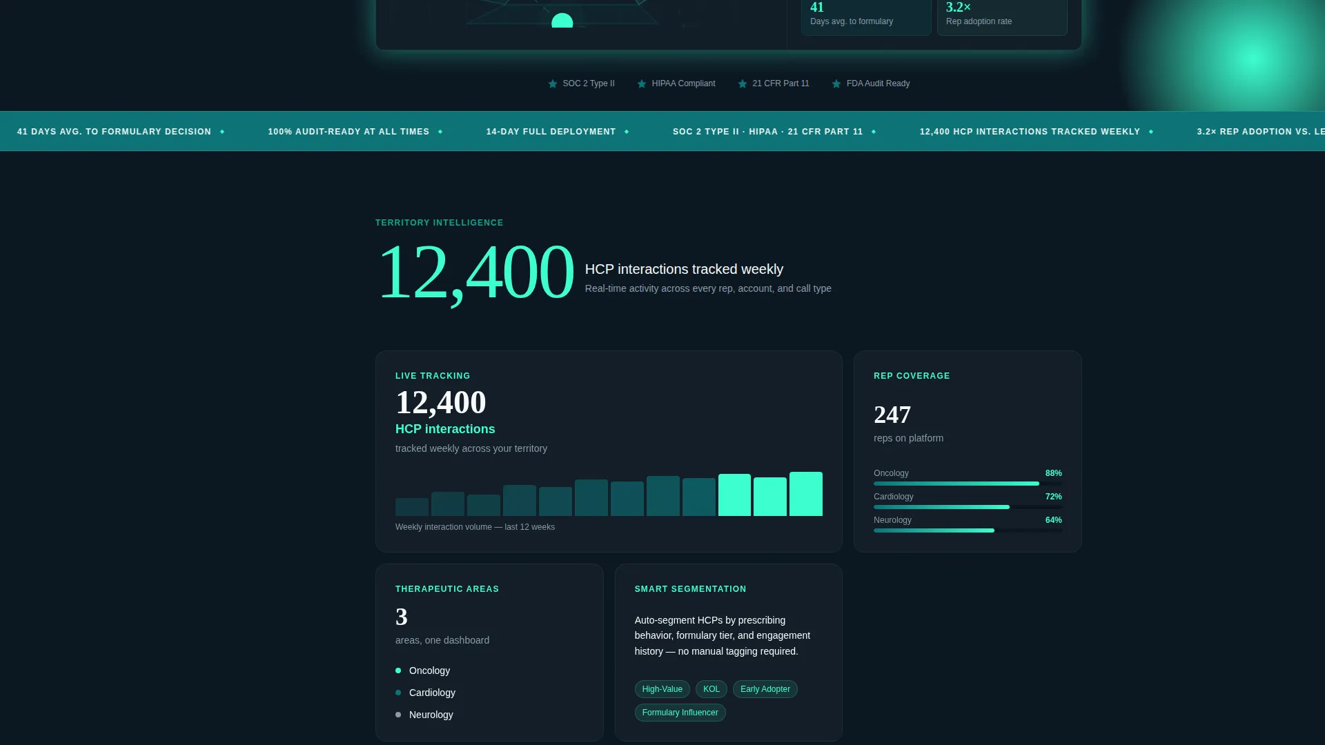
A persistent left-rail anchor nav links directly to five spoke sections: Territory Intelligence, Compliance Automation, KOL Mapping, Rep Adoption, and Integration Speed. Visitors can jump to any section instantly, and each click lands on a stat-first block so the evidence is always the first thing they read.
Stats-First Scroll Architecture
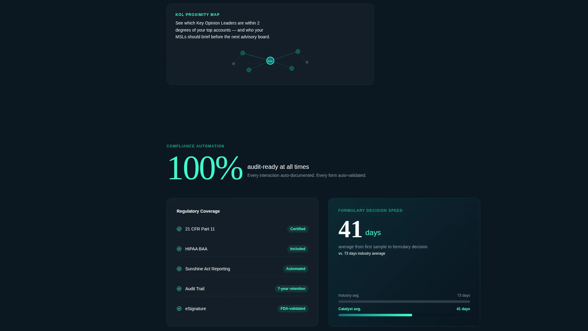
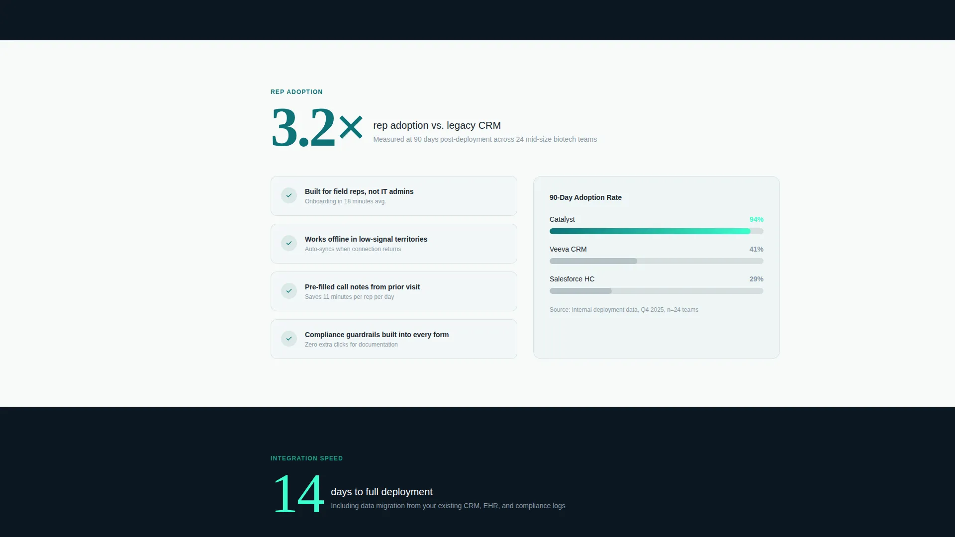
Each spoke section opens with an oversized impact number rendered in activated mint against a dark carbon slate background. The explanatory content fades in beneath it. Numbers like "12,400 HCP interactions tracked weekly" and "3.2x rep adoption versus. legacy CRM" stack a cumulative case as the visitor scrolls, making the comparison feel inevitable before they reach the table.
Product Screenshot Header
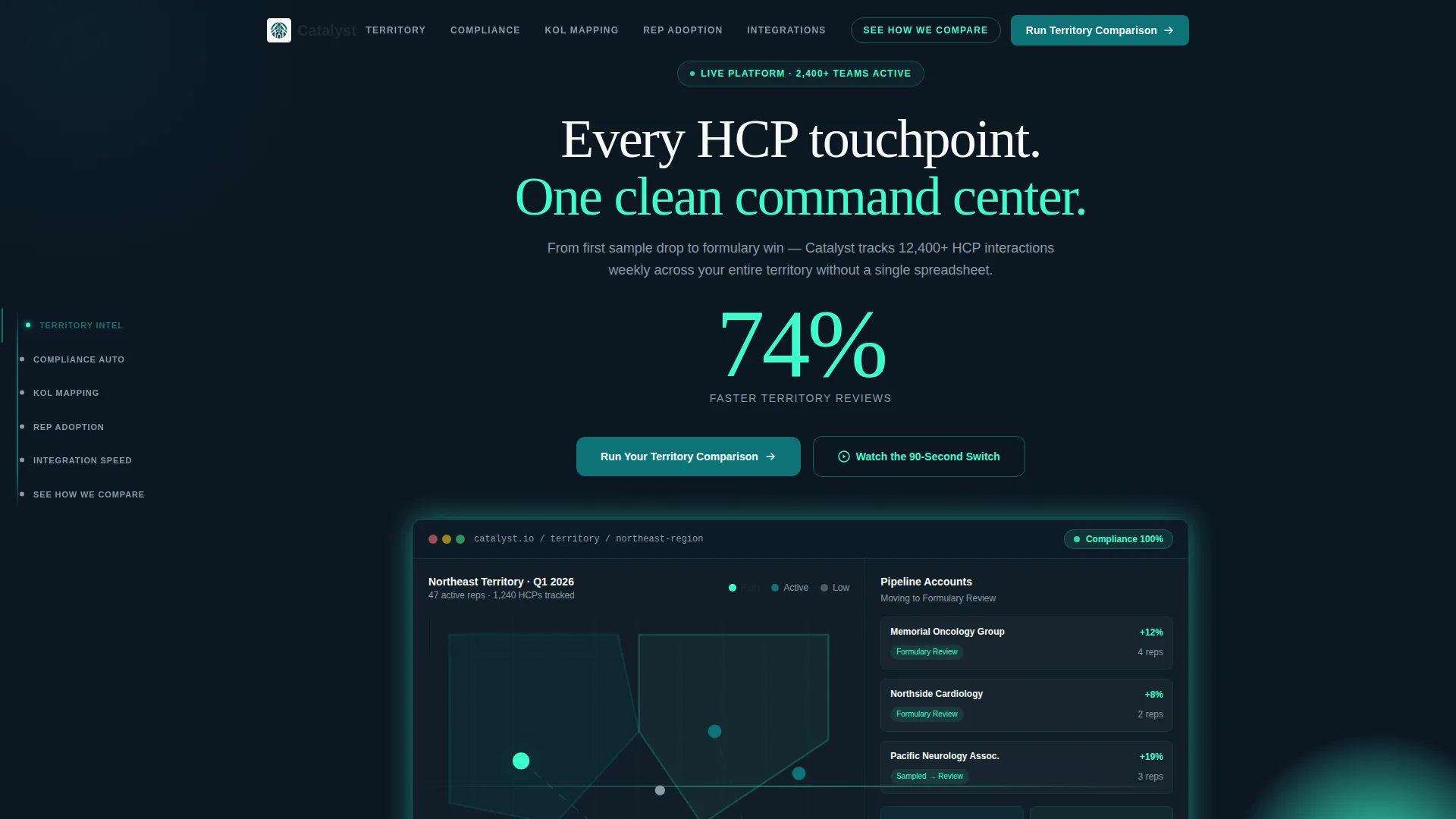
The header places the platform's healthcare professional engagement dashboard front and center. The screenshot shows a territory map with color-coded call activity, a compliance status ribbon reading 100%, and a pipeline sidebar with three accounts moving from sampled to formulary review. One floating stat in oversized mint type anchors the hero before the visitor scrolls.
Interactive Versus Comparison Table
A "See How We Compare" anchor in the nav opens a full comparison table with twelve evaluated dimensions. Green checkmarks in activated mint and neutral dashes in a muted slate distinguish the platform from competing tools clearly and without editorializing. The table does the persuasion work so the form does not have to.
Two-Path Conversion Zone
The primary call to action invites visitors to run a territory comparison using a short form that collects current CRM, team size, and work email. Visitors not ready to share details can take a secondary path and watch the embedded 90-second switch demo video instead. Both paths serve different buyer readiness levels without friction.
Teal Catalyst Color System
Deep pharma teal anchors headers, nav elements, and section dividers. Activated mint fires only on interactive moments such as hover states, stat counters, and comparison checkmarks. Clinical white opens content blocks. Carbon slate grounds body text. The palette communicates sterile precision and startup energy at the same time.
Page sections overview
| Section | Purpose |
|---|---|
| Hero Header | Anchors trust with product screenshot and a single oversized stat |
| Anchor Nav Spine | Gives visitors instant access to any spoke section |
| Territory Intelligence | Opens on territory map stat, explains geographic coverage |
| Compliance Automation | Leads with compliance percentage stat, details automation |
| KOL Mapping | Opens on key opinion leader engagement stat |
| Rep Adoption | Leads with adoption rate stat, addresses legacy CRM resistance |
| Integration Speed | Opens on time-to-value stat, addresses setup concern |
| Comparison Table | Pits the platform against alternatives across twelve dimensions |
| Conversion Zone | Hosts benchmark form and embedded demo video side by side |
Design & branding system
The visual identity is built on the Teal Catalyst color system, channeling a Startup Velocity theme that feels credible in pharma and fast in tech. Every color assignment has a defined role so the palette never feels arbitrary.
- Deep pharma teal (#0D7377) anchors headers, the nav spine, and section dividers for structural authority
- Activated mint (#3CFFD0) appears only on interactive elements, hover states, live stat pulses, and comparison checkmarks so each activation feels intentional
- Clinical white (#F7FAFA) and carbon slate (#1E2A33) handle content backgrounds and body text to maintain readability at every scroll depth
Mobile & speed optimization
The template is structured so that its fixed left-rail anchor nav and stat-first blocks adapt cleanly for smaller screens. The layout prioritizes the most persuasive element, the impact number, at every breakpoint.
- The anchor nav collapses gracefully on mobile so spoke navigation remains accessible without consuming screen real estate
- Stat counters and the versus comparison table are designed to remain readable and functional at reduced viewport widths
How this template helps you convert
Catalyst is engineered around a Comparison/Versus conversion strategy. Every structural decision moves a skeptical pharma buyer toward the form or the demo.
- The product screenshot in the header removes abstraction immediately. Visitors see the actual dashboard before reading a single line of copy, which builds credibility in the first three seconds.
- The stacking stat architecture means that by the time a visitor reaches the comparison table, they have already absorbed five data points that frame the competing tools as the inferior option. The form then feels like a logical next step, not a cold ask.
Other information about this template
This template is designed for pharmaceutical software and SaaS platforms operating in the pharmaceutical client management space. It is particularly relevant where buyers are comparing purpose-built tools against broader CRM platforms.
- The "See How We Compare" section is structured to address objections that arise when evaluating specialized pharmaceutical CRM tools against general-purpose platforms such as Veeva CRM and Salesforce Health Cloud
- The benchmark report form output is described in the brief as personalized to the visitor's current CRM and team size, making it a high-value lead capture mechanism
- The template supports the full buyer journey from anonymous scroll to qualified form submission within a single page
- It is suitable for product launches, sales enablement pages, and platform migration campaigns in the pharmaceutical technology sector
Theme
Startup Velocity
Creative direction
Stats-First Impact
Color system
Teal Catalyst
Style
Hub & Spoke (Anchor Nav)
Direction
Comparison/Versus
Page Sections
Fixed Anchor Navigation Spine
Stats-first Scroll Architecture
Product Screenshot Hero
Interactive Versus Comparison Table
Two-path Conversion Zone
Related questions
Who is this landing page template designed for?
What does the hub-and-spoke layout mean in practice?
Can I customize the comparison table dimensions?
Is there a way for visitors to convert without filling in the form?
What makes the color system work for a pharmaceutical audience?



