Construction Company Pricing Website Template
Catalyst is a split-screen construction pricing landing page template built for general contractors, estimators, and small commercial teams. It pairs a dark Tech Glass visual identity with a stats-first layout that leads every section with hard numbers before showing the product. Three frosted pricing panels, animated counters, a sticky call-to-action bar, and a minimal email signup make the free-tier conversion feel effortless and inevitable.
by Rocket studio
Quick summary
Catalyst is a single-page, split-screen landing page template designed for construction pricing tools. It opens with an animated counter, delivers metric-and-proof section pairs, and closes every conversion opportunity with a lightweight email form. The Tech Glass visual theme uses deep obsidian, reactive teal, and frosted panels to make numbers feel like live dashboard instruments.
Who this template is for
This template is built for construction professionals who need to present a pricing tool with credibility and urgency. It fits teams that compete on precision, not just price.
- General contractors and project managers running multiple residential builds at once
- Estimators who need to submit bids under tight deadlines and want a sharp, professional presence
- Small commercial outfits that want to look as capable as larger firms with dedicated preconstruction departments
What problem this template solves
Construction pricing tools are often hard to present clearly. Potential users arrive skeptical, unsure whether the tool scales to their project size or fits their workflow. This template removes that doubt fast.
- It leads with proof: animated stats and hard metrics appear before any feature list
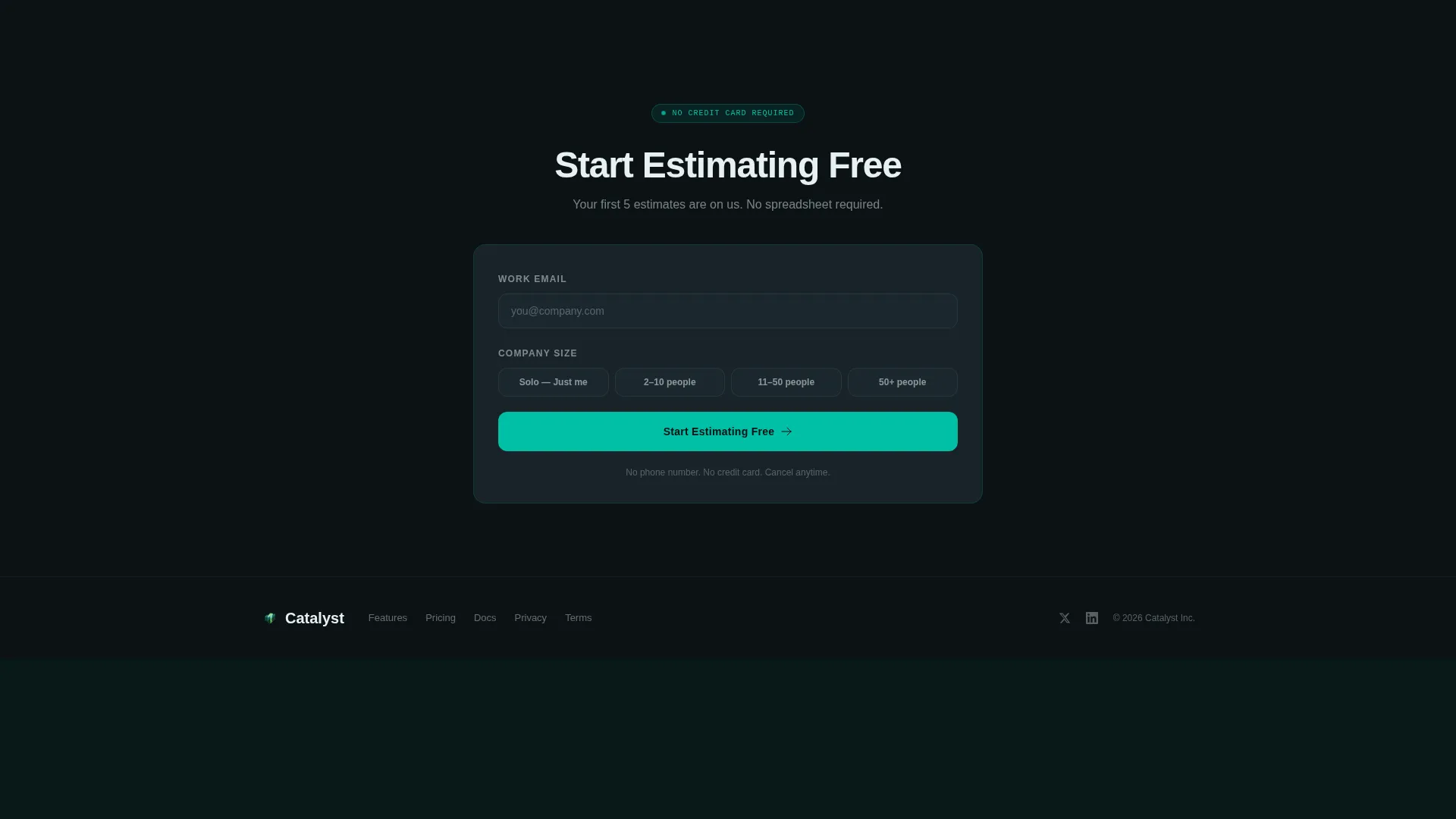
- It removes signup friction by asking only for email and company size, with no credit card required
- It lets visitors self-qualify into paid tiers through an on-page comparison table, without leaving the page
What you get with this template
You get a complete, conversion-focused landing page layout designed specifically for a construction pricing product. Every section is purposeful and ready to customize.
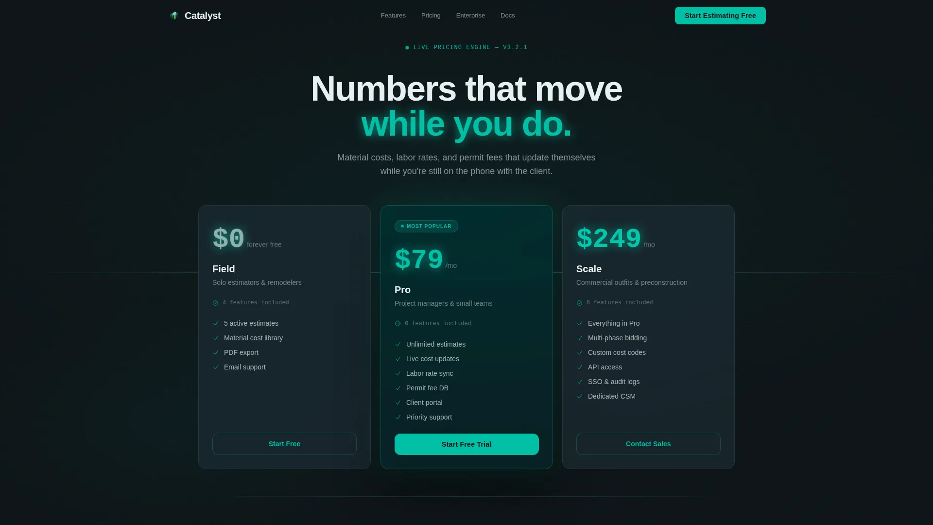
- A dark glass header with three floating pricing tier panels showing plan names, costs, and feature counts
- A stats-first scroll rhythm that pairs each metric with a corresponding product screen or micro-interaction
- A sticky bottom call-to-action bar, a mid-page signup form, and a collapsible feature comparison table
Feature list
This template ships with a focused set of layout and interaction components drawn directly from the brief.
Dark Glass Pricing Header
Three translucent, frosted panel rectangles float over a near-black background. Each panel displays a pricing tier with plan name, monthly cost, and feature count. The panels use a subtle parallax shift on scroll, creating a sense of physical depth without relying on hero images or illustrations.
Animated Stats Counter
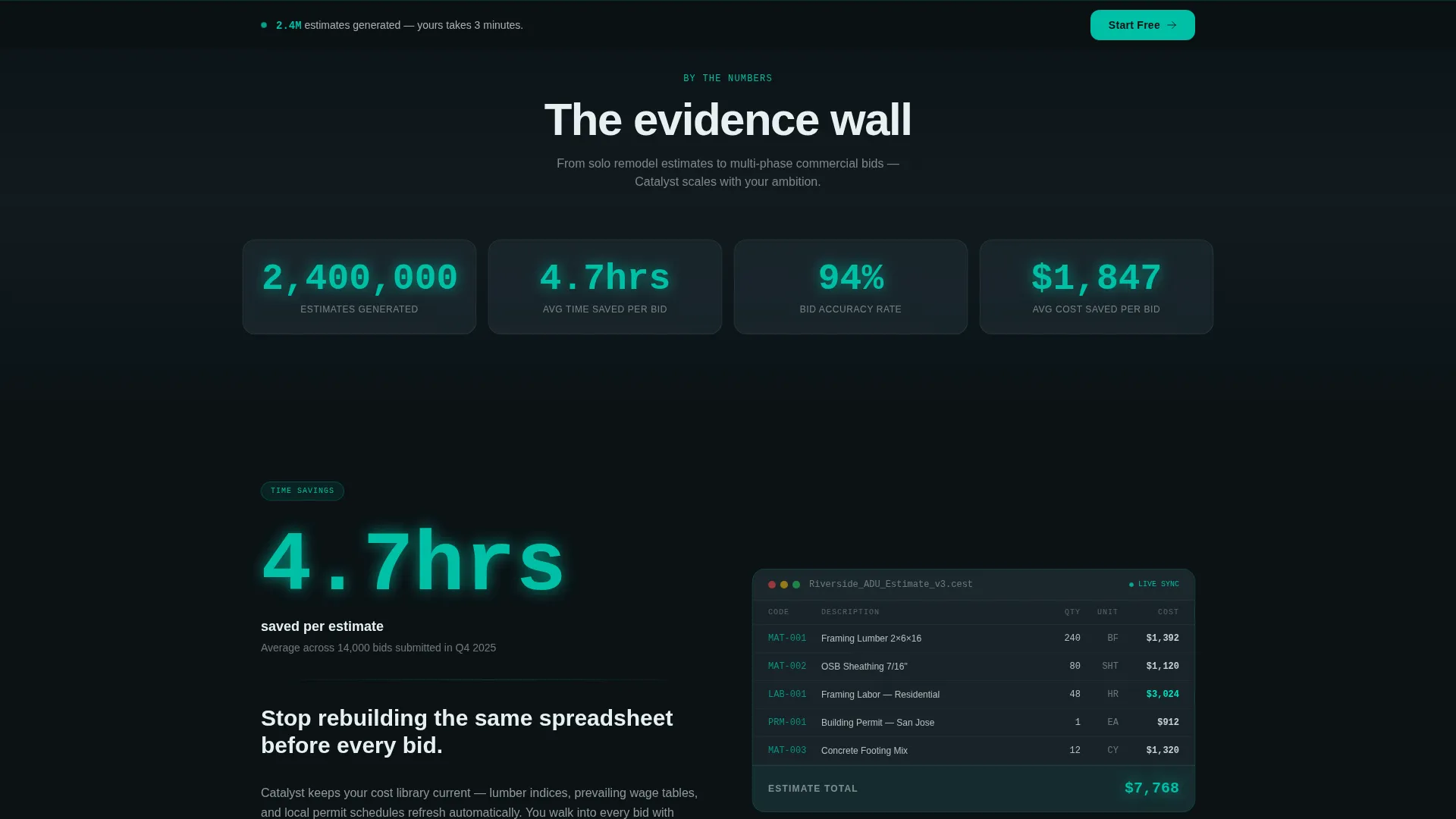
The page opens with a single full-width animated counter before splitting into the 50/50 layout. The counter creates immediate impact and signals scale. It sets the tone for the evidence-first scroll rhythm that follows.
Split-Screen Metric and Proof Sections
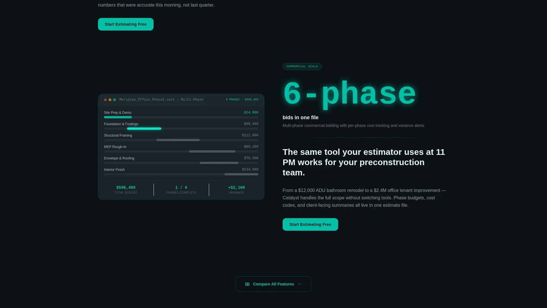
The 50/50 layout pairs a hard metric on the left side with the corresponding product screen or interaction on the right. Each section escalates from a solo remodel estimate to a multi-phase commercial bid. The structure builds a cumulative evidence wall as visitors scroll.
Sticky Conversion Bar
A sticky bottom bar appears after the visitor passes the second section. It carries the primary call-to-action and stays visible throughout the rest of the scroll. This keeps the conversion path accessible without interrupting the content flow.
Minimal Email Signup Form
The signup form captures only email address and company size, with four size options: solo, 2 to 10, 11 to 50, and 50 or more employees. No credit card and no phone number are required. The low-friction entry point supports freemium conversion.
On-Page Feature Comparison Table
A secondary call-to-action labeled "Compare All Features" expands a detailed comparison table directly on the page. Visitors can review all tier differences without navigating away. This lets users self-select into a paid plan after they have already committed to the free tier.
Page sections overview
| Section | Purpose |
|---|---|
| Frosted Pricing Header | Display three pricing tiers in floating dark glass panels with parallax depth |
| Animated Stats Counter | Open the scroll with a live-looking metric that signals product scale |
| Split-Screen Proof Pair 1 | Pair a time-saving metric with the product interaction that delivers it |
| Split-Screen Proof Pair 2 | Escalate stakes with a bid accuracy stat and its corresponding screen |
| Split-Screen Proof Pair 3 | Show multi-phase commercial bid scope alongside matching product view |
| Mid-Page Signup | Capture email and company size after the accuracy stat section |
| Sticky call to action Bar | Keep the primary call-to-action visible after the second section |
| Comparison Table Expander | Let visitors expand full feature comparison on-page without navigating away |
Design & branding system
The Teal Catalyst color system is built for dark environments where numbers need to read cleanly at a glance. Every color choice reinforces the control-room aesthetic described in the brief.
- Deep obsidian (#0B1215) as the base background, frosted panel gray (#1E2A30) for card surfaces, reactive teal (#00BFA6) for all interactive elements, signal white (#E8F0F2) for primary text and dividers, and catalyst green (#00E5C3) for accent hover states
- Large, high-contrast typography makes pricing figures readable from a distance, reflecting the "dashboard instruments" visual direction
- The palette avoids warm tones entirely, keeping the interface cool, luminous, and surgically focused on the data
Mobile & speed optimization
The split-screen layout is designed to restack cleanly on smaller viewports so the metric-and-proof rhythm is preserved on mobile screens.
- The 50/50 column structure collapses to a single-column stacked flow on narrow screens, keeping proof pairs intact
- Large numeral sizing ensures pricing figures and stat counters remain readable without zooming
- The sticky bottom bar is sized for thumb reach, keeping the primary call-to-action accessible throughout the mobile scroll
How this template helps you convert
Every layout decision in Catalyst points toward one outcome: getting the right visitor to start the free tier with minimal hesitation.
- The animated counter and stats-first scroll establish credibility before asking for anything, making the "Start Estimating Free" call-to-action feel earned rather than pushed.
- The minimal signup form (email and company size only) removes the two most common reasons visitors abandon a freemium offer: credit card requirements and excessive data requests.
- The on-page comparison table lets high-intent visitors self-upgrade without leaving, turning a single free-tier signup into a natural path toward a paid plan.
Other information about this template
This template is categorized under construction company website templates with a specific focus on the construction company pricing page niche. It is well-suited for teams evaluating specialized construction estimating tools.
- The template style is Split Screen (50/50), making it distinct from standard full-width or card-grid pricing page layouts common in the technology category
- The Tech Glass theme and Teal Catalyst color system are purpose-built for this template and are not generic design presets
- The creative direction is Stats-First Impact, meaning data leads every section rather than lifestyle imagery or generic benefit statements
- The header concept is Dark Glass Panels, a specific layout choice that makes the pricing tiers the first and most prominent visual element on the page
- The freemium and trial conversion direction shapes every call-to-action placement, form field decision, and secondary path in the template
Theme
Tech Glass
Creative direction
Stats-First Impact
Color system
Teal Catalyst
Style
Split Screen (50/50)
Direction
Freemium/Trial
Page Sections
Dark Glass Pricing Header Panels
Animated Opening Stats Counter
Split-screen Metric and Proof Layout
Sticky Bottom Conversion Bar
Low-friction Email Signup Form
On-page Feature Comparison Table
Related questions
Can I customize the pricing tiers and plan names in Catalyst?
Do I need design experience to use this template?
Is the signup form connected to any backend or email service?
Can I remove the on-page feature comparison table?
Who is this template best suited for?



