AI for Nonprofit Specialist Professional Website Template
Catalyst is a split-screen landing page template built for nonprofit AI recommendation engines. It pairs a live-metrics header with a side-by-side comparison flow, guiding donors from overwhelm to a personalized shortlist. The design runs on a deep teal and catalyst mint palette, built to feel precise, trustworthy, and ready to convert.
by Rocket studio
Quick summary
Catalyst is a single-page, split-screen landing page template for AI-powered nonprofit discovery platforms. It opens with a stats wall and a smart search field, then walks visitors through a scrolling comparison of old search methods versus precision matching. A three-step progressive form and a sticky call-to-action bar close the gap between curiosity and commitment.
Who this template is for
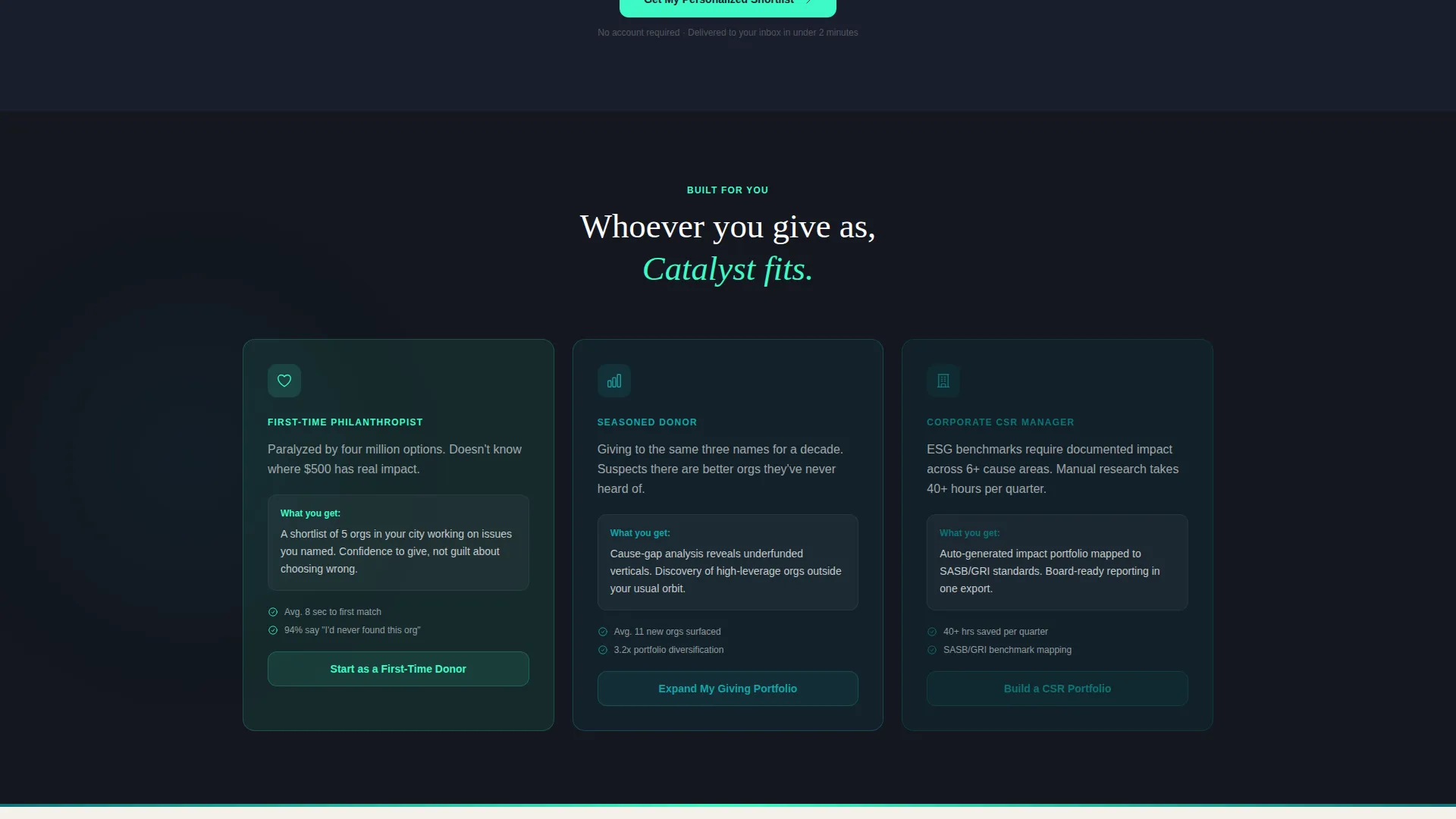
This template is built for teams launching or marketing an AI-driven nonprofit matching or donor discovery product. It speaks directly to three distinct audiences without alienating any of them.
- First-time philanthropists who feel lost navigating millions of registered 501(c)(3) organizations
- Seasoned donors ready to move beyond their familiar handful of causes and find new vetted nonprofits
- Corporate social responsibility managers building impact portfolios aligned with environmental, social, and governance benchmarks
What problem this template solves
The nonprofit giving space has a discovery problem. Millions of registered charities exist, but most donors cycle through the same few names because finding the right fit takes too much work. This template frames that problem visually and resolves it with a clear before-and-after narrative.
- Donors feel overwhelmed by scale and resort to familiar but limiting choices
- Existing tools like filtered directories return noisy, low-confidence results
- Corporate giving teams struggle to justify selections against measurable impact benchmarks
What you get with this template
You get a fully structured, conversion-focused landing page layout with every visual section and interaction pattern mapped out. The design system, copy architecture, and form flow are all defined and ready to build from.
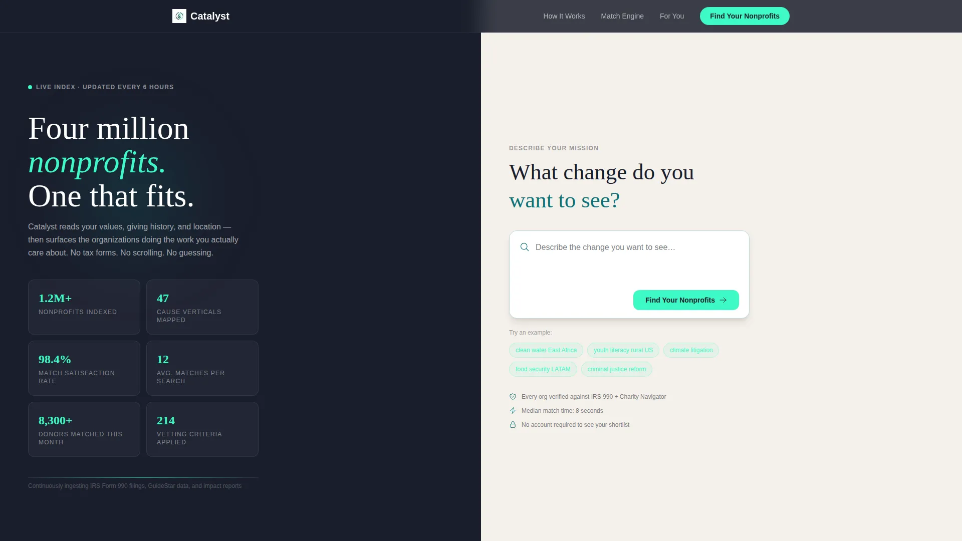
- A 50/50 split-screen layout with a live-counter stats header and ghost-text search field
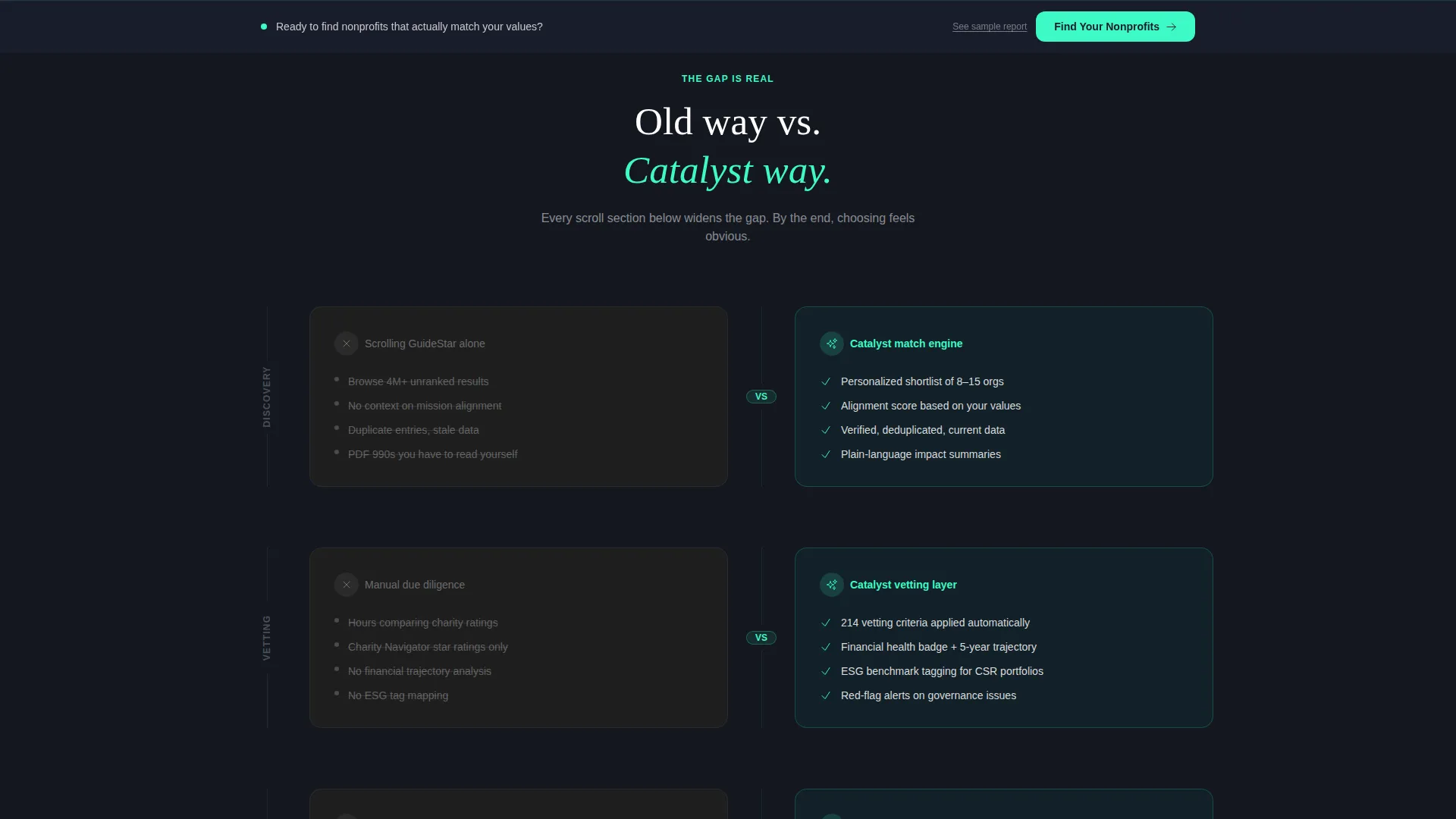
- A scrolling comparison engine showing the old way of searching versus the Catalyst-powered shortlist
- A three-step progressive form collecting giving interests, geography, budget range, and email
Feature list
This template packages several purpose-built components into a single, scroll-driven landing page experience.
Live Metrics Header Wall
The left panel of the header displays a mosaic of live-style counters: 1.2 million nonprofits indexed, 47 cause verticals mapped, and a 98.4 percent match-satisfaction rate. Numbers animate upward in catalyst mint against a midnight charcoal background, establishing credibility before a visitor reads a single line of copy.
Smart Search Field with Pill Tags
The right panel holds a single search input with ghost text reading "Describe the change you want to see..." Three example pill tags sit below it: "clean water East Africa," "youth literacy rural US," and "climate litigation." This component signals intent-based search and lowers the barrier to engagement immediately.
Scrolling Comparison Sections
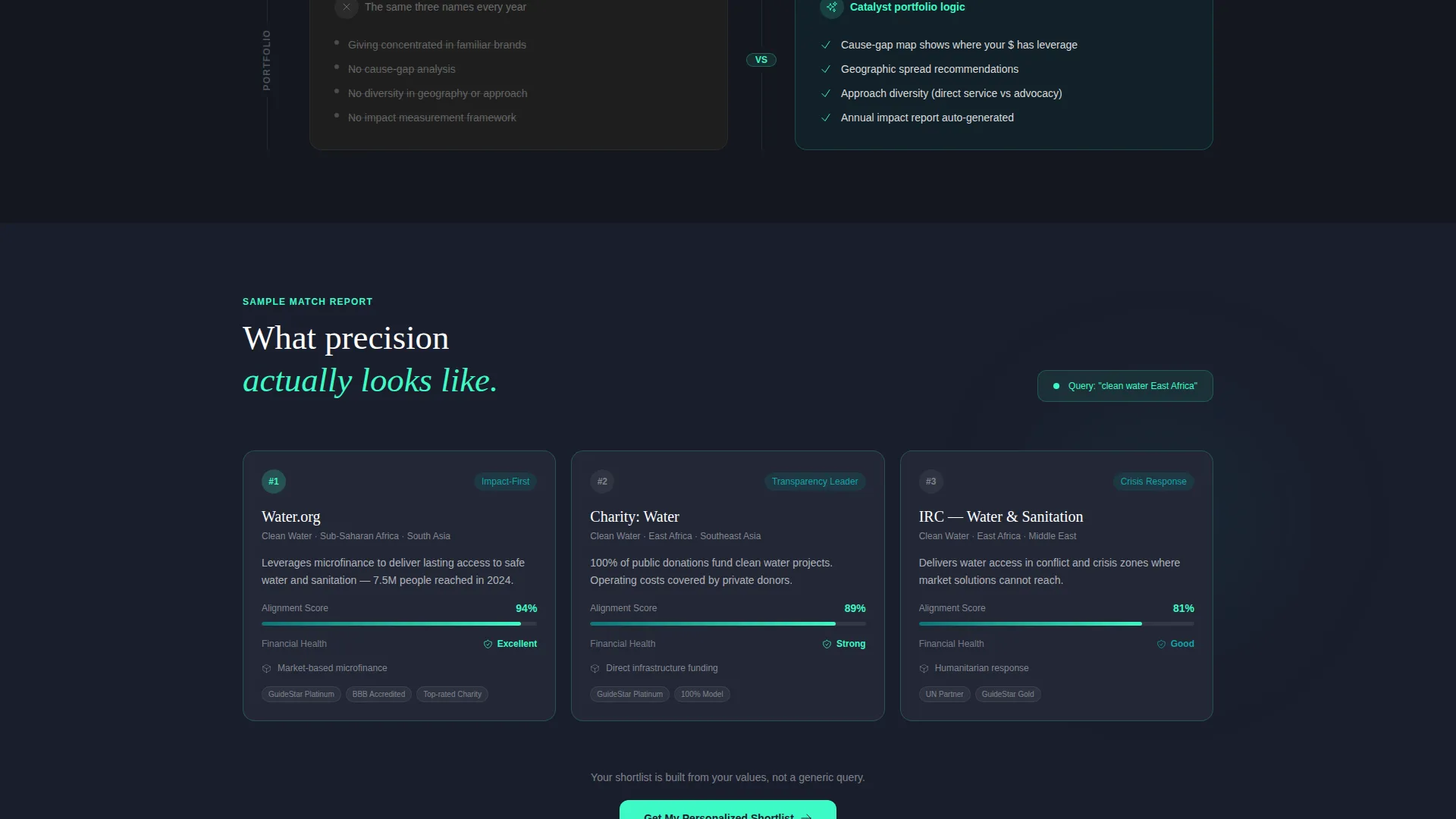
Below the fold, the split-screen layout flips into a side-by-side comparison engine. The left side renders the old search experience in desaturated gray, with logo walls, tax forms, and broken filters. The right side shows a Catalyst-generated shortlist with impact scores, financial health badges, and alignment percentages in mint. Each scroll section widens the gap between the two approaches.
Three-Step Progressive Form
The primary conversion path opens a three-step form. Step one collects giving interests through tag selection. Step two asks for annual giving range and geography preference. Step three requests an email address to deliver the personalized nonprofit shortlist. This staged approach reduces friction and keeps completion rates higher than a single long form.
Sticky Bottom Call-to-Action Bar
After the third comparison section, a sticky bar appears at the bottom of the viewport. It carries the primary call to action, "Find Your Nonprofits," keeping the conversion entry point visible without interrupting the scroll narrative.
Sample Match Report Path
A secondary call-to-action labeled "See a Sample Match Report" gives skeptical visitors a no-commitment preview of the output. This friction-reducing path is specifically designed for data-minded donors who need proof before they share their email.
Page sections overview
| Section | Purpose |
|---|---|
| Stats metrics header | Establish scale and accuracy with live-counter data points |
| Search field panel | Invite intent-based input with ghost text and example pill tags |
| Comparison section one | Contrast logo-heavy old search with AI-matched shortlist |
| Comparison section two | Highlight vetting depth and financial health badges |
| Comparison section three | Show portfolio diversification and tax-receipt automation |
| Sticky call to action bar | Maintain conversion visibility after third comparison section |
| Three-step form | Collect interests, geography, budget, and email progressively |
| Sample report path | Offer a preview shortlist for low-commitment visitors |
Design & branding system
The Teal Catalyst color system is designed to feel like a venture philanthropy dashboard: clinical enough to earn trust, vivid enough to drive action. Every color has a precise role in the visual hierarchy.
- Deep mission teal (#0D7377) anchors headers and primary buttons, projecting stability and purpose
- Midnight charcoal (#1A1E2C) fills left-panel backgrounds, giving data highlights maximum contrast
- Bright catalyst mint (#3EFAC5) fires on hover states and data callouts, directing the eye toward key metrics
- Warm cloud (#F4F0EB) holds the right panel, creating visual breathing room that balances the data-heavy left side
Mobile & speed optimization
The split-screen layout is designed to reflow cleanly when the viewport narrows. The Directory and Discovery theme prioritizes clear information hierarchy across screen sizes.
- The 50/50 panels stack vertically on smaller screens, keeping both the metrics wall and search field fully readable
- The sticky call-to-action bar and progressive form steps remain accessible throughout the scroll on mobile viewports
How this template helps you convert
The entire layout is engineered around a single conversion goal: moving a visitor from discovery to form submission. Every design decision supports that journey.
- The live-metrics header builds immediate trust, so visitors arrive at the search field already primed to engage rather than skeptical
- The scrolling comparison sections build progressive conviction, making the value gap between old methods and AI-powered matching feel wider with each section until acting feels like the obvious choice
Other information about this template
This template belongs to the Technology category with a focus on the AI for Nonprofit subcategory and the nonprofit AI recommendation engine niche. It is designed as a single-page layout, not a multi-page website, so all conversion elements live within one scroll journey.
- The creative direction follows a Launch Energy principle: each scroll section raises the stakes, mimicking a countdown to an inevitable decision
- The header concept is a Stats and Metrics wall, replacing stock photography entirely with data-driven credibility signals
- The landing page direction is Comparison and Versus, making the competitive gap the central persuasion device
- The theme is Directory and Discovery, reflecting a product that turns chaos into a curated, precise shortlist
- This template is well-suited for teams building donor-facing platforms, corporate giving portals, or philanthropic advisory tools that rely on algorithmic matching
Theme
Directory & Discovery
Creative direction
Launch Energy
Color system
Teal Catalyst
Style
Split Screen (50/50)
Direction
Comparison/Versus
Page Sections
Live Metrics Counter Header
Intent-based Search Field
Scrolling Comparison Engine
Three-step Progressive Form
Sticky Conversion Bar
Sample Report Secondary Path
Related questions
Who is this landing page template built for?
Does this template include the matching algorithm or any backend logic?
Can the comparison sections be adapted for a different product?
What is the purpose of the 'See a Sample Match Report' path?
How does the three-step form reduce friction for new visitors?



