Physics Education Reviews Website Template
Catalyst is a hub-and-spoke landing page template built for a physics flashcard and spaced-repetition review app. It opens with a live-metrics dashboard, guides visitors through a Problem-to-Solution scroll, and closes with event registration for a free "Cram Lab" webinar. The design uses a deep lab teal and reactor cyan palette that feels like precision instrumentation.
by Rocket studio
Quick summary
Catalyst is a single-page, anchor-nav landing page template designed for a physics flashcard and exam-review app. It leads with a stats dashboard, moves through three problem-and-solution spoke sections, and drives visitors toward registering for a free live webinar. The teal-and-cyan color system gives the page the feel of a research-grade instrument display.
Who this template is for
This template is built for creators and educators launching a physics study or exam-prep product. It fits anyone who needs to convert cold traffic into event sign-ups while demonstrating product value before the ask.
- Physics flashcard app founders and course builders targeting exam candidates
- Physics educators or teaching assistants who need a polished page to promote a curated study deck or live review session
- Edtech marketers promoting spaced-repetition tools to students sitting Advanced Placement, International Baccalaureate, MCAT, or GRE exams
What problem this template solves
Most study-app landing pages either dump features on the visitor or go straight to a sign-up form before earning any trust. This template solves both problems by sequencing proof before the ask.
- It shows retention metrics up front so visitors believe the science before reading a single feature bullet
- It walks visitors through three specific study failure modes, each paired with a hands-on card interaction, so the product value is felt rather than just described
- It removes friction from the registration path with a four-field form and a no-commitment secondary call to action
What you get with this template
You get a fully structured, single-page layout with every section pre-designed and copy-ready for a physics exam-prep or flashcard product.
- A dark-viewport header with animated metric counters, a scrolling equation ticker, and a fade-in headline
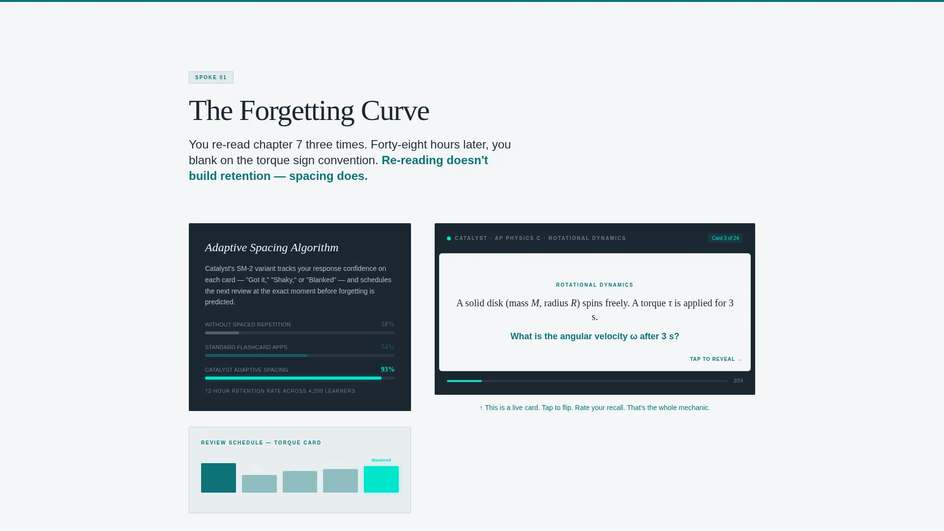
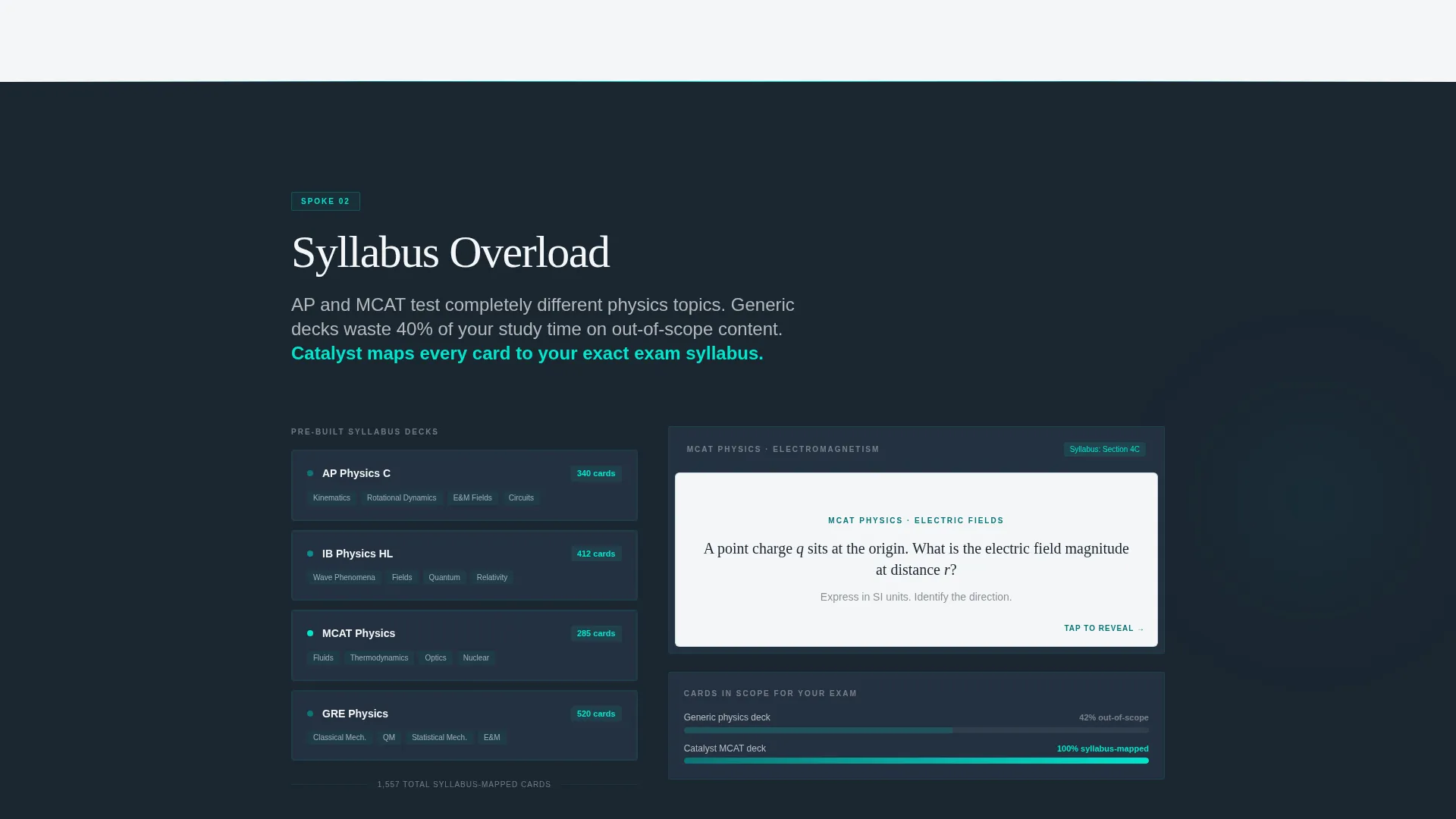
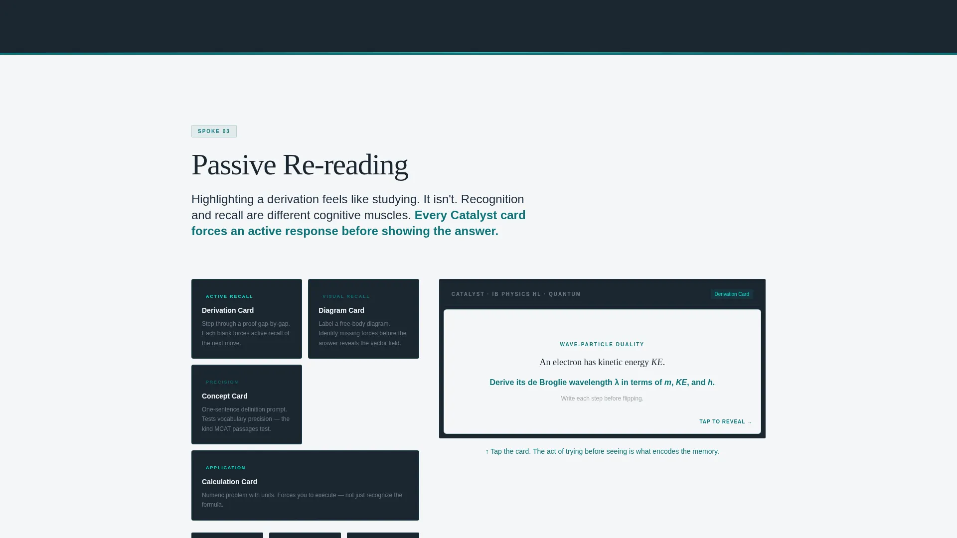
- Three spoke sections anchored in the navigation, each with a problem statement, a teal-backed solution block, and a flippable mini-card interaction
- A registration hub with a four-field sign-up form, a primary call-to-action button, and a ghost-button secondary path
Feature list
This section describes the core built-in components and interaction patterns included in the Catalyst template.
Animated Stats Dashboard Header
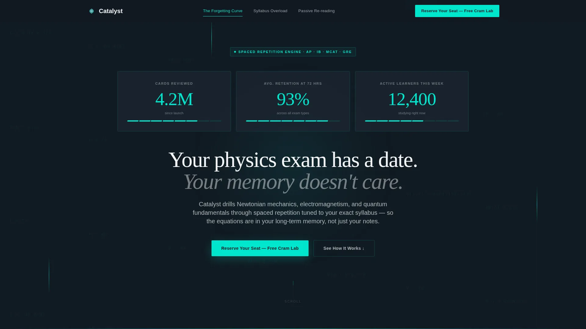
The header opens as a dark viewport frozen mid-session. Three oversized reactor cyan metrics, "4.2M cards reviewed," "93% average retention at 72 hours," and "12,400 active learners this week," animate in with a count-up effect. A faint grid of physics equations scrolls upward in the background, reinforcing scale before the visitor reads a word.
Hub-and-Spoke Anchor Navigation
A persistent navigation rail links directly to each spoke section: "The Forgetting Curve," "Syllabus Overload," and "Passive Re-reading." Visitors can jump to any pain point without losing their place. Teal dominates the nav rail; cyan highlights fire only on the active state.
Problem-to-Solution Spoke Sections
Each of the three spoke sections opens with a stark one-sentence problem statement on a charcoal-on-white block, then transitions into a teal-backed solution panel. The arc moves from generic study failure to physics-specific complexity, building tension and resolution across the scroll.
Flippable Mini-Card Interactions
Every spoke section embeds a live mini-card the visitor can flip directly on the page. This turns passive reading into an active product trial. By the time the registration form appears, the visitor has already experienced the card mechanic in their own hands.
Four-Field Event Registration Form
The registration hub contains a single-column form with four fields: first name, email, exam type via dropdown (Advanced Placement, International Baccalaureate, MCAT, GRE, or Other), and exam date. The form requires no scrolling within its bounds, keeping the commitment moment clean and frictionless.
Dual Call-to-Action Path
The primary call to action, "Reserve Your Seat - Free Cram Lab," appears in reactor cyan on charcoal and is pinned in the anchor nav, repeated at the hub center, and again at the page bottom. A ghost-button secondary option, "Try 10 Free Cards Now," sits beneath the form for visitors who want to test before committing.
Page sections overview
| Section | Purpose |
|---|---|
| Header Dashboard | Displays live-style metrics and sets credibility before the scroll begins |
| Anchor Navigation Rail | Lets visitors jump between spoke sections and keeps the primary call to action pinned |
| Forgetting Curve Spoke | Presents the memory retention problem and the adaptive spacing solution |
| Syllabus Overload Spoke | Addresses topic overwhelm and shows the syllabus-mapped deck builder response |
| Passive Re-reading Spoke | Calls out ineffective study habits and demonstrates active recall card types |
| Registration Hub | Houses the four-field form, primary call to action, and ghost-button secondary path |
| Page Bottom call to action | Repeats the "Reserve Your Seat" call to action for visitors who scroll past the hub |
Design & branding system
The Catalyst color system is built around the visual language of precision lab instrumentation. Every color choice has a functional role, not just an aesthetic one.
- Deep lab teal (#0D7377) anchors navigation rails and section dividers, giving the page a grounded, clinical structure
- Reactor-core cyan (#00E5CC) is reserved for hover states, active cards, metric counters, and call-to-action buttons, simulating the flicker of a live readout
- Chalkboard charcoal (#1B2631) fills backgrounds and text blocks, while dry-erase white (#F4F6F7) surfaces card faces and breathing space between sections
Mobile & speed optimization
The template layout is structured to stay clean and navigable on smaller screens without sacrificing the immersive dark-viewport aesthetic.
- The anchor navigation collapses gracefully so the persistent call to action remains accessible on mobile viewports
- The single-column registration form requires no scrolling within its container, keeping the sign-up moment frictionless on touch devices
- The flippable mini-card interactions are designed for tap-based engagement, so the hands-on product trial works as intended on phones and tablets
How this template helps you convert
This template is engineered around a specific conversion sequence: earn trust with data, demonstrate value through interaction, then make the ask.
- The stats dashboard leads with proof first. Visitors see retention numbers and learner volume before any feature claim, which lowers skepticism before the scroll even begins.
- Each flippable mini-card turns the page visit into a micro product trial. By the time the registration form appears, the visitor has already experienced what they are signing up for.
- The dual call-to-action path removes the binary choice between "commit now" or "leave." The ghost-button secondary option captures visitors who are interested but not yet ready to register.
Other information about this template
Catalyst is built specifically for the physics exam-prep niche and reflects the study habits and anxiety of its target audience in every design decision.
- The headline, "Your physics exam has a date. Your memory doesn't care," is included in the template and speaks directly to the urgency felt by students preparing for high-stakes exams
- The three spoke section titles, "The Forgetting Curve," "Syllabus Overload," and "Passive Re-reading," map to well-documented study science concepts and signal credibility to an educated audience
- The exam type dropdown covers Advanced Placement, International Baccalaureate, MCAT, and GRE, making the template immediately usable across multiple exam markets without modification
Theme
Corporate Precision
Creative direction
Problem→Solution Arc
Color system
Teal Catalyst
Style
Hub & Spoke (Anchor Nav)
Direction
Event Registration
Page Sections
Animated Stats Dashboard Header
Hub-and-spoke Anchor Navigation
Problem-to-solution Spoke Sections
Flippable Mini-card Interactions
Four-field Event Registration Form
Dual Call-to-action Path
Related questions
What kind of product is this template designed for?
Does this template include the interactive card flip feature?
How many calls to action does this template include?
Can I adapt this template for a subject other than physics?
What information does the registration form collect?



