Environmental Science Education Professional Website Template
Catalyst is an environmental science exam prep landing page template built around a five-stage study arc, an animated stats header, and a free diagnostic quiz flow. It combines comparison tables, scroll-linked reveals, and a field-notebook visual identity to help prep services convert students, graduate applicants, and certification candidates into paying users.
by Rocket studio
Quick summary
Catalyst is a single-page exam prep template for environmental science services. It opens with three animated performance counters, walks visitors through a five-stage study arc with per-stage comparison tables, and closes with an interactive diagnostic quiz that delivers a personalized study plan before asking for an email. The design feels like a university lab notebook: rigorous, warm, and instantly credible.
Who this template is for
This template is built for teams launching an environmental science exam prep service that needs to convert visitors into registered users quickly. It works especially well when your audience arrives already motivated but undecided about which plan to choose.
- College juniors preparing for the Advanced Placement Environmental Science (APES) exam
- Graduate applicants studying for GRE subject tests in environmental science
- Working professionals pursuing environmental certifications who need a structured return to topics like biogeochemical cycles and atmospheric chemistry
What problem this template solves
Most exam prep pages either overwhelm visitors with feature lists or bury the value behind a paywall. Catalyst solves both problems. It leads with proof, guides visitors through a logical study journey, and earns trust before asking for commitment.
- Visitors leave before understanding what the service actually covers or how it is structured
- Comparison tables are often static and fail to communicate what each plan unlocks at each stage
- Generic calls to action ask for an email before delivering any real value, which kills conversion
What you get with this template
You get a fully structured, single-page layout ready to present an environmental science exam prep service with clarity and confidence. Every section has a defined role and feeds naturally into the next.
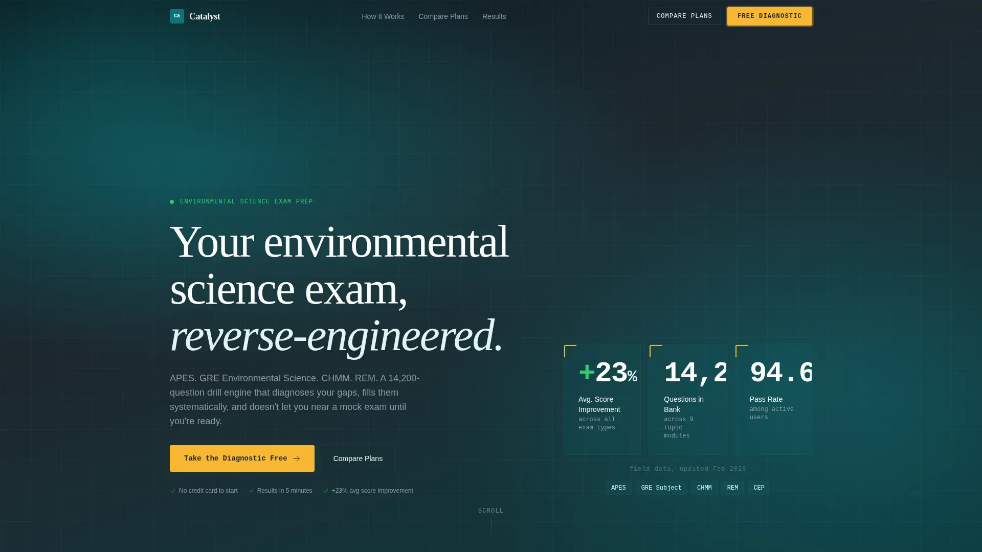
- An animated hero header with three live performance counters and a primary call-to-action button
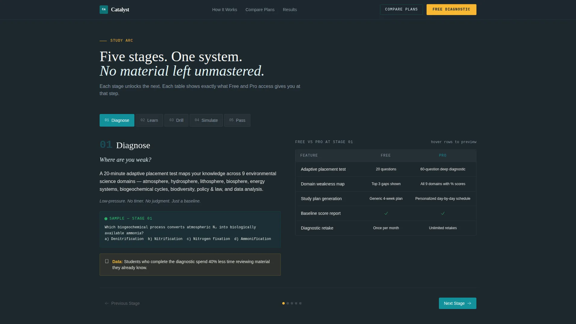
- A five-stage study arc (Diagnose, Learn, Drill, Simulate, Pass) with one comparison table per stage and hover-preview row interactions
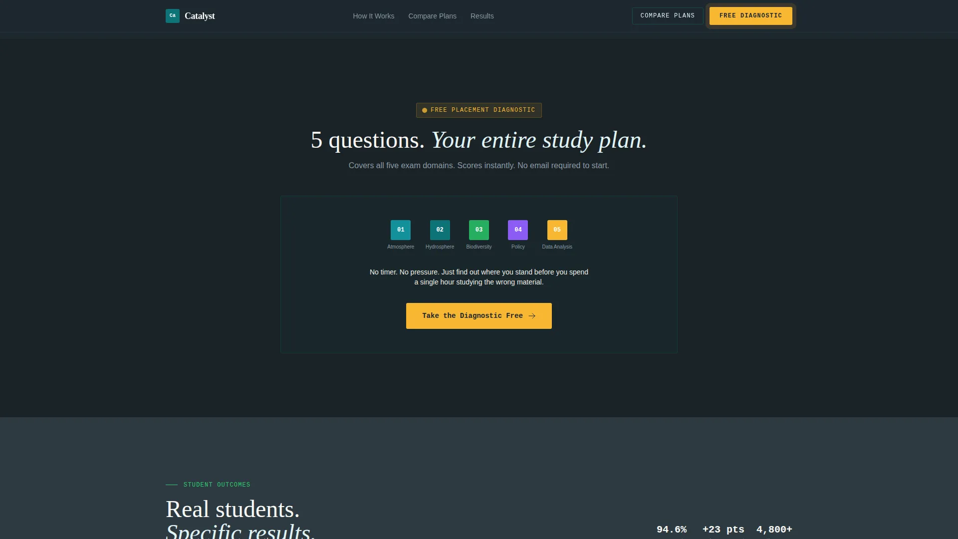
- A five-question interactive diagnostic quiz with instant scoring, a personalized study plan preview, and a post-results email gate
Feature list
This template ships with a focused set of interactive and structural components, each matched to a specific conversion moment in the study journey.
Animated Stats Header
Three oversized counters animate on page load using a monospaced typeface set against deep lab teal. The counters display average score improvement, total questions in the bank, and active-user pass rate. A single headline sits below the counters to anchor the value proposition.
Five-Stage Study Arc with Comparison Tables
The scroll experience is structured as five sequential stages: Diagnose, Learn, Drill, Simulate, and Pass. Each stage has its own full section containing a free-versus-Pro comparison table. Rows in the table support hover previews that surface the actual question type or resource at that stage.
Interactive Diagnostic Quiz
A five-question placement quiz covers atmosphere, hydrosphere, biodiversity, policy, and data analysis. Results score instantly and return a personalized study plan preview. The email gate appears only after results are shown, so the visitor receives value before being asked for anything.
Per-Stage Micro-Stats
Each stage section closes with a specific performance statistic drawn from user data, for example a score lift tied to completing a particular stage. These micro-stats build cumulative evidence as the visitor scrolls and reinforce the case for upgrading.
Sticky Navigation with Plan Comparison Anchor
A sticky navigation bar stays visible throughout the scroll. It includes a "Compare Plans" link that jumps directly to the full comparison table section, serving visitors who arrive ready to evaluate plans rather than read through the full arc.
Full Plan Comparison Table and Final Call to Action
A dedicated section presents the complete free-versus-Pro breakdown alongside a closing call to action. This section catches visitors who have read through the arc and are ready to decide, without forcing them to scroll back to the top.
Page sections overview
| Section | Purpose |
|---|---|
| Hero Stats Header | Display animated counters and primary call to action |
| Study Arc Stage 1 | Diagnose phase with free versus. Pro table |
| Study Arc Stage 2 | Learn phase with resource comparison and secondary call to action |
| Study Arc Stage 3 | Drill phase with question-type previews |
| Study Arc Stage 4 | Simulate phase with mock exam screenshot |
| Study Arc Stage 5 | Pass phase with outcome framing |
| Diagnostic Quiz | Five-question placement quiz with instant results |
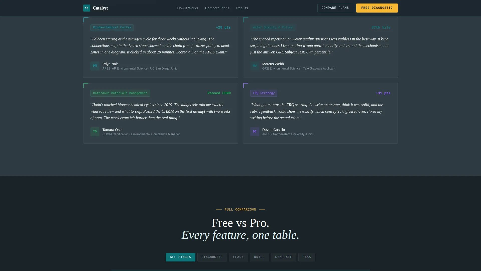
| Social Proof | Testimonials and field-notebook micro-stats |
| Full Comparison Table | Complete plan breakdown and final call to action |
| Footer | Linear single-row footer pattern |
Design & branding system
The visual identity follows an Educational Guide theme that blends institutional rigor with the warmth of a well-worn field notebook. The palette is called Teal Catalyst and each color has a clear functional role across the layout.
- Deep lab teal (#0D7377) dominates section backgrounds and header bars; reaction-green (#2ECC71) marks correct answers and progress states; chalkboard charcoal (#1E272E) anchors body text; and highlight amber (#F7B731) activates on hover and fires on interactive quiz elements
- Typography pairs Fraunces serif for headlines, JetBrains Mono for counters and data displays, and DM Sans for body copy, creating a readable hierarchy that feels academic without being cold
- The aesthetic avoids stock photography of students entirely; visual credibility comes from data, annotation-style layouts, and the clinical confidence of the counter dashboard
Mobile & speed optimization
This template is built with a mobile-first priority, recognizing that the core audience often studies late at night on a phone. Every interactive component is designed to function cleanly at small screen sizes.
- The five-stage scroll arc and comparison tables reflow for narrow viewports so rows remain readable without horizontal scrolling
- Client-side components such as the quiz, counter animations, and hover interactions are isolated; static sections use server components to keep initial load light
- The sticky navigation remains accessible on mobile and the "Compare Plans" anchor scroll works reliably across touch devices
How this template helps you convert
Catalyst is structured around a conversion logic that builds trust progressively rather than demanding commitment upfront. Each section earns the next click.
- The animated stats header leads with hard proof (score improvement, question bank size, pass rate) before any plan pricing appears, establishing credibility in the first five seconds of a visit.
- The diagnostic quiz delivers a personalized study plan preview before asking for a name or email, reversing the usual gate-first approach and giving visitors a concrete reason to continue.
- The per-stage micro-stats and hover-preview comparison tables make the Pro plan feel tangible and earned rather than upsold, so visitors who reach the full comparison table are already primed to upgrade.
Other information about this template
Catalyst was designed specifically for the environmental science exam prep niche, where audiences range from stressed APES students to professionals re-learning biogeochemical cycles for a certification exam. The template accommodates all three audience segments within a single scroll journey without feeling generic.
- The field-notebook aesthetic is a deliberate content strategy signal: annotation-style layouts and margin-like micro-stats communicate subject-matter depth before a visitor reads a single feature bullet
- The comparison table structure per stage is intentional; it lets the service show value progression across the study arc rather than presenting one flat pricing grid that visitors skim and ignore
- The template is built for English-language delivery in a United States academic calendar context, with USD pricing and reference points aligned to APES exam cycles and GRE testing windows
Theme
Educational Guide
Creative direction
Step-by-Step Guide
Color system
Teal Catalyst
Style
Comparison Table
Direction
Quiz/Assessment
Page Sections
Animated Performance Counter Header
Five-stage Study Arc Layout
Hover-preview Comparison Tables
Interactive Diagnostic Quiz with Value-first Gate
Sticky Navigation with Plan Anchor
Social Proof with Field-notebook Micro-stats
Related questions
Who is this template designed for?
Can I customize the comparison tables for my own plan features?
Does the diagnostic quiz require a third-party quiz tool?
How does the email gate work in the quiz flow?
Is this template suitable for mobile users?



