Nonprofit Digital Presence Professional Website Template
Caucus is a modular card-grid landing page template built for nonprofit membership platforms. It combines a glassmorphic Data Command visual identity with interactive explorer components, letting visitors experience the product before signing up. The primary call to action launches a free trial for up to 100 members, with no credit card required.
by Rocket studio
Quick summary
Caucus is a single-page, card-grid landing page template designed for nonprofit membership platforms. It uses a glassmorphic design system over a deep mission-blue background, features an interactive product screenshot header, and drives conversions through a friction-free free trial sign-up. Every section is built to show, not just tell.
Who this template is for
This template is built for the people inside nonprofits who feel the pain of disconnected tools every single week. If you spend your Fridays stitching data together instead of acting on it, this page speaks directly to you.
- Development directors at mid-size nonprofits managing donor records across multiple tools
- Volunteer coordinators who lose track of people between events and follow-ups
- Executive directors who need clean, board-ready reports on short notice
What problem this template solves
Most nonprofits track their members in a patchwork of spreadsheets, email threads, and sign-up forms that never talk to each other. The result is a blurry picture of your community, and missed opportunities at every stage of the member journey.
- Scattered donor and volunteer data that lives in three different places at once
- No clear view of renewal rates, lapsed members, or campaign performance
- Board reports that take hours to compile manually every single week
What you get with this template
You get a fully structured, single-page landing page that walks visitors through the platform's value in a tactile, exploratory way. The layout escalates from a striking header to increasingly powerful interactive card modules, building trust through hands-on proof rather than marketing copy alone.
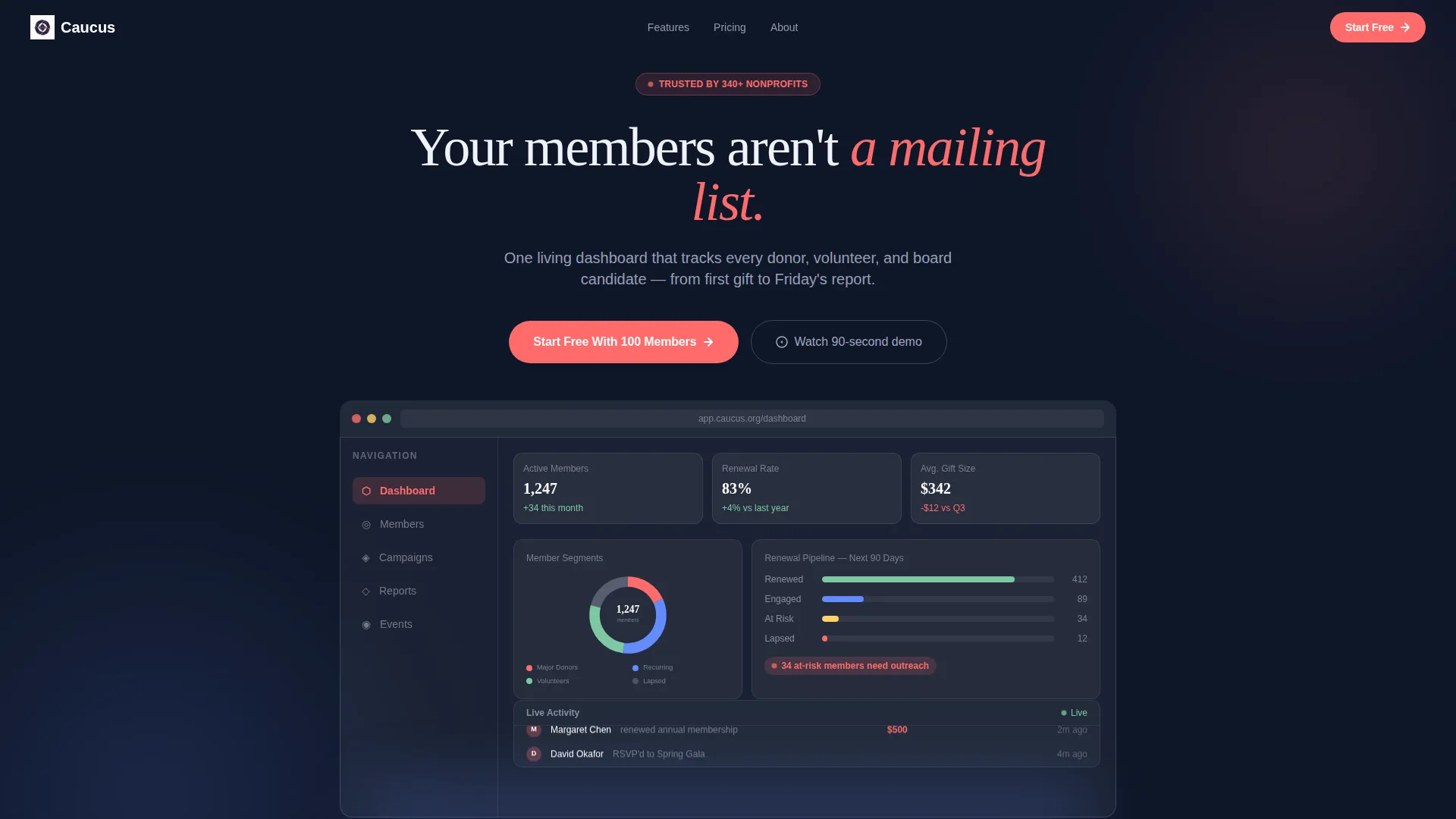
- A full-width product screenshot header with a frosted glass browser frame and subtle parallax motion
- A modular card grid where each card is a miniature interactive module visitors can play with
- A low-friction sign-up form and a secondary "Import Your Spreadsheet" conversion path
Feature list
This template is built around six tightly scoped components that work together to move a skeptical visitor toward a confident sign-up.
Live Dashboard Header
The header renders a pixel-perfect product screenshot mid-use: 1,247 active members in a segmented donut chart, an 83% renewal pipeline, and a scrolling real-time activity feed. The screenshot sits inside a frosted glass browser frame tilted five degrees on the Z-axis. A subtle cursor-driven parallax effect makes the data feel alive before the visitor reads a word.
Modular Interactive Card Grid
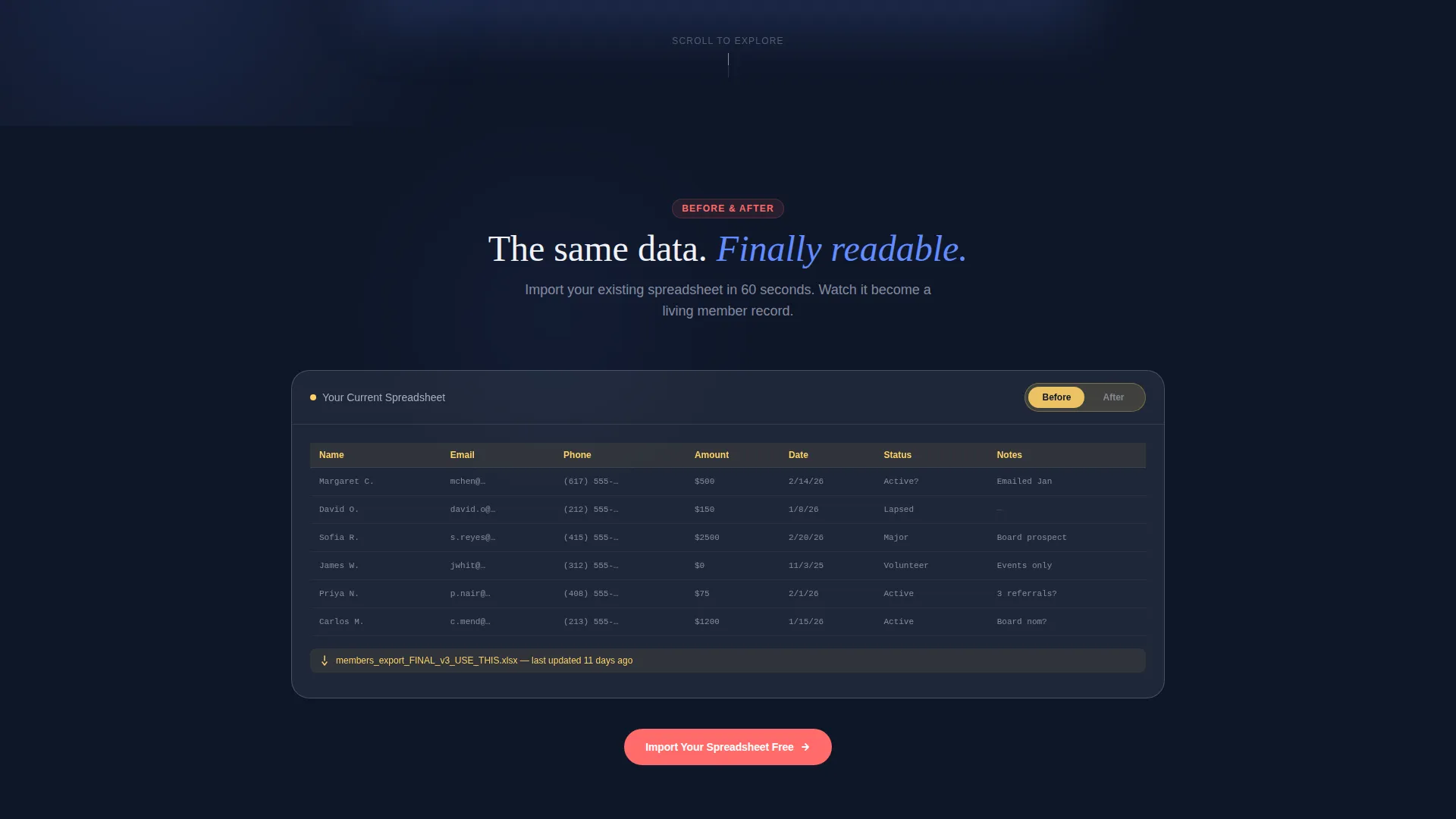
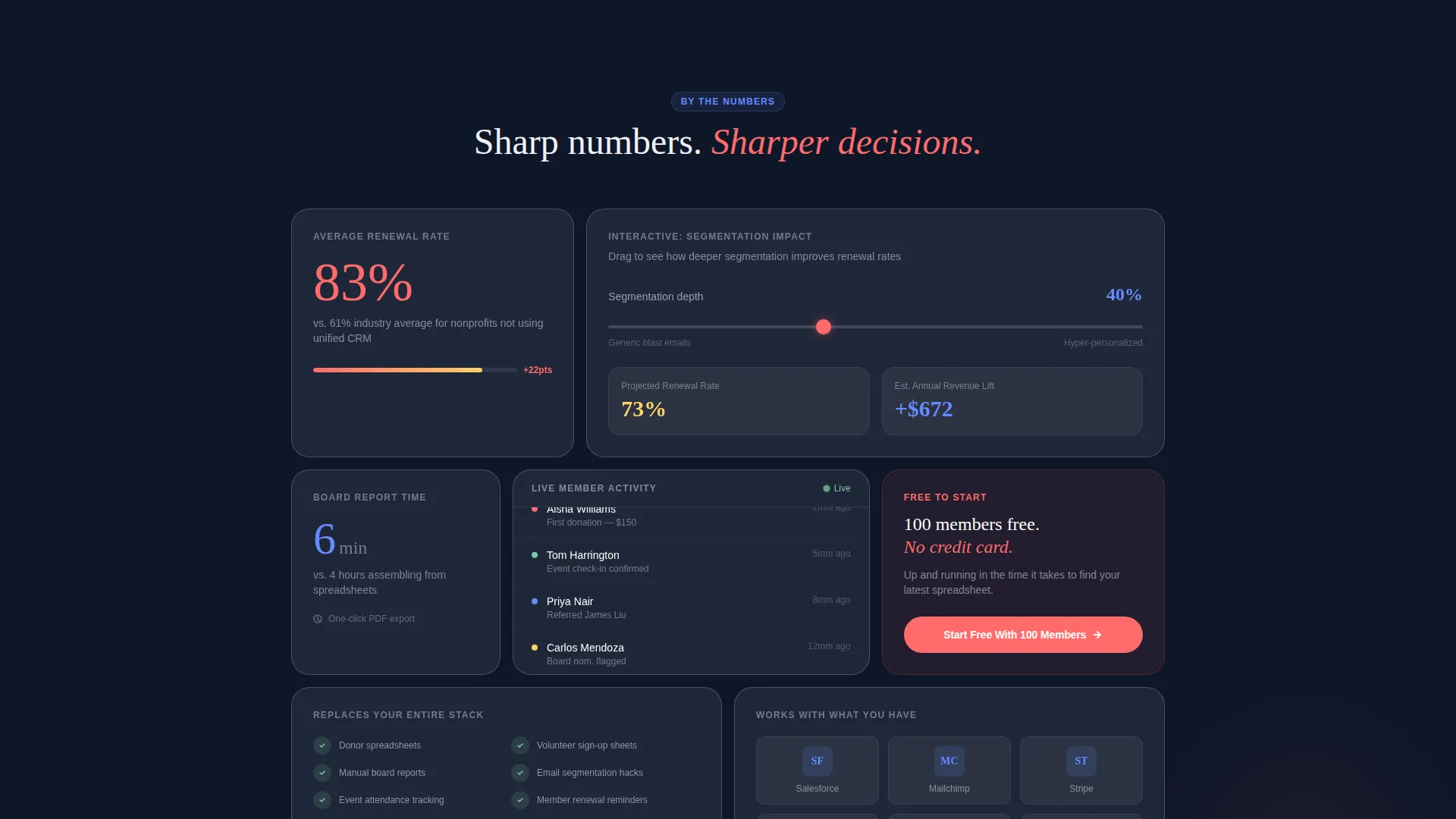
The page is structured as a card grid where each module invites direct interaction. Visitors can drag a slider to see how segmentation affects renewal rates, toggle between a messy spreadsheet view and a clean member profile card, or watch a sample board report generate from dummy data in real time.
Spreadsheet Import Preview
The secondary conversion path lets visitors upload a CSV file and instantly see a preview of their own data rendered inside the dashboard interface. This converts passive curiosity into personal ownership before an account is even created.
Repeating Coral Call-to-Action
The primary call-to-action button, "Start Free With 100 Members," repeats on every third card throughout the page. It is always rendered in coral (#FF6B6B) with a frosted glass hover state that brightens the background glow beneath it, keeping the conversion prompt consistently visible without feeling aggressive.
Minimal Sign-Up Form
The sign-up form asks for only three fields: organization name, role via dropdown (Executive Director, Development, Volunteer Coordination, or Other), and email address. No credit card and no phone number are required, removing every common barrier to a first-time sign-up.
Glassmorphic Card System
Each card uses a frosted translucent white surface (#FFFFFFB3) floating over the deep mission-blue background (#0F1729). Soft lavender-gray borders (#C8CDE2) catch light at the edges. The coral accent (#FF6B6B) is reserved exclusively for buttons and live data highlights, keeping the visual hierarchy clear and purposeful.
Page sections overview
| Section | Purpose |
|---|---|
| Dashboard Screenshot Header | Anchors attention with a live-feeling product view and the headline "Your members aren't a mailing list." |
| Member Lookup Card | Lets visitors search a sample member record to experience the platform's core function immediately |
| Segmentation Slider Card | Demonstrates how audience segmentation lifts renewal rates through a draggable interactive slider |
| Spreadsheet Toggle Card | Shows the before-and-after contrast between a messy spreadsheet and a clean member profile |
| Board Report Generator Card | Auto-generates a sample board report from dummy data, building confidence in reporting capability |
| Repeating call to action Card | Surfaces the "Start Free With 100 Members" prompt at regular intervals throughout the scroll |
| Spreadsheet Import Module | Lets visitors upload a CSV and preview their own data inside the dashboard user interface |
| Sign-Up Form Section | Captures organization name, role, and email with no credit card required |
Design & branding system
The visual identity follows a Data Command theme executed through a glassmorphic color system. The overall effect is like looking through a rain-streaked control tower window at night: surfaces that barely exist as objects, with the information behind them glowing with clarity.
- Deep mission-blue background (#0F1729) anchors the entire page and makes every card feel elevated
- Frosted translucent white cards (#FFFFFFB3) with soft lavender-gray borders (#C8CDE2) create depth without visual noise
- Coral (#FF6B6B) is used exclusively on buttons and live data highlights, ensuring high-contrast action cues throughout
Mobile & speed optimization
The modular card grid layout is structured to adapt across screen sizes without losing the interactive quality of each module. Stacked card flow keeps the escalating experience intact on smaller screens.
- Cards reflow into a single-column stack on narrow viewports, preserving readability and tap targets
- The parallax header and interactive card modules are scoped to remain usable on touch devices
- The minimal sign-up form reduces scroll depth on mobile and keeps the conversion path short
How this template helps you convert
The page is engineered around a principle of tactile proof: show the visitor something they can touch before asking them to commit.
- The interactive card modules let visitors experience the product's core value (member lookup, segmentation, board reporting) before signing up, replacing abstract claims with hands-on confidence.
- The CSV import path turns a visitor's own data into a personalized preview inside the dashboard user interface, creating a sense of ownership that makes clicking "Start Free" feel like a natural next step rather than a risk.
Other information about this template
This template is purpose-built for the nonprofit digital presence space, where mission-driven organizations often need to communicate complex operational value quickly to time-pressed decision-makers.
- The template style is a card grid (modular) layout, which keeps individual sections easy to update or reorder independently
- The freemium trial direction means the page is optimized for low-commitment entry, not high-pressure sales
- The interactive explorer creative direction escalates from simple tasks to more powerful features as the visitor scrolls, building perceived value with each section
- This template fits organizations looking to establish a credible nonprofit membership site presence with a modern, data-forward visual identity
- The Data Command theme and glassmorphic color system make it well-suited for platforms that want to signal analytical rigor without feeling cold or corporate
Theme
Data Command
Creative direction
Interactive Explorer
Color system
Glassmorphic
Style
Card Grid (Modular)
Direction
Freemium/Trial
Page Sections
Live Dashboard Product Screenshot Header
Modular Interactive Card Grid
Spreadsheet Import Preview Path
Repeating Coral Call-to-action Button
Three-field Minimal Sign-up Form
Glassmorphic Data Command Visual System
Related questions
Who is this landing page template built for?
Does the sign-up form require a credit card?
What does the spreadsheet import feature do in this template?
Can I customize the card grid layout?
What makes this template different from a standard nonprofit website template?



